 我的书签
我的书签
 添加书签
添加书签 移除书签
移除书签- XCircle
- 安装
- 属性
- 插槽
- 相关 issue
- 贡献者
- 发布日志
XCircle
XCircle
demo 原始链接编辑文档组件源码

二维码
- 介绍
- 安装
- 栗子
- 基础用法
- 渐变
- API
- 重要提示及已知问题
- 贡献者
- 版本更新
Install
安装
局部注册
全局注册
import { XCircle } from 'vux'export default {components: {XCircle}}
// 在入口文件全局引入import Vue from 'vue'import { XCircle } from 'vux'Vue.component('x-circle', XCircle)
Examples基础用法
基础用法
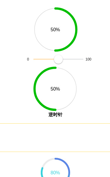
<template><div class="vux-circle-demo"><br><div style="width:150px;height:150px;"><x-circle:percent="percent":stroke-width="5"stroke-color="#04BE02"><span>{{ percent }}%</span></x-circle></div><div class="circle-demo-range"><range v-model="percent" :min="0" :max="100"></range></div><div style="width:150px;height:150px;"><x-circle:percent="percent":stroke-width="5"stroke-color="#04BE02"anticlockwise><span>{{ percent }}%</span></x-circle></div><h4>{{ $t('anticlockwise') }}</h4><br></div></template><i18n>anticlockwise:zh-CN: 逆时针</i18n><script>import { XCircle, Range, Icon } from 'vux'export default {components: {XCircle,Range,Icon},data () {return {percent: 50}}}</script><style scoped>.vux-circle-demo {text-align: center;}.vux-circle-demo > div {margin-left: auto;margin-right: auto;}.circle-demo-range {width: 250px;margin-top: 25px;margin-bottom: 25px;}</style>
 Show code
渐变
渐变
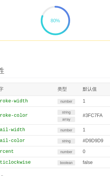
<template><div class="vux-circle-demo"><div style='width:100px;height:100px;'><x-circle:percent="percent":stroke-width="6":trail-width="6":stroke-color="['#36D1DC', '#5B86E5']"trail-color="#ececec"><span style="color:#36D1DC">{{ percent }}%</span></x-circle></div></div></template><script>import { XCircle } from 'vux'export default {components: {XCircle},data () {return {percent: 80}}}</script><style scoped>.vux-circle-demo {padding-top: 20px;text-align: center;}.vux-circle-demo > div {margin: 0 auto;}</style>
 Show code
API
属性
| 名字 | 类型 | 默认值 | 说明 | 版本要求 |
| stroke-width | number | 1 | 线条宽度 | — |
| stroke-color | string array | #3FC7FA | 线条颜色,数组时表示渐变 | — |
| trail-width | number | 1 | 背景线条宽度 | — |
| trail-color | string | #D9D9D9 | 背景线条颜色 | — |
| percent | number | 0 | 进度百分比 | — |
| anticlockwise | boolean | false | 按逆时针方向展示百分比 | — |
插槽
| 名字 | 说明 | 版本要求 |
| 默认插槽 | 圆圈中间显示内容 | — |
Issues
相关 issue
- #3194 修复x-circle同一个页面重复使用颜色配置问题
- #2709 x-circle:support show percent anticlockwise
- #2616 增加XCircle的外圈渐变颜色的配置
贡献者
贡献者
该组件(包含文档)迭代次数 14,贡献人数 5
xmgdtyairylandcomdengspencer1994CuberL
Changelog
发布日志
- v2.9.0 [feature] 支持渐变色 #2616 @spencer1994
