 我的书签
我的书签
 添加书签
添加书签 移除书签
移除书签- Msg
- 安装
- 属性
- 插槽
- 贡献者
- 发布日志
Msg
Msg
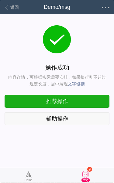
demo 原始链接demo 源码编辑文档组件源码
二维码
Install
安装
局部注册
全局注册
import { Msg } from 'vux'export default {components: {Msg}}
// 在入口文件全局引入import Vue from 'vue'import { Msg } from 'vux'Vue.component('msg', Msg)
prop:buttons 列表是 slot:buttons 插槽的默认显示内容,如果 prop:buttons 无法满足需求,可以使用 slot:buttons 引入 x-button 组件。
<msg><template slot="buttons"><x-button plain type="primary">hello</x-button><x-button>world</x-button></template></msg>
API
属性
| 名字 | 类型 | 默认值 | 说明 | 版本要求 |
| title | string | 操作状态提示文字 | — | |
| description | string | 描述文字 | — | |
| icon | string | success | 图标类型,可选值有 success, warn, info, waiting | — |
| buttons | array | 操作按钮列表,一个按钮对象包含text, type(和x-button组件type一致), link, onClick | — |
插槽
| 名字 | 说明 | 版本要求 |
| buttons | 自定义按钮区域元素 | — |
| description | 自定义描述文字内容 | — |
贡献者
贡献者
该组件(包含文档)迭代次数 7,贡献人数 2
airylandQiongrong Jiang
Changelog
发布日志
- v2.9.0 [change] prop:buttons 数组作为 slot:buttons 默认内容
- v2.1.0 [feature] 新组件
