 我的书签
我的书签
 添加书签
添加书签 移除书签
移除书签- BackTop回到顶部
- 何时使用
- 单独引入此组件
- 代码演示
- API
- nz-back-topcomponent
- nz-back-topcomponent
BackTop回到顶部
返回页面顶部的操作按钮。
何时使用
- 当页面内容区域比较长时;
- 当用户需要频繁返回顶部查看相关内容时。
单独引入此组件
想要了解更多关于单独引入组件的内容,可以在快速上手页面进行查看。
import { NzBackTopModule } from 'ng-zorro-antd/back-top';
代码演示
基本
最简单的用法。
import { Component } from '@angular/core';@Component({selector: 'nz-demo-back-top-basic',template: `<nz-back-top></nz-back-top>Scroll down to see the bottom-right<strong> gray </strong>button.`,styles: [`strong {color: rgba(64, 64, 64, 0.6);}`]})export class NzDemoBackTopBasicComponent {}
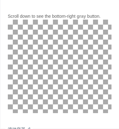
滚动容器
设置 nzTarget 参数,允许对某个容器返回顶部。
import { Component } from '@angular/core';@Component({selector: 'nz-demo-back-top-target',template: `Scroll down to see the bottom-right<strong> gray </strong>button.<div class="long-div" #divTarget><div class="long-div-inner"></div><nz-back-top [nzTarget]="divTarget"></nz-back-top></div>`,styles: [`:host ::ng-deep .long-div {height: 300px;overflow-y: scroll;background-image: url(//zos.alipayobjects.com/rmsportal/RmjwQiJorKyobvI.jpg);}:host ::ng-deep .long-div-inner {height: 1500px;}:host ::ng-deep .long-div .ant-back-top {right: 150px;}:host ::ng-deep strong {color: rgba(64, 64, 64, 0.6);}`]})export class NzDemoBackTopTargetComponent {}
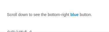
自定义样式
可以自定义回到顶部按钮的样式,限制宽高:40px * 40px。
import { Component } from '@angular/core';@Component({selector: 'nz-demo-back-top-custom',template: `<nz-back-top [nzTemplate]="tpl" [nzVisibilityHeight]="100" (nzOnClick)="notify()"><ng-template #tpl><div class="ant-back-top-inner">UP</div></ng-template></nz-back-top>Scroll down to see the bottom-right<strong> blue </strong>button.`,styles: [`:host ::ng-deep .ant-back-top {bottom: 100px;}:host ::ng-deep .ant-back-top-inner {height: 40px;width: 40px;line-height: 40px;border-radius: 4px;background-color: #1088e9;color: #fff;text-align: center;font-size: 20px;}:host ::ng-deep strong {color: #1088e9;}`]})export class NzDemoBackTopCustomComponent {notify(): void {console.log('notify');}}
API
nz-back-topcomponent
有默认样式,距离底部
50px,可覆盖。自定义样式宽高不大于40px * 40px。
| 成员 | 说明 | 类型 | 默认值 |
|---|---|---|---|
[nzTemplate] | 自定义内容,见示例 | TemplateRef<void> | - |
[nzVisibilityHeight] | 滚动高度达到此参数值才出现 nz-back-top | number | 400 |
[nzTarget] | 设置需要监听其滚动事件的元素,值为一个返回对应 DOM 元素的函数 | string | Element | window |
(nzClick) | 点击按钮的回调函数 | EventEmitter<boolean> | - |
