 我的书签
我的书签
 添加书签
添加书签 移除书签
移除书签- Tabs标签页
- 何时使用
- 单独引入此组件
- 代码演示
- API
- nz-tabsetcomponent
- nz-tabcomponent
- [nz-tab]directive
- [nz-tab-link]directive
- 路由联动
Tabs标签页
选项卡切换组件。
何时使用
提供平级的区域将大块内容进行收纳和展现,保持界面整洁。
Ant Design 依次提供了三级选项卡,分别用于不同的场景。
- 卡片式的页签,提供可关闭的样式,常用于容器顶部。
- 标准线条式页签,用于容器内部的主功能切换,这是最常用的 Tabs。
- RadioButton 可作为更次级的页签来使用。
单独引入此组件
想要了解更多关于单独引入组件的内容,可以在快速上手页面进行查看。
import { NzTabsModule } from 'ng-zorro-antd/tabs';
代码演示

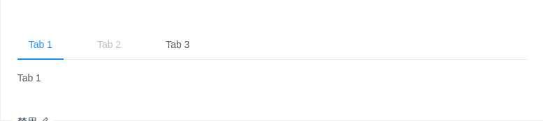
基本
默认选中第一项。
import { Component } from '@angular/core';@Component({selector: 'nz-demo-tabs-basic',template: `<nz-tabset><nz-tab nzTitle="Tab 1">Content of Tab Pane 1</nz-tab><nz-tab nzTitle="Tab 2">Content of Tab Pane 2</nz-tab><nz-tab nzTitle="Tab 3">Content of Tab Pane 3</nz-tab></nz-tabset>`})export class NzDemoTabsBasicComponent {}
禁用
禁用某一项。
import { Component } from '@angular/core';@Component({selector: 'nz-demo-tabs-disabled',template: `<nz-tabset><nz-tab *ngFor="let tab of tabs" [nzTitle]="tab.name" [nzDisabled]="tab.disabled">{{ tab.name }}</nz-tab></nz-tabset>`})export class NzDemoTabsDisabledComponent {tabs = [{name: 'Tab 1',disabled: false},{name: 'Tab 2',disabled: true},{name: 'Tab 3',disabled: false}];}

图标
有图标的标签。
import { Component } from '@angular/core';@Component({selector: 'nz-demo-tabs-icon',template: `<nz-tabset><nz-tab *ngFor="let tab of tabs" [nzTitle]="titleTemplate"><ng-template #titleTemplate> <i nz-icon [nzType]="tab.icon"></i>{{ tab.name }} </ng-template>{{ tab.name }}</nz-tab></nz-tabset>`})export class NzDemoTabsIconComponent {tabs = [{active: true,name: 'Tab 1',icon: 'apple'},{active: false,name: 'Tab 2',icon: 'android'}];}

滑动
可以左右、上下滑动,容纳更多标签。
import { Component, OnInit } from '@angular/core';@Component({selector: 'nz-demo-tabs-slide',template: `<nz-radio-group [(ngModel)]="nzTabPosition"><label nz-radio-button [nzValue]="'top'">Horizontal</label><label nz-radio-button [nzValue]="'left'">Vertical</label></nz-radio-group><nz-input-number style="float:right;" [nzMin]="0" [nzMax]="10" [(ngModel)]="selectedIndex"></nz-input-number><nz-tabsetstyle="height:220px;"[nzTabPosition]="nzTabPosition"[(nzSelectedIndex)]="selectedIndex"(nzSelectChange)="log([$event])"><nz-tab*ngFor="let tab of tabs"[nzTitle]="tab.name"(nzSelect)="log(['select', tab])"(nzClick)="log(['click', tab])"(nzDeselect)="log(['deselect', tab])">{{ tab.content }}</nz-tab></nz-tabset>`})export class NzDemoTabsSlideComponent implements OnInit {tabs: any[] = [];nzTabPosition = 'top';selectedIndex = 0;/* tslint:disable-next-line:no-any */log(args: any[]): void {console.log(args);}ngOnInit(): void {for (let i = 0; i < 11; i++) {this.tabs.push({name: `Tab ${i}`,content: `Content of tab ${i}`});}}}

附加内容
可以在页签右边添加附加操作。
import { Component } from '@angular/core';@Component({selector: 'nz-demo-tabs-extra',template: `<nz-tabset [nzTabBarExtraContent]="extraTemplate"><nz-tab *ngFor="let tab of tabs" [nzTitle]="'Tab ' + tab"> Content of tab {{ tab }} </nz-tab></nz-tabset><ng-template #extraTemplate><button nz-button>Extra Action</button></ng-template>`})export class NzDemoTabsExtraComponent {tabs = [1, 2, 3];}
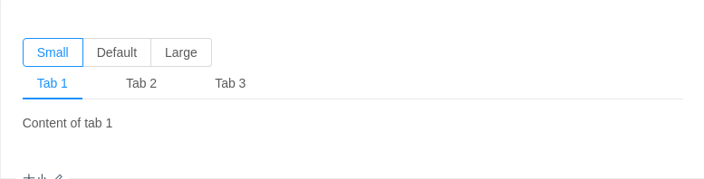
大小
大号页签用在页头区域,小号用在弹出框等较狭窄的容器内。
import { Component } from '@angular/core';@Component({selector: 'nz-demo-tabs-size',template: `<nz-radio-group [(ngModel)]="size"><label nz-radio-button nzValue="small"><span>Small</span></label><label nz-radio-button nzValue="default"><span>Default</span></label><label nz-radio-button nzValue="large"><span>Large</span></label></nz-radio-group><nz-tabset [nzSize]="size"><nz-tab *ngFor="let tab of tabs" [nzTitle]="'Tab ' + tab"> Content of tab {{ tab }} </nz-tab></nz-tabset>`})export class NzDemoTabsSizeComponent {size = 'small';tabs = [1, 2, 3];}
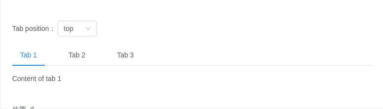
位置
有四个位置,nzTabPosition="left|right|top|bottom"。
import { Component } from '@angular/core';@Component({selector: 'nz-demo-tabs-position',template: `<div style="margin-bottom: 16px;">Tab position:<nz-select [(ngModel)]="position" style="width: 80px;"><nz-option *ngFor="let option of options" [nzLabel]="option.label" [nzValue]="option.value"> </nz-option></nz-select></div><nz-tabset [nzTabPosition]="position" [nzType]="'line'"><nz-tab *ngFor="let tab of tabs" [nzTitle]="'Tab ' + tab"> Content of tab {{ tab }} </nz-tab></nz-tabset>`})export class NzDemoTabsPositionComponent {position = 'top';tabs = [1, 2, 3];options = [{ value: 'top', label: 'top' },{ value: 'left', label: 'left' },{ value: 'right', label: 'right' },{ value: 'bottom', label: 'bottom' }];}
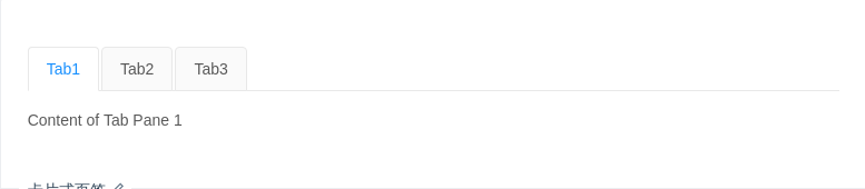
卡片式页签
另一种样式的页签,不提供对应的垂直样式。
import { Component } from '@angular/core';@Component({selector: 'nz-demo-tabs-card',template: `<nz-tabset [nzTabPosition]="'top'" [nzType]="'card'"><nz-tab *ngFor="let tab of tabs" [nzTitle]="'Tab' + tab"> Content of Tab Pane {{ tab }} </nz-tab></nz-tabset>`})export class NzDemoTabsCardComponent {tabs = [1, 2, 3];}

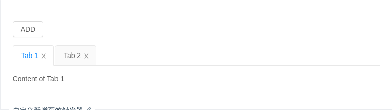
新增和关闭页签
只有卡片样式的页签支持新增和关闭选项。
import { Component } from '@angular/core';@Component({selector: 'nz-demo-tabs-editable-card',template: `<nz-tabset [nzType]="'card'" [nzTabBarExtraContent]="extraTemplate"><nz-tab *ngFor="let tab of tabs" [nzTitle]="titleTemplate"><ng-template #titleTemplate><div>{{ tab }}<i nz-icon nzType="close" (click)="closeTab(tab)" class="ant-tabs-close-x"></i></div></ng-template>Content of {{ tab }}</nz-tab></nz-tabset><ng-template #extraTemplate><i class="ant-tabs-new-tab" nz-icon nzType="plus" (click)="newTab()"></i></ng-template>`})export class NzDemoTabsEditableCardComponent {tabs = ['Tab 1', 'Tab 2'];closeTab(tab: string): void {this.tabs.splice(this.tabs.indexOf(tab), 1);}newTab(): void {this.tabs.push('New Tab');}}

卡片式页签容器
用于容器顶部,需要一点额外的样式覆盖。
import { Component } from '@angular/core';@Component({selector: 'nz-demo-tabs-card-top',template: `<div class="card-container"><nz-tabset [nzTabPosition]="'top'" [nzType]="'card'"><nz-tab *ngFor="let tab of tabs" [nzTitle]="'Tab Title ' + tab"><p>Content of Tab Pane {{ tab }}</p><p>Content of Tab Pane {{ tab }}</p><p>Content of Tab Pane {{ tab }}</p></nz-tab></nz-tabset></div>`,styles: [`:host {background: #f5f5f5;overflow: hidden;padding: 24px;display: block;}.card-container ::ng-deep .ant-tabs-card .ant-tabs-content {height: 120px;margin-top: -16px;}.card-container ::ng-deep .ant-tabs-card .ant-tabs-content .ant-tabs-tabpane {background: #fff;padding: 16px;}.card-container ::ng-deep .ant-tabs-card .ant-tabs-bar {border-color: #fff;}.card-container ::ng-deep .ant-tabs-card .ant-tabs-bar .ant-tabs-tab {border-color: transparent;background: transparent;}.card-container ::ng-deep .ant-tabs-card .ant-tabs-bar .ant-tabs-tab-active {border-color: #fff;background: #fff;}`]})export class NzDemoTabsCardTopComponent {tabs = [1, 2, 3];}
自定义新增页签触发器
给自定义触发器绑定事件。
import { Component } from '@angular/core';@Component({selector: 'nz-demo-tabs-custom-add-trigger',template: `<div style="margin-bottom: 16px;"><button nz-button (click)="newTab()">ADD</button></div><nz-tabset [nzType]="'card'" [nzSelectedIndex]="index"><nz-tab *ngFor="let tab of tabs" [nzTitle]="titleTemplate"><ng-template #titleTemplate><div>{{ tab }}<i nz-icon nzType="close" class="ant-tabs-close-x" (click)="closeTab(tab)"></i></div></ng-template>Content of {{ tab }}</nz-tab></nz-tabset>`})export class NzDemoTabsCustomAddTriggerComponent {index = 0;tabs = ['Tab 1', 'Tab 2'];closeTab(tab: string): void {this.tabs.splice(this.tabs.indexOf(tab), 1);}newTab(): void {this.tabs.push('New Tab');this.index = this.tabs.length - 1;}}
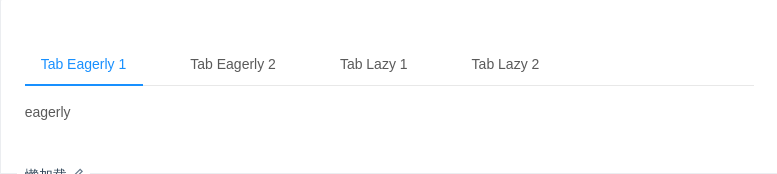
懒加载
默认情况下,nz-tab 中的组件会进行预加载,如果希望当 Tab 被激活时再加载组件,可以使用该示例中的懒加载方式。
/* entryComponents: NzDemoTabContentLazyComponent,NzDemoTabContentEagerlyComponent */import { Component, OnInit } from '@angular/core';@Component({selector: 'nz-demo-tabs-lazy',template: `<nz-tabset><nz-tab nzTitle="Tab Eagerly 1"><nz-demo-tab-content-eagerly></nz-demo-tab-content-eagerly></nz-tab><nz-tab nzTitle="Tab Eagerly 2"><nz-demo-tab-content-eagerly></nz-demo-tab-content-eagerly></nz-tab><nz-tab nzTitle="Tab Lazy 1"><ng-template nz-tab><nz-demo-tab-content-lazy></nz-demo-tab-content-lazy></ng-template></nz-tab><nz-tab nzTitle="Tab Lazy 2"><ng-template nz-tab><nz-demo-tab-content-lazy></nz-demo-tab-content-lazy></ng-template></nz-tab></nz-tabset>`})export class NzDemoTabsLazyComponent {}@Component({selector: 'nz-demo-tab-content-lazy',template: `lazy`})export class NzDemoTabContentLazyComponent implements OnInit {ngOnInit(): void {console.log(`I will init when tab active`);}}@Component({selector: 'nz-demo-tab-content-eagerly',template: `eagerly`})export class NzDemoTabContentEagerlyComponent implements OnInit {ngOnInit(): void {console.log(`I will init eagerly`);}}

路由联动
与路由联动,点击 tab 更改路由,并且在路由改变时自动切换 tab。
import { Component } from '@angular/core';@Component({selector: 'nz-demo-tabs-link-router',template: `<nz-tabset nzLinkRouter><nz-tab><a nz-tab-link [routerLink]="['.']" [queryParams]="{ tab: 'one' }" queryParamsHandling="merge">Default</a>Default.</nz-tab><nz-tab><a nz-tab-link [routerLink]="['.']" [queryParams]="{ tab: 'two' }" queryParamsHandling="merge">Two</a>Two.</nz-tab><nz-tab><a nz-tab-link [routerLink]="['.']" [queryParams]="{ tab: 'three' }" queryParamsHandling="merge">Three</a>Three.</nz-tab><nz-tab><a nz-tab-link [routerLink]="['.']" [queryParams]="{ tab: 'four' }" queryParamsHandling="merge">Four</a>Four.</nz-tab></nz-tabset>`})export class NzDemoTabsLinkRouterComponent {}
API
nz-tabsetcomponent
| 参数 | 说明 | 类型 | 默认值 |
|---|---|---|---|
[nzSelectedIndex] | 当前激活 tab 面板的 序列号,可双向绑定 | number | - |
[nzAnimated] | 是否使用动画切换 Tabs,在 nzTabPosition=top | bottom 时有效 | boolean | {inkBar:boolean, tabPane:boolean} | true, 当 type="card" 时为 false |
[nzSize] | 大小,提供 largedefault 和 small 三种大小 | 'large' | 'small' | 'default' | 'default' |
[nzTabBarExtraContent] | tab bar 上额外的元素 | TemplateRef<void> | - |
[nzTabBarStyle] | tab bar 的样式对象 | object | - |
[nzTabPosition] | 页签位置,可选值有 toprightbottomleft | 'top' | 'right' | 'bottom' | 'left' | 'top' |
[nzType] | 页签的基本样式,可选 line、card 类型 | 'line' | 'card' | 'line' |
[nzTabBarGutter] | tabs 之间的间隙 | number | - |
[nzHideAll] | 是否隐藏所有tab内容 | boolean | false |
[nzShowPagination] | 是否超出范围时显示pre和next按钮 | boolean | true |
[nzLinkRouter] | 与 Angular 路由联动 | boolean | false |
[nzLinkExact] | 以严格匹配模式确定联动的路由 | boolean | true |
(nzSelectedIndexChange) | 当前激活 tab 面板的 序列号变更回调函数 | EventEmitter<number> | - |
(nzSelectChange) | 当前激活 tab 面板变更回调函数 | EventEmitter<{nzSelectedIndex: number,tab: NzTabComponent}> | - |
(nzOnNextClick) | next 按钮被点击的回调 | EventEmitter<void> | - |
(nzOnPrevClick) | prev 按钮被点击的回调 | EventEmitter<void> | - |
nz-tabcomponent
| 参数 | 说明 | 类型 | 默认值 |
|---|---|---|---|
[nzTitle] | 选项卡头显示文字 | string | TemplateRef<void> | - |
[nzForceRender] | 被隐藏时是否渲染 DOM 结构 | boolean | false |
[nzDisabled] | 是否禁用 | boolean | - |
(nzClick) | title被点击的回调函数 | EventEmitter<void> | - |
(nzSelect) | tab被选中的回调函数 | EventEmitter<void> | - |
(nzDeselect) | tab被取消选中的回调函数 | EventEmitter<void> | - |
[nz-tab]directive
与 ng-template 一同使用,用于标记需要懒加载的 tab 内容,具体用法见示例。
[nz-tab-link]directive
选项卡头显示链接,在路由联动模式下使用。
路由联动
路由联动可以让 tab 的切换和路由行为相一致。使用此功能时,title 必须通过 nz-tab-link 组件指定。
