 我的书签
我的书签
 添加书签
添加书签 移除书签
移除书签- Alert警告提示
- 何时使用
- 单独引入此组件
- 代码演示
- API
- nz-alertcomponent
- nz-alertcomponent
Alert警告提示
警告提示,展现需要关注的信息。
何时使用
- 当某个页面需要向用户显示警告的信息时。
- 非浮层的静态展现形式,始终展现,不会自动消失,用户可以点击关闭。
单独引入此组件
想要了解更多关于单独引入组件的内容,可以在快速上手页面进行查看。
import { NzAlertModule } from 'ng-zorro-antd/alert';
代码演示
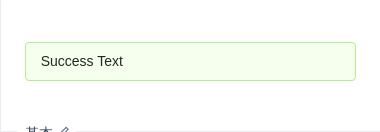
基本
最简单的用法,适用于简短的警告提示。
import { Component } from '@angular/core';@Component({selector: 'nz-demo-alert-basic',template: `<nz-alert nzType="success" nzMessage="Success Text"></nz-alert>`})export class NzDemoAlertBasicComponent {}

可关闭的警告提示
显示关闭按钮,点击可关闭警告提示。
import { Component } from '@angular/core';@Component({selector: 'nz-demo-alert-closable',template: `<nz-alertnzType="warning"nzCloseablenzMessage="Warning Text Warning Text Warning Text Warning Text Warning Text Warning Text Warning Text"(nzOnClose)="afterClose()"></nz-alert><nz-alertnzType="error"nzCloseablenzMessage="Error Text"nzDescription="Error Description Error Description Error Description Error Description Error Description Error Description"(nzOnClose)="afterClose()"></nz-alert>`,styles: [`nz-alert {margin-bottom: 16px;}`]})export class NzDemoAlertClosableComponent {afterClose(): void {console.log('close');}}
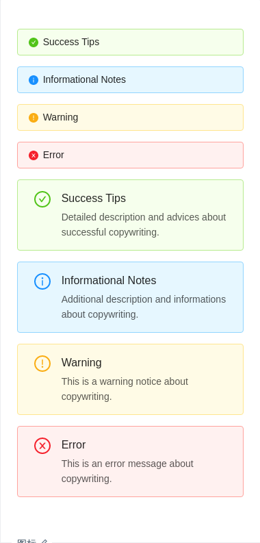
图标
可口的图标让信息类型更加醒目。
import { Component } from '@angular/core';@Component({selector: 'nz-demo-alert-icon',template: `<nz-alert nzType="success" nzMessage="Success Tips" nzShowIcon></nz-alert><nz-alert nzType="info" nzMessage="Informational Notes" nzShowIcon></nz-alert><nz-alert nzType="warning" nzMessage="Warning" nzShowIcon></nz-alert><nz-alert nzType="error" nzMessage="Error" nzShowIcon></nz-alert><nz-alertnzType="success"nzMessage="Success Tips"nzDescription="Detailed description and advices about successful copywriting."nzShowIcon></nz-alert><nz-alertnzType="info"nzMessage="Informational Notes"nzDescription="Additional description and informations about copywriting."nzShowIcon></nz-alert><nz-alertnzType="warning"nzMessage="Warning"nzDescription="This is a warning notice about copywriting."nzShowIcon></nz-alert><nz-alert nzType="error" nzMessage="Error" nzDescription="This is an error message about copywriting." nzShowIcon></nz-alert>`,styles: [`nz-alert {margin-bottom: 16px;}`]})export class NzDemoAlertIconComponent {}
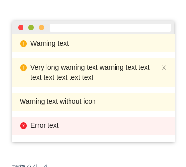
顶部公告
页面顶部通告形式,默认有图标且nzType 为 'warning'。
import { Component } from '@angular/core';@Component({selector: 'nz-demo-alert-banner',template: `<nz-alert nzBanner nzMessage="Warning text"></nz-alert><nz-alertnzBannernzMessage="Very long warning text warning text text text text text text text"nzCloseable></nz-alert><nz-alert nzBanner nzMessage="Warning text without icon" [nzShowIcon]="false"></nz-alert><nz-alert nzBanner nzType="error" nzMessage="Error text"></nz-alert>`,styles: [`nz-alert {margin-bottom: 12px;}`]})export class NzDemoAlertBannerComponent {}

四种样式
共有四种样式 success、info、warning、error。
import { Component } from '@angular/core';@Component({selector: 'nz-demo-alert-style',template: `<nz-alert nzType="success" nzMessage="Success Text"></nz-alert><nz-alert nzType="info" nzMessage="Info Text"></nz-alert><nz-alert nzType="warning" nzMessage="Warning Text"></nz-alert><nz-alert nzType="error" nzMessage="Error Text"></nz-alert>`,styles: [`nz-alert {margin-bottom: 16px;}`]})export class NzDemoAlertStyleComponent {}
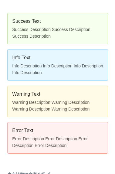
含有辅助性文字介绍
含有辅助性文字介绍的警告提示。
import { Component } from '@angular/core';@Component({selector: 'nz-demo-alert-description',template: `<nz-alertnzType="success"nzMessage="Success Text"nzDescription="Success Description Success Description Success Description"></nz-alert><nz-alertnzType="info"nzMessage="Info Text"nzDescription="Info Description Info Description Info Description Info Description"></nz-alert><nz-alertnzType="warning"nzMessage="Warning Text"nzDescription="Warning Description Warning Description Warning Description Warning Description"></nz-alert><nz-alertnzType="error"nzMessage="Error Text"nzDescription="Error Description Error Description Error Description Error Description"></nz-alert>`,styles: [`nz-alert {margin-bottom: 16px;}`]})export class NzDemoAlertDescriptionComponent {}
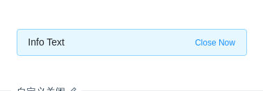
自定义关闭
可以自定义关闭,自定义的内容会替换原先的关闭按钮。
import { Component } from '@angular/core';@Component({selector: 'nz-demo-alert-close-text',template: `<nz-alert nzType="info" nzMessage="Info Text" nzCloseText="Close Now"></nz-alert>`})export class NzDemoAlertCloseTextComponent {}
API
nz-alertcomponent
| 参数 | 说明 | 类型 | 默认值 |
|---|---|---|---|
[nzBanner] | 是否用作顶部公告 | boolean | false |
[nzCloseable] | 默认不显示关闭按钮 | boolean | - |
[nzCloseText] | 自定义关闭按钮 | string | TemplateRef<void> | - |
[nzDescription] | 警告提示的辅助性文字介绍 | string | TemplateRef<void> | - |
[nzMessage] | 警告提示内容 | string | TemplateRef<void> | - |
[nzShowIcon] | 是否显示辅助图标,nzBanner 模式下默认值为 true | boolean | false |
[nzIconType] | 自定义图标类型,nzShowIcon 为 true 时有效 | string | string[] | Set<string> | { [klass: string]: any; } | - |
[nzType] | 指定警告提示的样式,nzBanner 模式下默认值为 'warning' | 'success' | 'info' | 'warning' | 'error' | 'info' |
(nzOnClose) | 关闭时触发的回调函数 | EventEmitter<void> | - |
