 我的书签
我的书签
 添加书签
添加书签 移除书签
移除书签- Card卡片
- 何时使用
- 单独引入此组件
- 代码演示
- API
- nz-cardcomponent
- nz-card-metacomponent
- [nz-card-grid]directive
- nz-card-tabcomponent
Card卡片
通用卡片容器。
何时使用
最基础的卡片容器,可承载文字、列表、图片、段落,常用于后台概览页面。
单独引入此组件
想要了解更多关于单独引入组件的内容,可以在快速上手页面进行查看。
import { NzCardModule } from 'ng-zorro-antd/card';
代码演示
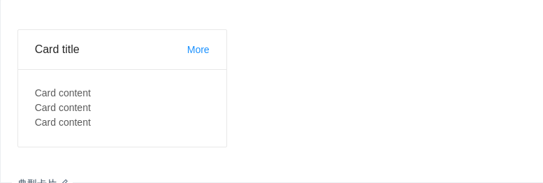
典型卡片
包含标题、内容、操作区域。
import { Component } from '@angular/core';@Component({selector: 'nz-demo-card-basic',template: `<nz-card style="width:300px;" nzTitle="Card title" [nzExtra]="extraTemplate"><p>Card content</p><p>Card content</p><p>Card content</p></nz-card><ng-template #extraTemplate><a>More</a></ng-template>`,styles: [`p {margin: 0;}`]})export class NzDemoCardBasicComponent {}

无边框
在灰色背景上使用无边框的卡片。
import { Component } from '@angular/core';@Component({selector: 'nz-demo-card-border-less',template: `<div style="background: #ECECEC;padding:30px;"><nz-card style="width:300px;" [nzBordered]="false" nzTitle="Card title" [nzExtra]="extraTemplate"><p>Card content</p><p>Card content</p><p>Card content</p></nz-card></div><ng-template #extraTemplate><a>More</a></ng-template>`,styles: [`p {margin: 0;}`]})export class NzDemoCardBorderLessComponent {}
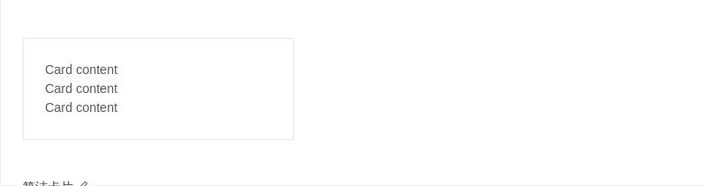
简洁卡片
只包含内容区域。
import { Component } from '@angular/core';@Component({selector: 'nz-demo-card-simple',template: `<nz-card style="width:300px;"><p>Card content</p><p>Card content</p><p>Card content</p></nz-card>`,styles: [`p {margin: 0;}`]})export class NzDemoCardSimpleComponent {}

更灵活的内容展示
可以利用 nz-card-meta 支持更灵活的内容。
import { Component } from '@angular/core';@Component({selector: 'nz-demo-card-flexible-content',template: `<nz-card nzHoverable style="width:240px" [nzCover]="coverTemplate"><nz-card-meta nzTitle="Europe Street beat" nzDescription="www.instagram.com"></nz-card-meta></nz-card><ng-template #coverTemplate><img alt="example" src="https://os.alipayobjects.com/rmsportal/QBnOOoLaAfKPirc.png" /></ng-template>`})export class NzDemoCardFlexibleContentComponent {}

栅格卡片
在系统概览页面常常和栅格进行配合。
import { Component } from '@angular/core';@Component({selector: 'nz-demo-card-in-column',template: `<div style="background: #ECECEC;padding:30px;"><div nz-row [nzGutter]="8"><div nz-col [nzSpan]="8"><nz-card nzTitle="Card title"><p>Card content</p></nz-card></div><div nz-col [nzSpan]="8"><nz-card nzTitle="Card title"><p>Card content</p></nz-card></div><div nz-col [nzSpan]="8"><nz-card nzTitle="Card title"><p>Card content</p></nz-card></div></div></div>`,styles: [`p {margin: 0;}`]})export class NzDemoCardInColumnComponent {}
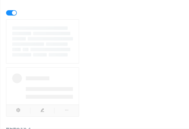
预加载的卡片
数据读入前会有文本块样式。
import { Component } from '@angular/core';@Component({selector: 'nz-demo-card-loading',template: `<nz-switch [(ngModel)]="loading"></nz-switch><nz-card style="width: 300px;margin-top: 16px" [nzLoading]="loading"><nz-card-meta[nzAvatar]="avatarTemplate"nzTitle="Card title"nzDescription="This is the description"></nz-card-meta></nz-card><nz-card style="width: 300px;margin-top: 16px" [nzActions]="[actionSetting, actionEdit, actionEllipsis]"><nz-skeleton [nzActive]="true" [nzLoading]="loading" [nzAvatar]="{ size: 'large' }"><nz-card-meta[nzAvatar]="avatarTemplate"nzTitle="Card title"nzDescription="This is the description"></nz-card-meta></nz-skeleton></nz-card><ng-template #avatarTemplate><nz-avatar nzSrc="https://zos.alipayobjects.com/rmsportal/ODTLcjxAfvqbxHnVXCYX.png"></nz-avatar></ng-template><ng-template #actionSetting><i nz-icon nzType="setting"></i></ng-template><ng-template #actionEdit><i nz-icon nzType="edit"></i></ng-template><ng-template #actionEllipsis><i nz-icon nzType="ellipsis"></i></ng-template>`})export class NzDemoCardLoadingComponent {loading = true;}
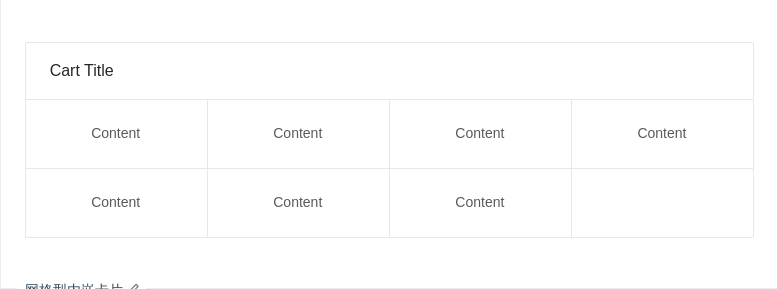
网格型内嵌卡片
一种常见的卡片内容区隔模式。
import { Component } from '@angular/core';@Component({selector: 'nz-demo-card-grid-card',template: `<nz-card nzTitle="Cart Title"><div nz-card-grid [ngStyle]="gridStyle">Content</div><div nz-card-grid [ngStyle]="gridStyle">Content</div><div nz-card-grid [ngStyle]="gridStyle">Content</div><div nz-card-grid [ngStyle]="gridStyle">Content</div><div nz-card-grid [ngStyle]="gridStyle">Content</div><div nz-card-grid [ngStyle]="gridStyle">Content</div><div nz-card-grid [ngStyle]="gridStyle">Content</div></nz-card>`})export class NzDemoCardGridCardComponent {gridStyle = {width: '25%',textAlign: 'center'};}

内部卡片
可以放在普通卡片内部,展示多层级结构的信息。
import { Component } from '@angular/core';@Component({selector: 'nz-demo-card-inner',template: `<nz-card nzTitle="Card Title"><p style="font-size:14px;color:rgba(0, 0, 0, 0.85);margin-bottom:16px;font-weight: 500;">Group title</p><nz-card nzType="inner" nzTitle="Inner Card Title" [nzExtra]="extraTemplate"><a>Inner Card Content</a></nz-card><nz-card nzType="inner" style="margin-top:16px;" nzTitle="Inner Card Title" [nzExtra]="extraTemplate"><a>Inner Card Content</a></nz-card></nz-card><ng-template #extraTemplate><a>More</a></ng-template>`})export class NzDemoCardInnerComponent {}
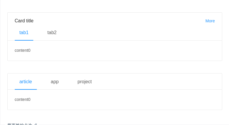
带页签的卡片
可承载更多内容。
import { Component } from '@angular/core';@Component({selector: 'nz-demo-card-tabs',template: `<nz-card style="width: 100%;" nzTitle="Card title" [nzExtra]="extraTemplate"><nz-card-tab><nz-tabset nzSize="large" [(nzSelectedIndex)]="index1"><nz-tab nzTitle="tab1"></nz-tab><nz-tab nzTitle="tab2"></nz-tab></nz-tabset></nz-card-tab>content{{ index1 }}</nz-card><ng-template #extraTemplate><a>More</a></ng-template><br /><br /><nz-card style="width: 100%;"><nz-card-tab><nz-tabset nzSize="large" [(nzSelectedIndex)]="index2"><nz-tab nzTitle="article"></nz-tab><nz-tab nzTitle="app"></nz-tab><nz-tab nzTitle="project"></nz-tab></nz-tabset></nz-card-tab>content{{ index2 }}</nz-card>`})export class NzDemoCardTabsComponent {index1 = 0;index2 = 0;}
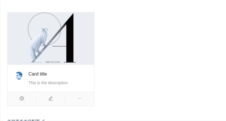
支持更多内容配置
一种支持封面、头像、标题和描述信息的卡片。
import { Component } from '@angular/core';@Component({selector: 'nz-demo-card-meta',template: `<nz-card style="width:300px;" [nzCover]="coverTemplate" [nzActions]="[actionSetting, actionEdit, actionEllipsis]"><nz-card-metanzTitle="Card title"nzDescription="This is the description"[nzAvatar]="avatarTemplate"></nz-card-meta></nz-card><ng-template #avatarTemplate><nz-avatar nzSrc="https://zos.alipayobjects.com/rmsportal/ODTLcjxAfvqbxHnVXCYX.png"></nz-avatar></ng-template><ng-template #coverTemplate><img alt="example" src="https://gw.alipayobjects.com/zos/rmsportal/JiqGstEfoWAOHiTxclqi.png" /></ng-template><ng-template #actionSetting><i nz-icon nzType="setting"></i></ng-template><ng-template #actionEdit><i nz-icon nzType="edit"></i></ng-template><ng-template #actionEllipsis><i nz-icon nzType="ellipsis"></i></ng-template>`})export class NzDemoCardMetaComponent {}
API
<nz-card nzTitle="卡片标题">卡片内容</nz-card>
nz-cardcomponent
| 参数 | 说明 | 类型 | 默认值 |
|---|---|---|---|
[nzActions] | 卡片操作组,位置在卡片底部 | Array<TemplateRef<void>> | - |
[nzBodyStyle] | 内容区域自定义样式 | { [key: string]: string } | - |
[nzBordered] | 是否有边框 | boolean | true |
[nzCover] | 卡片封面 | TemplateRef<void> | - |
[nzExtra] | 卡片右上角的操作区域 | string | TemplateRef<void> | - |
[nzHoverable] | 鼠标移过时可浮起 | boolean | false |
[nzLoading] | 当卡片内容还在加载中时,可以用 loading 展示一个占位 | boolean | false |
[nzTitle] | 卡片标题 | string | TemplateRef<void> | - |
[nzType] | 卡片类型,可设置为 inner 或 不设置 | 'inner' | - |
[nzSize] | 卡片的尺寸 | 'default' | 'small' | 'default' |
nz-card-metacomponent
| 参数 | 说明 | 类型 | 默认值 |
|---|---|---|---|
[nzAvatar] | 头像/图标 | TemplateRef<void> | - |
[nzDescription] | 描述内容 | string | TemplateRef<void> | - |
[nzTitle] | 标题内容 | string | TemplateRef<void> | - |
[nz-card-grid]directive
分隔卡片内容区域
nz-card-tabcomponent
分隔页签标题区域
