 我的书签
我的书签
 添加书签
添加书签 移除书签
移除书签- PageHeader页头
- 何时使用
- 单独引入此组件
- 代码演示
- API
- nz-page-headercomponent
- Page header 组成部分
PageHeader页头
页头用来声明页面的主题,包含了用户所关注的最重要的信息。
何时使用
当需要用户快速理解当前页面是什么以及它的功能时使用。
单独引入此组件
想要了解更多关于单独引入组件的内容,可以在快速上手页面进行查看。
import { NzPageHeaderModule } from 'ng-zorro-antd/page-header';
代码演示

标准样式
标准页头
import { Component } from '@angular/core';@Component({selector: 'nz-demo-page-header-basic',template: `<nz-page-header (nzBack)="onBack()" nzBackIcon nzTitle="Title" nzSubtitle="This is a subtitle"> </nz-page-header>`,styles: [`nz-page-header {border: 1px solid rgb(235, 237, 240);}`]})export class NzDemoPageHeaderBasicComponent {onBack() {console.log('onBack');}}
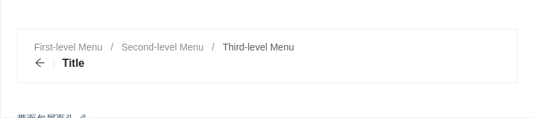
带面包屑页头
带面包屑页头
import { Component } from '@angular/core';@Component({selector: 'nz-demo-page-header-breadcrumb',template: `<nz-page-header nzBackIcon nzTitle="Title"><nz-breadcrumb nz-page-header-breadcrumb><nz-breadcrumb-item>First-level Menu</nz-breadcrumb-item><nz-breadcrumb-item><a>Second-level Menu</a></nz-breadcrumb-item><nz-breadcrumb-item>Third-level Menu</nz-breadcrumb-item></nz-breadcrumb></nz-page-header>`,styles: [`nz-page-header {border: 1px solid rgb(235, 237, 240);}`]})export class NzDemoPageHeaderBreadcrumbComponent {}

内容
你可以使用 <nz-page-header-content> 添加内容。
import { Component } from '@angular/core';@Component({selector: 'nz-demo-page-header-content',template: `<nz-page-header nzTitle="Page Title"><nz-breadcrumb nz-page-header-breadcrumb><nz-breadcrumb-item>First-level Menu</nz-breadcrumb-item><nz-breadcrumb-item><a>Second-level Menu</a></nz-breadcrumb-item><nz-breadcrumb-item>Third-level Menu</nz-breadcrumb-item></nz-breadcrumb><nz-page-header-content><div class="wrap"><div class="content"><div class="content"><p>Ant Design interprets the color system into two levels: a system-level color system and a product-levelcolor system.</p><p>Ant Design's design team preferred to design with the HSB color model, which makes it easier fordesigners to have a clear psychological expectation of color when adjusting colors, as well asfacilitate communication in teams.</p><p class="content-link"><a><img src="https://gw.alipayobjects.com/zos/rmsportal/MjEImQtenlyueSmVEfUD.svg" alt="start" />QuickStart</a><a><img src="https://gw.alipayobjects.com/zos/rmsportal/NbuDUAuBlIApFuDvWiND.svg" alt="info" />ProductInfo</a><a><img src="https://gw.alipayobjects.com/zos/rmsportal/ohOEPSYdDTNnyMbGuyLb.svg" alt="doc" />Product Doc</a></p></div></div><div class="extra-content"><imgsrc="https://gw.alipayobjects.com/mdn/mpaas_user/afts/img/A*KsfVQbuLRlYAAAAAAAAAAABjAQAAAQ/original"alt="content"/></div></div></nz-page-header-content></nz-page-header>`,styles: [`nz-page-header {border: 1px solid rgb(235, 237, 240);}.wrap {display: flex;}.content {flex: 1;}.content p {margin-bottom: 8px;}.content-link {padding-top: 16px;}.content-link a {display: inline-block;vertical-align: text-top;margin-right: 32px;}.content-link a img {margin-right: 8px;}.extra-content {min-width: 240px;text-align: right;}`]})export class NzDemoPageHeaderContentComponent {}

复杂的例子
使用操作区,并自定义子节点
import { Component } from '@angular/core';@Component({selector: 'nz-demo-page-header-actions',template: `<nz-page-header nzBackIcon><nz-page-header-title>Title</nz-page-header-title><nz-page-header-subtitle>This is a subtitle</nz-page-header-subtitle><nz-page-header-tags><nz-tag [nzColor]="'red'">Warning</nz-tag></nz-page-header-tags><nz-page-header-extra><button nz-button>Operation</button><button nz-button>Operation</button><button nz-button nzType="primary">Primary</button></nz-page-header-extra><nz-page-header-content><div class="wrap"><div nz-row class="content padding"><div nz-col nzSpan="12"><div class="description"><span class="term">Created</span><p class="detail">Lili Qu</p></div></div><div nz-col nzSpan="12"><div class="description"><span class="term">Association</span><a>421421</a></div></div><div nz-col nzSpan="12"><div class="description"><span class="term">Creation Time</span><p class="detail">2017-01-10</p></div></div><div nz-col nzSpan="12"><div class="description"><span class="term">Effective Time</span><p class="detail">2017-01-10</p></div></div><div nz-col nzSpan="12"><div class="description"><span class="term">Remarks</span><p class="detail">Gonghu Road, Xihu District, Hangzhou, Zhejiang, China</p></div></div></div><div nz-row class="extra-content"><div nz-col nzSpan="12"><span class="label">Status</span><p class="detail">Pending</p></div><div nz-col nzSpan="12"><span class="label"> Price</span><p class="detail">$ 568.08</p></div></div></div></nz-page-header-content><nz-page-header-footer><nz-tabset [nzSelectedIndex]="1"><nz-tab nzTitle="Details"></nz-tab><nz-tab nzTitle="Rule"></nz-tab></nz-tabset></nz-page-header-footer></nz-page-header>`,styles: [`nz-page-header {border: 1px solid rgb(235, 237, 240);}.wrap {display: flex;}.content {flex: 1;}.content.padding {padding-left: 40px;}.content p {margin-bottom: 8px;}.content .description {display: table;}.description .term {display: table-cell;margin-right: 8px;padding-bottom: 8px;white-space: nowrap;line-height: 20px;}.description .term:after {position: relative;top: -0.5px;margin: 0 8px 0 2px;content: ':';}.description .detail {display: table-cell;padding-bottom: 8px;width: 100%;line-height: 20px;}.extra-content {min-width: 240px;text-align: right;}.extra-content .label {font-size: 14px;color: rgba(0, 0, 0, 0.45);line-height: 22px;}.extra-content .detail {font-size: 20px;color: rgba(0, 0, 0, 0.85);line-height: 28px;}`]})export class NzDemoPageHeaderActionsComponent {}
API
<nz-page-header nzTitle="Page Title"></nz-page-header>
nz-page-headercomponent
| 参数 | 说明 | 类型 | 默认值 |
|---|---|---|---|
[nzTitle] | title 文字 | string | TemplateRef<void> | - |
[nzSubtitle] | subTitle 文字 | string | TemplateRef<void> | - |
[nzBackIcon] | 自定义 back icon | string | TemplateRef<void> | - |
(nzBack) | 返回按钮的点击事件 | EventEmitter<void> | 未订阅该事件时默认调用 Location[back] |
Page header 组成部分
| 元素 | 说明 |
|---|---|
<nz-page-header-title> | title 部分,[nzTitle] 优先级更高 |
<nz-page-header-subtitle> | subtitle 部分,[nzSubtitle] 优先级更高 |
<nz-page-header-content> | 内容部分 |
<nz-page-header-footer> | 底部部分 |
<nz-page-header-tags> | title 旁的 tag 列表容器 |
<nz-page-header-extra> | title 的行尾操作区部分 |
<nz-breadcrumb nz-page-header-breadcrumb> | 面包屑部分 |
