 我的书签
我的书签
 添加书签
添加书签 移除书签
移除书签- Input输入框
- 何时使用
- 单独引入此组件
- 代码演示
- API
- [nz-input]directive
- nz-input-groupcomponent
Input输入框
通过鼠标或键盘输入内容,是最基础的表单域的包装。
何时使用
- 需要用户输入表单域内容时。
- 提供组合型输入框,带搜索的输入框,还可以进行大小选择。
单独引入此组件
想要了解更多关于单独引入组件的内容,可以在快速上手页面进行查看。
import { NzInputModule } from 'ng-zorro-antd/input';
代码演示
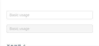
基本使用
基本使用。
import { Component } from '@angular/core';@Component({selector: 'nz-demo-input-basic',template: `<input nz-input placeholder="Basic usage" [(ngModel)]="value" /><br /><br /><input nz-input placeholder="Basic usage" [(ngModel)]="value" [disabled]="true" />`})export class NzDemoInputBasicComponent {value: string;}
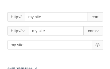
前置/后置标签
用于配置一些固定组合。
import { Component } from '@angular/core';@Component({selector: 'nz-demo-input-addon',template: `<div style="margin-bottom: 16px;"><nz-input-group nzAddOnBefore="Http://" nzAddOnAfter=".com"><input type="text" nz-input [(ngModel)]="inputValue" /></nz-input-group></div><div style="margin-bottom: 16px;"><nz-input-group [nzAddOnBefore]="addOnBeforeTemplate" [nzAddOnAfter]="addOnAfterTemplate"><input type="text" nz-input [(ngModel)]="inputValue" /></nz-input-group><ng-template #addOnBeforeTemplate><nz-select [ngModel]="'Http://'"><nz-option [nzLabel]="'Http://'" [nzValue]="'Http://'"></nz-option><nz-option [nzLabel]="'Https://'" [nzValue]="'Https://'"></nz-option></nz-select></ng-template><ng-template #addOnAfterTemplate><nz-select [ngModel]="'.com'"><nz-option [nzLabel]="'.com'" [nzValue]="'.com'"></nz-option><nz-option [nzLabel]="'.jp'" [nzValue]="'.jp'"></nz-option><nz-option [nzLabel]="'.cn'" [nzValue]="'.cn'"></nz-option><nz-option [nzLabel]="'.org'" [nzValue]="'.org'"></nz-option></nz-select></ng-template></div><div style="margin-bottom: 16px;"><nz-input-group [nzAddOnAfterIcon]="'setting'"><input type="text" nz-input [(ngModel)]="inputValue" /></nz-input-group></div>`})export class NzDemoInputAddonComponent {inputValue: string = 'my site';}

搜索框
带有搜索按钮的输入框。
import { Component } from '@angular/core';@Component({selector: 'nz-demo-input-search-input',template: `<nz-input-group [nzSuffix]="suffixIconSearch"><input type="text" nz-input placeholder="input search text" /></nz-input-group><ng-template #suffixIconSearch><i nz-icon nzType="search"></i></ng-template><br /><br /><nz-input-group nzSearch [nzAddOnAfter]="suffixIconButton"><input type="text" nz-input placeholder="input search text" /></nz-input-group><ng-template #suffixIconButton><button nz-button nzType="primary" nzSearch><i nz-icon nzType="search"></i></button></ng-template><br /><br /><nz-input-group nzSearch nzSize="large" [nzAddOnAfter]="suffixButton"><input type="text" nz-input placeholder="input search text" /></nz-input-group><ng-template #suffixButton><button nz-button nzType="primary" nzSize="large" nzSearch>Search</button></ng-template>`})export class NzDemoInputSearchInputComponent {}

适应文本高度的文本域
nzAutosize 属性适用于 textarea 节点,并且只有高度会自动变化。另外 nzAutosize 可以设定为一个对象,指定最小行数和最大行数。
import { Component } from '@angular/core';@Component({selector: 'nz-demo-input-autosize-textarea',template: `<div><textarea nz-input placeholder="Autosize height based on content lines" ngModel nzAutosize></textarea><div style="margin:24px 0;"></div><textareanz-inputplaceholder="Autosize height with minimum and maximum number of lines"[(ngModel)]="value"[nzAutosize]="{ minRows: 2, maxRows: 6 }"></textarea></div>`})export class NzDemoInputAutosizeTextareaComponent {value: string;}

前缀和后缀
在输入框上添加前缀或后缀图标。
import { Component } from '@angular/core';@Component({selector: 'nz-demo-input-presuffix',template: `<nz-input-group [nzSuffix]="suffixTemplate" [nzPrefix]="prefixTemplate"><input type="text" nz-input placeholder="Enter your username" /></nz-input-group><ng-template #prefixTemplate><i nz-icon nzType="user"></i></ng-template><ng-template #suffixTemplate><i nz-icon nz-tooltip nzTitle="Extra information" nzType="info-circle"></i></ng-template>`})export class NzDemoInputPresuffixComponent {}
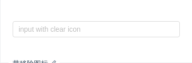
带移除图标
带移除图标的输入框,点击图标删除所有内容。
import { Component } from '@angular/core';@Component({selector: 'nz-demo-input-allow-clear',template: `<nz-input-group [nzSuffix]="suffixTemplate"><input type="text" nz-input [(ngModel)]="inputValue" placeholder="input with clear icon" /></nz-input-group><ng-template #suffixTemplate><inz-iconnz-tooltipclass="ant-input-clear-icon"nzTheme="fill"nzType="close-circle"*ngIf="inputValue"(click)="inputValue = null"></i></ng-template>`})export class NzDemoInputAllowClearComponent {inputValue: string | null;}
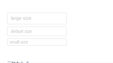
三种大小
我们为 nz-input 输入框定义了三种尺寸(大、默认、小),高度分别为 40px、32px 和 24px。
注意: 在表单里面,我们只使用大尺寸的输入框。
import { Component } from '@angular/core';@Component({selector: 'nz-demo-input-size',template: `<div class="example-input"><input nz-input placeholder="large size" nzSize="large" /><input nz-input placeholder="default size" nzSize="default" /><input nz-input placeholder="small size" nzSize="small" /></div>`,styles: [`.example-input .ant-input {width: 200px;margin: 0 8px 8px 0;}`]})export class NzDemoInputSizeComponent {}
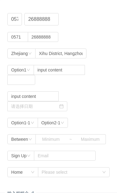
输入框组合
输入框的组合展现。
注意:使用 nzCompact 模式时,不需要通过 nz-col 来控制宽度。
import { Component } from '@angular/core';@Component({selector: 'nz-demo-input-group',template: `<nz-input-group [nzSize]="'large'"><div nz-col nzSpan="4"><input type="text" nz-input [ngModel]="'0571'" /></div><div nz-col nzSpan="8"><input type="text" nz-input [ngModel]="'26888888'" /></div></nz-input-group><br /><nz-input-group nzCompact><input type="text" nz-input [ngModel]="'0571'" style="width: 20%;" /><input type="text" nz-input [ngModel]="'26888888'" style="width:30%;" /></nz-input-group><br /><nz-input-group nzCompact><nz-select [ngModel]="'Zhejiang'"><nz-option [nzLabel]="'Zhejiang'" [nzValue]="'Zhejiang'"></nz-option><nz-option [nzLabel]="'Jiangsu'" [nzValue]="'Jiangsu'"></nz-option></nz-select><input type="text" nz-input [ngModel]="'Xihu District, Hangzhou'" style="width:50%;" /></nz-input-group><br /><nz-input-group nzCompact><nz-select [ngModel]="'Option1'"><nz-option [nzLabel]="'Option1'" [nzValue]="'Option1'"></nz-option><nz-option [nzLabel]="'Option2'" [nzValue]="'Option2'"></nz-option></nz-select><input type="text" nz-input [ngModel]="'input content'" style="width:50%;" /><nz-input-number></nz-input-number></nz-input-group><br /><nz-input-group nzCompact><input type="text" nz-input [ngModel]="'input content'" style="width:50%;" /><nz-date-picker></nz-date-picker></nz-input-group><br /><nz-input-group nzCompact><nz-select [ngModel]="'Option1-1'"><nz-option [nzLabel]="'Option1-1'" [nzValue]="'Option1-1'"></nz-option><nz-option [nzLabel]="'Option1-2'" [nzValue]="'Option1-2'"></nz-option></nz-select><nz-select [ngModel]="'Option2-1'"><nz-option [nzLabel]="'Option2-1'" [nzValue]="'Option2-1'"></nz-option><nz-option [nzLabel]="'Option2-2'" [nzValue]="'Option2-2'"></nz-option></nz-select></nz-input-group><br /><nz-input-group nzCompact><nz-select [ngModel]="'Between'"><nz-option [nzLabel]="'Between'" [nzValue]="'Between'"></nz-option><nz-option [nzLabel]="'Except'" [nzValue]="'Except'"></nz-option></nz-select><input type="text" nz-input placeholder="Minimum" style="width:100px; text-align: center;" /><inputtype="text"disablednz-inputplaceholder="~"style="width: 30px; border-left: 0px; pointer-events: none; background-color: rgb(255, 255, 255);"/><input type="text" nz-input placeholder="Maximum" style="width: 100px; text-align: center; border-left: 0px;" /></nz-input-group><br /><nz-input-group nzCompact><nz-select [ngModel]="'Sign Up'"><nz-option [nzLabel]="'Sign Up'" [nzValue]="'Sign Up'"></nz-option><nz-option [nzLabel]="'Sign In'" [nzValue]="'Sign In'"></nz-option></nz-select><input type="email" nz-input placeholder="Email" style="width: 200px;" /></nz-input-group><br /><nz-input-group nzCompact><nz-select [ngModel]="'Home'" style="width: 30%;"><nz-option [nzLabel]="'Home'" [nzValue]="'Home'"></nz-option><nz-option [nzLabel]="'Company'" [nzValue]="'Company'"></nz-option></nz-select><nz-cascader [nzOptions]="options" style="width: 70%;"></nz-cascader></nz-input-group>`})export class NzDemoInputGroupComponent {options = [{value: 'zhejiang',label: 'Zhejiang',children: [{value: 'hangzhou',label: 'Hangzhou',children: [{value: 'xihu',label: 'West Lake',isLeaf: true}]},{value: 'ningbo',label: 'Ningbo',isLeaf: true}]},{value: 'jiangsu',label: 'Jiangsu',children: [{value: 'nanjing',label: 'Nanjing',children: [{value: 'zhonghuamen',label: 'Zhong Hua Men',isLeaf: true}]}]}];}
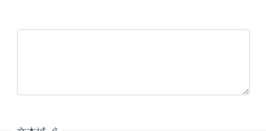
文本域
用于多行输入。
import { Component } from '@angular/core';@Component({selector: 'nz-demo-input-textarea',template: `<textarea rows="4" nz-input [(ngModel)]="inputValue"></textarea>`})export class NzDemoInputTextareaComponent {inputValue: string;}
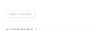
输入时格式化展示
结合 Tooltip 组件,实现一个数值输入框,方便内容超长时的全量展现。
import { Component, ElementRef, ViewChild, ViewEncapsulation } from '@angular/core';@Component({selector: 'nz-demo-input-tooltip',encapsulation: ViewEncapsulation.None,template: `<input#inputElementstyle="width: 120px"nz-inputnz-tooltipnzTrigger="focus"nzPlacement="topLeft"nzOverlayClassName="numeric-input"[nzTitle]="title"placeholder="Input a number"[ngModel]="value"(ngModelChange)="onChange($event)"(blur)="onBlur()"/>`,styles: [`.numeric-input .ant-tooltip-inner {min-width: 32px;min-height: 37px;}.numeric-input .numeric-input-title {font-size: 14px;}`]})export class NzDemoInputTooltipComponent {value = '';title = 'Input a number';@ViewChild('inputElement', { static: false }) inputElement: ElementRef;onChange(value: string): void {this.updateValue(value);}// '.' at the end or only '-' in the input box.onBlur(): void {if (this.value.charAt(this.value.length - 1) === '.' || this.value === '-') {this.updateValue(this.value.slice(0, -1));}}updateValue(value: string): void {const reg = /^-?(0|[1-9][0-9]*)(\.[0-9]*)?$/;if ((!isNaN(+value) && reg.test(value)) || value === '' || value === '-') {this.value = value;}this.inputElement.nativeElement.value = this.value;this.updateTitle();}updateTitle(): void {this.title = (this.value !== '-' ? this.formatNumber(this.value) : '-') || 'Input a number';}formatNumber(value: string): string {const string = `${value}`;const list = string.split('.');const prefix = list[0].charAt(0) === '-' ? '-' : '';let num = prefix ? list[0].slice(1) : list[0];let result = '';while (num.length > 3) {result = `,${num.slice(-3)}${result}`;num = num.slice(0, num.length - 3);}if (num) {result = num + result;}return `${prefix}${result}${list[1] ? `.${list[1]}` : ''}`;}}

密码框
密码框。
import { Component } from '@angular/core';@Component({selector: 'nz-demo-input-password-input',template: `<nz-input-group [nzSuffix]="suffixTemplate"><input[type]="passwordVisible ? 'text' : 'password'"nz-inputplaceholder="input password"[(ngModel)]="password"/></nz-input-group><ng-template #suffixTemplate><i nz-icon [nzType]="passwordVisible ? 'eye-invisible' : 'eye'" (click)="passwordVisible = !passwordVisible"></i></ng-template>`,styles: [`i {cursor: pointer;}`]})export class NzDemoInputPasswordInputComponent {passwordVisible = false;password: string;}
API
[nz-input]directive
nz-input 可以使用所有的W3C标准下的所有 使用方式 和 Angular对 input 的全部额外功能支持。
| 参数 | 说明 | 类型 | 默认值 |
|---|---|---|---|
[nzSize] | 控件大小。注:标准表单内的输入框大小限制为 large | 'large' | 'small' | 'default' | 'default' |
[nzAutosize] | 只可以用于 textarea,自适应内容高度,可设置为 boolean 或对象:{ minRows: 2, maxRows: 6 } | boolean | { minRows: number, maxRows: number } | false |
nz-input-groupcomponent
| 参数 | 说明 | 类型 | 默认值 |
|---|---|---|---|
[nzAddOnAfter] | 带标签的 input,设置后置标签,可以与 nzAddOnBefore 配合使用 | string | TemplateRef<void> | - |
[nzAddOnBefore] | 带标签的 input,设置前置标签,可以与 nzAddOnBefore 配合使用 | string | TemplateRef<void> | - |
[nzPrefix] | 带有前缀图标的 input,可以与 nzSuffix 配合使用 | string | TemplateRef<void> | - |
[nzSuffix] | 带有后缀图标的 input,可以与 nzPrefix 配合使用 | string | TemplateRef<void> | - |
[nzCompact] | 是否用紧凑模式 | boolean | false |
[nzSearch] | 是否用搜索框 | boolean | false |
[nzSize] | nz-input-group 中所有的 nz-input 的大小 | 'large' | 'small' | 'default' | 'default' |
