 我的书签
我的书签
 添加书签
添加书签 移除书签
移除书签- Notification通知提醒框
- 何时使用
- 单独引入此组件
- 如何使用
- 代码演示
- API
- NzNotificationServiceservice
- 全局配置(NZ_MESSAGE_CONFIG)
- NzNotificationDataFilled
Notification通知提醒框
全局展示通知提醒信息。
何时使用
在系统四个角显示通知提醒信息。经常用于以下情况:
- 较为复杂的通知内容。
- 带有交互的通知,给出用户下一步的行动点。
- 系统主动推送。
单独引入此组件
想要了解更多关于单独引入组件的内容,可以在快速上手页面进行查看。
import { NzNotificationModule } from 'ng-zorro-antd/notification';
如何使用
与NzMessage类似,如果要修改全局默认配置,你可以设置提供商 NZ_NOTIFICATION_CONFIG 的值来修改。(如:在你的模块的providers中加入 { provide: NZ_NOTIFICATION_CONFIG, useValue: { nzDuration: 3000 }},NZ_NOTIFICATION_CONFIG 可以从 ng-zorro-antd 中导入)
默认全局配置为:
{nzTop : '24px',nzBottom : '24px',nzPlacement : 'topRight',nzDuration : 4500,nzMaxStack : 7,nzPauseOnHover: true,nzAnimate : true}
代码演示
基本
最简单的用法,4.5 秒后自动关闭。
import { Component } from '@angular/core';import { NzNotificationService } from 'ng-zorro-antd/notification';@Component({selector: 'nz-demo-notification-basic',template: `<button nz-button [nzType]="'primary'" (click)="createBasicNotification()">Open the notification box</button>`})export class NzDemoNotificationBasicComponent {constructor(private notification: NzNotificationService) {}createBasicNotification(): void {this.notification.blank('Notification Title','This is the content of the notification. This is the content of the notification. This is the content of the notification.');}}
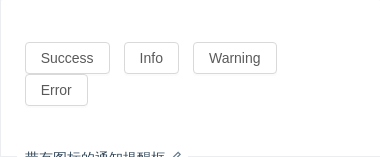
带有图标的通知提醒框
通知提醒框左侧有图标。
import { Component } from '@angular/core';import { NzNotificationService } from 'ng-zorro-antd/notification';@Component({selector: 'nz-demo-notification-with-icon',template: `<button nz-button (click)="createNotification('success')">Success</button><button nz-button (click)="createNotification('info')">Info</button><button nz-button (click)="createNotification('warning')">Warning</button><button nz-button (click)="createNotification('error')">Error</button>`,styles: [`button {margin-right: 1em;}`]})export class NzDemoNotificationWithIconComponent {createNotification(type: string): void {this.notification.create(type,'Notification Title','This is the content of the notification. This is the content of the notification. This is the content of the notification.');}constructor(private notification: NzNotificationService) {}}

自定义图标
图标可以被自定义。
import { Component, TemplateRef } from '@angular/core';import { NzNotificationService } from 'ng-zorro-antd/notification';@Component({selector: 'nz-demo-notification-custom-icon',template: `<ng-template #template><div class="ant-notification-notice-content"><div class="ant-notification-notice-with-icon"><span class="ant-notification-notice-icon"><i nz-icon nzType="smile" style="color: rgb(16, 142, 233);"></i></span><div class="ant-notification-notice-message">Notification Title</div><div class="ant-notification-notice-description">This is the content of the notification. This is the content of the notification. This is the content of thenotification.</div></div></div></ng-template><button nz-button [nzType]="'primary'" (click)="createBasicNotification(template)">Open the notification box</button>`})export class NzDemoNotificationCustomIconComponent {constructor(private notification: NzNotificationService) {}createBasicNotification(template: TemplateRef<{}>): void {this.notification.template(template);}}

自定义样式
使用 nzStyle 和 nzClass 来定义样式。
import { Component } from '@angular/core';import { NzNotificationService } from 'ng-zorro-antd/notification';@Component({selector: 'nz-demo-notification-custom-style',template: `<button nz-button [nzType]="'primary'" (click)="createBasicNotification()">Open the notification box</button>`})export class NzDemoNotificationCustomStyleComponent {constructor(private notification: NzNotificationService) {}createBasicNotification(): void {this.notification.blank('Notification Title','This is the content of the notification. This is the content of the notification. This is the content of the notification.',{nzStyle: {width: '600px',marginLeft: '-265px'},nzClass: 'test-class'});}}
使用模板
通过模板来实现更加复杂的效果和交互。
import { Component, TemplateRef, ViewChild } from '@angular/core';import { NzNotificationService } from 'ng-zorro-antd/notification';@Component({selector: 'nz-demo-notification-template',template: `<button nz-button [nzType]="'primary'" (click)="ninja()">Open the notification box</button><ng-template let-fruit="data">It's a <nz-tag [nzColor]="fruit.color">{{ fruit.name }}</nz-tag><button nz-button nzType="small">Cut It!</button></ng-template>`,styles: [`button {margin-top: 8px;}`]})export class NzDemoNotificationTemplateComponent {@ViewChild(TemplateRef, { static: false }) template: TemplateRef<{}>;ninja(): void {const fruits = [{ name: 'Apple', color: 'red' },{ name: 'Orange', color: 'orange' },{ name: 'Watermelon', color: 'green' }];fruits.forEach(fruit => {this.notificationService.template(this.template, { nzData: fruit });});}constructor(private notificationService: NzNotificationService) {}}
自动关闭的延时
自定义通知框自动关闭的延时,默认4.5s,取消自动关闭只要将该值设为 0 即可。
import { Component } from '@angular/core';import { NzNotificationService } from 'ng-zorro-antd/notification';@Component({selector: 'nz-demo-notification-duration',template: `<button nz-button [nzType]="'primary'" (click)="createBasicNotification()">Open the notification box</button>`})export class NzDemoNotificationDurationComponent {createBasicNotification(): void {this.notification.blank('Notification Title','I will never close automatically. I will be close automatically. I will never close automatically.',{ nzDuration: 0 });}constructor(private notification: NzNotificationService) {}}

自定义按钮
自定义关闭按钮的样式和文字。
import { Component, TemplateRef } from '@angular/core';import { NzNotificationService } from 'ng-zorro-antd/notification';@Component({selector: 'nz-demo-notification-with-btn',template: `<ng-template #template let-notification><div class="ant-notification-notice-content"><div><div class="ant-notification-notice-message">Notification Title</div><div class="ant-notification-notice-description">A function will be be called after the notification is closed (automatically after the "duration" time ofmanually).</div><span class="ant-notification-notice-btn"><button nz-button nzType="primary" nzSize="small" (click)="notification.close()"><span>Confirm</span></button></span></div></div></ng-template><button nz-button [nzType]="'primary'" (click)="createBasicNotification(template)">Open the notification box</button>`})export class NzDemoNotificationWithBtnComponent {constructor(private notification: NzNotificationService) {}createBasicNotification(template: TemplateRef<{}>): void {this.notification.template(template);}}
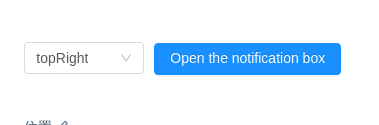
位置
可以设置通知从右上角、右下角、左下角、左上角弹出。
import { Component } from '@angular/core';import { NzNotificationService } from 'ng-zorro-antd/notification';@Component({selector: 'nz-demo-notification-placement',template: `<nz-select[(ngModel)]="placement"style="width: 120px; margin-right: 10px;"(ngModelChange)="clearBeforeNotifications()"><nz-option nzValue="topLeft" nzLabel="topLeft"></nz-option><nz-option nzValue="topRight" nzLabel="topRight"></nz-option><nz-option nzValue="bottomLeft" nzLabel="bottomLeft"></nz-option><nz-option nzValue="bottomRight" nzLabel="bottomRight"></nz-option></nz-select><button nz-button [nzType]="'primary'" (click)="createBasicNotification()">Open the notification box</button>`})export class NzDemoNotificationPlacementComponent {placement = 'topRight';clearBeforeNotifications(): void {this.notification.remove();}createBasicNotification(): void {this.notification.config({nzPlacement: this.placement});this.notification.blank('Notification Title','This is the content of the notification. This is the content of the notification. This is the content of the notification.');}constructor(private notification: NzNotificationService) {}}

更新消息内容
可以通过唯一的 nzKey 来更新内容。
import { Component } from '@angular/core';import { NzNotificationService } from 'ng-zorro-antd/notification';@Component({selector: 'nz-demo-notification-update',template: `<button nz-button [nzType]="'primary'" (click)="createAutoUpdatingNotifications()">Open the notification box</button>`})export class NzDemoNotificationUpdateComponent {constructor(private notification: NzNotificationService) {}createAutoUpdatingNotifications(): void {this.notification.blank('Notification Title', 'Description.', {nzKey: 'key'});setTimeout(() => {this.notification.blank('New Title', 'New description', {nzKey: 'key'});}, 1000);}}
API
NzNotificationServiceservice
组件提供了一些服务方法,使用方式和参数如下:
NzNotificationService.blank(title, content, [options])// 不带图标的提示NzNotificationService.success(title, content, [options])NzNotificationService.error(title, content, [options])NzNotificationService.info(title, content, [options])NzNotificationService.warning(title, content, [options])参数 说明 类型 默认值 title 标题 string- content 提示内容 string- options 支持设置针对当前提示框的参数,见下方表格 object-
options 支持设置的参数如下:
| 参数 | 说明 | 类型 |
|---|---|---|
| nzKey | 通知提示的唯一标识符 | string |
| nzDuration | 持续时间(毫秒),当设置为 0 时不消失 | number |
| nzPauseOnHover | 鼠标移上时禁止自动移除 | boolean |
| nzAnimate | 开关动画效果 | boolean |
| nzStyle | 自定义内联样式 | object |
| nzClass | 自定义 CSS class | object |
| nzData | 任何想要在模板中作为上下文的数据 | any |
还提供了全局销毁方法:
NzNotificationService.remove(id)// 移除特定id的消息,当id为空时,移除所有消息(该消息id通过上述方法返回值中得到)
全局配置(NZ_MESSAGE_CONFIG)
| 参数 | 说明 | 类型 | 默认值 |
|---|---|---|---|
| nzDuration | 持续时间(毫秒),当设置为0时不消失 | number | 4500 |
| nzMaxStack | 同一时间可展示的最大提示数量 | number | 8 |
| nzPauseOnHover | 鼠标移上时禁止自动移除 | boolean | true |
| nzAnimate | 开关动画效果 | boolean | true |
| nzTop | 消息从顶部弹出时,距离顶部的位置。 | string | 24px |
| nzBottom | 消息从底部弹出时,距离底部的位置。 | string | 24px |
| nzPlacement | 弹出位置,可选 topLefttopRightbottomLeftbottomRight | string | topRight |
NzNotificationDataFilled
当你调用 NzNotificationService.success 或其他方法时会返回该对象。
export interface NzNotificationDataFilled {onClose: Subject<boolean>; // 当 notification 关闭时它会派发一个事件,如果为用户手动关闭会派发 `true`}
