 我的书签
我的书签
 添加书签
添加书签 移除书签
移除书签- Button按钮
- 何时使用
- 单独引入此组件
- 代码演示
- API
- [nz-button]directive
- [nz-button]directive
Button按钮
按钮用于开始一个即时操作。
何时使用
标记了一个(或封装一组)操作命令,响应用户点击行为,触发相应的业务逻辑。
单独引入此组件
想要了解更多关于单独引入组件的内容,可以在快速上手页面进行查看。
import { NzButtonModule } from 'ng-zorro-antd/button';
代码演示
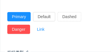
按钮类型
按钮有四种类型:主按钮、次按钮、虚线按钮、危险按钮。主按钮在同一个操作区域最多出现一次。
import { Component } from '@angular/core';@Component({selector: 'nz-demo-button-basic',template: `<button nz-button nzType="primary">Primary</button><button nz-button nzType="default">Default</button><button nz-button nzType="dashed">Dashed</button><button nz-button nzType="danger">Danger</button><button nz-button nzType="link">Link</button>`,styles: [`[nz-button] {margin-right: 8px;margin-bottom: 12px;}`]})export class NzDemoButtonBasicComponent {}
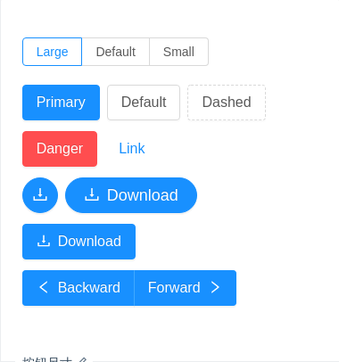
按钮尺寸
按钮有大、中、小三种尺寸。
通过设置 nzSize 为 largesmall 分别把按钮设为大、小尺寸。若不设置 nzSize,则尺寸为中。
import { Component } from '@angular/core';@Component({selector: 'nz-demo-button-size',template: `<nz-radio-group [(ngModel)]="size"><label nz-radio-button nzValue="large">Large</label><label nz-radio-button nzValue="default">Default</label><label nz-radio-button nzValue="small">Small</label></nz-radio-group><br /><br /><button nz-button [nzSize]="size" nzType="primary">Primary</button><button nz-button [nzSize]="size" nzType="default">Default</button><button nz-button [nzSize]="size" nzType="dashed">Dashed</button><button nz-button [nzSize]="size" nzType="danger">Danger</button><button nz-button [nzSize]="size" nzType="link">Link</button><br /><button nz-button nzType="primary" [nzSize]="size" nzShape="circle"><i nz-icon nzType="download"></i></button><button nz-button nzType="primary" [nzSize]="size" nzShape="round"><i nz-icon nzType="download"></i>Download</button><button nz-button nzType="primary" [nzSize]="size"><i nz-icon nzType="download"></i>Download</button><br /><nz-button-group [nzSize]="size"><button nz-button nzType="primary"><i nz-icon nzType="left"></i>Backward</button><button nz-button nzType="primary">Forward<i nz-icon nzType="right"></i></button></nz-button-group>`,styles: [`[nz-button] {margin-right: 8px;margin-bottom: 12px;}nz-button-group [nz-button] {margin-right: 0;}`]})export class NzDemoButtonSizeComponent {size = 'large';}

加载中状态
添加 nzLoading 属性即可让按钮处于加载状态,最后两个按钮演示点击后进入加载状态。
import { Component } from '@angular/core';@Component({selector: 'nz-demo-button-loading',template: `<button nz-button nzType="primary" nzLoading><i nz-icon nzType="poweroff"></i>Loading</button><button nz-button nzType="primary" nzSize="small" nzLoading>Loading</button><br /><button nz-button nzType="primary" (click)="loadOne()" [nzLoading]="isLoadingOne">Click me!</button><button nz-button nzType="primary" (click)="loadTwo()" [nzLoading]="isLoadingTwo"><i nz-icon nzType="poweroff"></i>Click me!</button><br /><button nz-button nzLoading nzShape="circle"></button><button nz-button nzLoading nzType="primary" nzShape="circle"></button>`,styles: [`[nz-button] {margin-right: 8px;margin-bottom: 12px;}`]})export class NzDemoButtonLoadingComponent {isLoadingOne = false;isLoadingTwo = false;loadOne(): void {this.isLoadingOne = true;setTimeout(() => {this.isLoadingOne = false;}, 5000);}loadTwo(): void {this.isLoadingTwo = true;setTimeout(() => {this.isLoadingTwo = false;}, 5000);}}
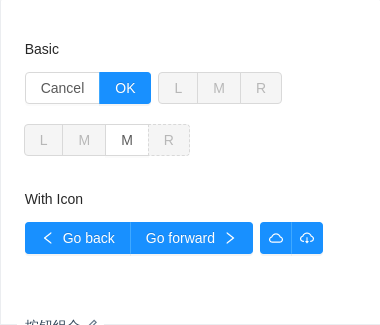
按钮组合
可以将多个 nz-button 放入 nz-button-group 的容器中。
通过设置 nzSize 为 largesmall 分别把按钮组合设为大、小尺寸。若不设置 nzSize,则尺寸为中。
import { Component } from '@angular/core';@Component({selector: 'nz-demo-button-button-group',template: `<h4>Basic</h4><nz-button-group><button nz-button>Cancel</button><button nz-button nzType="primary">OK</button></nz-button-group><nz-button-group><button nz-button nzType="default" disabled>L</button><button nz-button nzType="default" disabled>M</button><button nz-button nzType="default" disabled>R</button></nz-button-group><nz-button-group><button nz-button nzType="primary" disabled>L</button><button nz-button nzType="default" disabled>M</button><button nz-button nzType="default">M</button><button nz-button nzType="dashed" disabled>R</button></nz-button-group><h4>With Icon</h4><nz-button-group><button nz-button nzType="primary"><i nz-icon nzType="left"></i> Go back</button><button nz-button nzType="primary">Go forward<i nz-icon nzType="right"></i></button></nz-button-group><nz-button-group><button nz-button nzType="primary"><i nz-icon nzType="cloud"></i></button><button nz-button nzType="primary"><i nz-icon nzType="cloud-download"></i></button></nz-button-group>`,styles: [`h4 {margin: 16px 0;font-size: 14px;line-height: 1;font-weight: normal;}h4:first-child {margin-top: 0;}[nz-button] {margin-bottom: 12px;}nz-button-group {margin-bottom: 8px;margin-right: 8px;}`]})export class NzDemoButtonButtonGroupComponent {}
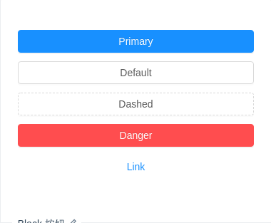
Block 按钮
nzBlock 属性将使按钮适合其父宽度。
import { Component } from '@angular/core';@Component({selector: 'nz-demo-button-block',template: `<button nz-button nzType="primary" nzBlock>Primary</button><button nz-button nzType="default" nzBlock>Default</button><button nz-button nzType="dashed" nzBlock>Dashed</button><button nz-button nzType="danger" nzBlock>Danger</button><button nz-button nzType="link" nzBlock>Link</button>`,styles: [`[nz-button] {margin-bottom: 12px;}`]})export class NzDemoButtonBlockComponent {}
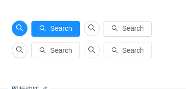
图标按钮
当需要在 nz-button 内嵌入图标时,可以直接在 nz-button 内嵌入对应的 icon。
import { Component } from '@angular/core';@Component({selector: 'nz-demo-button-icon',template: `<button nz-button nzType="primary" nzShape="circle"><i nz-icon nzType="search"></i></button><button nz-button nzType="primary"><i nz-icon nzType="search"></i>Search</button><button nz-button nzType="default" nzShape="circle"><i nz-icon nzType="search"></i></button><button nz-button nzType="default"><i nz-icon nzType="search"></i>Search</button><br /><button nz-button nzType="default" nzShape="circle"><i nz-icon nzType="search"></i></button><button nz-button nzType="default"><i nz-icon nzType="search"></i>Search</button><button nz-button nzType="dashed" nzShape="circle"><i nz-icon nzType="search"></i></button><button nz-button nzType="dashed"><i nz-icon nzType="search"></i>Search</button>`,styles: [`[nz-button] {margin-right: 8px;margin-bottom: 12px;}`]})export class NzDemoButtonIconComponent {}
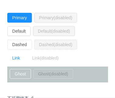
不可用状态
添加 disabled 属性即可让按钮处于不可用状态,同时按钮样式也会改变。
import { Component } from '@angular/core';@Component({selector: 'nz-demo-button-disabled',template: `<button nz-button nzType="primary">Primary</button><button nz-button nzType="primary" disabled>Primary(disabled)</button><br /><button nz-button nzType="default">Default</button><button nz-button nzType="default" disabled>Default(disabled)</button><br /><button nz-button nzType="dashed">Dashed</button><button nz-button nzType="dashed" disabled>Dashed(disabled)</button><br /><button nz-button nzType="link">Link</button><button nz-button nzType="link" disabled>Link(disabled)</button><div style="padding: 8px 8px 0px; background: rgb(190, 200, 200);"><button nz-button nzGhost>Ghost</button><button nz-button nzGhost disabled>Ghost(disabled)</button></div>`,styles: [`[nz-button] {margin-right: 8px;margin-bottom: 12px;}`]})export class NzDemoButtonDisabledComponent {}
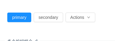
多个按钮组合
按钮组合使用时,推荐使用1个主操作 + n 个次操作,3个以上操作时把更多操作放到 nz-dropdown 中组合使用。
import { Component } from '@angular/core';@Component({selector: 'nz-demo-button-multiple',template: `<button nz-button nzType="primary">primary</button><button nz-button nzType="default">secondary</button><button nz-button nz-dropdown [nzDropdownMenu]="menu">Actions<i nz-icon nzType="down"></i></button><nz-dropdown-menu #menu="nzDropdownMenu"><ul nz-menu><li nz-menu-item><a>1st item</a></li><li nz-menu-item><a>2nd item</a></li><li nz-menu-item><a>3rd item</a></li></ul></nz-dropdown-menu>`,styles: [`[nz-button] {margin-right: 8px;margin-bottom: 12px;}`]})export class NzDemoButtonMultipleComponent {}

幽灵按钮
添加 nzGhost 属性后,幽灵按钮将其他按钮的内容反色,背景变为透明,常用在有色背景上。
import { Component } from '@angular/core';@Component({selector: 'nz-demo-button-ghost',template: `<div style="background: rgb(190, 200, 200);padding: 26px 16px 16px;"><button nz-button nzType="primary" nzGhost>Primary</button><button nz-button nzType="default" nzGhost>Default</button><button nz-button nzType="dashed" nzGhost>Dashed</button><button nz-button nzType="danger" nzGhost>Danger</button><button nz-button nzType="link" nzGhost>Link</button></div>`,styles: [`[nz-button] {margin-right: 8px;margin-bottom: 12px;}`]})export class NzDemoButtonGhostComponent {}
API
[nz-button]directive
通过设置 Button 的属性来产生不同的按钮样式,推荐顺序为:nzType -> nzShape -> nzSize -> nzLoading -> disabled
按钮的属性说明如下:
| 属性 | 说明 | 类型 | 默认值 |
|---|---|---|---|
[nzGhost] | 幽灵属性,使按钮背景透明 | boolean | false |
[nzLoading] | 设置按钮载入状态 | boolean | false |
[nzShape] | 设置按钮形状,可选值为 circleround 或者不设 | 'circle' | 'round' | - |
[nzSize] | 设置按钮大小,可选值为 smalllarge 或者不设 | 'large' | 'small' | 'default' | 'default' |
[nzType] | 设置按钮类型,可选值为 primarydasheddanger 或者不设 | 'primary' | 'dashed' | 'danger' | 'default' | 'link' | 'default' |
[nzBlock] | 将按钮宽度调整为其父宽度的选项 | boolean | false |
