 我的书签
我的书签
 添加书签
添加书签 移除书签
移除书签- Switch开关
- 何时使用
- 单独引入此组件
- 代码演示
- API
- nz-switchcomponent
- 方法
- 方法
- nz-switchcomponent
Switch开关
开关选择器。
何时使用
- 需要表示开关状态/两种状态之间的切换时;
- 和
checkbox的区别是,切换switch会直接触发状态改变,而checkbox一般用于状态标记,需要和提交操作配合。
单独引入此组件
想要了解更多关于单独引入组件的内容,可以在快速上手页面进行查看。
import { NzSwitchModule } from 'ng-zorro-antd/switch';
代码演示
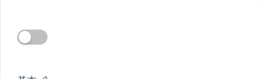
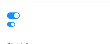
基本
最简单的用法。
import { Component } from '@angular/core';@Component({selector: 'nz-demo-switch-basic',template: `<nz-switch [(ngModel)]="switchValue"></nz-switch>`})export class NzDemoSwitchBasicComponent {switchValue = false;}
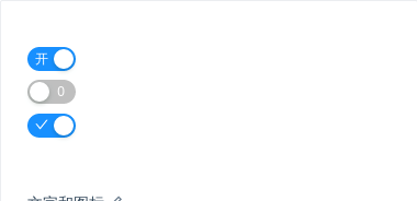
文字和图标
带有文字和图标。
import { Component } from '@angular/core';@Component({selector: 'nz-demo-switch-text',template: `<nz-switch [ngModel]="true" nzCheckedChildren="开" nzUnCheckedChildren="关"></nz-switch><br /><nz-switch [ngModel]="false" nzCheckedChildren="1" nzUnCheckedChildren="0"></nz-switch><br /><nz-switch[ngModel]="true"[nzCheckedChildren]="checkedTemplate"[nzUnCheckedChildren]="unCheckedTemplate"></nz-switch><ng-template #checkedTemplate><i nz-icon nzType="check"></i></ng-template><ng-template #unCheckedTemplate><i nz-icon nzType="close"></i></ng-template>`,styles: [`nz-switch {margin-bottom: 8px;}`]})export class NzDemoSwitchTextComponent {}
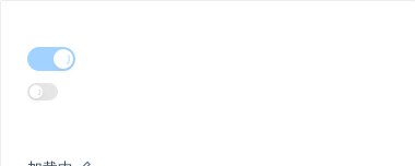
加载中
标识开关操作仍在执行中。
import { Component } from '@angular/core';@Component({selector: 'nz-demo-switch-loading',template: `<nz-switch [ngModel]="true" nzLoading></nz-switch><br /><nz-switch nzSize="small" [ngModel]="false" nzLoading></nz-switch>`,styles: [`nz-switch {margin-bottom: 8px;}`]})export class NzDemoSwitchLoadingComponent {}
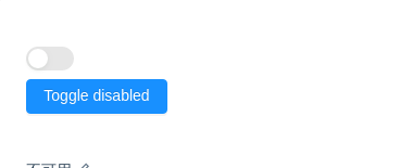
不可用
Switch 失效状态。
import { Component } from '@angular/core';@Component({selector: 'nz-demo-switch-disabled',template: `<nz-switch [(ngModel)]="switchValue" [nzDisabled]="isDisabled"></nz-switch><br /><button nz-button [nzType]="'primary'" (click)="isDisabled = !isDisabled">Toggle disabled</button>`,styles: [`nz-switch {margin-bottom: 8px;}`]})export class NzDemoSwitchDisabledComponent {switchValue = false;isDisabled = true;}
两种大小
nzSize="small" 表示小号开关。
import { Component } from '@angular/core';@Component({selector: 'nz-demo-switch-size',template: `<nz-switch [ngModel]="true"></nz-switch><br /><nz-switch nzSize="small" [ngModel]="true"></nz-switch>`,styles: [`nz-switch {margin-bottom: 8px;}`]})export class NzDemoSwitchSizeComponent {}

完整控制
Switch 的状态完全由用户接管,不再自动根据点击事件改变数据。
import { Component } from '@angular/core';@Component({selector: 'nz-demo-switch-control',template: `<nz-switch [(ngModel)]="switchValue" [nzControl]="true" (click)="clickSwitch()" [nzLoading]="loading"></nz-switch>`})export class NzDemoSwitchControlComponent {switchValue = false;loading = false;clickSwitch(): void {if (!this.loading) {this.loading = true;setTimeout(() => {this.switchValue = !this.switchValue;this.loading = false;}, 3000);}}}
API
nz-switchcomponent
| 参数 | 说明 | 类型 | 默认值 |
|---|---|---|---|
[ngModel] | 指定当前是否选中,可双向绑定 | boolean | false |
[nzCheckedChildren] | 选中时的内容 | string | TemplateRef<void> | - |
[nzUnCheckedChildren] | 非选中时的内容 | string | TemplateRef<void> | - |
[nzDisabled] | disable 状态 | boolean | false |
[nzSize] | 开关大小,可选值:defaultsmall | 'small' | 'default' | 'default' |
[nzLoading] | 加载中的开关 | boolean | false |
[nzControl] | 是否完全由用户控制状态 | boolean | false |
(ngModelChange) | 当前是否选中的回调 | EventEmitter<boolean> | false |
方法
| 名称 | 描述 |
|---|---|
| focus() | 获取焦点 |
| blur() | 移除焦点 |
