 我的书签
我的书签
 添加书签
添加书签 移除书签
移除书签- Select选择器
- 何时使用
- 单独引入此组件
- 代码演示
- API
- nz-selectcomponent
- nz-optioncomponent
- nz-option-groupcomponent
- 方法
- nz-selectcomponent
- nz-selectcomponent
Select选择器
下拉选择器。
何时使用
- 弹出一个下拉菜单给用户选择操作,用于代替原生的选择器,或者需要一个更优雅的多选器时。
- 当选项少时(少于 5 项),建议直接将选项平铺,使用 Radio 是更好的选择。
单独引入此组件
想要了解更多关于单独引入组件的内容,可以在快速上手页面进行查看。
import { NzSelectModule } from 'ng-zorro-antd/select';
代码演示
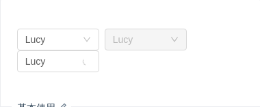
基本使用
基本使用。
import { Component } from '@angular/core';@Component({selector: 'nz-demo-select-basic',template: `<div><nz-select style="width: 120px;" [(ngModel)]="selectedValue" nzAllowClear nzPlaceHolder="Choose"><nz-option nzValue="jack" nzLabel="Jack"></nz-option><nz-option nzValue="lucy" nzLabel="Lucy"></nz-option><nz-option nzValue="disabled" nzLabel="Disabled" nzDisabled></nz-option></nz-select><nz-select style="width: 120px;" [ngModel]="'lucy'" nzDisabled><nz-option nzValue="lucy" nzLabel="Lucy"></nz-option></nz-select><nz-select style="width: 120px;" [ngModel]="'lucy'" nzLoading><nz-option nzValue="lucy" nzLabel="Lucy"></nz-option></nz-select></div>`,styles: [`nz-select {margin-right: 8px;}`]})export class NzDemoSelectBasicComponent {selectedValue = 'lucy';}
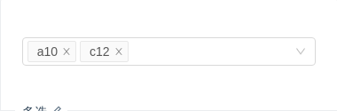
多选
多选,从已有条目中选择,例子中通过 nzMaxTagCount 限制最多显示3个选项。
import { Component, OnInit } from '@angular/core';@Component({selector: 'nz-demo-select-multiple',template: `<nz-select[nzMaxTagCount]="3"[nzMaxTagPlaceholder]="tagPlaceHolder"style="width: 100%"nzMode="multiple"nzPlaceHolder="Please select"[(ngModel)]="listOfSelectedValue"><nz-option *ngFor="let option of listOfOption" [nzLabel]="option.label" [nzValue]="option.value"></nz-option></nz-select><ng-template #tagPlaceHolder let-selectedList> and {{ selectedList.length }} more selected </ng-template>`})export class NzDemoSelectMultipleComponent implements OnInit {listOfOption: Array<{ label: string; value: string }> = [];listOfSelectedValue = ['a10', 'c12'];ngOnInit(): void {const children: Array<{ label: string; value: string }> = [];for (let i = 10; i < 36; i++) {children.push({ label: i.toString(36) + i, value: i.toString(36) + i });}this.listOfOption = children;}}
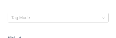
标签
tags select,随意输入的内容(scroll the menu)
import { Component, OnInit } from '@angular/core';@Component({selector: 'nz-demo-select-tags',template: `<nz-select nzMode="tags" style="width: 100%;" nzPlaceHolder="Tag Mode" [(ngModel)]="listOfTagOptions"><nz-option *ngFor="let option of listOfOption" [nzLabel]="option.label" [nzValue]="option.value"> </nz-option></nz-select>`})export class NzDemoSelectTagsComponent implements OnInit {listOfOption: Array<{ label: string; value: string }> = [];listOfTagOptions = [];ngOnInit(): void {const children: Array<{ label: string; value: string }> = [];for (let i = 10; i < 36; i++) {children.push({ label: i.toString(36) + i, value: i.toString(36) + i });}this.listOfOption = children;}}
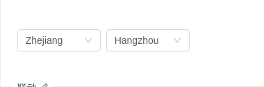
联动
省市联动是典型的例子。
推荐使用 Cascader 组件。
import { Component } from '@angular/core';@Component({selector: 'nz-demo-select-coordinate',template: `<div><nz-select style="width: 120px;" [(ngModel)]="selectedProvince" (ngModelChange)="provinceChange($event)"><nz-option *ngFor="let p of provinceData" [nzValue]="p" [nzLabel]="p"></nz-option></nz-select><nz-select style="width: 120px;" [(ngModel)]="selectedCity"><nz-option *ngFor="let c of cityData[selectedProvince]" [nzValue]="c" [nzLabel]="c"></nz-option></nz-select></div>`,styles: [`nz-select {margin-right: 8px;}`]})export class NzDemoSelectCoordinateComponent {selectedProvince = 'Zhejiang';selectedCity = 'Hangzhou';provinceData = ['Zhejiang', 'Jiangsu'];cityData: { [place: string]: string[] } = {Zhejiang: ['Hangzhou', 'Ningbo', 'Wenzhou'],Jiangsu: ['Nanjing', 'Suzhou', 'Zhenjiang']};provinceChange(value: string): void {this.selectedCity = this.cityData[value][0];}}
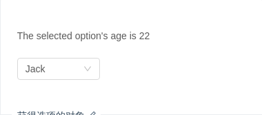
获得选项的对象
ngModel 取到的值为选中 nz-option 的 nzValue 值,当 nzValue 传入为一个对象时,ngModel 获取的值也是一个对象,compareWith 的用法参见 这里.
import { Component } from '@angular/core';@Component({selector: 'nz-demo-select-label-in-value',template: `<p>The selected option's age is {{ selectedValue?.age }}</p><br /><nz-selectstyle="width: 120px;"[compareWith]="compareFn"[(ngModel)]="selectedValue"(ngModelChange)="log($event)"nzAllowClearnzPlaceHolder="Choose"><nz-option *ngFor="let option of optionList" [nzValue]="option" [nzLabel]="option.label"></nz-option></nz-select>`})export class NzDemoSelectLabelInValueComponent {optionList = [{ label: 'Lucy', value: 'lucy', age: 20 }, { label: 'Jack', value: 'jack', age: 22 }];selectedValue = { label: 'Jack', value: 'jack', age: 22 };// tslint:disable-next-line:no-anycompareFn = (o1: any, o2: any) => (o1 && o2 ? o1.value === o2.value : o1 === o2);log(value: { label: string; value: string; age: number }): void {console.log(value);}}

搜索用户
一个带有远程搜索,节流控制,请求时序控制,加载状态的多选示例。
import { HttpClient } from '@angular/common/http';import { Component, OnInit } from '@angular/core';import { BehaviorSubject, Observable } from 'rxjs';import { debounceTime, map, switchMap } from 'rxjs/operators';@Component({selector: 'nz-demo-select-select-users',template: `<nz-selectstyle="width: 100%;"nzMode="multiple"[(ngModel)]="selectedUser"nzPlaceHolder="Select users"nzAllowClearnzShowSearch[nzServerSearch]="true"(nzOnSearch)="onSearch($event)"><ng-container *ngFor="let o of optionList"><nz-option *ngIf="!isLoading" [nzValue]="o" [nzLabel]="o"></nz-option></ng-container><nz-option *ngIf="isLoading" nzDisabled nzCustomContent><i nz-icon nzType="loading" class="loading-icon"></i> Loading Data...</nz-option></nz-select>`,styles: [`.loading-icon {margin-right: 8px;}`]})export class NzDemoSelectSelectUsersComponent implements OnInit {randomUserUrl = 'https://api.randomuser.me/?results=5';searchChange$ = new BehaviorSubject('');optionList: string[] = [];selectedUser: string;isLoading = false;onSearch(value: string): void {this.isLoading = true;this.searchChange$.next(value);}constructor(private http: HttpClient) {}ngOnInit(): void {// tslint:disable-next-line:no-anyconst getRandomNameList = (name: string) =>this.http.get(`${this.randomUserUrl}`).pipe(map((res: any) => res.results)).pipe(map((list: any) => {return list.map((item: any) => `${item.name.first} ${name}`);}));const optionList$: Observable<string[]> = this.searchChange$.asObservable().pipe(debounceTime(500)).pipe(switchMap(getRandomNameList));optionList$.subscribe(data => {this.optionList = data;this.isLoading = false;});}}

隐藏已选择选项
隐藏下拉列表中已选择的选项。
import { Component } from '@angular/core';@Component({selector: 'nz-demo-select-hide-selected',template: `<nz-selectstyle="width: 100%"nzMode="multiple"nzPlaceHolder="Inserted are removed"[(ngModel)]="listOfSelectedValue"><ng-container *ngFor="let option of listOfOption"><nz-option [nzLabel]="option" [nzValue]="option" *ngIf="isNotSelected(option)"></nz-option></ng-container></nz-select>`})export class NzDemoSelectHideSelectedComponent {listOfOption = ['Apples', 'Nails', 'Bananas', 'Helicopters'];listOfSelectedValue: string[] = [];isNotSelected(value: string): boolean {return this.listOfSelectedValue.indexOf(value) === -1;}}

下拉加载
一个带有下拉加载远程数据的例子。
import { HttpClient } from '@angular/common/http';import { Component, OnInit } from '@angular/core';import { Observable } from 'rxjs';import { map } from 'rxjs/operators';@Component({selector: 'nz-demo-select-scroll-load',template: `<nz-selectstyle="width: 100%;"[(ngModel)]="selectedUser"(nzScrollToBottom)="loadMore()"nzPlaceHolder="Select users"nzAllowClear><nz-option *ngFor="let o of optionList" [nzValue]="o" [nzLabel]="o"></nz-option><nz-option *ngIf="isLoading" nzDisabled nzCustomContent><i nz-icon nzType="loading" class="loading-icon"></i> Loading Data...</nz-option></nz-select>`,styles: [`.loading-icon {margin-right: 8px;}`]})export class NzDemoSelectScrollLoadComponent implements OnInit {randomUserUrl = 'https://api.randomuser.me/?results=10';optionList: string[] = [];selectedUser = null;isLoading = false;// tslint:disable:no-anygetRandomNameList: Observable<string[]> = this.http.get(`${this.randomUserUrl}`).pipe(map((res: any) => res.results)).pipe(map((list: any) => {return list.map((item: any) => `${item.name.first}`);}));// tslint:enable:no-anyloadMore(): void {this.isLoading = true;this.getRandomNameList.subscribe(data => {this.isLoading = false;this.optionList = [...this.optionList, ...data];});}constructor(private http: HttpClient) {}ngOnInit(): void {this.loadMore();}}
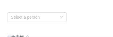
带搜索框
展开后可对选项进行搜索。
import { Component } from '@angular/core';@Component({selector: 'nz-demo-select-search',template: `<nz-selectstyle="width: 200px;"nzShowSearchnzAllowClearnzPlaceHolder="Select a person"[(ngModel)]="selectedValue"><nz-option nzLabel="Jack" nzValue="jack"></nz-option><nz-option nzLabel="Lucy" nzValue="lucy"></nz-option><nz-option nzLabel="Tom" nzValue="tom"></nz-option></nz-select>`})export class NzDemoSelectSearchComponent {selectedValue = null;}
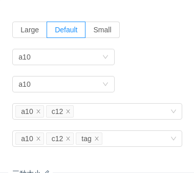
三种大小
三种大小的选择框,当 nzSize 分别为 large 和 small 时,输入框高度为 40px 和 24px ,默认高度为 32px。
import { Component, OnInit } from '@angular/core';@Component({selector: 'nz-demo-select-size',template: `<nz-radio-group [(ngModel)]="size"><label nz-radio-button nzValue="large"><span>Large</span></label><label nz-radio-button nzValue="default"><span>Default</span></label><label nz-radio-button nzValue="small"><span>Small</span></label></nz-radio-group><br /><br /><nz-select style="width: 200px;" [(ngModel)]="singleValue" [nzSize]="size"><nz-option *ngFor="let option of listOfOption" [nzLabel]="option.label" [nzValue]="option.value"></nz-option></nz-select><br /><br /><nz-select style="width: 200px;" [(ngModel)]="singleValue" [nzSize]="size" nzShowSearch><nz-option *ngFor="let option of listOfOption" [nzLabel]="option.label" [nzValue]="option.value"></nz-option></nz-select><br /><br /><nz-selectstyle="width: 100%"[(ngModel)]="multipleValue"[nzSize]="size"nzMode="multiple"nzPlaceHolder="Please select"><nz-option *ngFor="let option of listOfOption" [nzLabel]="option.label" [nzValue]="option.value"></nz-option></nz-select><br /><br /><nz-select style="width: 100%" [(ngModel)]="tagValue" [nzSize]="size" nzMode="tags" nzPlaceHolder="Please select"><nz-option *ngFor="let option of listOfOption" [nzLabel]="option.label" [nzValue]="option.value"></nz-option></nz-select>`})export class NzDemoSelectSizeComponent implements OnInit {listOfOption: Array<{ label: string; value: string }> = [];size = 'default';singleValue = 'a10';multipleValue = ['a10', 'c12'];tagValue = ['a10', 'c12', 'tag'];ngOnInit(): void {const children: Array<{ label: string; value: string }> = [];for (let i = 10; i < 36; i++) {children.push({ label: i.toString(36) + i, value: i.toString(36) + i });}this.listOfOption = children;}}
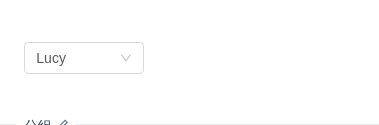
分组
用 nz-option-group 进行选项分组。
import { Component } from '@angular/core';@Component({selector: 'nz-demo-select-optgroup',template: `<nz-select style="width: 120px;" [(ngModel)]="selectedValue" nzAllowClear nzPlaceHolder="Choose"><nz-option-group nzLabel="Manager"><nz-option nzValue="jack" nzLabel="Jack"></nz-option><nz-option nzValue="lucy" nzLabel="Lucy"></nz-option></nz-option-group><nz-option-group nzLabel="Engineer"><nz-option nzValue="Tom" nzLabel="tom"></nz-option></nz-option-group></nz-select>`})export class NzDemoSelectOptgroupComponent {selectedValue = 'lucy';}
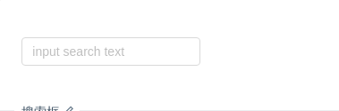
搜索框
搜索和远程数据结合。
import { HttpClient } from '@angular/common/http';import { Component } from '@angular/core';@Component({selector: 'nz-demo-select-search-box',template: `<nz-selectstyle="width: 200px;"nzShowSearchnzServerSearchnzPlaceHolder="input search text"[nzShowArrow]="false"[nzFilterOption]="nzFilterOption"[(ngModel)]="selectedValue"(nzOnSearch)="search($event)"><nz-option *ngFor="let o of listOfOption" [nzLabel]="o.text" [nzValue]="o.value"> </nz-option></nz-select>`})export class NzDemoSelectSearchBoxComponent {selectedValue = null;listOfOption: Array<{ value: string; text: string }> = [];nzFilterOption = () => true;constructor(private httpClient: HttpClient) {}search(value: string): void {this.httpClient.jsonp<{ result: Array<[string, string]> }>(`https://suggest.taobao.com/sug?code=utf-8&q=${value}`, 'callback').subscribe(data => {const listOfOption: Array<{ value: string; text: string }> = [];data.result.forEach(item => {listOfOption.push({value: item[0],text: item[0]});});this.listOfOption = listOfOption;});}}
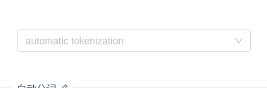
自动分词
试下复制 露西,杰克 到输入框里。只在 tags 和 multiple 模式下可用。
import { Component, OnInit } from '@angular/core';@Component({selector: 'nz-demo-select-automatic-tokenization',template: `<nz-selectnzMode="tags"[nzTokenSeparators]="[',']"style="width: 100%;"[(ngModel)]="listOfTagOptions"nzPlaceHolder="automatic tokenization"><nz-option *ngFor="let option of listOfOption" [nzLabel]="option.label" [nzValue]="option.value"> </nz-option></nz-select>`})export class NzDemoSelectAutomaticTokenizationComponent implements OnInit {listOfOption: Array<{ label: string; value: string }> = [];listOfTagOptions = [];ngOnInit(): void {const children: Array<{ label: string; value: string }> = [];for (let i = 10; i < 36; i++) {children.push({ label: i.toString(36) + i, value: i.toString(36) + i });}this.listOfOption = children;}}
扩展菜单
使用 nzDropdownRender 对下拉菜单进行自由扩展。
import { Component } from '@angular/core';@Component({selector: 'nz-demo-select-custom-dropdown-menu',template: `<nz-select style="width: 120px;" nzShowSearch nzAllowClear [ngModel]="'lucy'" [nzDropdownRender]="render"><nz-option nzValue="jack" nzLabel="Jack"></nz-option><nz-option nzValue="lucy" nzLabel="Lucy"></nz-option></nz-select><ng-template #render><nz-divider style="margin: 4px 0;"></nz-divider><div style="padding: 8px; cursor: pointer"><i nz-icon nzType="plus"></i> Add item</div></ng-template>`})export class NzDemoSelectCustomDropdownMenuComponent {}
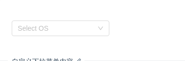
自定义下拉菜单内容
通过 nzCustomContent 自定义 nz-option 显示的内容。
import { Component } from '@angular/core';@Component({selector: 'nz-demo-select-custom-content',template: `<nz-select style="width: 200px;" nzShowSearch nzAllowClear nzPlaceHolder="Select OS" [(ngModel)]="selectedOS"><nz-option nzCustomContent nzLabel="Windows" nzValue="windows"><i nz-icon nzType="windows"></i> Windows</nz-option><nz-option nzCustomContent nzLabel="Mac" nzValue="mac"><i nz-icon nzType="apple"></i> Mac</nz-option><nz-option nzCustomContent nzLabel="Android" nzValue="android"><i nz-icon nzType="android"></i> Android</nz-option></nz-select>`})export class NzDemoSelectCustomContentComponent {selectedOS = null;}
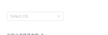
自定义选择器内容
通过 nzCustomTemplate 自定义 nz-select 显示的内容。
import { Component } from '@angular/core';@Component({selector: 'nz-demo-select-custom-template',template: `<nz-selectstyle="width: 200px;"nzAllowClearnzPlaceHolder="Select OS"[(ngModel)]="selectedOS"[nzCustomTemplate]="custom"><nz-option nzCustomContent nzLabel="Windows" nzValue="windows"><i nz-icon nzType="windows"></i> Windows</nz-option><nz-option nzCustomContent nzLabel="Mac" nzValue="mac"><i nz-icon nzType="apple"></i> Mac</nz-option><nz-option nzCustomContent nzLabel="Android" nzValue="android"><i nz-icon nzType="android"></i> Android</nz-option></nz-select><ng-template #custom let-selected><span>Label: {{ selected.nzLabel }} Value: {{ selected.nzValue }}</span></ng-template>`})export class NzDemoSelectCustomTemplateComponent {selectedOS = null;}
API
<nz-select><nz-option nzValue="lucy" nzLabel="Lucy"></nz-option></nz-select>
nz-selectcomponent
| 参数 | 说明 | 类型 | 默认值 |
|---|---|---|---|
[ngModel] | 当前选中的 nz-option 的 nzValue 值,可双向绑定,当 nzMode 为 multiple 或 tags 时,ngModel 为数组 | any | any[] | - |
[compareWith] | 与 SelectControlValueAccessor 相同 | (o1: any, o2: any) => boolean | (o1: any, o2: any) => o1===o2 |
[nzAutoClearSearchValue] | 是否在选中项后清空搜索框,只在 mode 为 multiple 或 tags 时有效。 | boolean | true |
[nzAllowClear] | 支持清除 | boolean | false |
[nzOpen] | 下拉菜单是否打开,可双向绑定 | boolean | false |
[nzAutoFocus] | 默认获取焦点 | boolean | false |
[nzDisabled] | 是否禁用 | boolean | false |
[nzDropdownClassName] | 下拉菜单的 className 属性 | string | - |
[nzDropdownMatchSelectWidth] | 下拉菜单和选择器同宽 | boolean | true |
[nzDropdownStyle] | 下拉菜单的 style 属性 | object | - |
[nzCustomTemplate] | 自定义选择框的Template内容 | TemplateRef<{ $implicit: NzOptionComponent }> | - |
[nzServerSearch] | 是否使用服务端搜索,当为 true 时,将不再在前端对 nz-option 进行过滤 | boolean | false |
[nzFilterOption] | 是否根据输入项进行筛选。当其为一个函数时,会接收 inputValueoption 两个参数,当 option 符合筛选条件时,应返回 true,反之则返回 false。 | (input?: string, option?: NzOptionComponent) => boolean; | - |
[nzMaxMultipleCount] | 最多选中多少个标签 | number | Infinity |
[nzMode] | 设置 nz-select 的模式 | 'multiple' | 'tags' | 'default' | 'default' |
[nzNotFoundContent] | 当下拉列表为空时显示的内容 | string | TemplateRef<void> | - |
[nzPlaceHolder] | 选择框默认文字 | string | - |
[nzShowArrow] | 是否显示下拉小箭头 | boolean | true |
[nzShowSearch] | 使单选模式可搜索 | boolean | false |
[nzSize] | 选择框大小 | 'large' | 'small' | 'default' | 'default' |
[nzSuffixIcon] | 自定义的选择框后缀图标 | TemplateRef<void> | - |
[nzRemoveIcon] | 自定义的多选框清除图标 | TemplateRef<void> | - |
[nzClearIcon] | 自定义的多选框清空图标 | TemplateRef<void> | - |
[nzMenuItemSelectedIcon] | 自定义当前选中的条目图标 | TemplateRef<void> | - |
[nzTokenSeparators] | 在 tags 和 multiple 模式下自动分词的分隔符 | string[] | [] |
[nzLoading] | 加载中状态 | boolean | false |
[nzMaxTagCount] | 最多显示多少个 tag | number | - |
[nzMaxTagPlaceholder] | 隐藏 tag 时显示的内容 | TemplateRef<{ $implicit: any[] }> | - |
(ngModelChange) | 选中的 nz-option 发生变化时,调用此函数 | EventEmitter<any[]> | - |
(nzOpenChange) | 下拉菜单打开状态变化回调 | EventEmitter<boolean> | - |
(nzScrollToBottom) | 下拉列表滚动到底部的回调 | EventEmitter<void> | - |
(nzOnSearch) | 文本框值变化时回调 | EventEmitter<string> | - |
(nzFocus) | focus时回调 | EventEmitter<void> | - |
(nzBlur) | blur时回调 | EventEmitter<void> | - |
nz-optioncomponent
| 参数 | 说明 | 类型 | 默认值 |
|---|---|---|---|
[nzDisabled] | 是否禁用 | boolean | false |
[nzLabel] | 选中该 nz-option 后,nz-select 中显示的文字 | string | - |
[nzValue] | nz-select 中 ngModel 的值 | any | - |
[nzCustomContent] | 是否自定义在下拉菜单中的Template内容,当为 true 时,nz-option 包裹的内容将直接渲染在下拉菜单中 | boolean | false |
nz-option-groupcomponent
| 参数 | 说明 | 类型 | 默认值 |
|---|---|---|---|
[nzLabel] | 组名 | string | TemplateRef<void> | - |
方法
nz-selectcomponent
| 名称 | 说明 |
|---|---|
| blur() | 取消焦点 |
| focus() | 获取焦点 |
