 我的书签
我的书签
 添加书签
添加书签 移除书签
移除书签- Checkbox多选框
- 何时使用
- 单独引入此组件
- 代码演示
- API
- [nz-checkbox]directive
- nz-checkbox-groupcomponent
- nz-checkbox-wrappercomponent
- 方法
- [nz-checkbox]directive
- [nz-checkbox]directive
Checkbox多选框
多选框。
何时使用
- 在一组可选项中进行多项选择时;
- 单独使用可以表示两种状态之间的切换,和
switch类似。区别在于切换switch会直接触发状态改变,而checkbox一般用于状态标记,需要和提交操作配合。
单独引入此组件
想要了解更多关于单独引入组件的内容,可以在快速上手页面进行查看。
import { NzCheckboxModule } from 'ng-zorro-antd/checkbox';
代码演示
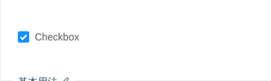
基本用法
简单的 checkbox。
import { Component } from '@angular/core';@Component({selector: 'nz-demo-checkbox-basic',template: `<label nz-checkbox [(ngModel)]="checked">Checkbox</label>`})export class NzDemoCheckboxBasicComponent {checked = true;}

受控的 Checkbox
联动 checkbox。
import { Component } from '@angular/core';@Component({selector: 'nz-demo-checkbox-controller',template: `<p style="margin-bottom: 20px;"><label nz-checkbox [(ngModel)]="isCheckedButton" [nzDisabled]="isDisabledButton">{{ isCheckedButton ? 'Checked' : 'Unchecked' }} - {{ isDisabledButton ? 'Disabled' : 'Enabled' }}</label></p><p><button nz-button [nzType]="'primary'" (click)="checkButton()" [nzSize]="'small'">{{ !isCheckedButton ? 'Checked' : 'Unchecked' }}</button><button nz-button [nzType]="'primary'" (click)="disableButton()" [nzSize]="'small'">{{ isDisabledButton ? 'Enabled' : 'Disabled' }}</button></p>`,styles: [`button {margin-right: 8px;}`]})export class NzDemoCheckboxControllerComponent {isCheckedButton = true;isDisabledButton = false;checkButton(): void {this.isCheckedButton = !this.isCheckedButton;}disableButton(): void {this.isDisabledButton = !this.isDisabledButton;}}

全选
在实现全选效果时,你可能会用到 nzIndeterminate 属性。
import { Component } from '@angular/core';@Component({selector: 'nz-demo-checkbox-check-all',template: `<div style="border-bottom: 1px solid rgb(233, 233, 233);"><labelnz-checkbox[(ngModel)]="allChecked"(ngModelChange)="updateAllChecked()"[nzIndeterminate]="indeterminate">Check all</label></div><br /><nz-checkbox-group [(ngModel)]="checkOptionsOne" (ngModelChange)="updateSingleChecked()"></nz-checkbox-group>`})export class NzDemoCheckboxCheckAllComponent {allChecked = false;indeterminate = true;checkOptionsOne = [{ label: 'Apple', value: 'Apple', checked: true },{ label: 'Pear', value: 'Pear', checked: false },{ label: 'Orange', value: 'Orange', checked: false }];updateAllChecked(): void {this.indeterminate = false;if (this.allChecked) {this.checkOptionsOne = this.checkOptionsOne.map(item => {return {...item,checked: true};});} else {this.checkOptionsOne = this.checkOptionsOne.map(item => {return {...item,checked: false};});}}updateSingleChecked(): void {if (this.checkOptionsOne.every(item => item.checked === false)) {this.allChecked = false;this.indeterminate = false;} else if (this.checkOptionsOne.every(item => item.checked === true)) {this.allChecked = true;this.indeterminate = false;} else {this.indeterminate = true;}}}
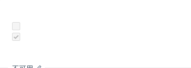
不可用
checkbox 不可用。
import { Component } from '@angular/core';@Component({selector: 'nz-demo-checkbox-disabled',template: `<label nz-checkbox nzDisabled [ngModel]="false"></label><br /><label nz-checkbox nzDisabled [ngModel]="true"></label>`})export class NzDemoCheckboxDisabledComponent {}

Checkbox 组
方便的从数组生成 Checkbox 组。
import { Component } from '@angular/core';@Component({selector: 'nz-demo-checkbox-group',template: `<nz-checkbox-group [(ngModel)]="checkOptionsOne" (ngModelChange)="log(checkOptionsOne)"></nz-checkbox-group><br /><br /><nz-checkbox-group [(ngModel)]="checkOptionsTwo" (ngModelChange)="log(checkOptionsTwo)"></nz-checkbox-group><br /><br /><nz-checkbox-group [(ngModel)]="checkOptionsThree" (ngModelChange)="log(checkOptionsThree)"></nz-checkbox-group>`})export class NzDemoCheckboxGroupComponent {checkOptionsOne = [{ label: 'Apple', value: 'Apple', checked: true },{ label: 'Pear', value: 'Pear' },{ label: 'Orange', value: 'Orange' }];checkOptionsTwo = [{ label: 'Apple', value: 'Apple' },{ label: 'Pear', value: 'Pear', checked: true },{ label: 'Orange', value: 'Orange' }];checkOptionsThree = [{ label: 'Apple', value: 'Apple', disabled: true, checked: true },{ label: 'Pear', value: 'Pear', disabled: true },{ label: 'Orange', value: 'Orange' }];log(value: object[]): void {console.log(value);}}

布局
nz-checkbox-wrapper 内嵌 nz-checkbox 并与 Grid 组件一起使用,可以实现灵活的布局。
import { Component } from '@angular/core';@Component({selector: 'nz-demo-checkbox-layout',template: `<nz-checkbox-wrapper style="width: 100%;" (nzOnChange)="log($event)"><div nz-row><div nz-col nzSpan="8"><label nz-checkbox nzValue="A" [ngModel]="true">A</label></div><div nz-col nzSpan="8"><label nz-checkbox nzValue="B">B</label></div><div nz-col nzSpan="8"><label nz-checkbox nzValue="C">C</label></div><div nz-col nzSpan="8"><label nz-checkbox nzValue="D">D</label></div><div nz-col nzSpan="8"><label nz-checkbox nzValue="E">E</label></div></div></nz-checkbox-wrapper>`})export class NzDemoCheckboxLayoutComponent {log(value: string[]): void {console.log(value);}}
API
[nz-checkbox]directive
| 参数 | 说明 | 类型 | 默认值 |
|---|---|---|---|
[nzAutoFocus] | 自动获取焦点 | boolean | false |
[nzDisabled] | 设定 disable 状态 | boolean | false |
[ngModel] | 指定当前是否选中,可双向绑定 | boolean | false |
[nzIndeterminate] | 设置 indeterminate 状态,只负责样式控制 | boolean | false |
[nzValue] | 仅与 nz-checkbox-wrapper 的选中回调配合使用 | string | - |
(ngModelChange) | 选中变化时回调 | EventEmitter<boolean> | - |
nz-checkbox-groupcomponent
| 参数 | 说明 | 类型 | 默认值 |
|---|---|---|---|
[ngModel] | 指定可选项,可双向绑定 | Array<{ label: string; value: string; checked?: boolean; }> | [] |
[nzDisabled] | 设定全部 checkbox disable 状态 | boolean | false |
(ngModelChange) | 选中数据变化时的回调 | EventEmitter<Array<{ label: string; value: string; checked?: boolean; }>> | - |
nz-checkbox-wrappercomponent
| 参数 | 说明 | 类型 | 默认值 |
|---|---|---|---|
(nzOnChange) | 选中数据变化时的回调 | EventEmitter<string[]> | - |
方法
[nz-checkbox]directive
通过ViewChild或其他方式获得 nz-checkbox 实例
| 名称 | 描述 |
|---|---|
| focus() | 获取焦点 |
| blur() | 移除焦点 |
