 我的书签
我的书签
 添加书签
添加书签 移除书签
移除书签- Tooltip文字提示
- 何时使用
- 单独引入此组件
- 代码演示
- API
- [nz-tooltip]directive
- 共同的 API
- 注意
Tooltip文字提示
简单的文字提示气泡框。
何时使用
鼠标移入则显示提示,移出消失,气泡浮层不承载复杂文本和操作。
可用来代替系统默认的 title 提示,提供一个按钮/文字/操作的文案解释。
单独引入此组件
想要了解更多关于单独引入组件的内容,可以在快速上手页面进行查看。
import { NzToolTipModule } from 'ng-zorro-antd/tooltip';
代码演示

基本
最简单的用法。
import { Component } from '@angular/core';@Component({selector: 'nz-demo-tooltip-basic',template: `<span nz-tooltip nzTooltipTitle="prompt text">Tooltip will show when mouse enter.</span>`})export class NzDemoTooltipBasicComponent {}

箭头指向
通过设置 nzPlacement ,可以箭头将指向目标元素的中心。
import { Component } from '@angular/core';@Component({selector: 'nz-demo-tooltip-arrow-point-at-center',template: `<button nz-button nzTooltipTitle="prompt text" nzTooltipPlacement="topLeft" nz-tooltip>Align edge / 边缘对齐</button><button nz-button nzTooltipTitle="prompt text" nzTooltipPlacement="topCenter" nz-tooltip>Arrow points to center / 箭头指向中心</button>`,styles: [`button {margin-right: 8px;margin-bottom: 8px;}`]})export class NzDemoTooltipArrowPointAtCenterComponent {}
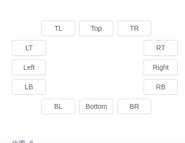
位置
位置有 12 个方向。
import { Component } from '@angular/core';@Component({selector: 'nz-demo-tooltip-placement',template: `<div style="margin-left:60px;"><button nzTooltipTitle="prompt text" nzTooltipPlacement="topLeft" nz-button nz-tooltip>TL</button><button nzTooltipTitle="prompt text" nzTooltipPlacement="top" nz-button nz-tooltip>Top</button><button nzTooltipTitle="prompt text" nzTooltipPlacement="topRight" nz-button nz-tooltip>TR</button></div><div style="float:left;width: 60px;"><button nzTooltipTitle="prompt text" nzTooltipPlacement="leftTop" nz-button nz-tooltip>LT</button><button nzTooltipTitle="prompt text" nzTooltipPlacement="left" nz-button nz-tooltip>Left</button><button nzTooltipTitle="prompt text" nzTooltipPlacement="leftBottom" nz-button nz-tooltip>LB</button></div><div style="margin-left:270px;width: 60px;"><button nzTooltipTitle="prompt text" nzTooltipPlacement="rightTop" nz-button nz-tooltip>RT</button><button nzTooltipTitle="prompt text" nzTooltipPlacement="right" nz-button nz-tooltip>Right</button><button nzTooltipTitle="prompt text" nzTooltipPlacement="rightBottom" nz-button nz-tooltip>RB</button></div><div style="margin-left:60px;clear: both;"><button nzTooltipTitle="prompt text" nzTooltipPlacement="bottomLeft" nz-button nz-tooltip>BL</button><button nzTooltipTitle="prompt text" nzTooltipPlacement="bottom" nz-button nz-tooltip>Bottom</button><button nzTooltipTitle="prompt text" nzTooltipPlacement="bottomRight" nz-button nz-tooltip>BR</button></div>`,styles: [`button {width: 70px;text-align: center;padding: 0;margin-right: 8px;margin-bottom: 8px;}`]})export class NzDemoTooltipPlacementComponent {}
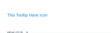
模板渲染
nzTitle 可以传入 TemplateRef<void> 模板渲染。
import { Component } from '@angular/core';@Component({selector: 'nz-demo-tooltip-template',template: `<a nz-tooltip [nzTooltipTitle]="titleTemplate">This Tooltip Have Icon</a><ng-template #titleTemplate><i nz-icon nzType="file" style="margin-right: 8px"></i> <span>Tooltip With Icon</span></ng-template>`})export class NzDemoTooltipTemplateComponent {}
API
[nz-tooltip]directive
| 参数 | 说明 | 类型 | 默认值 |
|---|---|---|---|
[nzTooltipTitle] | 提示文字 | string | TemplateRef<void> | - |
[nzTooltipTrigger] | 触发行为,可选 hover/focus/click | 'click' | 'focus' | 'hover' | 'hover' |
[nzTooltipPlacement] | 气泡框位置 | 'top' | 'left' | 'right' | 'bottom' | 'topLeft' | 'topRight' | 'bottomLeft' | 'bottomRight' | 'leftTop' | 'leftBottom' | 'rightTop' | 'rightBottom' | 'top' |
共同的 API
以下 API 为 nz-tooltip、nz-popconfirm、nz-popover 共享的 API。
| 参数 | 说明 | 类型 | 默认值 |
|---|---|---|---|
[nzMouseEnterDelay] | 鼠标移入后延时多少才显示 Tooltip,单位:秒 | number | 0.15 |
[nzMouseLeaveDelay] | 鼠标移出后延时多少才隐藏 Tooltip,单位:秒 | number | 0.1 |
[nzOverlayClassName] | 卡片类名 | string | - |
[nzOverlayStyle] | 卡片样式 | object | - |
[nzVisible] | 用于手动控制浮层显隐 | boolean | false |
(nzVisibleChange) | 显示隐藏的回调 | EventEmitter<boolean> | - |
| 方法 | 说明 |
|---|---|
show | 打开 |
hide | 隐藏 |
updatePosition | 调整位置 |
注意
请确保 nz-tooltip 的子元素能接受 onMouseEnter、onMouseLeave、onFocus、onClick 事件。
