 我的书签
我的书签
 添加书签
添加书签 移除书签
移除书签- Affix固钉
- 何时使用
- 单独引入此组件
- 代码演示
- API
- nz-affixcomponent
- nz-affixcomponent
Affix固钉
将页面元素钉在可视范围。
何时使用
当内容区域比较长,需要滚动页面时,这部分内容对应的操作或者导航需要在滚动范围内始终展现。常用于侧边菜单和按钮组合。
页面可视范围过小时,慎用此功能以免遮挡页面内容。
单独引入此组件
想要了解更多关于单独引入组件的内容,可以在快速上手页面进行查看。
import { NzAffixModule } from 'ng-zorro-antd/affix';
代码演示

基本
最简单的用法。
import { Component } from '@angular/core';@Component({selector: 'nz-demo-affix-basic',template: `<nz-affix><button nz-button [nzType]="'primary'"><span>Affix top</span></button></nz-affix><br /><nz-affix nzOffsetBottom="0"><button nz-button [nzType]="'primary'"><span>Affix bottom</span></button></nz-affix>`})export class NzDemoAffixBasicComponent {}
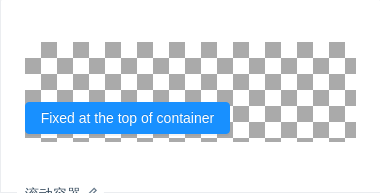
滚动容器
用 nzTarget 设置 nz-affix 需要监听其滚动事件的元素,默认为 window。
import { Component } from '@angular/core';@Component({selector: 'nz-demo-affix-target',template: `<div class="scrollable-container" #target><div class="background"><nz-affix [nzTarget]="target" id="affix-container-target"><button nz-button [nzType]="'primary'"><span>Fixed at the top of container</span></button></nz-affix></div></div>`,styles: [`.scrollable-container {height: 100px;overflow-y: scroll;}.background {padding-top: 60px;height: 300px;background-image: url(//zos.alipayobjects.com/rmsportal/RmjwQiJorKyobvI.jpg);}`]})export class NzDemoAffixTargetComponent {}
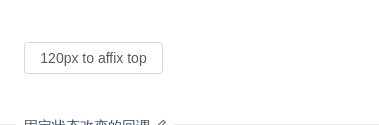
固定状态改变的回调
可以获得是否固定的状态。
import { Component } from '@angular/core';@Component({selector: 'nz-demo-affix-on-change',template: `<nz-affix [nzOffsetTop]="120" (nzChange)="onChange($event)"><button nz-button><span>120px to affix top</span></button></nz-affix>`})export class NzDemoAffixOnChangeComponent {onChange(status: boolean) {console.log(status);}}
API
nz-affixcomponent
| 成员 | 说明 | 类型 | 默认值 |
|---|---|---|---|
[nzOffsetBottom] | 距离窗口底部达到指定偏移量后触发 | number | - |
[nzOffsetTop] | 距离窗口顶部达到指定偏移量后触发 | number | 0 |
[nzTarget] | 设置 nz-affix 需要监听其滚动事件的元素,值为一个返回对应 DOM 元素的函数 | string | HTMLElement | window |
(nzChange) | 固定状态改变时触发的回调函数 | EventEmitter<boolean> | - |
注意:nz-affix 内的元素不要使用绝对定位,如需要绝对定位的效果,可以直接设置 nz-affix 为绝对定位:
<nz-affix style="position: absolute; top: 10px, left: 10px">...</nz-affix>
