 我的书签
我的书签
 添加书签
添加书签 移除书签
移除书签- Carousel走马灯
- 何时使用
- 单独引入此组件
- 代码演示
- API
- nz-carouselcomponent
- 方法
- InjectionToken
- 自定义切换效果
- nz-carouselcomponent
Carousel走马灯
旋转木马,一组轮播的区域。
何时使用
- 当有一组平级的内容。
- 当内容空间不足时,可以用走马灯的形式进行收纳,进行轮播展现。
- 常用于一组图片或卡片轮播。
单独引入此组件
想要了解更多关于单独引入组件的内容,可以在快速上手页面进行查看。
import { NzCarouselModule } from 'ng-zorro-antd/carousel';
代码演示

基本
最简单的用法。
import { Component } from '@angular/core';@Component({selector: 'nz-demo-carousel-basic',template: `<nz-carousel [nzEffect]="effect"><div nz-carousel-content *ngFor="let index of array"><h3>{{ index }}</h3></div></nz-carousel>`,styles: [`[nz-carousel-content] {text-align: center;height: 160px;line-height: 160px;background: #364d79;color: #fff;overflow: hidden;}h3 {color: #fff;}`]})export class NzDemoCarouselBasicComponent {array = [1, 2, 3, 4];effect = 'scrollx';}

渐显
切换效果为渐显。
import { Component } from '@angular/core';@Component({selector: 'nz-demo-carousel-fade',template: `<nz-carousel [nzEffect]="'fade'"><div nz-carousel-content *ngFor="let index of array"><h3>{{ index }}</h3></div></nz-carousel>`,styles: [`[nz-carousel-content] {text-align: center;height: 160px;line-height: 160px;background: #364d79;color: #fff;overflow: hidden;}h3 {color: #fff;}`]})export class NzDemoCarouselFadeComponent {array = [1, 2, 3, 4];}

位置
位置有 4 个方向。
import { Component } from '@angular/core';@Component({selector: 'nz-demo-carousel-position',template: `<nz-radio-group [(ngModel)]="dotPosition"><label nz-radio-button nzValue="bottom">Bottom</label><label nz-radio-button nzValue="top">Top</label><label nz-radio-button nzValue="left">Left</label><label nz-radio-button nzValue="right">Right</label></nz-radio-group><nz-carousel [nzDotPosition]="dotPosition"><div nz-carousel-content *ngFor="let index of array"><h3>{{ index }}</h3></div></nz-carousel>`,styles: [`nz-radio-group {margin-bottom: 8px;}[nz-carousel-content] {text-align: center;height: 160px;line-height: 160px;background: #364d79;color: #fff;overflow: hidden;}h3 {color: #fff;}`]})export class NzDemoCarouselPositionComponent {array = [1, 2, 3, 4];dotPosition = 'bottom';}
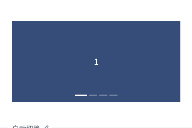
自动切换
定时切换下一张。
import { Component } from '@angular/core';@Component({selector: 'nz-demo-carousel-autoplay',template: `<nz-carousel nzAutoPlay><div nz-carousel-content *ngFor="let index of array"><h3>{{ index }}</h3></div></nz-carousel>`,styles: [`[nz-carousel-content] {text-align: center;height: 160px;line-height: 160px;background: #364d79;color: #fff;overflow: hidden;}h3 {color: #fff;}`]})export class NzDemoCarouselAutoplayComponent {array = [1, 2, 3, 4];}
API
nz-carouselcomponent
| 参数 | 说明 | 类型 | 默认值 | 版本 | |
|---|---|---|---|---|---|
[nzAutoPlay] | 是否自动切换 | boolean | false | ||
[nzAutoPlaySpeed] | 切换时间(毫秒),当设置为0时不切换 | number | 3000 | ||
[nzDotRender] | Dot渲染模板 | TemplateRef<{ $implicit: number }> | - | ||
[nzDotPosition] | 面板指示点位置,可选 topbottomleftright | string | bottom | 8.0.0 | |
[nzDots] | 是否显示面板指示点 | boolean | true | ||
[nzEffect] | 动画效果函数,可取 scrollx, fade | 'scrollx'|'fade' | 'scrollx' | ||
[nzEnableSwipe] | 是否支持手势划动切换 | boolean | true | ||
(nzAfterChange) | 切换面板的回调 | EventEmitter<number> | - | ||
(nzBeforeChange) | 切换面板的回调 | EventEmitter<{ from: number; to: number }> | - |
方法
| 名称 | 描述 |
|---|---|
goTo(slideNumber) | 切换到指定面板 |
next() | 切换到下一面板 |
pre() | 切换到上一面板 |
InjectionToken
| Token | 说明 | 参数 | 默认值 |
|---|---|---|---|
NZ_CAROUSEL_CUSTOM_STRATEGIES | 提供用户自定义的切换效果 | CarouselStrategyRegistryItem[] | - |
自定义切换效果
你可以提供自定义的切换效果,切换效果应当继承 NzCarouselBaseStrategy 类(默认的两种切换效果同样基于该类)。
