 我的书签
我的书签
 添加书签
添加书签 移除书签
移除书签- Tag标签
- 何时使用
- 单独引入此组件
- 代码演示
- API
- nz-tagcomponent
- nz-tagcomponent
Tag标签
进行标记和分类的小标签。
何时使用
- 用于标记事物的属性和维度。
- 进行分类。
单独引入此组件
想要了解更多关于单独引入组件的内容,可以在快速上手页面进行查看。
import { NzTagModule } from 'ng-zorro-antd/tag';
代码演示

基本
基本标签的用法,可以通过添加 nzMode="closeable" 变为可关闭标签。可关闭标签具有 nzOnClosenzAfterClose 两个事件。
import { Component } from '@angular/core';@Component({selector: 'nz-demo-tag-basic',template: `<nz-tag>Tag 1</nz-tag><nz-tag><a href="https://github.com/NG-ZORRO/ng-zorro-antd">Link</a></nz-tag><nz-tag nzMode="closeable" (nzOnClose)="onClose()" (nzAfterClose)="afterClose()">Tag 2</nz-tag><nz-tag nzMode="closeable" (nzOnClose)="preventDefault($event)">Prevent Default</nz-tag>`})export class NzDemoTagBasicComponent {onClose(): void {console.log('tag was closed.');}afterClose(): void {console.log('after tag closed');}preventDefault(e: Event): void {e.preventDefault();e.stopPropagation();console.log('tag can not be closed.');}}
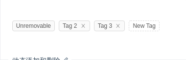
动态添加和删除
用数组生成一组标签,可以动态添加和删除,通过监听删除动画结束的事件 nzAfterClose 实现。
import { Component, ElementRef, ViewChild } from '@angular/core';@Component({selector: 'nz-demo-tag-control',template: `<nz-tag*ngFor="let tag of tags; let i = index"[nzMode]="i === 0 ? 'default' : 'closeable'"(nzAfterClose)="handleClose(tag)">{{ sliceTagName(tag) }}</nz-tag><nz-tag *ngIf="!inputVisible" class="editable-tag" nzNoAnimation (click)="showInput()"><i nz-icon nzType="plus"></i> New Tag</nz-tag><input#inputElementnz-inputnzSize="small"*ngIf="inputVisible"type="text"[(ngModel)]="inputValue"style="width: 78px;"(blur)="handleInputConfirm()"(keydown.enter)="handleInputConfirm()"/>`,styles: [`.editable-tag {background: rgb(255, 255, 255);border-style: dashed;}`]})export class NzDemoTagControlComponent {tags = ['Unremovable', 'Tag 2', 'Tag 3'];inputVisible = false;inputValue = '';@ViewChild('inputElement', { static: false }) inputElement: ElementRef;handleClose(removedTag: {}): void {this.tags = this.tags.filter(tag => tag !== removedTag);}sliceTagName(tag: string): string {const isLongTag = tag.length > 20;return isLongTag ? `${tag.slice(0, 20)}...` : tag;}showInput(): void {this.inputVisible = true;setTimeout(() => {this.inputElement.nativeElement.focus();}, 10);}handleInputConfirm(): void {if (this.inputValue && this.tags.indexOf(this.inputValue) === -1) {this.tags = [...this.tags, this.inputValue];}this.inputValue = '';this.inputVisible = false;}}

热门标签
选择你感兴趣的话题。
import { Component } from '@angular/core';const tagsFromServer = ['Movie', 'Books', 'Music', 'Sports'];@Component({selector: 'nz-demo-tag-hot-tags',template: `<strong>Categories: </strong><nz-tag*ngFor="let tag of hotTags"nzMode="checkable"[nzChecked]="selectedTags.indexOf(tag) > -1"(nzCheckedChange)="handleChange($event, tag)">{{ tag }}</nz-tag>`})export class NzDemoTagHotTagsComponent {hotTags = tagsFromServer;selectedTags: string[] = [];handleChange(checked: boolean, tag: string): void {if (checked) {this.selectedTags.push(tag);} else {this.selectedTags = this.selectedTags.filter(t => t !== tag);}console.log('You are interested in: ', this.selectedTags);}}

多彩标签
我们添加了多种预设色彩的标签样式,用作不同场景使用。如果预设值不能满足你的需求,可以设置为具体的色值。
import { Component, ViewEncapsulation } from '@angular/core';@Component({selector: 'nz-demo-tag-colorful',encapsulation: ViewEncapsulation.None,template: `<h4 style="margin-bottom: 16px;">Presets:</h4><div><nz-tag [nzColor]="'magenta'">magenta</nz-tag><nz-tag [nzColor]="'red'">red</nz-tag><nz-tag [nzColor]="'volcano'">volcano</nz-tag><nz-tag [nzColor]="'orange'">orange</nz-tag><nz-tag [nzColor]="'gold'">gold</nz-tag><nz-tag [nzColor]="'lime'">lime</nz-tag><nz-tag [nzColor]="'green'">green</nz-tag><nz-tag [nzColor]="'cyan'">cyan</nz-tag><nz-tag [nzColor]="'blue'">blue</nz-tag><nz-tag [nzColor]="'geekblue'">geekblue</nz-tag><nz-tag [nzColor]="'purple'">purple</nz-tag></div><h4 style="margin: 16px 0px;'">Custom:</h4><div><nz-tag [nzColor]="'#f50'">#f50</nz-tag><nz-tag [nzColor]="'#2db7f5'">#2db7f5</nz-tag><nz-tag [nzColor]="'#87d068'">#87d068</nz-tag><nz-tag [nzColor]="'#108ee9'">#108ee9</nz-tag></div>`,styles: [`.ant-tag {margin-bottom: 8px;}`]})export class NzDemoTagColorfulComponent {}
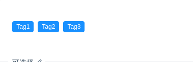
可选择
可通过 nzMode="checkable" 实现类似 Checkbox 的效果,点击切换选中效果。
import { Component } from '@angular/core';@Component({selector: 'nz-demo-tag-checkable',template: `<nz-tag nzMode="checkable" [nzChecked]="true" (nzCheckedChange)="checkChange($event)">Tag1</nz-tag><nz-tag nzMode="checkable" [nzChecked]="true" (nzCheckedChange)="checkChange($event)">Tag2</nz-tag><nz-tag nzMode="checkable" [nzChecked]="true" (nzCheckedChange)="checkChange($event)">Tag3</nz-tag>`})export class NzDemoTagCheckableComponent {checkChange(e: boolean): void {console.log(e);}}
API
nz-tagcomponent
| 参数 | 说明 | 类型 | 默认值 |
|---|---|---|---|
[nzMode] | 设定标签工作的模式 | 'closeable' | 'default' | 'checkable' | 'default' |
[nzChecked] | 设置标签的选中状态,可双向绑定,在 nzMode="checkable" 时可用 | boolean | false |
[nzColor] | 标签色 | string | - |
(nzAfterClose) | 关闭动画完成后的回调,在 nzMode="closable" 时可用 | EventEmitter<void> | - |
(nzOnClose) | 关闭时的回调,在 nzMode="closable" 时可用 | EventEmitter<MouseEvent> | - |
(nzCheckedChange) | 设置标签的选中状态的回调,在 nzMode="checkable" 时可用 | EventEmitter<void> | - |
