 我的书签
我的书签
 添加书签
添加书签 移除书签
移除书签- Autocomplete自动完成
- 何时使用
- 单独引入此组件
- 代码演示
- API
- [nzAutocomplete]directive
- nz-autocompletecomponent
- nz-auto-optioncomponent
Autocomplete自动完成
输入框自动完成功能。
何时使用
需要自动完成时。
单独引入此组件
想要了解更多关于单独引入组件的内容,可以在快速上手页面进行查看。
import { NzAutocompleteModule } from 'ng-zorro-antd/auto-complete';
代码演示
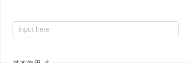
基本使用
基本使用。通过 nzDataSource 设置自动完成的数据源
import { Component, ViewEncapsulation } from '@angular/core';@Component({selector: 'nz-demo-auto-complete-basic',encapsulation: ViewEncapsulation.None,template: `<div class="example-input"><inputplaceholder="input here"nz-input[(ngModel)]="inputValue"(input)="onInput($event.target?.value)"[nzAutocomplete]="auto"/><nz-autocomplete nzBackfill #auto><nz-auto-option *ngFor="let option of options" [nzValue]="option">{{ option }}</nz-auto-option></nz-autocomplete></div>`})export class NzDemoAutoCompleteBasicComponent {inputValue: string;options: string[] = [];onInput(value: string): void {this.options = value ? [value, value + value, value + value + value] : [];}}
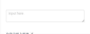
自定义输入组件
自定义输入组件。
import { Component, ViewEncapsulation } from '@angular/core';@Component({selector: 'nz-demo-auto-complete-custom',encapsulation: ViewEncapsulation.None,template: `<div class="example-input"><textareaplaceholder="input here"nz-inputrow="4"[(ngModel)]="inputValue"(input)="onInput($event.target?.value)"[nzAutocomplete]="auto"></textarea><nz-autocomplete #auto><nz-auto-option *ngFor="let option of options" [nzValue]="option">{{ option }}</nz-auto-option></nz-autocomplete></div>`})export class NzDemoAutoCompleteCustomComponent {inputValue: string;options: string[] = [];onInput(value: string): void {this.options = value ? [value, value + value, value + value + value] : [];}}
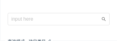
查询模式 - 确定类目
查询模式: 确定类目 示例。
import { ChangeDetectionStrategy, Component, OnInit, ViewEncapsulation } from '@angular/core';@Component({selector: 'nz-demo-auto-complete-certain-category',encapsulation: ViewEncapsulation.None,changeDetection: ChangeDetectionStrategy.OnPush,template: `<div class="example-input"><nz-input-group nzSize="large" [nzSuffix]="suffixIcon"><inputplaceholder="input here"nz-input[(ngModel)]="inputValue"(ngModelChange)="onChange($event)"[nzAutocomplete]="auto"/></nz-input-group><ng-template #suffixIcon><i nz-icon nzType="search"></i></ng-template><nz-autocomplete #auto><nz-auto-optgroup *ngFor="let group of optionGroups" [nzLabel]="groupTitle"><ng-template #groupTitle><span>{{ group.title }}<a class="more-link" href="https://www.google.com/search?q=ng+zorro" target="_blank">更多</a></span></ng-template><nz-auto-option *ngFor="let option of group.children" [nzLabel]="option.title" [nzValue]="option">{{ option.title }}<span class="certain-search-item-count">{{ option.count }} 人 关注</span></nz-auto-option></nz-auto-optgroup></nz-autocomplete></div>`,styles: [`.certain-search-item-count {position: absolute;color: #999;right: 16px;}.more-link {float: right;}`]})export class NzDemoAutoCompleteCertainCategoryComponent implements OnInit {inputValue: string;optionGroups: any[];onChange(value: any): void {console.log(value);}ngOnInit(): void {setTimeout(() => {this.optionGroups = [{title: '话题',children: [{title: 'AntDesign',count: 10000},{title: 'AntDesign UI',count: 10600}]},{title: '问题',children: [{title: 'AntDesign UI 有多好',count: 60100},{title: 'AntDesign 是啥',count: 30010}]},{title: '文章',children: [{title: 'AntDesign 是一个设计语言',count: 100000}]}];}, 1000);}}
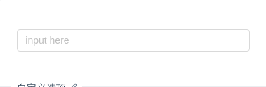
自定义选项
也可以直接传 nz-option 作为 nz-autocomplete 的 Content,而非使用 nzDataSource。
import { Component, ViewEncapsulation } from '@angular/core';@Component({selector: 'nz-demo-auto-complete-options',encapsulation: ViewEncapsulation.None,template: `<div class="example-input"><inputplaceholder="input here"nz-input[(ngModel)]="inputValue"(ngModelChange)="onChange($event)"[nzAutocomplete]="auto"/><nz-autocomplete #auto><nz-auto-option *ngFor="let option of options" [nzValue]="option">{{ option }}</nz-auto-option></nz-autocomplete></div>`})export class NzDemoAutoCompleteOptionsComponent {inputValue: string;options: string[] = [];onChange(value: string): void {if (!value || value.indexOf('@') >= 0) {this.options = [];} else {this.options = ['gmail.com', '163.com', 'qq.com'].map(domain => `${value}@${domain}`);}}}
不区分大小写
不区分大小写的 AutoComplete
import { Component, ViewEncapsulation } from '@angular/core';@Component({selector: 'nz-demo-auto-complete-non-case-sensitive',encapsulation: ViewEncapsulation.None,template: `<div class="example-input"><inputplaceholder="try to type \`b\`"nz-input[(ngModel)]="inputValue"(input)="onInput($event.target?.value)"[nzAutocomplete]="auto"/><nz-autocomplete [nzDataSource]="filteredOptions" #auto> </nz-autocomplete></div>`})export class NzDemoAutoCompleteNonCaseSensitiveComponent {inputValue: string;filteredOptions: string[] = [];options = ['Burns Bay Road', 'Downing Street', 'Wall Street'];constructor() {this.filteredOptions = this.options;}onInput(value: string): void {this.filteredOptions = this.options.filter(option => option.toLowerCase().indexOf(value.toLowerCase()) === 0);}}
查询模式 - 不确定类目
查询模式: 不确定类目 示例。
import { Component, ViewEncapsulation } from '@angular/core';@Component({selector: 'nz-demo-auto-complete-uncertain-category',encapsulation: ViewEncapsulation.None,template: `<div class="example-input"><nz-input-group nzSearch nzSize="large" [nzAddOnAfter]="suffixIconButton"><inputplaceholder="input here"nz-input[(ngModel)]="inputValue"(ngModelChange)="onChange($event)"[nzAutocomplete]="auto"/></nz-input-group><ng-template #suffixIconButton><button nz-button nzType="primary" nzSize="large" nzSearch><i nz-icon nzType="search" nzTheme="outline"></i></button></ng-template><nz-autocomplete #auto><nz-auto-option *ngFor="let option of options" [nzValue]="option.category">{{ option.value }} 在<a [href]="'https://s.taobao.com/search?q=' + option.query" target="_blank" rel="noopener noreferrer">{{ option.category }}</a>区块中<span class="global-search-item-count">约 {{ option.count }} 个结果</span></nz-auto-option></nz-autocomplete></div>`,styles: [`.global-search-item-count {position: absolute;right: 16px;}`]})export class NzDemoAutoCompleteUncertainCategoryComponent {inputValue: string;options: Array<{ value: string; category: string; count: number }> = [];onChange(value: string): void {this.options = new Array(this.getRandomInt(15, 5)).join('.').split('.').map((_item, idx) => ({value,category: `${value}${idx}`,count: this.getRandomInt(200, 100)}));}private getRandomInt(max: number, min: number = 0): number {return Math.floor(Math.random() * (max - min + 1)) + min;}}
API
<input nz-input [(ngModel)]="value" [nzAutocomplete]="auto"><nz-autocomplete [nzDataSource]="['12345', '23456', '34567']" #auto></nz-autocomplete>
<input nz-input [(ngModel)]="value" [nzAutocomplete]="auto"><nz-autocomplete #auto><nz-auto-option [nzValue]="'12345'">12345</nz-auto-option><nz-auto-option [nzValue]="'23456'">23456</nz-auto-option><nz-auto-option [nzValue]="'34567'">34567</nz-auto-option></nz-autocomplete>
[nzAutocomplete]directive
| 属性 | 说明 | 类型 | 默认值 |
|---|---|---|---|
[nzAutocomplete] | 用于绑定 nzAutocomplete 组件 | NzAutocompleteComponent | - |
nz-autocompletecomponent
| 属性 | 说明 | 类型 | 默认值 |
|---|---|---|---|
[nzBackfill] | 使用键盘选择选项的时候把选中项回填到输入框中 | boolean | false |
[nzDataSource] | 自动完成的数据源 | AutocompleteDataSource | - |
[nzDefaultActiveFirstOption] | 是否默认高亮第一个选项。 | boolean | true |
[nzWidth] | 自定义宽度单位 px | number | 触发元素宽度 |
[nzOverlayClassName] | 下拉根元素的类名称 | string | - |
[nzOverlayStyle] | 下拉根元素的样式 | object | - |
nz-auto-optioncomponent
| 属性 | 说明 | 类型 | 默认值 |
|---|---|---|---|
[nzValue] | 绑定到触发元素 ngModel 的值 | any | - |
[nzLabel] | 填入触发元素显示的值 | string | - |
[nzDisabled] | 禁用选项 | boolean | false |
