 我的书签
我的书签
 添加书签
添加书签 移除书签
移除书签- Skeleton加载占位图
- 何时使用
- 单独引入此组件
- 代码演示
- API
- nz-skeletoncomponent
- NzSkeletonAvatar
- NzSkeletonTitle
- NzSkeletonParagraph
Skeleton加载占位图
在需要等待加载内容的位置提供一个占位图。
何时使用
- 网络较慢,需要长时间等待加载处理的情况下。
- 图文信息内容较多的列表/卡片中。
单独引入此组件
想要了解更多关于单独引入组件的内容,可以在快速上手页面进行查看。
import { NzSkeletonModule } from 'ng-zorro-antd/skeleton';
代码演示

基本
最简单的用法。
import { Component } from '@angular/core';@Component({selector: 'nz-demo-skeleton-basic',template: `<nz-skeleton></nz-skeleton>`})export class NzDemoSkeletonBasicComponent {}
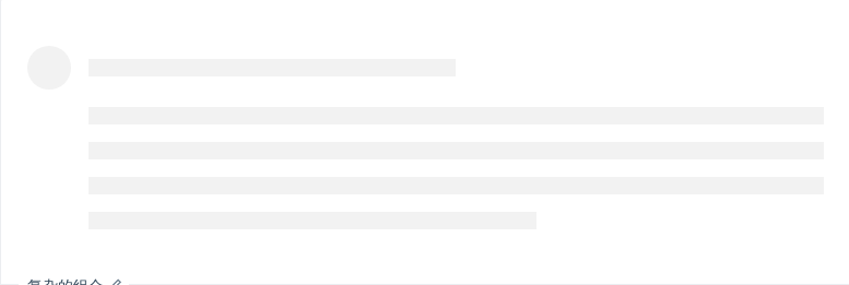
复杂的组合
更复杂的组合。
import { Component } from '@angular/core';@Component({selector: 'nz-demo-skeleton-complex',template: `<nz-skeleton [nzAvatar]="true" [nzParagraph]="{ rows: 4 }"></nz-skeleton>`})export class NzDemoSkeletonComplexComponent {}

动画效果
显示动画效果。
import { Component } from '@angular/core';@Component({selector: 'nz-demo-skeleton-active',template: `<nz-skeleton [nzActive]="true"></nz-skeleton>`})export class NzDemoSkeletonActiveComponent {}
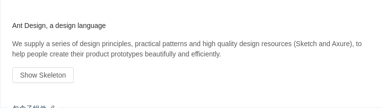
包含子组件
加载占位图包含子组件。
import { Component } from '@angular/core';@Component({selector: 'nz-demo-skeleton-children',template: `<div class="article"><nz-skeleton [nzLoading]="loading"><h4>Ant Design, a design language</h4><p>We supply a series of design principles, practical patterns and high quality design resources (Sketch andAxure), to help people create their product prototypes beautifully and efficiently.</p></nz-skeleton><button nz-button (click)="showSkeleton()" [disabled]="loading">Show Skeleton</button></div>`,styles: [`.article h4 {margin-bottom: 16px;}.article button {margin-top: 16px;}`]})export class NzDemoSkeletonChildrenComponent {loading = false;showSkeleton(): void {this.loading = true;setTimeout(() => {this.loading = false;}, 3000);}}
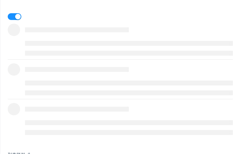
列表样例
在列表组件中使用加载占位符。
import { Component } from '@angular/core';@Component({selector: 'nz-demo-skeleton-list',template: `<nz-switch [(ngModel)]="loading"></nz-switch><nz-list [nzDataSource]="listData" [nzRenderItem]="item" [nzItemLayout]="'vertical'"><ng-template #item let-item><nz-list-item[nzContent]="loading ? ' ' : item.content"[nzActions]="loading ? [] : [starAction, likeAction, msgAction]"[nzExtra]="loading ? '' : extra"><nz-skeleton [nzLoading]="loading" [nzActive]="true" [nzAvatar]="true"><ng-template #starAction><i nz-icon nzType="star-o" style="margin-right: 8px;"></i> 156</ng-template><ng-template #likeAction><i nz-icon nzType="like-o" style="margin-right: 8px;"></i> 156</ng-template><ng-template #msgAction><i nz-icon nzType="message" style="margin-right: 8px;"></i> 2</ng-template><nz-list-item-meta [nzAvatar]="item.avatar" [nzTitle]="nzTitle" [nzDescription]="item.description"><ng-template #nzTitle><a href="{{ item.href }}">{{ item.title }}</a></ng-template></nz-list-item-meta><ng-template #extra><img width="272" alt="logo" src="https://gw.alipayobjects.com/zos/rmsportal/mqaQswcyDLcXyDKnZfES.png" /></ng-template></nz-skeleton></nz-list-item></ng-template></nz-list>`})export class NzDemoSkeletonListComponent {loading = true;listData = new Array(3).fill({}).map((_i, index) => {return {href: 'http://ng.ant.design',title: `ant design part ${index}`,avatar: 'https://zos.alipayobjects.com/rmsportal/ODTLcjxAfvqbxHnVXCYX.png',description: 'Ant Design, a design language for background applications, is refined by Ant UED Team.',content:'We supply a series of design principles, practical patterns and high quality design resources (Sketch and Axure), to help people create their product prototypes beautifully and efficiently.'};});}
API
nz-skeletoncomponent
| 属性 | 说明 | 类型 | 默认值 |
|---|---|---|---|
[nzActive] | 是否展示动画效果 | boolean | false |
[nzAvatar] | 是否显示头像占位图 | boolean | NzSkeletonAvatar | false |
[nzLoading] | 为 true 时,显示占位图。反之则直接展示子组件 | boolean | - |
[nzParagraph] | 是否显示段落占位图 | boolean | NzSkeletonParagraph | true |
[nzTitle] | 是否显示标题占位图 | boolean | NzSkeletonTitle | true |
NzSkeletonAvatar
| 属性 | 说明 | 类型 | 默认值 |
|---|---|---|---|
size | 设置头像占位图的大小 | 'large' | 'small' | 'default' | - |
shape | 指定头像的形状 | 'circle' | 'square' | - |
NzSkeletonTitle
| 属性 | 说明 | 类型 | 默认值 |
|---|---|---|---|
width | 设置标题占位图的宽度 | number | string | - |
NzSkeletonParagraph
| 属性 | 说明 | 类型 | 默认值 |
|---|---|---|---|
rows | 设置段落占位图的行数 | number | - |
width | 设置标题占位图的宽度,若为数组时则为对应的每行宽度,反之则是最后一行的宽度 | number | string | Array<number | string> | - |
