 我的书签
我的书签
 添加书签
添加书签 移除书签
移除书签- Calendar日历
- 何时使用
- 单独引入此组件
- 代码演示
- API
- nz-calendarcomponent
- nz-calendarcomponent
Calendar日历
按照日历形式展示数据的容器。
何时使用
当数据是日期或按照日期划分时,例如日程、课表、价格日历等,农历等。目前支持年/月切换。
单独引入此组件
想要了解更多关于单独引入组件的内容,可以在快速上手页面进行查看。
import { NzCalendarModule } from 'ng-zorro-antd/calendar';
代码演示
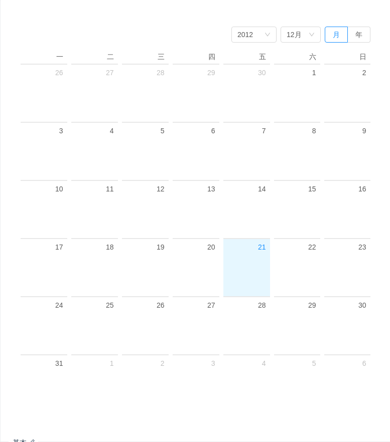
基本
一个通用的日历面板,支持年/月切换。
import { Component } from '@angular/core';@Component({selector: 'nz-demo-calendar-basic',template: `<nz-calendar [(ngModel)]="date" [(nzMode)]="mode" (nzPanelChange)="panelChange($event)"></nz-calendar>`})export class NzDemoCalendarBasicComponent {date = new Date(2012, 11, 21);mode = 'month';panelChange(change: { date: Date; mode: string }): void {console.log(change.date, change.mode);}}
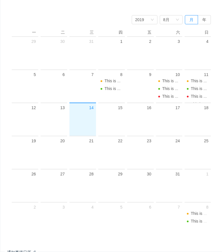
通知事项日历
一个复杂的应用示例,用 dateCell 和 monthCell 模版来自定义需要渲染的数据。
import { Component } from '@angular/core';@Component({selector: 'nz-demo-calendar-notice-calendar',template: `<nz-calendar><ul *nzDateCell="let date" class="events"><ng-container [ngSwitch]="date.getDate()"><ng-container *ngSwitchCase="8"><li *ngFor="let item of listDataMap.eight"><nz-badge [nzStatus]="item.type" [nzText]="item.content"></nz-badge></li></ng-container><ng-container *ngSwitchCase="10"><li *ngFor="let item of listDataMap.ten"><nz-badge [nzStatus]="item.type" [nzText]="item.content"></nz-badge></li></ng-container><ng-container *ngSwitchCase="11"><li *ngFor="let item of listDataMap.eleven"><nz-badge [nzStatus]="item.type" [nzText]="item.content"></nz-badge></li></ng-container></ng-container></ul><ng-container *nzMonthCell="let month"><div *ngIf="getMonthData(month) as monthData" class="notes-month"><section>{{ monthData }}</section><span>Backlog number</span></div></ng-container></nz-calendar>`,styles: [`.events {list-style: none;margin: 0;padding: 0;}.events .ant-badge-status {overflow: hidden;white-space: nowrap;width: 100%;text-overflow: ellipsis;font-size: 12px;}.notes-month {text-align: center;font-size: 28px;}.notes-month section {font-size: 28px;}`]})export class NzDemoCalendarNoticeCalendarComponent {listDataMap = {eight: [{ type: 'warning', content: 'This is warning event.' },{ type: 'success', content: 'This is usual event.' }],ten: [{ type: 'warning', content: 'This is warning event.' },{ type: 'success', content: 'This is usual event.' },{ type: 'error', content: 'This is error event.' }],eleven: [{ type: 'warning', content: 'This is warning event' },{ type: 'success', content: 'This is very long usual event........' },{ type: 'error', content: 'This is error event 1.' },{ type: 'error', content: 'This is error event 2.' },{ type: 'error', content: 'This is error event 3.' },{ type: 'error', content: 'This is error event 4.' }]};getMonthData(date: Date): number | null {if (date.getMonth() === 8) {return 1394;}return null;}}
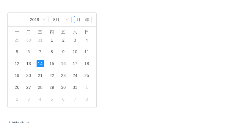
卡片模式
用于嵌套在空间有限的容器中。
import { Component } from '@angular/core';@Component({selector: 'nz-demo-calendar-card',template: `<div [ngStyle]="{ width: '300px', border: '1px solid #d9d9d9', borderRadius: '4px' }"><nz-calendarnzCard(nzSelectChange)="onValueChange($event)"(nzPanelChange)="onPanelChange($event)"></nz-calendar></div>`})export class NzDemoCalendarCardComponent {onValueChange(value: Date): void {console.log(`Current value: ${value}`);}onPanelChange(change: { date: Date; mode: string }): void {console.log(`Current value: ${change.date}`);console.log(`Current mode: ${change.mode}`);}}
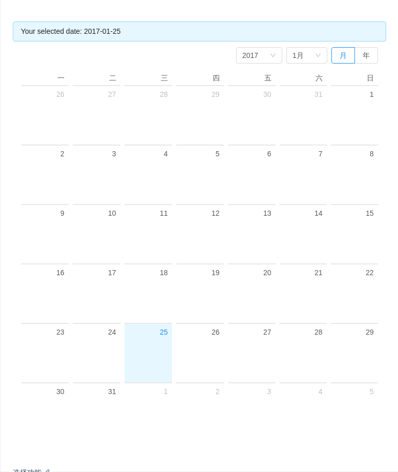
选择功能
一个通用的日历面板,支持年/月切换。
import { Component } from '@angular/core';@Component({selector: 'nz-demo-calendar-select',template: `<nz-alert nzMessage="Your selected date: {{ selectedValue | date: 'yyyy-MM-dd' }}"></nz-alert><nz-calendar [(ngModel)]="selectedValue" (nzSelectChange)="selectChange($event)"></nz-calendar>`})export class NzDemoCalendarSelectComponent {selectedValue = new Date('2017-01-25');selectChange(select: Date): void {console.log(`Select value: ${select}`);}}
API
注意:Calendar 的部分 locale 来自于 Angular 自身的国际化支持,需要在 app.module.ts 文件中 引入相应的 Angular 语言包。
例如:
import { registerLocaleData } from '@angular/common';import zh from '@angular/common/locales/zh';registerLocaleData(zh);
<nz-calendar[nzDateCell]="dateCellTpl"[(ngModel)]="selectedDate"[(nzMode)]="mode"(nzPanelChange)="panelChange($event)"(nzSelectChange)="selectChange($event)"><!-- 定义 Cell 的另一种方式 --><div *dateCell>Foo</div></nz-calendar><!-- 传入 TemplateRef 的方式 --><ng-template #dateCellTpl let-date><span>{{ date | date:'d'}}</span></ng-template>
nz-calendarcomponent
| 参数 | 说明 | 类型 | 默认值 |
|---|---|---|---|
[(ngModel)] | (可双向绑定)展示日期 | Date | 当前日期 |
[(nzMode)] | (可双向绑定)显示模式 | 'month' | 'year' | 'month' |
[nzFullscreen] | 是否全屏显示 | boolean | true |
[nzCard] | 是否不全屏显示 | boolean | false |
[nzDateCell] | (可作为内容)自定义渲染日期单元格,模版内容会被追加到单元格 | TemplateRef<Date> | - |
[nzDateFullCell] | (可作为内容)自定义渲染日期单元格,模版内容覆盖单元格 | TemplateRef<Date> | - |
[nzMonthCell] | (可作为内容)自定义渲染月单元格,模版内容会被追加到单元格 | TemplateRef<Date> | - |
[nzMonthFullCell] | (可作为内容)自定义渲染月单元格,模版内容覆盖单元格 | TemplateRef<Date> | - |
(nzPanelChange) | 面板变化的回调 | EventEmitter<{ date: Date, mode: 'month' | 'year' }> | - |
(nzSelectChange) | 选择日期的回调 | EventEmitter<Date> | - |
