 我的书签
我的书签
 添加书签
添加书签 移除书签
移除书签- Popconfirm气泡确认框
- 何时使用
- 单独引入此组件
- 代码演示
- API
- [nz-popconfirm]directive
- 注意
Popconfirm气泡确认框
点击元素,弹出气泡式的确认框。
何时使用
目标元素的操作需要用户进一步的确认时,在目标元素附近弹出浮层提示,询问用户。
和 confirm 弹出的全屏居中模态对话框相比,交互形式更轻量。
单独引入此组件
想要了解更多关于单独引入组件的内容,可以在快速上手页面进行查看。
import { NzPopconfirmModule } from 'ng-zorro-antd/popconfirm';
代码演示

基本
最简单的用法。
import { Component } from '@angular/core';import { NzMessageService } from 'ng-zorro-antd/message';@Component({selector: 'nz-demo-popconfirm-basic',template: `<anz-popconfirmnzPopconfirmTitle="Are you sure delete this task?"nzPopconfirmPlacement="bottom"(nzOnConfirm)="confirm()"(nzOnCancel)="cancel()">Delete</a>`})export class NzDemoPopconfirmBasicComponent {cancel(): void {this.nzMessageService.info('click cancel');}confirm(): void {this.nzMessageService.info('click confirm');}constructor(private nzMessageService: NzMessageService) {}}
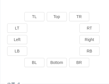
位置
位置有十二个方向。如需箭头指向目标元素中心,可以设置 arrowPointAtCenter。
import { Component } from '@angular/core';import { NzMessageService } from 'ng-zorro-antd/message';@Component({selector: 'nz-demo-popconfirm-placement',template: `<div style="margin-left: 60px"><buttonnz-popconfirmnzPopconfirmTitle="Are you sure delete this task?"(nzOnConfirm)="confirm()"(nzOnCancel)="cancel()"nzPopconfirmPlacement="topLeft"nz-button>TL</button><buttonnz-popconfirmnzPopconfirmTitle="Are you sure delete this task?"(nzOnConfirm)="confirm()"(nzOnCancel)="cancel()"nzPopconfirmPlacement="top"nz-button>Top</button><buttonnz-popconfirmnzPopconfirmTitle="Are you sure delete this task?"(nzOnConfirm)="confirm()"(nzOnCancel)="cancel()"nzPopconfirmPlacement="topRight"nz-button>TR</button></div><div style="width: 60px; float: left;"><buttonnz-popconfirmnzPopconfirmTitle="Are you sure delete this task?"(nzOnConfirm)="confirm()"(nzOnCancel)="cancel()"nzPopconfirmPlacement="leftTop"nz-button>LT</button><buttonnz-popconfirmnzPopconfirmTitle="Are you sure delete this task?"(nzOnConfirm)="confirm()"(nzOnCancel)="cancel()"nzPopconfirmPlacement="left"nz-button>Left</button><buttonnz-popconfirmnzPopconfirmTitle="Are you sure delete this task?"(nzOnConfirm)="confirm()"(nzOnCancel)="cancel()"nzPopconfirmPlacement="leftBottom"nz-button>LB</button></div><div style="width: 60px; margin-left: 252px;"><buttonnz-popconfirmnzPopconfirmTitle="Are you sure delete this task?"(nzOnConfirm)="confirm()"(nzOnCancel)="cancel()"nzPopconfirmPlacement="rightTop"nz-button>RT</button><buttonnz-popconfirmnzPopconfirmTitle="Are you sure delete this task?"(nzOnConfirm)="confirm()"(nzOnCancel)="cancel()"nzPopconfirmPlacement="right"nz-button>Right</button><buttonnz-popconfirmnzPopconfirmTitle="Are you sure delete this task?"(nzOnConfirm)="confirm()"(nzOnCancel)="cancel()"nzPopconfirmPlacement="rightBottom"nz-button>RB</button></div><div style="margin-left: 60px; clear: both;"><buttonnz-popconfirmnzPopconfirmTitle="Are you sure delete this task?"(nzOnConfirm)="confirm()"(nzOnCancel)="cancel()"nzPopconfirmPlacement="bottomLeft"nz-button>BL</button><buttonnz-popconfirmnzPopconfirmTitle="Are you sure delete this task?"(nzOnConfirm)="confirm()"(nzOnCancel)="cancel()"nzPopconfirmPlacement="bottom"nz-button>Bottom</button><buttonnz-popconfirmnzPopconfirmTitle="Are you sure delete this task?"(nzOnConfirm)="confirm()"(nzOnCancel)="cancel()"nzPopconfirmPlacement="bottomRight"nz-button>BR</button></div>`,styles: [`button {margin-right: 8px;margin-bottom: 8px;width: 70px;text-align: center;padding: 0;}`]})export class NzDemoPopconfirmPlacementComponent {cancel(): void {this.nzMessageService.info('click cancel');}confirm(): void {this.nzMessageService.info('click confirm');}constructor(private nzMessageService: NzMessageService) {}}

自定义 icon 图标
使用 nzIcon 自定义提示图标。
import { Component } from '@angular/core';@Component({selector: 'nz-demo-popconfirm-custom-icon',template: `<a nz-popconfirm nzPopconfirmTitle="Are you sure?" [nzIcon]="iconTpl">Delete</a><ng-template #iconTpl><i nz-icon nzType="question-circle-o" style="color: red;"></i></ng-template>`})export class NzDemoPopconfirmCustomIconComponent {}
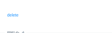
国际化
使用 okText 和 cancelText 自定义按钮文字。
import { Component } from '@angular/core';import { NzMessageService } from 'ng-zorro-antd/message';@Component({selector: 'nz-demo-popconfirm-locale',template: `<anz-popconfirmnzPopconfirmTitle="Are you sure?"nzOkText="ok"nzCancelText="cancel"(nzOnConfirm)="confirm()"(nzOnCancel)="cancel()">delete</a>`})export class NzDemoPopconfirmLocaleComponent {cancel(): void {this.nzMessageService.info('click cancel');}confirm(): void {this.nzMessageService.info('click confirm');}constructor(private nzMessageService: NzMessageService) {}}

条件触发
可以判断是否需要弹出。
import { Component } from '@angular/core';import { NzMessageService } from 'ng-zorro-antd/message';@Component({selector: 'nz-demo-popconfirm-dynamic-trigger',template: `<anz-popconfirmnzPopconfirmTitle="Are you sure delete this task?"[nzCondition]="switchValue"(nzOnConfirm)="confirm()"(nzOnCancel)="cancel()">Delete a task</a><br /><br />Whether directly execute:<nz-switch [(ngModel)]="switchValue"></nz-switch>`})export class NzDemoPopconfirmDynamicTriggerComponent {switchValue = false;cancel(): void {this.nzMessageService.info('click cancel');}confirm(): void {this.nzMessageService.info('click confirm');}constructor(private nzMessageService: NzMessageService) {}}
API
[nz-popconfirm]directive
| 参数 | 说明 | 类型 | 默认值 |
|---|---|---|---|
[nzPopconfirmTitle] | 确认框的描述 | string | TemplateRef<void> | - |
[nzPopconfirmTrigger] | 触发行为 | 'click' | 'focus' | 'hover' | 'hover' |
[nzPopconfirmPlacement] | 气泡框位置 | 'top' | 'left' | 'right' | 'bottom' | 'topLeft' | 'topRight' | 'bottomLeft' | 'bottomRight' | 'leftTop' | 'leftBottom' | 'rightTop' | 'rightBottom' | 'top' |
[nzCancelText] | 取消按钮文字 | string | '取消' |
[nzOkText] | 确认按钮文字 | string | '确定' |
[nzOkType] | 确认按钮类型 | 'primary' | 'ghost' | 'dashed' | 'danger' | 'default' | 'primary' |
[nzCondition] | 是否直接触发 nzOnConfirm 而不弹出框 | boolean | false |
[nzIcon] | 自定义弹出框的 icon | string | TemplateRef<void> | - |
(nzOnCancel) | 点击取消的回调 | EventEmitter<void> | - |
(nzOnConfirm) | 点击确认的回调 | EventEmitter<void> | - |
更多属性请参考 Tooltip。
注意
请确保 nz-popconfirm 的子元素能接受 onMouseEnter、onMouseLeave、onFocus、onClick 事件。
