- Shadows
- Examples
- Examples
Shadows
Add or remove shadows to elements with box-shadow utilities.
Examples
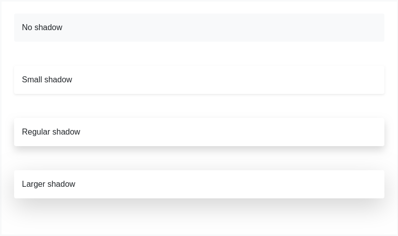
While shadows on components are disabled by default in Bootstrap and can be enabled via $enable-shadows, you can also quickly add or remove a shadow with our box-shadow utility classes. Includes support for .shadow-none and three default sizes (which have associated variables to match).

<div class="shadow-none p-3 mb-5 bg-light rounded">No shadow</div><div class="shadow-sm p-3 mb-5 bg-white rounded">Small shadow</div><div class="shadow p-3 mb-5 bg-white rounded">Regular shadow</div><div class="shadow-lg p-3 mb-5 bg-white rounded">Larger shadow</div>
