- Dropdowns
- Overview
- Accessibility
- Examples
- Single button
- Split button
- Sizing
- Directions
- Dropup
- Dropright
- Dropleft
- Menu items
- Active
- Disabled
- Menu alignment
- Responsive alignment
- Menu content
- Headers
- Dividers
- Text
- Forms
- Dropdown options
- Usage
- Via data attributes
- Via JavaScript
- data-toggle="dropdown" still required
- Options
- Methods
- Events
Dropdowns
Toggle contextual overlays for displaying lists of links and more with the Bootstrap dropdown plugin.
Overview
Dropdowns are toggleable, contextual overlays for displaying lists of links and more. They’re made interactive with the included Bootstrap dropdown JavaScript plugin. They’re toggled by clicking, not by hovering; this is an intentional design decision.
Dropdowns are built on a third party library, Popper.js, which provides dynamic positioning and viewport detection. Be sure to include popper.min.js before Bootstrap’s JavaScript or use bootstrap.bundle.min.js / bootstrap.bundle.js which contains Popper.js. Popper.js isn’t used to position dropdowns in navbars though as dynamic positioning isn’t required.
If you’re building our JavaScript from source, it requires util.js.
Accessibility
The WAIARIA standard defines an actual role="menu" widget, but this is specific to application-like menus which trigger actions or functions. ARIA menus can only contain menu items, checkbox menu items, radio button menu items, radio button groups, and sub-menus.
Bootstrap’s dropdowns, on the other hand, are designed to be generic and applicable to a variety of situations and markup structures. For instance, it is possible to create dropdowns that contain additional inputs and form controls, such as search fields or login forms. For this reason, Bootstrap does not expect (nor automatically add) any of the role and aria- attributes required for true ARIA menus. Authors will have to include these more specific attributes themselves.
However, Bootstrap does add built-in support for most standard keyboard menu interactions, such as the ability to move through individual .dropdown-item elements using the cursor keys and close the menu with the ESC key.
Examples
Wrap the dropdown’s toggle (your button or link) and the dropdown menu within .dropdown, or another element that declares position: relative;. Dropdowns can be triggered from <a> or <button> elements to better fit your potential needs.
Single button
Any single .btn can be turned into a dropdown toggle with some markup changes. Here’s how you can put them to work with either <button> elements:

<div class="dropdown"><button class="btn btn-secondary dropdown-toggle" type="button" id="dropdownMenuButton" data-toggle="dropdown" aria-haspopup="true" aria-expanded="false">Dropdown button</button><div class="dropdown-menu" aria-labelledby="dropdownMenuButton"><a class="dropdown-item" href="#">Action</a><a class="dropdown-item" href="#">Another action</a><a class="dropdown-item" href="#">Something else here</a></div></div>
And with <a> elements:

<div class="dropdown"><a class="btn btn-secondary dropdown-toggle" href="#" role="button" id="dropdownMenuLink" data-toggle="dropdown" aria-haspopup="true" aria-expanded="false">Dropdown link</a><div class="dropdown-menu" aria-labelledby="dropdownMenuLink"><a class="dropdown-item" href="#">Action</a><a class="dropdown-item" href="#">Another action</a><a class="dropdown-item" href="#">Something else here</a></div></div>
The best part is you can do this with any button variant, too:

<!-- Example single danger button --><div class="btn-group"><button type="button" class="btn btn-danger dropdown-toggle" data-toggle="dropdown" aria-haspopup="true" aria-expanded="false">Action</button><div class="dropdown-menu"><a class="dropdown-item" href="#">Action</a><a class="dropdown-item" href="#">Another action</a><a class="dropdown-item" href="#">Something else here</a><div class="dropdown-divider"></div><a class="dropdown-item" href="#">Separated link</a></div></div>
Split button
Similarly, create split button dropdowns with virtually the same markup as single button dropdowns, but with the addition of .dropdown-toggle-split for proper spacing around the dropdown caret.
We use this extra class to reduce the horizontal padding on either side of the caret by 25% and remove the margin-left that’s added for regular button dropdowns. Those extra changes keep the caret centered in the split button and provide a more appropriately sized hit area next to the main button.

<!-- Example split danger button --><div class="btn-group"><button type="button" class="btn btn-danger">Action</button><button type="button" class="btn btn-danger dropdown-toggle dropdown-toggle-split" data-toggle="dropdown" aria-haspopup="true" aria-expanded="false"><span class="sr-only">Toggle Dropdown</span></button><div class="dropdown-menu"><a class="dropdown-item" href="#">Action</a><a class="dropdown-item" href="#">Another action</a><a class="dropdown-item" href="#">Something else here</a><div class="dropdown-divider"></div><a class="dropdown-item" href="#">Separated link</a></div></div>
Sizing
Button dropdowns work with buttons of all sizes, including default and split dropdown buttons.

<!-- Large button groups (default and split) --><div class="btn-group"><button class="btn btn-secondary btn-lg dropdown-toggle" type="button" data-toggle="dropdown" aria-haspopup="true" aria-expanded="false">Large button</button><div class="dropdown-menu">...</div></div><div class="btn-group"><button class="btn btn-secondary btn-lg" type="button">Large split button</button><button type="button" class="btn btn-lg btn-secondary dropdown-toggle dropdown-toggle-split" data-toggle="dropdown" aria-haspopup="true" aria-expanded="false"><span class="sr-only">Toggle Dropdown</span></button><div class="dropdown-menu">...</div></div><!-- Small button groups (default and split) --><div class="btn-group"><button class="btn btn-secondary btn-sm dropdown-toggle" type="button" data-toggle="dropdown" aria-haspopup="true" aria-expanded="false">Small button</button><div class="dropdown-menu">...</div></div><div class="btn-group"><button class="btn btn-secondary btn-sm" type="button">Small split button</button><button type="button" class="btn btn-sm btn-secondary dropdown-toggle dropdown-toggle-split" data-toggle="dropdown" aria-haspopup="true" aria-expanded="false"><span class="sr-only">Toggle Dropdown</span></button><div class="dropdown-menu">...</div></div>
Directions
Dropup
Trigger dropdown menus above elements by adding .dropup to the parent element.

<!-- Default dropup button --><div class="btn-group dropup"><button type="button" class="btn btn-secondary dropdown-toggle" data-toggle="dropdown" aria-haspopup="true" aria-expanded="false">Dropup</button><div class="dropdown-menu"><!-- Dropdown menu links --></div></div><!-- Split dropup button --><div class="btn-group dropup"><button type="button" class="btn btn-secondary">Split dropup</button><button type="button" class="btn btn-secondary dropdown-toggle dropdown-toggle-split" data-toggle="dropdown" aria-haspopup="true" aria-expanded="false"><span class="sr-only">Toggle Dropdown</span></button><div class="dropdown-menu"><!-- Dropdown menu links --></div></div>
Dropright
Trigger dropdown menus at the right of the elements by adding .dropright to the parent element.

<!-- Default dropright button --><div class="btn-group dropright"><button type="button" class="btn btn-secondary dropdown-toggle" data-toggle="dropdown" aria-haspopup="true" aria-expanded="false">Dropright</button><div class="dropdown-menu"><!-- Dropdown menu links --></div></div><!-- Split dropright button --><div class="btn-group dropright"><button type="button" class="btn btn-secondary">Split dropright</button><button type="button" class="btn btn-secondary dropdown-toggle dropdown-toggle-split" data-toggle="dropdown" aria-haspopup="true" aria-expanded="false"><span class="sr-only">Toggle Dropright</span></button><div class="dropdown-menu"><!-- Dropdown menu links --></div></div>
Dropleft
Trigger dropdown menus at the left of the elements by adding .dropleft to the parent element.

<!-- Default dropleft button --><div class="btn-group dropleft"><button type="button" class="btn btn-secondary dropdown-toggle" data-toggle="dropdown" aria-haspopup="true" aria-expanded="false">Dropleft</button><div class="dropdown-menu"><!-- Dropdown menu links --></div></div><!-- Split dropleft button --><div class="btn-group"><div class="btn-group dropleft" role="group"><button type="button" class="btn btn-secondary dropdown-toggle dropdown-toggle-split" data-toggle="dropdown" aria-haspopup="true" aria-expanded="false"><span class="sr-only">Toggle Dropleft</span></button><div class="dropdown-menu"><!-- Dropdown menu links --></div></div><button type="button" class="btn btn-secondary">Split dropleft</button></div>
Menu items
Historically dropdown menu contents had to be links, but that’s no longer the case with v4. Now you can optionally use <button> elements in your dropdowns instead of just <a>s.

<div class="dropdown"><button class="btn btn-secondary dropdown-toggle" type="button" id="dropdownMenu2" data-toggle="dropdown" aria-haspopup="true" aria-expanded="false">Dropdown</button><div class="dropdown-menu" aria-labelledby="dropdownMenu2"><button class="dropdown-item" type="button">Action</button><button class="dropdown-item" type="button">Another action</button><button class="dropdown-item" type="button">Something else here</button></div></div>
You can also create non-interactive dropdown items with .dropdown-item-text. Feel free to style further with custom CSS or text utilities.

<div class="dropdown-menu"><span class="dropdown-item-text">Dropdown item text</span><a class="dropdown-item" href="#">Action</a><a class="dropdown-item" href="#">Another action</a><a class="dropdown-item" href="#">Something else here</a></div>
Active
Add .active to items in the dropdown to style them as active.

<div class="dropdown-menu"><a class="dropdown-item" href="#">Regular link</a><a class="dropdown-item active" href="#">Active link</a><a class="dropdown-item" href="#">Another link</a></div>
Disabled
Add .disabled to items in the dropdown to style them as disabled.

<div class="dropdown-menu"><a class="dropdown-item" href="#">Regular link</a><a class="dropdown-item disabled" href="#" tabindex="-1" aria-disabled="true">Disabled link</a><a class="dropdown-item" href="#">Another link</a></div>
Menu alignment
By default, a dropdown menu is automatically positioned 100% from the top and along the left side of its parent. Add .dropdown-menu-right to a .dropdown-menu to right align the dropdown menu.
Heads up! Dropdowns are positioned thanks to Popper.js (except when they are contained in a navbar).

<div class="btn-group"><button type="button" class="btn btn-secondary dropdown-toggle" data-toggle="dropdown" aria-haspopup="true" aria-expanded="false">Right-aligned menu</button><div class="dropdown-menu dropdown-menu-right"><button class="dropdown-item" type="button">Action</button><button class="dropdown-item" type="button">Another action</button><button class="dropdown-item" type="button">Something else here</button></div></div>
Responsive alignment
If you want to use responsive alignment, disable dynamic positioning by adding the data-display="static" attribute and use the responsive variation classes.
To align right the dropdown menu with the given breakpoint or larger, add .dropdown-menu{-sm|-md|-lg|-xl}-right.

<div class="btn-group"><button type="button" class="btn btn-secondary dropdown-toggle" data-toggle="dropdown" data-display="static" aria-haspopup="true" aria-expanded="false">Left-aligned but right aligned when large screen</button><div class="dropdown-menu dropdown-menu-lg-right"><button class="dropdown-item" type="button">Action</button><button class="dropdown-item" type="button">Another action</button><button class="dropdown-item" type="button">Something else here</button></div></div>
To align left the dropdown menu with the given breakpoint or larger, add .dropdown-menu-right and .dropdown-menu{-sm|-md|-lg|-xl}-left.

<div class="btn-group"><button type="button" class="btn btn-secondary dropdown-toggle" data-toggle="dropdown" data-display="static" aria-haspopup="true" aria-expanded="false">Right-aligned but left aligned when large screen</button><div class="dropdown-menu dropdown-menu-right dropdown-menu-lg-left"><button class="dropdown-item" type="button">Action</button><button class="dropdown-item" type="button">Another action</button><button class="dropdown-item" type="button">Something else here</button></div></div>
Note that you don’t need to add a data-display="static" attribute to dropdown buttons in navbars, since Popper.js isn’t used in navbars.
Menu content
Headers
Add a header to label sections of actions in any dropdown menu.

<div class="dropdown-menu"><h6 class="dropdown-header">Dropdown header</h6><a class="dropdown-item" href="#">Action</a><a class="dropdown-item" href="#">Another action</a></div>
Dividers
Separate groups of related menu items with a divider.

<div class="dropdown-menu"><a class="dropdown-item" href="#">Action</a><a class="dropdown-item" href="#">Another action</a><a class="dropdown-item" href="#">Something else here</a><div class="dropdown-divider"></div><a class="dropdown-item" href="#">Separated link</a></div>
Text
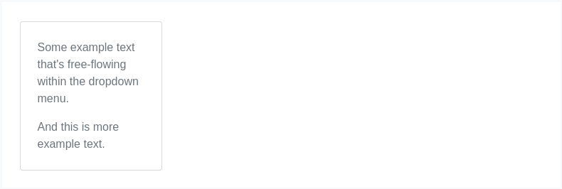
Place any freeform text within a dropdown menu with text and use spacing utilities. Note that you’ll likely need additional sizing styles to constrain the menu width.

<div class="dropdown-menu p-4 text-muted" style="max-width: 200px;"><p>Some example text that's free-flowing within the dropdown menu.</p><p class="mb-0">And this is more example text.</p></div>
Forms
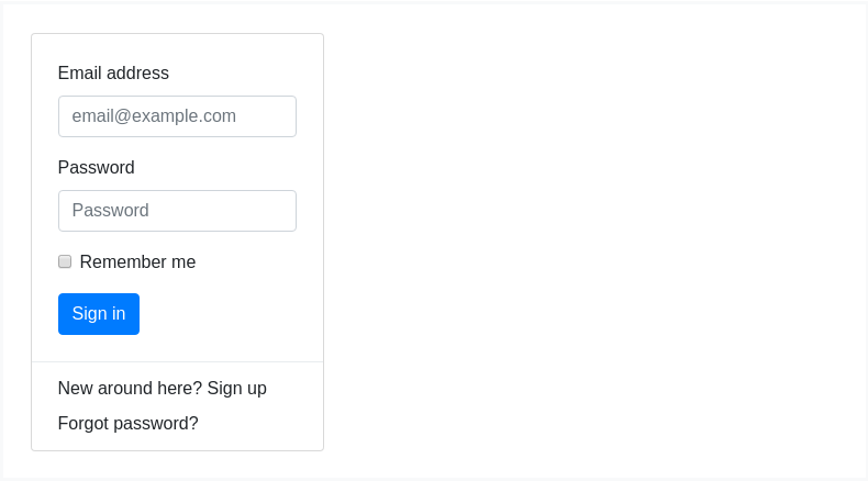
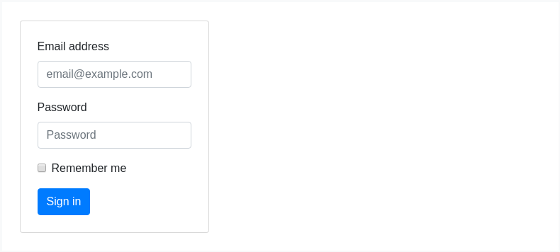
Put a form within a dropdown menu, or make it into a dropdown menu, and use margin or padding utilities to give it the negative space you require.

<div class="dropdown-menu"><form class="px-4 py-3"><div class="form-group"><label for="exampleDropdownFormEmail1">Email address</label><input type="email" class="form-control" id="exampleDropdownFormEmail1" placeholder="email@example.com"></div><div class="form-group"><label for="exampleDropdownFormPassword1">Password</label><input type="password" class="form-control" id="exampleDropdownFormPassword1" placeholder="Password"></div><div class="form-group"><div class="form-check"><input type="checkbox" class="form-check-input" id="dropdownCheck"><label class="form-check-label" for="dropdownCheck">Remember me</label></div></div><button type="submit" class="btn btn-primary">Sign in</button></form><div class="dropdown-divider"></div><a class="dropdown-item" href="#">New around here? Sign up</a><a class="dropdown-item" href="#">Forgot password?</a></div>

<form class="dropdown-menu p-4"><div class="form-group"><label for="exampleDropdownFormEmail2">Email address</label><input type="email" class="form-control" id="exampleDropdownFormEmail2" placeholder="email@example.com"></div><div class="form-group"><label for="exampleDropdownFormPassword2">Password</label><input type="password" class="form-control" id="exampleDropdownFormPassword2" placeholder="Password"></div><div class="form-group"><div class="form-check"><input type="checkbox" class="form-check-input" id="dropdownCheck2"><label class="form-check-label" for="dropdownCheck2">Remember me</label></div></div><button type="submit" class="btn btn-primary">Sign in</button></form>
Dropdown options
Use data-offset or data-reference to change the location of the dropdown.

<div class="d-flex"><div class="dropdown mr-1"><button type="button" class="btn btn-secondary dropdown-toggle" id="dropdownMenuOffset" data-toggle="dropdown" aria-haspopup="true" aria-expanded="false" data-offset="10,20">Offset</button><div class="dropdown-menu" aria-labelledby="dropdownMenuOffset"><a class="dropdown-item" href="#">Action</a><a class="dropdown-item" href="#">Another action</a><a class="dropdown-item" href="#">Something else here</a></div></div><div class="btn-group"><button type="button" class="btn btn-secondary">Reference</button><button type="button" class="btn btn-secondary dropdown-toggle dropdown-toggle-split" id="dropdownMenuReference" data-toggle="dropdown" aria-haspopup="true" aria-expanded="false" data-reference="parent"><span class="sr-only">Toggle Dropdown</span></button><div class="dropdown-menu" aria-labelledby="dropdownMenuReference"><a class="dropdown-item" href="#">Action</a><a class="dropdown-item" href="#">Another action</a><a class="dropdown-item" href="#">Something else here</a><div class="dropdown-divider"></div><a class="dropdown-item" href="#">Separated link</a></div></div></div>
Usage
Via data attributes or JavaScript, the dropdown plugin toggles hidden content (dropdown menus) by toggling the .show class on the parent list item. The data-toggle="dropdown" attribute is relied on for closing dropdown menus at an application level, so it’s a good idea to always use it.
On touch-enabled devices, opening a dropdown adds empty ($.noop) mouseover handlers to the immediate children of the <body> element. This admittedly ugly hack is necessary to work around a quirk in iOS’ event delegation, which would otherwise prevent a tap anywhere outside of the dropdown from triggering the code that closes the dropdown. Once the dropdown is closed, these additional empty mouseover handlers are removed.
Via data attributes
Add data-toggle="dropdown" to a link or button to toggle a dropdown.
<div class="dropdown"><button id="dLabel" type="button" data-toggle="dropdown" aria-haspopup="true" aria-expanded="false">Dropdown trigger</button><div class="dropdown-menu" aria-labelledby="dLabel">...</div></div>
Via JavaScript
Call the dropdowns via JavaScript:
$('.dropdown-toggle').dropdown()
data-toggle="dropdown" still required
Regardless of whether you call your dropdown via JavaScript or instead use the data-api, data-toggle="dropdown" is always required to be present on the dropdown’s trigger element.
Options
Options can be passed via data attributes or JavaScript. For data attributes, append the option name to data-, as in data-offset="".
| Name | Type | Default | Description |
|---|---|---|---|
| offset | number | string | function | 0 | Offset of the dropdown relative to its target.When a function is used to determine the offset, it is called with an object containing the offset data as its first argument. The function must return an object with the same structure. The triggering element DOM node is passed as the second argument.For more information refer to Popper.js's offset docs. |
| flip | boolean | true | Allow Dropdown to flip in case of an overlapping on the reference element. For more information refer to Popper.js's flip docs. |
| boundary | string | element | 'scrollParent' | Overflow constraint boundary of the dropdown menu. Accepts the values of 'viewport', 'window', 'scrollParent', or an HTMLElement reference (JavaScript only). For more information refer to Popper.js's preventOverflow docs. |
| reference | string | element | 'toggle' | Reference element of the dropdown menu. Accepts the values of 'toggle', 'parent', or an HTMLElement reference. For more information refer to Popper.js's referenceObject docs. |
| display | string | 'dynamic' | By default, we use Popper.js for dynamic positioning. Disable this with static. |
| popperConfig | null | object | null | To change Bootstrap's default Popper.js config, see Popper.js's configuration |
Note when boundary is set to any value other than 'scrollParent', the style position: static is applied to the .dropdown container.
Methods
| Method | Description |
|---|---|
$().dropdown('toggle') | Toggles the dropdown menu of a given navbar or tabbed navigation. |
$().dropdown('show') | Shows the dropdown menu of a given navbar or tabbed navigation. |
$().dropdown('hide') | Hides the dropdown menu of a given navbar or tabbed navigation. |
$().dropdown('update') | Updates the position of an element’s dropdown. |
$().dropdown('dispose') | Destroys an element’s dropdown. |
Events
All dropdown events are fired at the .dropdown-menu’s parent element and have a relatedTarget property, whose value is the toggling anchor element.hide.bs.dropdown and hidden.bs.dropdown events have a clickEvent property (only when the original event type is click) that contains an Event Object for the click event.
| Event | Description |
|---|---|
show.bs.dropdown | This event fires immediately when the show instance method is called. |
shown.bs.dropdown | This event is fired when the dropdown has been made visible to the user (will wait for CSS transitions, to complete). |
hide.bs.dropdown | This event is fired immediately when the hide instance method has been called. |
hidden.bs.dropdown | This event is fired when the dropdown has finished being hidden from the user (will wait for CSS transitions, to complete). |
$('#myDropdown').on('show.bs.dropdown', function () {// do something...})
