- Alerts
- Examples
- Conveying meaning to assistive technologies
- Examples
- Link color
- Additional content
- Dismissing
- JavaScript behavior
- Triggers
- Methods
- Events
Alerts
Provide contextual feedback messages for typical user actions with the handful of available and flexible alert messages.
Examples
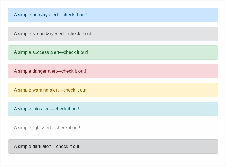
Alerts are available for any length of text, as well as an optional dismiss button. For proper styling, use one of the eight required contextual classes (e.g., .alert-success). For inline dismissal, use the alerts jQuery plugin.

<div class="alert alert-primary" role="alert">A simple primary alert—check it out!</div><div class="alert alert-secondary" role="alert">A simple secondary alert—check it out!</div><div class="alert alert-success" role="alert">A simple success alert—check it out!</div><div class="alert alert-danger" role="alert">A simple danger alert—check it out!</div><div class="alert alert-warning" role="alert">A simple warning alert—check it out!</div><div class="alert alert-info" role="alert">A simple info alert—check it out!</div><div class="alert alert-light" role="alert">A simple light alert—check it out!</div><div class="alert alert-dark" role="alert">A simple dark alert—check it out!</div>
Conveying meaning to assistive technologies
Using color to add meaning only provides a visual indication, which will not be conveyed to users of assistive technologies – such as screen readers. Ensure that information denoted by the color is either obvious from the content itself (e.g. the visible text), or is included through alternative means, such as additional text hidden with the .sr-only class.
Link color
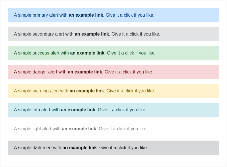
Use the .alert-link utility class to quickly provide matching colored links within any alert.

<div class="alert alert-primary" role="alert">
  A simple primary alert with <a href="#" class="alert-link">an example link</a>. Give it a click if you like.
</div>
<div class="alert alert-secondary" role="alert">
  A simple secondary alert with <a href="#" class="alert-link">an example link</a>. Give it a click if you like.
</div>
<div class="alert alert-success" role="alert">
  A simple success alert with <a href="#" class="alert-link">an example link</a>. Give it a click if you like.
</div>
<div class="alert alert-danger" role="alert">
  A simple danger alert with <a href="#" class="alert-link">an example link</a>. Give it a click if you like.
</div>
<div class="alert alert-warning" role="alert">
  A simple warning alert with <a href="#" class="alert-link">an example link</a>. Give it a click if you like.
</div>
<div class="alert alert-info" role="alert">
  A simple info alert with <a href="#" class="alert-link">an example link</a>. Give it a click if you like.
</div>
<div class="alert alert-light" role="alert">
  A simple light alert with <a href="#" class="alert-link">an example link</a>. Give it a click if you like.
</div>
<div class="alert alert-dark" role="alert">
  A simple dark alert with <a href="#" class="alert-link">an example link</a>. Give it a click if you like.
</div>
Additional content
Alerts can also contain additional HTML elements like headings, paragraphs and dividers.

<div class="alert alert-success" role="alert">
  <h4 class="alert-heading">Well done!</h4>
  <p>Aww yeah, you successfully read this important alert message. This example text is going to run a bit longer so that you can see how spacing within an alert works with this kind of content.</p>
  <hr>
  <p class="mb-0">Whenever you need to, be sure to use margin utilities to keep things nice and tidy.</p>
</div>
Dismissing
Using the alert JavaScript plugin, it’s possible to dismiss any alert inline. Here’s how:
- Be sure you’ve loaded the alert plugin, or the compiled Bootstrap JavaScript.
- If you’re building our JavaScript from source, it requires
util.js. The compiled version includes this. - Add a dismiss button and the
.alert-dismissibleclass, which adds extra padding to the right of the alert and positions the.closebutton. - On the dismiss button, add the
data-dismiss="alert"attribute, which triggers the JavaScript functionality. Be sure to use the<button>element with it for proper behavior across all devices. - To animate alerts when dismissing them, be sure to add the
.fadeand.showclasses.You can see this in action with a live demo:

<div class="alert alert-warning alert-dismissible fade show" role="alert">
<strong>Holy guacamole!</strong> You should check in on some of those fields below.
<button type="button" class="close" data-dismiss="alert" aria-label="Close">
<span aria-hidden="true">×</span>
</button>
</div>JavaScript behavior
Triggers
Enable dismissal of an alert via JavaScript:
$('.alert').alert()Or with data attributes on a button within the alert, as demonstrated above:
<button type="button" class="close" data-dismiss="alert" aria-label="Close">
<span aria-hidden="true">×</span>
</button>Note that closing an alert will remove it from the DOM.
Methods
| Method | Description |
|---|---|
$().alert() | Makes an alert listen for click events on descendant elements which have the data-dismiss="alert" attribute. (Not necessary when using the data-api’s auto-initialization.) |
$().alert('close') | Closes an alert by removing it from the DOM. If the .fade and .show classes are present on the element, the alert will fade out before it is removed. |
$().alert('dispose') | Destroys an element’s alert. |
$('.alert').alert('close')Events
Bootstrap’s alert plugin exposes a few events for hooking into alert functionality.
| Event | Description |
|---|---|
close.bs.alert | This event fires immediately when the close instance method is called. |
closed.bs.alert | This event is fired when the alert has been closed (will wait for CSS transitions to complete). |
$('#myAlert').on('closed.bs.alert', function () {
  // do something...
})