- Colors
- Color
- Background color
- Background gradient
- Dealing with specificity
- Conveying meaning to assistive technologies
- Conveying meaning to assistive technologies
- Dealing with specificity
Colors
Convey meaning through color with a handful of color utility classes. Includes support for styling links with hover states, too.
Color

<p class="text-primary">.text-primary</p><p class="text-secondary">.text-secondary</p><p class="text-success">.text-success</p><p class="text-danger">.text-danger</p><p class="text-warning">.text-warning</p><p class="text-info">.text-info</p><p class="text-light bg-dark">.text-light</p><p class="text-dark">.text-dark</p><p class="text-body">.text-body</p><p class="text-muted">.text-muted</p><p class="text-white bg-dark">.text-white</p><p class="text-black-50">.text-black-50</p><p class="text-white-50 bg-dark">.text-white-50</p>
Contextual text classes also work well on anchors with the provided hover and focus states. Note that the .text-white and .text-muted class has no additional link styling beyond underline.

<p><a href="#" class="text-primary">Primary link</a></p><p><a href="#" class="text-secondary">Secondary link</a></p><p><a href="#" class="text-success">Success link</a></p><p><a href="#" class="text-danger">Danger link</a></p><p><a href="#" class="text-warning">Warning link</a></p><p><a href="#" class="text-info">Info link</a></p><p><a href="#" class="text-light bg-dark">Light link</a></p><p><a href="#" class="text-dark">Dark link</a></p><p><a href="#" class="text-muted">Muted link</a></p><p><a href="#" class="text-white bg-dark">White link</a></p>
Background color
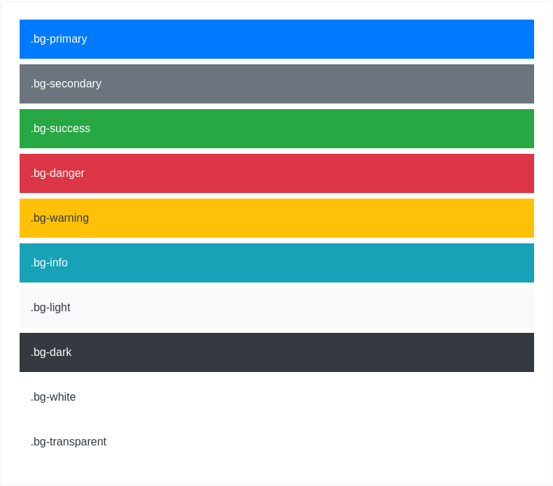
Similar to the contextual text color classes, easily set the background of an element to any contextual class. Anchor components will darken on hover, just like the text classes. Background utilities do not set color, so in some cases you’ll want to use .text-* utilities.

<div class="p-3 mb-2 bg-primary text-white">.bg-primary</div><div class="p-3 mb-2 bg-secondary text-white">.bg-secondary</div><div class="p-3 mb-2 bg-success text-white">.bg-success</div><div class="p-3 mb-2 bg-danger text-white">.bg-danger</div><div class="p-3 mb-2 bg-warning text-dark">.bg-warning</div><div class="p-3 mb-2 bg-info text-white">.bg-info</div><div class="p-3 mb-2 bg-light text-dark">.bg-light</div><div class="p-3 mb-2 bg-dark text-white">.bg-dark</div><div class="p-3 mb-2 bg-white text-dark">.bg-white</div><div class="p-3 mb-2 bg-transparent text-dark">.bg-transparent</div>
Background gradient
When $enable-gradients is set to true (default is false), you can use .bg-gradient- utility classes. Learn about our Sass options to enable these classes and more.
.bg-gradient-primary.bg-gradient-secondary.bg-gradient-success.bg-gradient-danger.bg-gradient-warning.bg-gradient-info.bg-gradient-light.bg-gradient-dark
Dealing with specificity
Sometimes contextual classes cannot be applied due to the specificity of another selector. In some cases, a sufficient workaround is to wrap your element’s content in a <div> with the class.
Conveying meaning to assistive technologies
Using color to add meaning only provides a visual indication, which will not be conveyed to users of assistive technologies – such as screen readers. Ensure that information denoted by the color is either obvious from the content itself (e.g. the visible text), or is included through alternative means, such as additional text hidden with the .sr-only class.
