- Tables
- Examples
- Table head options
- Striped rows
- Bordered table
- Borderless table
- Hoverable rows
- Small table
- Contextual classes
- Conveying meaning to assistive technologies
- Captions
- Responsive tables
- Vertical clipping/truncation
- Always responsive
- Breakpoint specific
Tables
Documentation and examples for opt-in styling of tables (given their prevalent use in JavaScript plugins) with Bootstrap.
Examples
Due to the widespread use of tables across third-party widgets like calendars and date pickers, we’ve designed our tables to be opt-in. Just add the base class .table to any <table>, then extend with custom styles or our various included modifier classes.
Using the most basic table markup, here’s how .table-based tables look in Bootstrap. All table styles are inherited in Bootstrap 4, meaning any nested tables will be styled in the same manner as the parent.
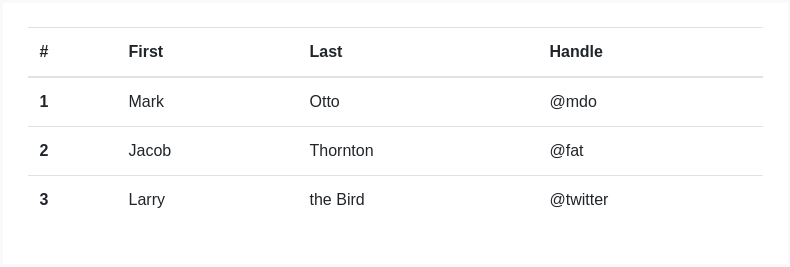
<table class="table"><thead><tr><th scope="col">#</th><th scope="col">First</th><th scope="col">Last</th><th scope="col">Handle</th></tr></thead><tbody><tr><th scope="row">1</th><td>Mark</td><td>Otto</td><td>@mdo</td></tr><tr><th scope="row">2</th><td>Jacob</td><td>Thornton</td><td>@fat</td></tr><tr><th scope="row">3</th><td>Larry</td><td>the Bird</td><td>@twitter</td></tr></tbody></table>
You can also invert the colors—with light text on dark backgrounds—with .table-dark.
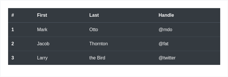
<table class="table table-dark"><thead><tr><th scope="col">#</th><th scope="col">First</th><th scope="col">Last</th><th scope="col">Handle</th></tr></thead><tbody><tr><th scope="row">1</th><td>Mark</td><td>Otto</td><td>@mdo</td></tr><tr><th scope="row">2</th><td>Jacob</td><td>Thornton</td><td>@fat</td></tr><tr><th scope="row">3</th><td>Larry</td><td>the Bird</td><td>@twitter</td></tr></tbody></table>
Table head options
Similar to tables and dark tables, use the modifier classes .thead-light or .thead-dark to make <thead>s appear light or dark gray.
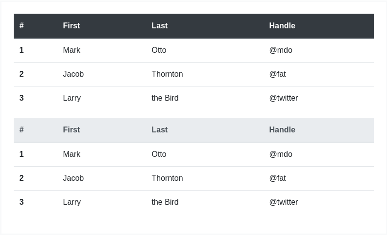
<table class="table"><thead class="thead-dark"><tr><th scope="col">#</th><th scope="col">First</th><th scope="col">Last</th><th scope="col">Handle</th></tr></thead><tbody><tr><th scope="row">1</th><td>Mark</td><td>Otto</td><td>@mdo</td></tr><tr><th scope="row">2</th><td>Jacob</td><td>Thornton</td><td>@fat</td></tr><tr><th scope="row">3</th><td>Larry</td><td>the Bird</td><td>@twitter</td></tr></tbody></table><table class="table"><thead class="thead-light"><tr><th scope="col">#</th><th scope="col">First</th><th scope="col">Last</th><th scope="col">Handle</th></tr></thead><tbody><tr><th scope="row">1</th><td>Mark</td><td>Otto</td><td>@mdo</td></tr><tr><th scope="row">2</th><td>Jacob</td><td>Thornton</td><td>@fat</td></tr><tr><th scope="row">3</th><td>Larry</td><td>the Bird</td><td>@twitter</td></tr></tbody></table>
Striped rows
Use .table-striped to add zebra-striping to any table row within the <tbody>.
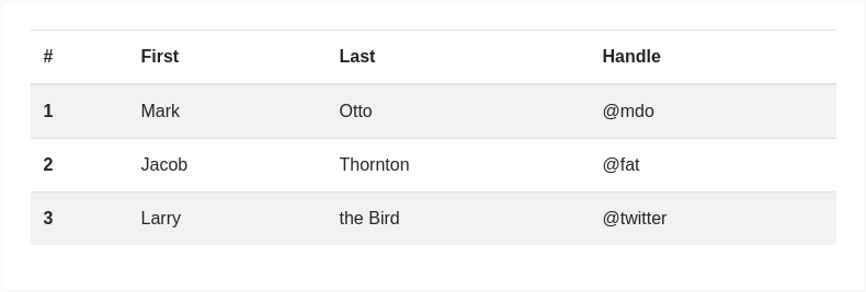
<table class="table table-striped"><thead><tr><th scope="col">#</th><th scope="col">First</th><th scope="col">Last</th><th scope="col">Handle</th></tr></thead><tbody><tr><th scope="row">1</th><td>Mark</td><td>Otto</td><td>@mdo</td></tr><tr><th scope="row">2</th><td>Jacob</td><td>Thornton</td><td>@fat</td></tr><tr><th scope="row">3</th><td>Larry</td><td>the Bird</td><td>@twitter</td></tr></tbody></table>
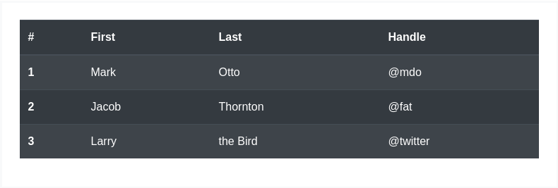
<table class="table table-striped table-dark"><thead><tr><th scope="col">#</th><th scope="col">First</th><th scope="col">Last</th><th scope="col">Handle</th></tr></thead><tbody><tr><th scope="row">1</th><td>Mark</td><td>Otto</td><td>@mdo</td></tr><tr><th scope="row">2</th><td>Jacob</td><td>Thornton</td><td>@fat</td></tr><tr><th scope="row">3</th><td>Larry</td><td>the Bird</td><td>@twitter</td></tr></tbody></table>
Bordered table
Add .table-bordered for borders on all sides of the table and cells.
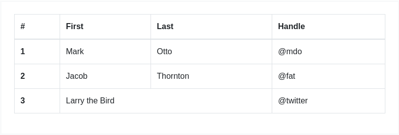
<table class="table table-bordered"><thead><tr><th scope="col">#</th><th scope="col">First</th><th scope="col">Last</th><th scope="col">Handle</th></tr></thead><tbody><tr><th scope="row">1</th><td>Mark</td><td>Otto</td><td>@mdo</td></tr><tr><th scope="row">2</th><td>Jacob</td><td>Thornton</td><td>@fat</td></tr><tr><th scope="row">3</th><td colspan="2">Larry the Bird</td><td>@twitter</td></tr></tbody></table>
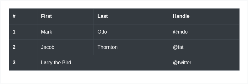
<table class="table table-bordered table-dark"><thead><tr><th scope="col">#</th><th scope="col">First</th><th scope="col">Last</th><th scope="col">Handle</th></tr></thead><tbody><tr><th scope="row">1</th><td>Mark</td><td>Otto</td><td>@mdo</td></tr><tr><th scope="row">2</th><td>Jacob</td><td>Thornton</td><td>@fat</td></tr><tr><th scope="row">3</th><td colspan="2">Larry the Bird</td><td>@twitter</td></tr></tbody></table>
Borderless table
Add .table-borderless for a table without borders.

<table class="table table-borderless"><thead><tr><th scope="col">#</th><th scope="col">First</th><th scope="col">Last</th><th scope="col">Handle</th></tr></thead><tbody><tr><th scope="row">1</th><td>Mark</td><td>Otto</td><td>@mdo</td></tr><tr><th scope="row">2</th><td>Jacob</td><td>Thornton</td><td>@fat</td></tr><tr><th scope="row">3</th><td colspan="2">Larry the Bird</td><td>@twitter</td></tr></tbody></table>
.table-borderless can also be used on dark tables.

<table class="table table-borderless table-dark"><thead><tr><th scope="col">#</th><th scope="col">First</th><th scope="col">Last</th><th scope="col">Handle</th></tr></thead><tbody><tr><th scope="row">1</th><td>Mark</td><td>Otto</td><td>@mdo</td></tr><tr><th scope="row">2</th><td>Jacob</td><td>Thornton</td><td>@fat</td></tr><tr><th scope="row">3</th><td colspan="2">Larry the Bird</td><td>@twitter</td></tr></tbody></table>
Hoverable rows
Add .table-hover to enable a hover state on table rows within a <tbody>.
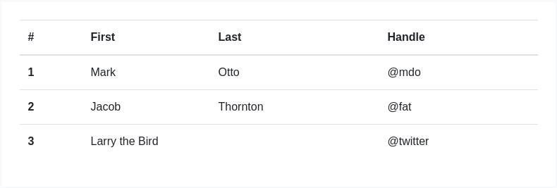
<table class="table table-hover"><thead><tr><th scope="col">#</th><th scope="col">First</th><th scope="col">Last</th><th scope="col">Handle</th></tr></thead><tbody><tr><th scope="row">1</th><td>Mark</td><td>Otto</td><td>@mdo</td></tr><tr><th scope="row">2</th><td>Jacob</td><td>Thornton</td><td>@fat</td></tr><tr><th scope="row">3</th><td colspan="2">Larry the Bird</td><td>@twitter</td></tr></tbody></table>
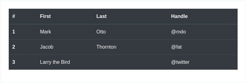
<table class="table table-hover table-dark"><thead><tr><th scope="col">#</th><th scope="col">First</th><th scope="col">Last</th><th scope="col">Handle</th></tr></thead><tbody><tr><th scope="row">1</th><td>Mark</td><td>Otto</td><td>@mdo</td></tr><tr><th scope="row">2</th><td>Jacob</td><td>Thornton</td><td>@fat</td></tr><tr><th scope="row">3</th><td colspan="2">Larry the Bird</td><td>@twitter</td></tr></tbody></table>
Small table
Add .table-sm to make tables more compact by cutting cell padding in half.

<table class="table table-sm"><thead><tr><th scope="col">#</th><th scope="col">First</th><th scope="col">Last</th><th scope="col">Handle</th></tr></thead><tbody><tr><th scope="row">1</th><td>Mark</td><td>Otto</td><td>@mdo</td></tr><tr><th scope="row">2</th><td>Jacob</td><td>Thornton</td><td>@fat</td></tr><tr><th scope="row">3</th><td colspan="2">Larry the Bird</td><td>@twitter</td></tr></tbody></table>

<table class="table table-sm table-dark"><thead><tr><th scope="col">#</th><th scope="col">First</th><th scope="col">Last</th><th scope="col">Handle</th></tr></thead><tbody><tr><th scope="row">1</th><td>Mark</td><td>Otto</td><td>@mdo</td></tr><tr><th scope="row">2</th><td>Jacob</td><td>Thornton</td><td>@fat</td></tr><tr><th scope="row">3</th><td colspan="2">Larry the Bird</td><td>@twitter</td></tr></tbody></table>
Contextual classes
Use contextual classes to color table rows or individual cells.
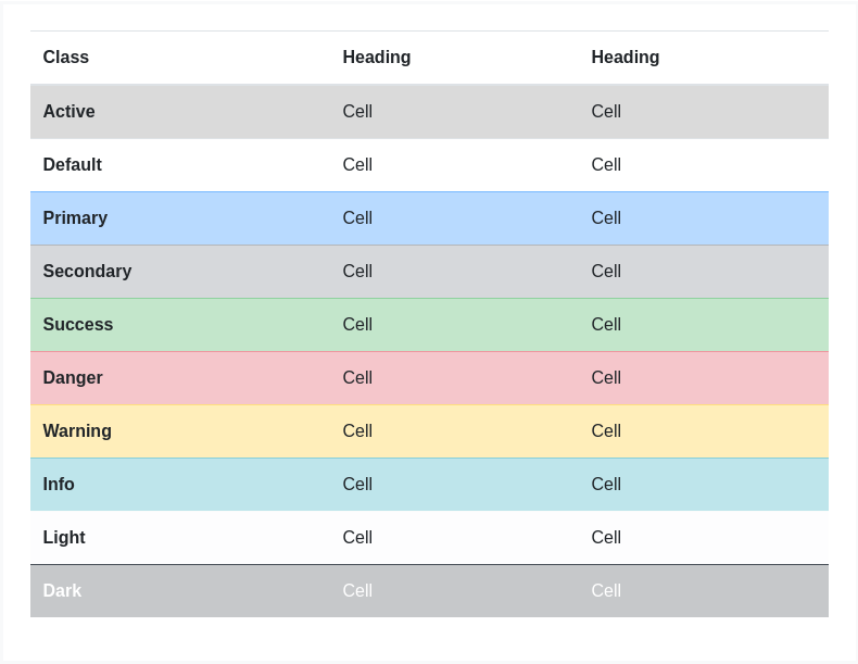
<!-- On rows --><tr class="table-active">...</tr><tr class="table-primary">...</tr><tr class="table-secondary">...</tr><tr class="table-success">...</tr><tr class="table-danger">...</tr><tr class="table-warning">...</tr><tr class="table-info">...</tr><tr class="table-light">...</tr><tr class="table-dark">...</tr><!-- On cells (`td` or `th`) --><tr><td class="table-active">...</td><td class="table-primary">...</td><td class="table-secondary">...</td><td class="table-success">...</td><td class="table-danger">...</td><td class="table-warning">...</td><td class="table-info">...</td><td class="table-light">...</td><td class="table-dark">...</td></tr>
Regular table background variants are not available with the dark table, however, you may use text or background utilities to achieve similar styles.
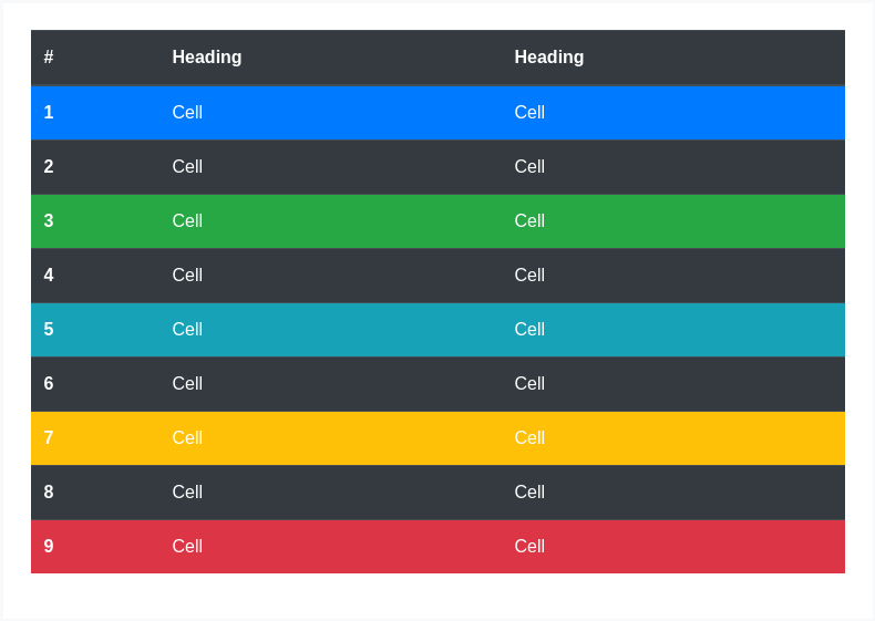
<!-- On rows --><tr class="bg-primary">...</tr><tr class="bg-success">...</tr><tr class="bg-warning">...</tr><tr class="bg-danger">...</tr><tr class="bg-info">...</tr><!-- On cells (`td` or `th`) --><tr><td class="bg-primary">...</td><td class="bg-success">...</td><td class="bg-warning">...</td><td class="bg-danger">...</td><td class="bg-info">...</td></tr>
Conveying meaning to assistive technologies
Using color to add meaning only provides a visual indication, which will not be conveyed to users of assistive technologies – such as screen readers. Ensure that information denoted by the color is either obvious from the content itself (e.g. the visible text), or is included through alternative means, such as additional text hidden with the .sr-only class.
Create responsive tables by wrapping any .table with .table-responsive{-sm|-md|-lg|-xl}, making the table scroll horizontally at each max-width breakpoint of up to (but not including) 576px, 768px, 992px, and 1120px, respectively.
Note that since browsers do not currently support range context queries, we work around the limitations of min- and max- prefixes and viewports with fractional widths (which can occur under certain conditions on high-dpi devices, for instance) by using values with higher precision for these comparisons.
Captions
A <caption> functions like a heading for a table. It helps users with screen readers to find a table and understand what it’s about and decide if they want to read it.
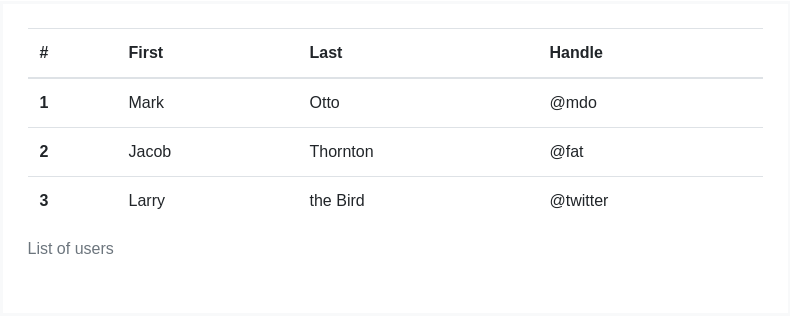
<table class="table"><caption>List of users</caption><thead><tr><th scope="col">#</th><th scope="col">First</th><th scope="col">Last</th><th scope="col">Handle</th></tr></thead><tbody><tr><th scope="row">1</th><td>Mark</td><td>Otto</td><td>@mdo</td></tr><tr><th scope="row">2</th><td>Jacob</td><td>Thornton</td><td>@fat</td></tr><tr><th scope="row">3</th><td>Larry</td><td>the Bird</td><td>@twitter</td></tr></tbody></table>
Responsive tables
Responsive tables allow tables to be scrolled horizontally with ease. Make any table responsive across all viewports by wrapping a .table with .table-responsive. Or, pick a maximum breakpoint with which to have a responsive table up to by using .table-responsive{-sm|-md|-lg|-xl}.
Vertical clipping/truncation
Responsive tables make use of overflow-y: hidden, which clips off any content that goes beyond the bottom or top edges of the table. In particular, this can clip off dropdown menus and other third-party widgets.
Always responsive
Across every breakpoint, use .table-responsive for horizontally scrolling tables.
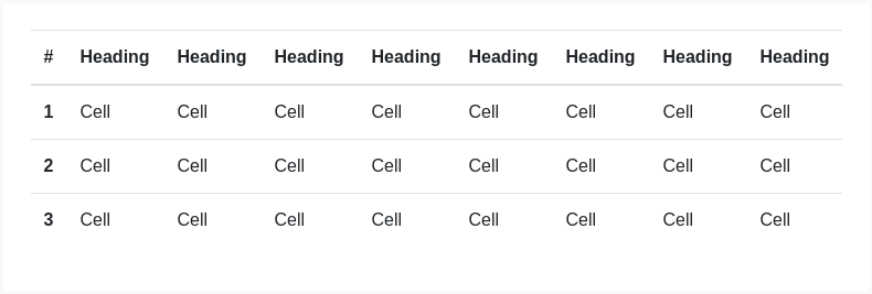
<div class="table-responsive"><table class="table">...</table></div>
Breakpoint specific
Use .table-responsive{-sm|-md|-lg|-xl} as needed to create responsive tables up to a particular breakpoint. From that breakpoint and up, the table will behave normally and not scroll horizontally.
These tables may appear broken until their responsive styles apply at specific viewport widths.

<div class="table-responsive-sm"><table class="table">...</table></div>

<div class="table-responsive-md"><table class="table">...</table></div>

<div class="table-responsive-lg"><table class="table">...</table></div>
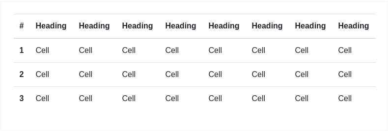
<div class="table-responsive-xl"><table class="table">...</table></div>
