- Flex
- Enable flex behaviors
- Direction
- Justify content
- Align items
- Align self
- Fill
- Grow and shrink
- Auto margins
- With align-items
- Wrap
- Order
- Align content
Flex
Quickly manage the layout, alignment, and sizing of grid columns, navigation, components, and more with a full suite of responsive flexbox utilities. For more complex implementations, custom CSS may be necessary.
Enable flex behaviors
Apply display utilities to create a flexbox container and transform direct children elements into flex items. Flex containers and items are able to be modified further with additional flex properties.

<div class="d-flex p-2 bd-highlight">I'm a flexbox container!</div>

<div class="d-inline-flex p-2 bd-highlight">I'm an inline flexbox container!</div>
Responsive variations also exist for .d-flex and .d-inline-flex.
.d-flex.d-inline-flex.d-sm-flex.d-sm-inline-flex.d-md-flex.d-md-inline-flex.d-lg-flex.d-lg-inline-flex.d-xl-flex.d-xl-inline-flex
Direction
Set the direction of flex items in a flex container with direction utilities. In most cases you can omit the horizontal class here as the browser default is row. However, you may encounter situations where you needed to explicitly set this value (like responsive layouts).
Use .flex-row to set a horizontal direction (the browser default), or .flex-row-reverse to start the horizontal direction from the opposite side.

<div class="d-flex flex-row bd-highlight mb-3"><div class="p-2 bd-highlight">Flex item 1</div><div class="p-2 bd-highlight">Flex item 2</div><div class="p-2 bd-highlight">Flex item 3</div></div><div class="d-flex flex-row-reverse bd-highlight"><div class="p-2 bd-highlight">Flex item 1</div><div class="p-2 bd-highlight">Flex item 2</div><div class="p-2 bd-highlight">Flex item 3</div></div>
Use .flex-column to set a vertical direction, or .flex-column-reverse to start the vertical direction from the opposite side.
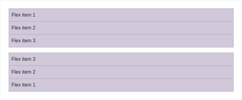
<div class="d-flex flex-column bd-highlight mb-3"><div class="p-2 bd-highlight">Flex item 1</div><div class="p-2 bd-highlight">Flex item 2</div><div class="p-2 bd-highlight">Flex item 3</div></div><div class="d-flex flex-column-reverse bd-highlight"><div class="p-2 bd-highlight">Flex item 1</div><div class="p-2 bd-highlight">Flex item 2</div><div class="p-2 bd-highlight">Flex item 3</div></div>
Responsive variations also exist for flex-direction.
.flex-row.flex-row-reverse.flex-column.flex-column-reverse.flex-sm-row.flex-sm-row-reverse.flex-sm-column.flex-sm-column-reverse.flex-md-row.flex-md-row-reverse.flex-md-column.flex-md-column-reverse.flex-lg-row.flex-lg-row-reverse.flex-lg-column.flex-lg-column-reverse.flex-xl-row.flex-xl-row-reverse.flex-xl-column.flex-xl-column-reverse
Justify content
Use justify-content utilities on flexbox containers to change the alignment of flex items on the main axis (the x-axis to start, y-axis if flex-direction: column). Choose from start (browser default), end, center, between, or around.
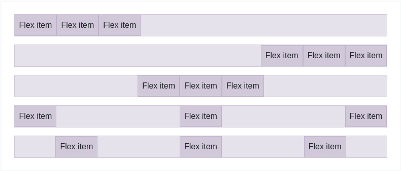
<div class="d-flex justify-content-start">...</div><div class="d-flex justify-content-end">...</div><div class="d-flex justify-content-center">...</div><div class="d-flex justify-content-between">...</div><div class="d-flex justify-content-around">...</div>
Responsive variations also exist for justify-content.
.justify-content-start.justify-content-end.justify-content-center.justify-content-between.justify-content-around.justify-content-sm-start.justify-content-sm-end.justify-content-sm-center.justify-content-sm-between.justify-content-sm-around.justify-content-md-start.justify-content-md-end.justify-content-md-center.justify-content-md-between.justify-content-md-around.justify-content-lg-start.justify-content-lg-end.justify-content-lg-center.justify-content-lg-between.justify-content-lg-around.justify-content-xl-start.justify-content-xl-end.justify-content-xl-center.justify-content-xl-between.justify-content-xl-around
Align items
Use align-items utilities on flexbox containers to change the alignment of flex items on the cross axis (the y-axis to start, x-axis if flex-direction: column). Choose from start, end, center, baseline, or stretch (browser default).
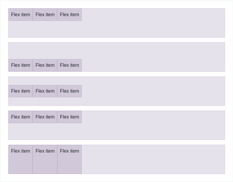
<div class="d-flex align-items-start">...</div><div class="d-flex align-items-end">...</div><div class="d-flex align-items-center">...</div><div class="d-flex align-items-baseline">...</div><div class="d-flex align-items-stretch">...</div>
Responsive variations also exist for align-items.
.align-items-start.align-items-end.align-items-center.align-items-baseline.align-items-stretch.align-items-sm-start.align-items-sm-end.align-items-sm-center.align-items-sm-baseline.align-items-sm-stretch.align-items-md-start.align-items-md-end.align-items-md-center.align-items-md-baseline.align-items-md-stretch.align-items-lg-start.align-items-lg-end.align-items-lg-center.align-items-lg-baseline.align-items-lg-stretch.align-items-xl-start.align-items-xl-end.align-items-xl-center.align-items-xl-baseline.align-items-xl-stretch
Align self
Use align-self utilities on flexbox items to individually change their alignment on the cross axis (the y-axis to start, x-axis if flex-direction: column). Choose from the same options as align-items: start, end, center, baseline, or stretch (browser default).
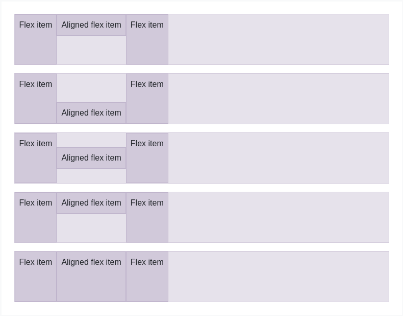
<div class="align-self-start">Aligned flex item</div><div class="align-self-end">Aligned flex item</div><div class="align-self-center">Aligned flex item</div><div class="align-self-baseline">Aligned flex item</div><div class="align-self-stretch">Aligned flex item</div>
Responsive variations also exist for align-self.
.align-self-start.align-self-end.align-self-center.align-self-baseline.align-self-stretch.align-self-sm-start.align-self-sm-end.align-self-sm-center.align-self-sm-baseline.align-self-sm-stretch.align-self-md-start.align-self-md-end.align-self-md-center.align-self-md-baseline.align-self-md-stretch.align-self-lg-start.align-self-lg-end.align-self-lg-center.align-self-lg-baseline.align-self-lg-stretch.align-self-xl-start.align-self-xl-end.align-self-xl-center.align-self-xl-baseline.align-self-xl-stretch
Fill
Use the .flex-fill class on a series of sibling elements to force them into widths equal to their content (or equal widths if their content does not surpass their border-boxes) while taking up all available horizontal space.

<div class="d-flex bd-highlight"><div class="p-2 flex-fill bd-highlight">Flex item with a lot of content</div><div class="p-2 flex-fill bd-highlight">Flex item</div><div class="p-2 flex-fill bd-highlight">Flex item</div></div>
Responsive variations also exist for flex-fill.
.flex-fill.flex-sm-fill.flex-md-fill.flex-lg-fill.flex-xl-fill
Grow and shrink
Use .flex-grow-* utilities to toggle a flex item’s ability to grow to fill available space. In the example below, the .flex-grow-1 elements uses all available space it can, while allowing the remaining two flex items their necessary space.

<div class="d-flex bd-highlight"><div class="p-2 flex-grow-1 bd-highlight">Flex item</div><div class="p-2 bd-highlight">Flex item</div><div class="p-2 bd-highlight">Third flex item</div></div>
Use .flex-shrink-* utilities to toggle a flex item’s ability to shrink if necessary. In the example below, the second flex item with .flex-shrink-1 is forced to wrap it’s contents to a new line, “shrinking” to allow more space for the previous flex item with .w-100.

<div class="d-flex bd-highlight"><div class="p-2 w-100 bd-highlight">Flex item</div><div class="p-2 flex-shrink-1 bd-highlight">Flex item</div></div>
Responsive variations also exist for flex-grow and flex-shrink.
.flex-{grow|shrink}-0.flex-{grow|shrink}-1.flex-sm-{grow|shrink}-0.flex-sm-{grow|shrink}-1.flex-md-{grow|shrink}-0.flex-md-{grow|shrink}-1.flex-lg-{grow|shrink}-0.flex-lg-{grow|shrink}-1.flex-xl-{grow|shrink}-0.flex-xl-{grow|shrink}-1
Auto margins
Flexbox can do some pretty awesome things when you mix flex alignments with auto margins. Shown below are three examples of controlling flex items via auto margins: default (no auto margin), pushing two items to the right (.mr-auto), and pushing two items to the left (.ml-auto).
Unfortunately, IE10 and IE11 do not properly support auto margins on flex items whose parent has a non-default justify-content value.See this StackOverflow answer for more details.

<div class="d-flex bd-highlight mb-3"><div class="p-2 bd-highlight">Flex item</div><div class="p-2 bd-highlight">Flex item</div><div class="p-2 bd-highlight">Flex item</div></div><div class="d-flex bd-highlight mb-3"><div class="mr-auto p-2 bd-highlight">Flex item</div><div class="p-2 bd-highlight">Flex item</div><div class="p-2 bd-highlight">Flex item</div></div><div class="d-flex bd-highlight mb-3"><div class="p-2 bd-highlight">Flex item</div><div class="p-2 bd-highlight">Flex item</div><div class="ml-auto p-2 bd-highlight">Flex item</div></div>
With align-items
Vertically move one flex item to the top or bottom of a container by mixing align-items, flex-direction: column, and margin-top: auto or margin-bottom: auto.
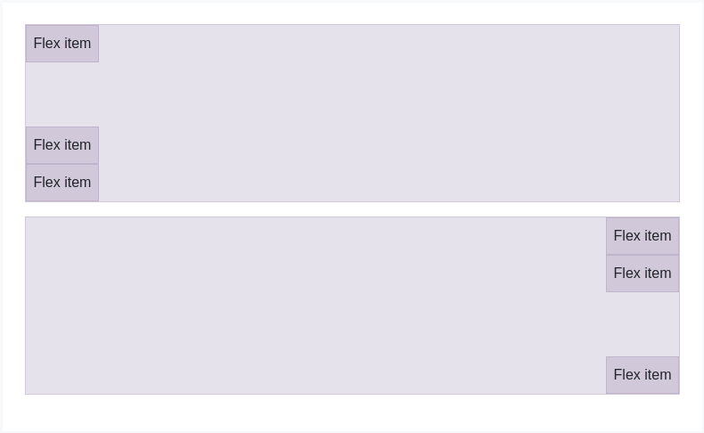
<div class="d-flex align-items-start flex-column bd-highlight mb-3" style="height: 200px;"><div class="mb-auto p-2 bd-highlight">Flex item</div><div class="p-2 bd-highlight">Flex item</div><div class="p-2 bd-highlight">Flex item</div></div><div class="d-flex align-items-end flex-column bd-highlight mb-3" style="height: 200px;"><div class="p-2 bd-highlight">Flex item</div><div class="p-2 bd-highlight">Flex item</div><div class="mt-auto p-2 bd-highlight">Flex item</div></div>
Wrap
Change how flex items wrap in a flex container. Choose from no wrapping at all (the browser default) with .flex-nowrap, wrapping with .flex-wrap, or reverse wrapping with .flex-wrap-reverse.

<div class="d-flex flex-nowrap">...</div>

<div class="d-flex flex-wrap">...</div>

<div class="d-flex flex-wrap-reverse">...</div>
Responsive variations also exist for flex-wrap.
.flex-nowrap.flex-wrap.flex-wrap-reverse.flex-sm-nowrap.flex-sm-wrap.flex-sm-wrap-reverse.flex-md-nowrap.flex-md-wrap.flex-md-wrap-reverse.flex-lg-nowrap.flex-lg-wrap.flex-lg-wrap-reverse.flex-xl-nowrap.flex-xl-wrap.flex-xl-wrap-reverse
Order
Change the visual order of specific flex items with a handful of order utilities. We only provide options for making an item first or last, as well as a reset to use the DOM order. As order takes any integer value (e.g., 5), add custom CSS for any additional values needed.

<div class="d-flex flex-nowrap bd-highlight"><div class="order-3 p-2 bd-highlight">First flex item</div><div class="order-2 p-2 bd-highlight">Second flex item</div><div class="order-1 p-2 bd-highlight">Third flex item</div></div>
Responsive variations also exist for order.
.order-0.order-1.order-2.order-3.order-4.order-5.order-6.order-7.order-8.order-9.order-10.order-11.order-12.order-sm-0.order-sm-1.order-sm-2.order-sm-3.order-sm-4.order-sm-5.order-sm-6.order-sm-7.order-sm-8.order-sm-9.order-sm-10.order-sm-11.order-sm-12.order-md-0.order-md-1.order-md-2.order-md-3.order-md-4.order-md-5.order-md-6.order-md-7.order-md-8.order-md-9.order-md-10.order-md-11.order-md-12.order-lg-0.order-lg-1.order-lg-2.order-lg-3.order-lg-4.order-lg-5.order-lg-6.order-lg-7.order-lg-8.order-lg-9.order-lg-10.order-lg-11.order-lg-12.order-xl-0.order-xl-1.order-xl-2.order-xl-3.order-xl-4.order-xl-5.order-xl-6.order-xl-7.order-xl-8.order-xl-9.order-xl-10.order-xl-11.order-xl-12
Align content
Use align-content utilities on flexbox containers to align flex items together on the cross axis. Choose from start (browser default), end, center, between, around, or stretch. To demonstrate these utilities, we’ve enforced flex-wrap: wrap and increased the number of flex items.
Heads up! This property has no effect on single rows of flex items.
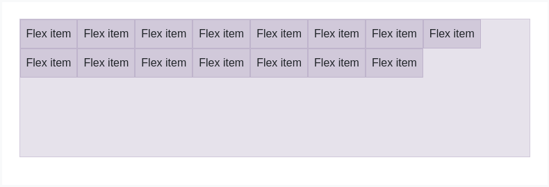
<div class="d-flex align-content-start flex-wrap">...</div>
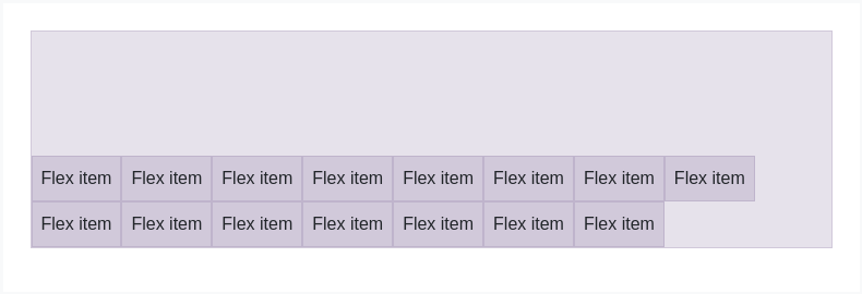
<div class="d-flex align-content-end flex-wrap">...</div>
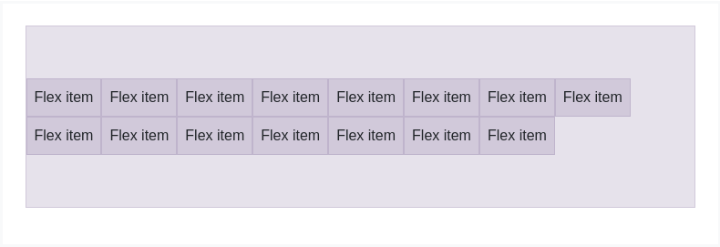
<div class="d-flex align-content-center flex-wrap">...</div>
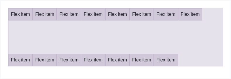
<div class="d-flex align-content-between flex-wrap">...</div>
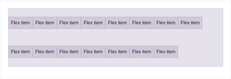
<div class="d-flex align-content-around flex-wrap">...</div>
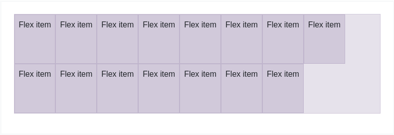
<div class="d-flex align-content-stretch flex-wrap">...</div>
Responsive variations also exist for align-content.
.align-content-start.align-content-end.align-content-center.align-content-around.align-content-stretch.align-content-sm-start.align-content-sm-end.align-content-sm-center.align-content-sm-around.align-content-sm-stretch.align-content-md-start.align-content-md-end.align-content-md-center.align-content-md-around.align-content-md-stretch.align-content-lg-start.align-content-lg-end.align-content-lg-center.align-content-lg-around.align-content-lg-stretch.align-content-xl-start.align-content-xl-end.align-content-xl-center.align-content-xl-around.align-content-xl-stretch
