 我的书签
我的书签
 添加书签
添加书签 移除书签
移除书签- Poptip 气泡提示
- 概述
- 代码示例
- API
- Poptip props
- Poptip events
- Poptip slot
Poptip 气泡提示
概述
Poptip 与 Tooltip 类似,具有很多相同配置,不同点是 Poptip 以卡片的形式承载了更多的内容,比如链接、表格、按钮等。
Poptip 还 confirm 确认框,与 Modal 不同的是,它会出现在就近元素,相对轻量。
代码示例
基础用法
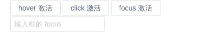
支持三种触发方式:鼠标悬停、点击、聚焦。默认是点击。
注意 Poptip 内的文本使用了 white-space: nowrap;,即不自动换行,如需展示很多内容并自动换行时,建议给内容 slot 增加样式 white-space: normal;。
<template><Poptip trigger="hover" title="Title" content="content"><Button>Hover</Button></Poptip><Poptip title="Title" content="content"><Button>Click</Button></Poptip><Poptip trigger="focus" title="Title" content="content"><Button>Focus</Button></Poptip><Poptip trigger="focus" title="Title" content="content"><Input placeholder="Input focus" /></Poptip></template><script>export default {}</script>
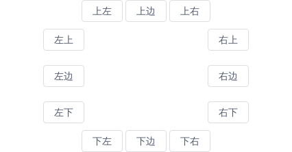
位置
组件提供了12个不同的方向显示Poptip,具体配置可查看API。。
<style scoped>.top,.bottom{text-align: center;}.center{width: 300px;margin: 10px auto;overflow: hidden;}.center-left{float: left;}.center-right{float: right;}</style><template><div class="top"><Poptip title="Title" content="content" placement="top-start"><Button>Top Left</Button></Poptip><Poptip title="Title" content="content" placement="top"><Button>Top Center</Button></Poptip><Poptip title="Title" content="content" placement="top-end"><Button>Top Right</Button></Poptip></div><div class="center"><div class="center-left"><Poptip title="Title" content="content" placement="left-start"><Button>Left Top</Button></Poptip><br><br><Poptip title="Title" content="content" placement="left"><Button>Left Center</Button></Poptip><br><br><Poptip title="Title" content="content" placement="left-end"><Button>Left Bottom</Button></Poptip></div><div class="center-right"><Poptip title="Title" content="content" placement="right-start"><Button>Right Top</Button></Poptip><br><br><Poptip title="Title" content="content" placement="right"><Button>Right Center</Button></Poptip><br><br><Poptip title="Title" content="content" placement="right-end"><Button>Right Bottom</Button></Poptip></div></div><div class="bottom"><Poptip title="Title" content="content" placement="bottom-start"><Button>Bottom Left</Button></Poptip><Poptip title="Title" content="content" placement="bottom"><Button>Bottom Center</Button></Poptip><Poptip title="Title" content="content" placement="bottom-end"><Button>Bottom Right</Button></Poptip></div></template><script>export default {}</script>

从浮层内关闭
通过v-model来控制提示框的显示和隐藏。
<template><Poptip v-model="visible"><a>Click</a><div slot="title"><i>Custom title</i></div><div slot="content"><a @click="close">close</a></div></Poptip></template><script>export default {data () {return {visible: false}},methods: {close () {this.visible = false;}}}</script>

嵌套复杂内容
通过自定义 slot 来实现复杂的内容。
<template><Poptip placement="right" width="400"><Button>Click</Button><div class="api" slot="content"><table><thead><tr><th>Version</th><th>Update Time</th><th>Description</th></tr></thead><tbody><tr><td>0.9.5</td><td>2016-10-26</td><td>Add new components <code>Tooltip</code> and <code>Poptip</code></td></tr><tr><td>0.9.4</td><td>2016-10-25</td><td>Add new components <code>Modal</code></td></tr><tr><td>0.9.2</td><td>2016-09-28</td><td>Add new components <code>Select</code></td></tr></tbody></table></div></Poptip></template><script>export default {}</script>

自动换行
设置属性 word-wrap,当超出宽度后,文本将自动换行,并两端对齐。
<template><Poptip word-wrap width="200" content="Steven Paul Jobs was an American entrepreneur and business magnate. He was the chairman, chief executive officer, and a co-founder of Apple Inc."><Button>Long Content</Button></Poptip></template><script>export default {}</script>

确认框
通过设置属性confirm开启确认框模式。确认框只会以 click 的形式激活,并且只会显示 title 的内容,忽略 content。
<template><Poptipconfirmtitle="Are you sure you want to delete this item?"@on-ok="ok"@on-cancel="cancel"><Button>Delete</Button></Poptip><Poptipconfirmtitle="Are you sure delete this task?"@on-ok="ok"@on-cancel="cancel"ok-text="yes"cancel-text="no"><Button>Internationalization</Button></Poptip></template><script>export default {methods: {ok () {this.$Message.info('You click ok');},cancel () {this.$Message.info('You click cancel');}}}</script>
API
Poptip props
| 属性 | 说明 | 类型 | 默认值 |
|---|---|---|---|
| trigger | 触发方式,可选值为hover(悬停)click(点击)focus(聚焦),在 confirm 模式下,只有 click 有效 | String | click |
| title | 显示的标题 | String | Number | - |
| content | 显示的正文内容,只在非 confirm 模式下有效 | String | Number | 空 |
| placement | 提示框出现的位置,可选值为toptop-starttop-endbottombottom-startbottom-endleftleft-startleft-endrightright-startright-end,2.12.0 版本开始支持自动识别 | String | top |
| width | 宽度,最小宽度为 150px,在 confirm 模式下,默认最大宽度为 300px | String | Number | - |
| confirm | 是否开启对话框模式 | Boolean | false |
| disabled 3.4.0 | 是否禁用 | Boolean | false |
| ok-text | 确定按钮的文字,只在 confirm 模式下有效 | String | 确定 |
| cancel-text | 取消按钮的文字,只在 confirm 模式下有效 | String | 取消 |
| transfer | 是否将弹层放置于 body 内,在 Tabs、带有 fixed 的 Table 列内使用时,建议添加此属性,它将不受父级样式影响,从而达到更好的效果 | Boolean | false |
| popper-class | 给 Poptip 设置 class-name,在使用 transfer 时会很有用 | String | - |
| word-wrap | 开启后,超出指定宽度文本将自动换行,并两端对齐 | Boolean | false |
| padding | 自定义间距值 | String | 8px 16px |
| offset | 出现位置的偏移量 | Number | 0 |
| options | 自定义 popper.js 的配置项,具体配置见 popper.js 文档 | Object |
|
Poptip events
| 事件名 | 说明 | 返回值 |
|---|---|---|
| on-popper-show | 在提示框显示时触发 | 无 |
| on-popper-hide | 在提示框消失时触发 | 无 |
| on-ok | 点击确定的回调,只在 confirm 模式下有效 | 无 |
| on-cancel | 点击取消的回调,只在 confirm 模式下有效 | 无 |
Poptip slot
| 名称 | 说明 |
|---|---|
| 无 | 主体内容 |
| title | 提示框标题,定义此 slot 时,会覆盖 props title |
| content | 提示框内容,定义此 slot 时,会覆盖 props content,只在非 confirm 模式下有效 |
