 我的书签
我的书签
 添加书签
添加书签 移除书签
移除书签- Tooltip 文字提示
- 概述
- 代码示例
- API
- Tooltip props
- Tooltip events
- Tooltip slot
Tooltip 文字提示
概述
文字提示气泡框,在鼠标悬停时显示,代替了系统的title提示。
代码示例

基础用法
最简单的用法。
注意 Tooltip 内的文本使用了 white-space: nowrap;,即不自动换行,如需展示很多内容并自动换行时,建议给内容 slot 增加样式 white-space: normal;。
<template><Tooltip content="Here is the prompt text">A balloon appears when the mouse passes over this text</Tooltip></template><script>export default {}</script>
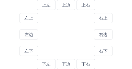
位置
组件提供了12个不同的方向显示Tooltip,具体配置可查看API。
<style scoped>.top,.bottom{text-align: center;}.center{width: 300px;margin: 10px auto;overflow: hidden;}.center-left{float: left;}.center-right{float: right;}</style><template><div class="top"><Tooltip content="Top Left text" placement="top-start"><Button>Top Left</Button></Tooltip><Tooltip content="Top Center text" placement="top"><Button>Top Center</Button></Tooltip><Tooltip content="Top Right text" placement="top-end"><Button>Top Right</Button></Tooltip></div><div class="center"><div class="center-left"><Tooltip content="Left Top text" placement="left-start"><Button>Left Top</Button></Tooltip><br><br><Tooltip content="Left Center text" placement="left"><Button>Left Center</Button></Tooltip><br><br><Tooltip content="Left Bottom text" placement="left-end"><Button>Left Bottom</Button></Tooltip></div><div class="center-right"><Tooltip content="Right Top text" placement="right-start"><Button>Right Top</Button></Tooltip><br><br><Tooltip content="Right Center text" placement="right"><Button>Right Center</Button></Tooltip><br><br><Tooltip content="Right Bottom text" placement="right-end"><Button>Right Bottom</Button></Tooltip></div></div><div class="bottom"><Tooltip content="Bottom Left text" placement="bottom-start"><Button>Bottom Left</Button></Tooltip><Tooltip content="Bottom Center text" placement="bottom"><Button>Bottom Center</Button></Tooltip><Tooltip content="Bottom Right text" placement="bottom-end"><Button>Bottom Right</Button></Tooltip></div></template><script>export default {}</script>

自定义内容
通过自定义 slot 显示多行文本或更复杂的样式。
<template><Tooltip placement="top"><Button>Multiple lines</Button><div slot="content"><p>Display multiple lines of information</p><p><i>Can customize the style</i></p></div></Tooltip></template><script>export default {}</script>

禁用
通过设置属性disabled可以禁用文字提示。
<template><Tooltip placement="top" content="Can disable text prompts" :disabled="disabled"><Button @click="disabled = true">Click to close</Button></Tooltip></template><script>export default {data () {return {disabled: false}}}</script>

延时
通过设置属性delay可以延时显示文字提示,单位毫秒。
<template><Tooltip placement="top" content="Tooltip text" :delay="1000"><Button @click="disabled = true">Delay 1 second to show</Button></Tooltip></template><script>export default {}</script>

主题
设置属性 theme 可以显示不同的颜色。
<template><Tooltip content="content of tooltip"><Button>Dark(default)</Button></Tooltip><Tooltip content="content of tooltip" theme="light"><Button>Light</Button></Tooltip></template><script>export default {}</script>

自动换行
设置属性 max-width,当超出最大值后,文本将自动换行,并两端对齐。
<template><Tooltip max-width="200" content="Steven Paul Jobs was an American entrepreneur and business magnate. He was the chairman, chief executive officer, and a co-founder of Apple Inc."><Button>Long Content</Button></Tooltip></template><script>export default {}</script>
API
Tooltip props
| 属性 | 说明 | 类型 | 默认值 |
|---|---|---|---|
| content | 显示的内容 | String | Number | 空 |
| placement | 提示框出现的位置,可选值为toptop-starttop-endbottombottom-startbottom-endleftleft-startleft-endrightright-startright-end,2.12.0 版本开始支持自动识别 | String | bottom |
| disabled | 是否禁用提示框 | Boolean | false |
| delay | 延迟显示,单位毫秒 | Number | 0 |
| always | 是否总是可见 | Boolean | false |
| theme | 主题,可选值为 dark 或 light | String | dark |
| max-width | 最大宽度,超出最大值后,文本将自动换行,并两端对齐 | String | Number | - |
| offset | 出现位置的偏移量 | Number | 0 |
| transfer | 是否将弹层放置于 body 内,在 Tabs、带有 fixed 的 Table 列内使用时,建议添加此属性,它将不受父级样式影响,从而达到更好的效果 | Boolean | false |
| options | 自定义 popper.js 的配置项,具体配置见 popper.js 文档 | Object |
|
Tooltip events
| 事件名 | 说明 | 返回值 |
|---|---|---|
| on-popper-show | 在提示框显示时触发 | 无 |
| on-popper-hide | 在提示框消失时触发 | 无 |
Tooltip slot
| 名称 | 说明 |
|---|---|
| 无 | 主体内容 |
| content | 提示框的内容,定义此 slot 时,会覆盖 props content。 |
