 我的书签
我的书签
 添加书签
添加书签 移除书签
移除书签- Badge 徽标数
- 概述
- 代码示例
- API
- Badge props
- Badge slot
Badge 徽标数
概述
主要用于通知未读数的角标,提醒用户点击。
代码示例

基础用法
最简单的使用方法。
<style scoped>.demo-badge{width: 42px;height: 42px;background: #eee;border-radius: 6px;display: inline-block;}</style><template><Badge :count="3"><a href="#" class="demo-badge"></a></Badge><Badge><a href="#" class="demo-badge" style="margin-left: 32px"></a><Icon type="md-time" slot="count" color="#ed4014" size="16" /></Badge></template><script>export default {}</script>

小红点
强迫症患者慎用!
<template><Badge dot><a href="#" class="demo-badge"></a></Badge><Badge dot><Icon type="ios-notifications-outline" size="26"></Icon></Badge><Badge dot><a href="#">可以是一个链接</a></Badge></template><script>export default {}</script>

封顶数字
通过设置overflow-count属性设置一个封顶值,当超过时,会显示${overflowCount}+
<template>
    <Badge :count="100">
        <a href="#" class="demo-badge"></a>
    </Badge>
    <Badge :count="1000" overflow-count="999">
        <a href="#" class="demo-badge"></a>
    </Badge>
</template>
<script>
    export default {

    }
</script>

独立使用及自定义样式
可以没有 slot 独立展示。
<style>
    .demo-badge-alone{
        background: #5cb85c !important;
    }
</style>
<template>
    <Badge :count="10"></Badge>
    <Badge :count="20" class-name="demo-badge-alone"></Badge>
</template>
<script>
    export default {

    }
</script>

自定义内容
设置 text 属性,可以自定义显示内容。
<template>
    <Row>
        <Col span="6">
            <Badge text="new">
                <a href="#" class="demo-badge"></a>
            </Badge>
        </Col>
        <Col span="6">
            <Badge text="hot">
                <a href="#" class="demo-badge"></a>
            </Badge>
        </Col>
    </Row>
</template>
<script>
    export default {

    }
</script>
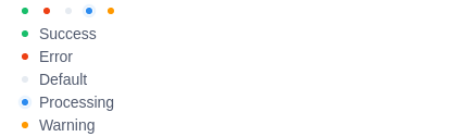
状态点
用于表示状态的小圆点。
<template>
    <Badge status="success" />
    <Badge status="error" />
    <Badge status="default" />
    <Badge status="processing" />
    <Badge status="warning" />
    <br />
    <Badge status="success" text="Success" />
    <br />
    <Badge status="error" text="Error" />
    <br />
    <Badge status="default" text="Default" />
    <br />
    <Badge status="processing" text="Processing" />
    <br />
    <Badge status="warning" text="Warning" />
</template>
<script>
    export default {

    }
</script>
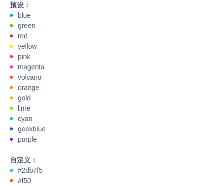
多彩徽标
4.0.0 属性 color 可以设置更多预设的状态点颜色,或者自定义颜色。
<template>
    <div>
        <strong>Presets:</strong>
        <br>
        <Badge color="blue" text="blue" />
        <Badge color="green" text="green" />
        <Badge color="red" text="red" />
        <Badge color="yellow" text="yellow" />
        <Badge color="pink" text="pink" />
        <Badge color="magenta" text="magenta" />
        <Badge color="volcano" text="volcano" />
        <Badge color="orange" text="orange" />
        <Badge color="gold" text="gold" />
        <Badge color="lime" text="lime" />
        <Badge color="cyan" text="cyan" />
        <Badge color="geekblue" text="geekblue" />
        <Badge color="purple" text="purple" />
        <br>
        <strong>Custom:</strong>
        <br>
        <Badge color="#2db7f5" text="#2db7f5" />
        <Badge color="#f50" text="#f50" />
    </div>
</template>
<script>
    export default {

    }
</script>

预设颜色
使用 type 属性,可以设置不同的颜色。
<template>
    <Badge :count="5" type="primary">
        <a href="#" class="demo-badge"></a>
    </Badge>
    <Badge :count="5" type="success">
        <a href="#" class="demo-badge"></a>
    </Badge>
    <Badge :count="5" type="normal">
        <a href="#" class="demo-badge"></a>
    </Badge>
    <Badge :count="5" type="info">
        <a href="#" class="demo-badge"></a>
    </Badge>
    <Badge :count="5" type="error">
        <a href="#" class="demo-badge"></a>
    </Badge>
    <Badge :count="5" type="warning">
        <a href="#" class="demo-badge"></a>
    </Badge>
</template>
<script>
    export default {

    }
</script>
API
Badge props
| 属性 | 说明 | 类型 | 默认值 |
|---|---|---|---|
| count | 显示的数字,大于overflowCount时,显示${overflowCount}+,为 0 时隐藏 | Number | - |
| overflow-count | 展示封顶的数字值 | Number | String | 99 |
| dot | 不展示数字,只有一个小红点,如需隐藏 dot ,需要设置count为 0 | Boolean | false |
| class-name | 自定义的class名称,dot 模式下无效 | String | - |
| type | 使用预设的颜色,可选值为 success、primary、normal、error、warning、info | String | - |
| show-zero | 当数值为 0 时,是否展示 Badge | Boolean | false |
| status | 设置 Badge 为状态点,可选值为 success、processing、default、error、warning | String | - |
| text | 自定义内容,如果设置了 status,则为状态点的文本 | String | - |
| offset | 设置状态点的位置偏移,格式为 [x, y] | Array | - |
| color 4.0.0 | 设置更多状态点的颜色或自定义颜色 | String | - |
Badge slot
| 名称 | 说明 |
|---|---|
| count 4.0.0 | 自定义角标显示内容(去角标背景),数值 count 将无效。 |
| text 4.0.0 | 自定义角标显示内容(带角标背景),数值 count 将无效。亦可自定义状态点模式下的 text 内容。 |
