 我的书签
我的书签
 添加书签
添加书签 移除书签
移除书签- Alert 警告提示
- 概述
- 代码示例
- API
- Alert props
- Alert events
- Alert slot
Alert 警告提示
概述
静态地呈现一些警告信息,可手动关闭。
代码示例
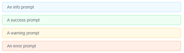
基础用法
基本使用方法,有四种样式可以选择info、success、warning、error。
<template><Alert>An info prompt</Alert><Alert type="success">A success prompt</Alert><Alert type="warning">A warning prompt</Alert><Alert type="error">An error prompt</Alert></template><script>export default {}</script>
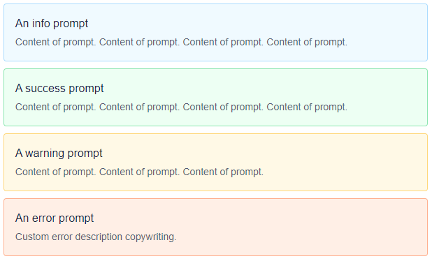
含描述信息
自定义<slot name="desc">描述内容。
<template><Alert>An info prompt<template slot="desc">Content of prompt. Content of prompt. Content of prompt. Content of prompt. </template></Alert><Alert type="success">A success prompt<template slot="desc">Content of prompt. Content of prompt. Content of prompt. Content of prompt. </template></Alert><Alert type="warning">A warning prompt<template slot="desc">Content of prompt. Content of prompt. Content of prompt.</template></Alert><Alert type="error">An error prompt<span slot="desc">Custom error description copywriting. <Icon type="help-circled" size="14"></Icon></span></Alert></template><script>export default {}</script>
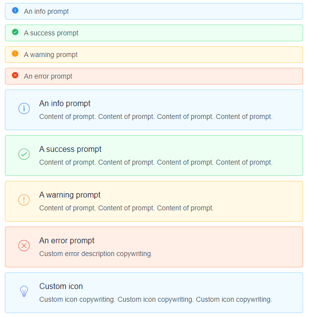
图标
根据 type 属性自动添加不同图标,或者自定义图标 slot 。
<template><Alert show-icon>An info prompt</Alert><Alert type="success" show-icon>A success prompt</Alert><Alert type="warning" show-icon>A warning prompt</Alert><Alert type="error" show-icon>An error prompt</Alert><Alert show-icon>An info prompt<template slot="desc">Content of prompt. Content of prompt. Content of prompt. Content of prompt. </template></Alert><Alert type="success" show-icon>A success prompt<span slot="desc">Content of prompt. Content of prompt. Content of prompt. Content of prompt. </span></Alert><Alert type="warning" show-icon>A warning prompt<template slot="desc">Content of prompt. Content of prompt. Content of prompt.</template></Alert><Alert type="error" show-icon>An error prompt<span slot="desc">Custom error description copywriting.</span></Alert><Alert show-icon>Custom icon<Icon type="ios-bulb-outline" slot="icon"></Icon><template slot="desc">Custom icon copywriting. Custom icon copywriting. Custom icon copywriting. </template></Alert></template><script>export default {}</script>
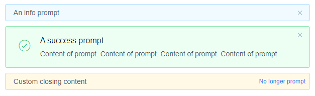
可关闭
显示关闭按钮,点击可关闭提示,也可以自定义关闭 slot 。
<template><Alert closable>An info prompt</Alert><Alert type="success" show-icon closable>A success prompt<span slot="desc">Content of prompt. Content of prompt. Content of prompt. Content of prompt. </span></Alert><Alert type="warning" closable>Custom closing content<span slot="close">No longer prompt</span></Alert></template><script>export default {}</script>

顶部公告
设置属性 banner 可以应用顶部公告的样式。
<template><Alert banner type="warning">Notice: notification contents...</Alert><Alert banner closable type="warning">Notice: notification contents...</Alert></template><script>export default {}</script>
API
Alert props
| 属性 | 说明 | 类型 | 默认值 |
|---|---|---|---|
| type | 警告提示样式,可选值为info、success、warning、error | String | info |
| closable | 是否可关闭 | Boolean | false |
| show-icon | 是否显示图标 | Boolean | false |
Alert events
| 事件名 | 说明 | 返回值 |
|---|---|---|
| on-close | 关闭时触发 | event |
Alert slot
| 名称 | 说明 |
|---|---|
| 无 | 警告提示内容 |
| desc | 警告提示辅助性文字介绍 |
| icon | 自定义图标内容 |
| close | 自定义关闭内容 |
