 我的书签
我的书签
 添加书签
添加书签 移除书签
移除书签- Tabs 标签页
- 何时使用
- 代码演示
- 基本用法
- 禁用
- 图标
- 滑动
- 附加内容
- 大小
- 位置
- 卡片式页签
- 新增和关闭页签
- 卡片式页签容器
- 自定义新增页签触发器
- 自定义页签头
- API
- Tabs
- 事件
- Tabs.TabPane
Tabs 标签页
选项卡切换组件。
何时使用
提供平级的区域将大块内容进行收纳和展现,保持界面整洁。
Ant Design 依次提供了三级选项卡,分别用于不同的场景。
- 卡片式的页签,提供可关闭的样式,常用于容器顶部。
- 标准线条式页签,用于容器内部的主功能切换,这是最常用的 Tabs。
- RadioButton 可作为更次级的页签来使用。
代码演示
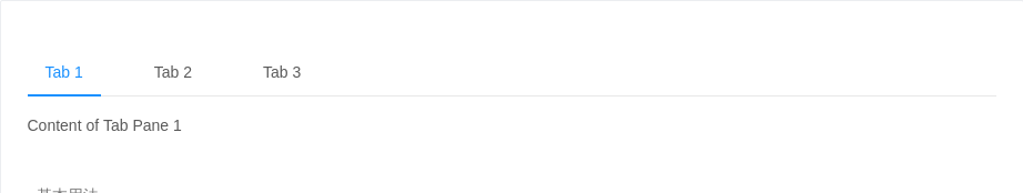
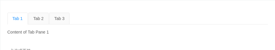
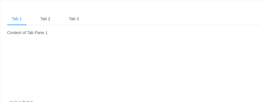
基本用法
默认选中第一项。
<template><div><a-tabs defaultActiveKey="1" @change="callback"><a-tab-pane tab="Tab 1" key="1">Content of Tab Pane 1</a-tab-pane><a-tab-pane tab="Tab 2" key="2" forceRender>Content of Tab Pane 2</a-tab-pane><a-tab-pane tab="Tab 3" key="3">Content of Tab Pane 3</a-tab-pane></a-tabs></div></template><script>export default {data () {return {}},methods: {callback (key) {console.log(key)},},}</script>
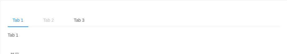
禁用
禁用某一项。
<template><a-tabs defaultActiveKey="1"><a-tab-pane tab="Tab 1" key="1">Tab 1</a-tab-pane><a-tab-pane tab="Tab 2" disabled key="2">Tab 2</a-tab-pane><a-tab-pane tab="Tab 3" key="3">Tab 3</a-tab-pane></a-tabs></template>
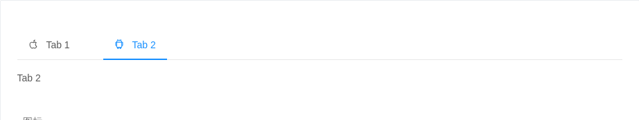
图标
有图标的标签。
<template><a-tabs defaultActiveKey="2"><a-tab-pane key="1"><span slot="tab"><a-icon type="apple" />Tab 1</span>Tab 1</a-tab-pane><a-tab-pane key="2"><span slot="tab"><a-icon type="android" />Tab 2</span>Tab 2</a-tab-pane></a-tabs></template>
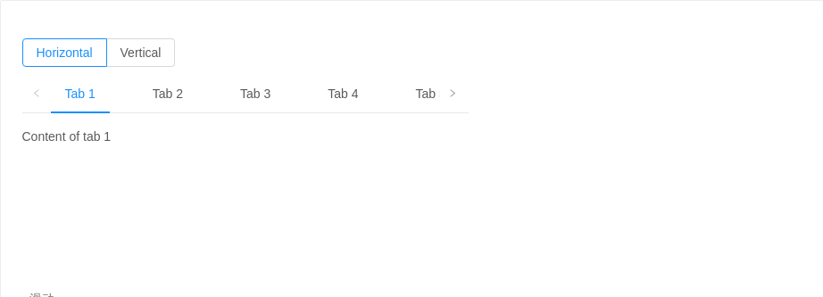
滑动
可以左右、上下滑动,容纳更多标签。
<template><div style="width: 500px"><a-radio-group v-model="mode" :style="{ marginBottom: '8px' }"><a-radio-button value="top">Horizontal</a-radio-button><a-radio-button value="left">Vertical</a-radio-button></a-radio-group><a-tabs defaultActiveKey="1" :tabPosition="mode" :style="{ height: '200px'}" @prevClick="callback" @nextClick="callback"><a-tab-pane tab="Tab 1" key="1">Content of tab 1</a-tab-pane><a-tab-pane tab="Tab 2" key="2">Content of tab 2</a-tab-pane><a-tab-pane tab="Tab 3" key="3">Content of tab 3</a-tab-pane><a-tab-pane tab="Tab 4" key="4">Content of tab 4</a-tab-pane><a-tab-pane tab="Tab 5" key="5">Content of tab 5</a-tab-pane><a-tab-pane tab="Tab 6" key="6">Content of tab 6</a-tab-pane><a-tab-pane tab="Tab 7" key="7">Content of tab 7</a-tab-pane><a-tab-pane tab="Tab 8" key="8">Content of tab 8</a-tab-pane><a-tab-pane tab="Tab 9" key="9">Content of tab 9</a-tab-pane><a-tab-pane tab="Tab 10" key="10">Content of tab 10</a-tab-pane><a-tab-pane tab="Tab 11" key="11">Content of tab 11</a-tab-pane></a-tabs></div></template><script>export default {data () {return {mode: 'top',}},methods: {callback (val) {console.log(val)},},}</script>
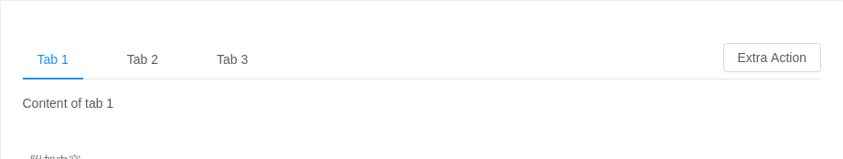
附加内容
可以在页签右边添加附加操作。
<template><a-tabs><a-tab-pane tab="Tab 1" key="1">Content of tab 1</a-tab-pane><a-tab-pane tab="Tab 2" key="2">Content of tab 2</a-tab-pane><a-tab-pane tab="Tab 3" key="3">Content of tab 3</a-tab-pane><a-button slot="tabBarExtraContent">Extra Action</a-button></a-tabs></template>
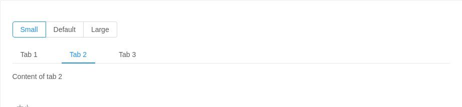
大小
大号页签用在页头区域,小号用在弹出框等较狭窄的容器内。
<template><div><a-radio-group v-model="size" style="margin-bottom: 16px"><a-radio-button value="small">Small</a-radio-button><a-radio-button value="default">Default</a-radio-button><a-radio-button value="large">Large</a-radio-button></a-radio-group><a-tabs defaultActiveKey="2" :size="size"><a-tab-pane tab="Tab 1" key="1">Content of tab 1</a-tab-pane><a-tab-pane tab="Tab 2" key="2">Content of tab 2</a-tab-pane><a-tab-pane tab="Tab 3" key="3">Content of tab 3</a-tab-pane></a-tabs></div></template><script>export default {data () {return {size: 'small',}},}</script>
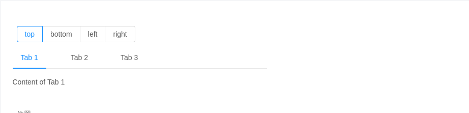
位置
有四个位置,tabPosition="left|right|top|bottom"。
<template><div style="width: 500px"><a-radio-group v-model="tabPosition" style="margin:8px"><a-radio-button value="top">top</a-radio-button><a-radio-button value="bottom">bottom</a-radio-button><a-radio-button value="left">left</a-radio-button><a-radio-button value="right">right</a-radio-button></a-radio-group><a-tabs defaultActiveKey="1" :tabPosition="tabPosition"><a-tab-pane tab="Tab 1" key="1">Content of Tab 1</a-tab-pane><a-tab-pane tab="Tab 2" key="2">Content of Tab 2</a-tab-pane><a-tab-pane tab="Tab 3" key="3">Content of Tab 3</a-tab-pane></a-tabs></div></template><script>export default {data () {return {tabPosition: 'top',}},methods: {callback (val) {console.log(val)},},}</script>
卡片式页签
另一种样式的页签,不提供对应的垂直样式。
<template><a-tabs @change="callback" type="card"><a-tab-pane tab="Tab 1" key="1">Content of Tab Pane 1</a-tab-pane><a-tab-pane tab="Tab 2" key="2">Content of Tab Pane 2</a-tab-pane><a-tab-pane tab="Tab 3" key="3">Content of Tab Pane 3</a-tab-pane></a-tabs></template><script>export default {data () {return {}},methods: {callback (key) {console.log(key)},},}</script>
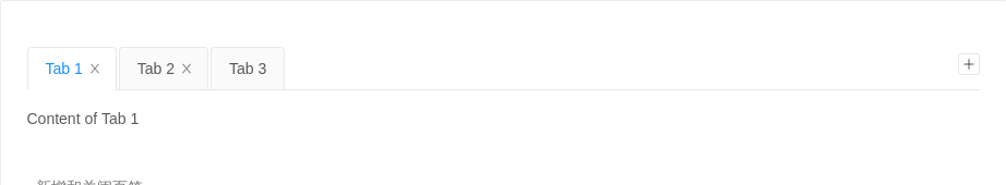
新增和关闭页签
只有卡片样式的页签支持新增和关闭选项。使用 closable={false} 禁止关闭。
<template><a-tabsv-model="activeKey"type="editable-card"@edit="onEdit"><a-tab-pane v-for="pane in panes" :tab="pane.title" :key="pane.key" :closable="pane.closable">{{pane.content}}</a-tab-pane></a-tabs></template><script>export default {data () {const panes = [{ title: 'Tab 1', content: 'Content of Tab 1', key: '1' },{ title: 'Tab 2', content: 'Content of Tab 2', key: '2' },{ title: 'Tab 3', content: 'Content of Tab 3', key: '3', closable: false },]return {activeKey: panes[0].key,panes,newTabIndex: 0,}},methods: {callback (key) {console.log(key)},onEdit (targetKey, action) {this[action](targetKey)},add () {const panes = this.panesconst activeKey = `newTab${this.newTabIndex++}`panes.push({ title: 'New Tab', content: 'Content of new Tab', key: activeKey })this.panes = panesthis.activeKey = activeKey},remove (targetKey) {let activeKey = this.activeKeylet lastIndexthis.panes.forEach((pane, i) => {if (pane.key === targetKey) {lastIndex = i - 1}})const panes = this.panes.filter(pane => pane.key !== targetKey)if (lastIndex >= 0 && activeKey === targetKey) {activeKey = panes[lastIndex].key}this.panes = panesthis.activeKey = activeKey},},}</script>
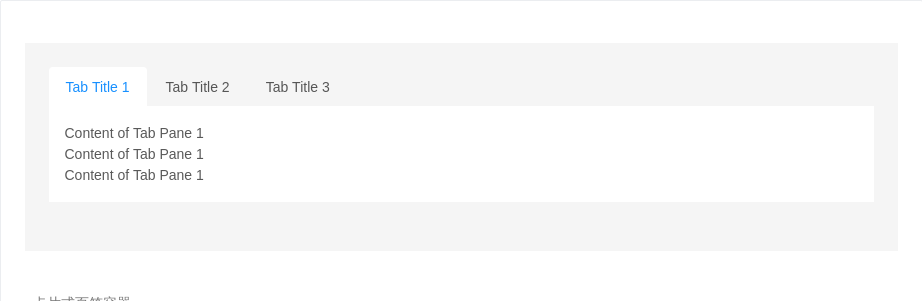
卡片式页签容器
用于容器顶部,需要一点额外的样式覆盖。
<template><div class="card-container"><a-tabs type="card"><a-tab-pane tab="Tab Title 1" key="1"><p>Content of Tab Pane 1</p><p>Content of Tab Pane 1</p><p>Content of Tab Pane 1</p></a-tab-pane><a-tab-pane tab="Tab Title 2" key="2"><p>Content of Tab Pane 2</p><p>Content of Tab Pane 2</p><p>Content of Tab Pane 2</p></a-tab-pane><a-tab-pane tab="Tab Title 3" key="3"><p>Content of Tab Pane 3</p><p>Content of Tab Pane 3</p><p>Content of Tab Pane 3</p></a-tab-pane></a-tabs></div></template><script>export default {data () {return {}},methods: {callback (key) {console.log(key)},},}</script><style>.card-container {background: #F5F5F5;overflow: hidden;padding: 24px;}.card-container > .ant-tabs-card > .ant-tabs-content {height: 120px;margin-top: -16px;}.card-container > .ant-tabs-card > .ant-tabs-content > .ant-tabs-tabpane {background: #fff;padding: 16px;}.card-container > .ant-tabs-card > .ant-tabs-bar {border-color: #fff;}.card-container > .ant-tabs-card > .ant-tabs-bar .ant-tabs-tab {border-color: transparent;background: transparent;}.card-container > .ant-tabs-card > .ant-tabs-bar .ant-tabs-tab-active {border-color: #fff;background: #fff;}</style>
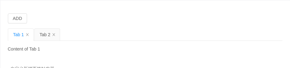
自定义新增页签触发器
隐藏默认的页签增加图标,给自定义触发器绑定事件。
<template><div><div :style="{ marginBottom: '16px' }"><a-button @click="add">ADD</a-button></div><a-tabshideAddv-model="activeKey"type="editable-card"@edit="onEdit"><a-tab-pane v-for="pane in panes" :tab="pane.title" :key="pane.key" :closable="pane.closable">{{pane.content}}</a-tab-pane></a-tabs></div></template><script>export default {data () {const panes = [{ title: 'Tab 1', content: 'Content of Tab 1', key: '1' },{ title: 'Tab 2', content: 'Content of Tab 2', key: '2' },]return {activeKey: panes[0].key,panes,newTabIndex: 0,}},methods: {callback (key) {console.log(key)},onEdit (targetKey, action) {this[action](targetKey)},add () {const panes = this.panesconst activeKey = `newTab${this.newTabIndex++}`panes.push({ title: `New Tab ${activeKey}`, content: `Content of new Tab ${activeKey}`, key: activeKey })this.panes = panesthis.activeKey = activeKey},remove (targetKey) {let activeKey = this.activeKeylet lastIndexthis.panes.forEach((pane, i) => {if (pane.key === targetKey) {lastIndex = i - 1}})const panes = this.panes.filter(pane => pane.key !== targetKey)if (lastIndex >= 0 && activeKey === targetKey) {activeKey = panes[lastIndex].key}this.panes = panesthis.activeKey = activeKey},},}</script>
自定义页签头
自定义页签头
<template><div><a-tabs defaultActiveKey="1"><a-tab-pane tab="Tab 1" key="1" style="height: 200px">Content of Tab Pane 1</a-tab-pane><a-tab-pane tab="Tab 2" key="2" forceRender>Content of Tab Pane 2</a-tab-pane><a-tab-pane tab="Tab 3" key="3">Content of Tab Pane 3</a-tab-pane><template slot="renderTabBar" slot-scope="props, DefaultTabBar"><component :is="DefaultTabBar" {...props} /></template></a-tabs></div></template><script>export default {data () {return {}},methods: {callback (key) {console.log(key)},},}</script>
API
Tabs
| 参数 | 说明 | 类型 | 默认值 |
|---|---|---|---|
| activeKey(v-model) | 当前激活 tab 面板的 key | string | 无 |
| animated | 是否使用动画切换 Tabs,在 tabPosition=top|bottom 时有效 | boolean | {inkBar:boolean, tabPane:boolean} | true, 当 type="card" 时为 false |
| defaultActiveKey | 初始化选中面板的 key,如果没有设置 activeKey | string | 第一个面板 |
| hideAdd | 是否隐藏加号图标,在 type="editable-card" 时有效 | boolean | false |
| size | 大小,提供 large default 和 small 三种大小 | string | 'default' |
| tabBarExtraContent | tab bar 上额外的元素 | slot | 无 |
| tabBarStyle | tab bar 的样式对象 | object | - |
| tabPosition | 页签位置,可选值有 top right bottom left | string | 'top' |
| type | 页签的基本样式,可选 line、card editable-card 类型 | string | 'line' |
| tabBarGutter | tabs 之间的间隙 | number | 无 |
事件
| 事件名称 | 说明 | 回调参数 |
|---|---|---|
| change | 切换面板的回调 | Function(activeKey) {} |
| edit | 新增和删除页签的回调,在 type="editable-card" 时有效 | (targetKey, action): void |
| nextClick | next 按钮被点击的回调 | Function |
| prevClick | prev 按钮被点击的回调 | Function |
| tabClick | tab 被点击的回调 | Function |
Tabs.TabPane
| 参数 | 说明 | 类型 | 默认值 |
|---|---|---|---|
| forceRender | 被隐藏时是否渲染 DOM 结构 | boolean | false |
| key | 对应 activeKey | string | 无 |
| tab | 选项卡头显示文字 | string|slot | 无 |
