 我的书签
我的书签
 添加书签
添加书签 移除书签
移除书签- Slider 滑动输入条
- 何时使用
- 代码演示
- 基本
- 带输入框的滑块
- 带 icon 的滑块
- 自定义提示
- 事件
- 带标签的滑块
- 垂直
- 控制 ToolTip 的显示
- API
- 事件
- 方法
Slider 滑动输入条
滑动型输入器,展示当前值和可选范围。
何时使用
当用户需要在数值区间/自定义区间内进行选择时,可为连续或离散值。
代码演示
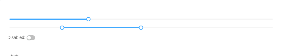
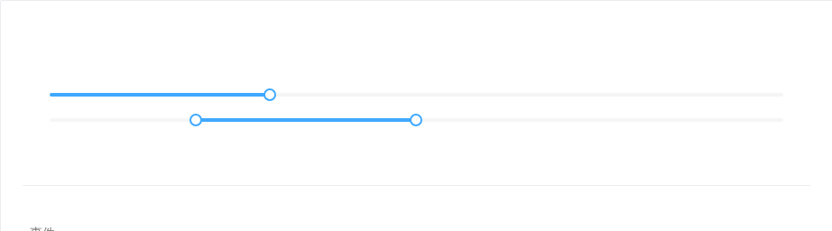
基本
基本滑动条。当 range 为 true 时,渲染为双滑块。当 disabled 为 true 时,滑块处于不可用状态。
<template><div><a-slider id="test" :defaultValue="30" :disabled="disabled" /><a-slider range :defaultValue="[20, 50]" :disabled="disabled" />Disabled: <a-switch size="small" :checked="disabled" @change="handleDisabledChange" /></div></template><script>export default {data() {return {disabled: false,}},methods: {handleDisabledChange(disabled) {this.disabled = disabled}},}</script><style scoped>.code-box-demo .ant-slider {margin-bottom: 16px;}</style>
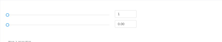
带输入框的滑块
和 数字输入框 组件保持同步。
<template><div><a-row><a-col :span="12"><a-slider :min="1" :max="20" v-model="inputValue1" /></a-col><a-col :span="4"><a-input-number:min="1":max="20"style="marginLeft: 16px"v-model="inputValue1"/></a-col></a-row><a-row><a-col :span="12"><a-slider :min="0" :max="1" v-model="inputValue" :step="0.01" /></a-col><a-col :span="4"><a-input-number:min="0":max="1":step="0.01"style="marginLeft: 16px"v-model="inputValue"/></a-col></a-row></div></template><script>export default {data() {return {inputValue: 0,inputValue1: 1,}},}</script><style scoped>.code-box-demo .ant-slider {margin-bottom: 16px;}</style>
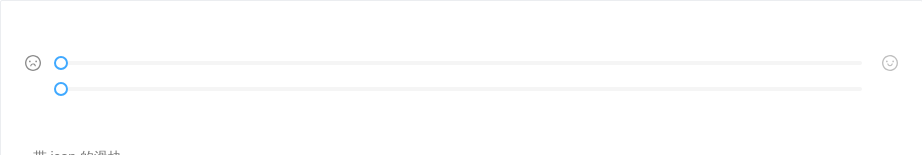
带 icon 的滑块
滑块左右可以设置图标来表达业务含义。
<template><div class="icon-wrapper"><a-icon :style="{color: preColor}" type="frown-o" /><a-slider :min="0" :max="20" @change="handleChange" :value="value" /><a-slider :min="0" :max="20" v-model="value" /><a-icon :style="{color: nextColor}" type="smile-o" /></div></template><script>export default {data() {return {value: 0,min: 0,max: 20,}},methods: {handleChange(value) {this.value = value}},computed: {preColor() {const { max, min, value } = thisconst mid = ((max - min) / 2).toFixed(5);return value >= mid ? '' : 'rgba(0, 0, 0, .45)';const nextColor = value >= mid ? 'rgba(0, 0, 0, .45)' : '';},nextColor() {const { max, min, value } = thisconst mid = ((max - min) / 2).toFixed(5);return value >= mid ? 'rgba(0, 0, 0, .45)' : '';}}}</script><style scoped>.icon-wrapper {position: relative;padding: 0px 30px;}.icon-wrapper .anticon {position: absolute;top: -2px;width: 16px;height: 16px;line-height: 1;font-size: 16px;color: rgba(0, 0, 0, .25);}.icon-wrapper .anticon:first-child {left: 0;}.icon-wrapper .anticon:last-child {right: 0;}</style>
自定义提示
使用 tipFormatter 可以格式化 Tooltip 的内容,设置 tipFormatter={null},则隐藏 Tooltip。
<template><div><a-slider :tipFormatter="formatter" /><a-slider :tipFormatter="null" /></div></template><script>export default {data() {return {disabled: false,}},methods: {formatter(value) {return `${value}%`;}},}</script>
事件
当 Slider 的值发生改变时,会触发 onChange 事件,并把改变后的值作为参数传入。在 onmouseup 时,会触发 onAfterChange 事件,并把当前值作为参数传入。
<template><div class="code-box-demo"><a-slider :defaultValue="30" @change="onChange" @afterChange="onAfterChange" /><a-slider range :step="10" :defaultValue="[20, 50]" @change="onChange" @afterChange="onAfterChange" /></div></template><script>export default {data() {return {disabled: false,}},methods: {onChange(value) {console.log('change: ', value);},onAfterChange(value) {console.log('afterChange: ', value);}},}</script><style scoped>.code-box-demo .ant-slider {margin-bottom: 16px;}</style>
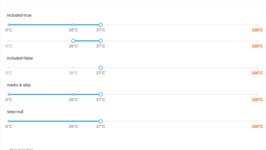
带标签的滑块
使用 marks 属性标注分段式滑块,使用 value / defaultValue 指定滑块位置。当 included=false 时,表明不同标记间为并列关系。当 step=null 时,Slider 的可选值仅有 marks 标出来的部分。
<template><div id="components-slider-demo-mark"><h4>included=true</h4><a-slider :marks="marks" :defaultValue="37" /><a-slider range :marks="marks" :defaultValue="[26, 37]" /><h4>included=false</h4><a-slider :marks="marks" :included="false" :defaultValue="37" /><h4>marks & step</h4><a-slider :marks="marks" :step="10" :defaultValue="37" /><h4>step=null</h4><a-slider :marks="marks" :step="null" :defaultValue="37" /></div></template><script>export default {data() {return {marks: {0: '0°C',26: '26°C',37: '37°C',100: {style: {color: '#f50',},label: <strong>100°C</strong>,},},}},methods: {onChange(value) {console.log('change: ', value);},onAfterChange(value) {console.log('afterChange: ', value);}},}</script><style scoped>#components-slider-demo-mark h4 {margin: 0 0 16px;}#components-slider-demo-mark .ant-slider-with-marks {margin-bottom: 44px;}</style>
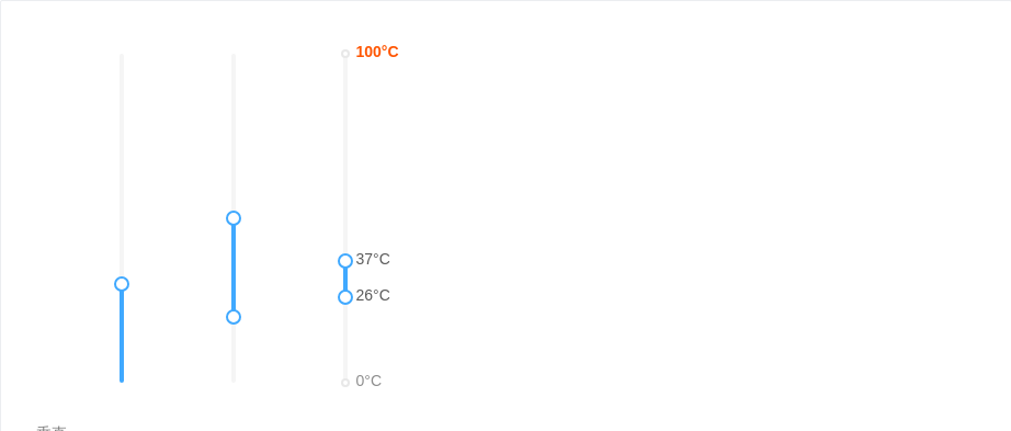
垂直
垂直方向的 Slider。
<template><div style="height: 300px"><div style="float:left;height: 300px;marginLeft: 70px"><a-slider vertical :defaultValue="30" /></div><div style="float:left;height: 300px;marginLeft: 70px"><a-slider vertical range :step="10" :defaultValue="[20, 50]" /></div><div style="float:left;height: 300px;marginLeft: 70px"><a-slider vertical range :marks="marks" :defaultValue="[26, 37]" /></div></div></template><script>export default {data() {return {marks: {0: '0°C',26: '26°C',37: '37°C',100: {style: {color: '#f50',},label: <strong>100°C</strong>,},},}},methods: {handleDisabledChange(disabled) {this.disabled = disabled}},}</script><style scoped>.code-box-demo .ant-slider {margin-bottom: 16px;}</style>
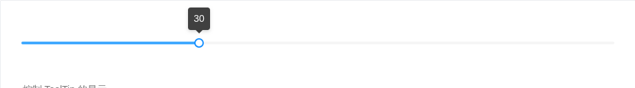
控制 ToolTip 的显示
当 tooltipVisible 为 true 时,将始终显示ToolTip;反之则始终不显示,即使在拖动、移入时也是如此。
<template><a-slider :defaultValue="30" :tooltipVisible="true" /></template>
API
| 参数 | 说明 | 类型 | 默认值 |
|---|---|---|---|
| autoFocus | 自动获取焦点 | boolean | false |
| defaultValue | 设置初始取值。当 range 为 false 时,使用 number,否则用 [number, number] | number|number[] | 0 or [0, 0] |
| disabled | 值为 true 时,滑块为禁用状态 | boolean | false |
| dots | 是否只能拖拽到刻度上 | boolean | false |
| included | marks 不为空对象时有效,值为 true 时表示值为包含关系,false 表示并列 | boolean | true |
| marks | 刻度标记,key 的类型必须为 number 且取值在闭区间 [min, max] 内,每个标签可以单独设置样式 | object | { number: string|VNode } or { number: { style: object, label: string|VNode } } or { number: () => VNode } |
| max | 最大值 | number | 100 |
| min | 最小值 | number | 0 |
| range | 双滑块模式 | boolean | false |
| step | 步长,取值必须大于 0,并且可被 (max - min) 整除。当 marks 不为空对象时,可以设置 step 为 null,此时 Slider 的可选值仅有 marks 标出来的部分。 | number|null | 1 |
| tipFormatter | Slider 会把当前值传给 tipFormatter,并在 Tooltip 中显示 tipFormatter 的返回值,若为 null,则隐藏 Tooltip。 | Function|null | IDENTITY |
| value(v-model) | 设置当前取值。当 range 为 false 时,使用 number,否则用 [number, number] | number|number[] | |
| vertical | 值为 true 时,Slider 为垂直方向 | Boolean | false |
| tooltipVisible | 值为true时,Tooltip 将会始终显示;否则始终不显示,哪怕在拖拽及移入时。 | Boolean |
事件
| 事件名称 | 说明 | 回调参数 |
|---|---|---|
| afterChange | 与 mouseup 触发时机一致,把当前值作为参数传入。 | Function(value) |
| change | 当 Slider 的值发生改变时,会触发 change 事件,并把改变后的值作为参数传入。 | Function(value) |
方法
| 名称 | 描述 |
|---|---|
| blur() | 移除焦点 |
| focus() | 获取焦点 |
