 我的书签
我的书签
 添加书签
添加书签 移除书签
移除书签- Collapse折叠面板
- 何时使用
- 代码演示
- 折叠面板
- 手风琴
- 面板嵌套
- 简洁风格
- 自定义面板
- 隐藏箭头
- API
- Collapse
- 事件
- Collapse.Panel
Collapse折叠面板
可以折叠/展开的内容区域。
何时使用
- 对复杂区域进行分组和隐藏,保持页面的整洁。
- ‘手风琴’ 是一种特殊的折叠面板,只允许单个内容区域展开。
代码演示
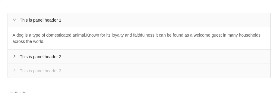
折叠面板
可以同时展开多个面板,这个例子默认展开了第一个。
<template><div><a-collapse v-model="activeKey"><a-collapse-panel header="This is panel header 1" key="1"><p>{{text}}</p></a-collapse-panel><a-collapse-panel header="This is panel header 2" key="2" :disabled='false'><p>{{text}}</p></a-collapse-panel><a-collapse-panel header="This is panel header 3" key="3" disabled><p>{{text}}</p></a-collapse-panel></a-collapse></div></template><script>export default {data () {return {text: `A dog is a type of domesticated animal.Known for its loyalty and faithfulness,it can be found as a welcome guest in many households across the world.`,activeKey: ['1']}},watch: {activeKey(key){console.log(key)}},}</script>
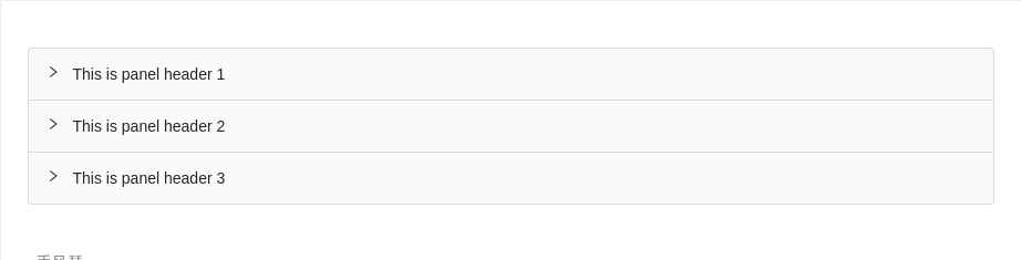
手风琴
手风琴,每次只打开一个tab。默认打开第一个。
<template><div><a-collapse accordion><a-collapse-panel header="This is panel header 1" key="1"><p>{{text}}</p></a-collapse-panel><a-collapse-panel header="This is panel header 2" key="2" :disabled='false'><p>{{text}}</p></a-collapse-panel><a-collapse-panel header="This is panel header 3" key="3"><p>{{text}}</p></a-collapse-panel></a-collapse></div></template><script>export default {data () {return {text: `A dog is a type of domesticated animal.Known for its loyalty and faithfulness,it can be found as a welcome guest in many households across the world.`,}},}</script>

面板嵌套
嵌套折叠面板。
<template><div><a-collapse @change="changeActivekey"><a-collapse-panel header="This is panel header 1" key="1"><a-collapse defaultActiveKey="4"><a-collapse-panel header="This is panel nest panel" key="4"><p>{{text}}</p></a-collapse-panel></a-collapse></a-collapse-panel><a-collapse-panel header="This is panel header 2" key="2" :disabled='false'><p>{{text}}</p></a-collapse-panel><a-collapse-panel header="This is panel header 3" key="3"><p>{{text}}</p></a-collapse-panel></a-collapse></div></template><script>export default {data () {return {text: `A dog is a type of domesticated animal.Known for its loyalty and faithfulness,it can be found as a welcome guest in many households across the world.`,}},methods: {changeActivekey (key) {console.log(key)},},}</script>
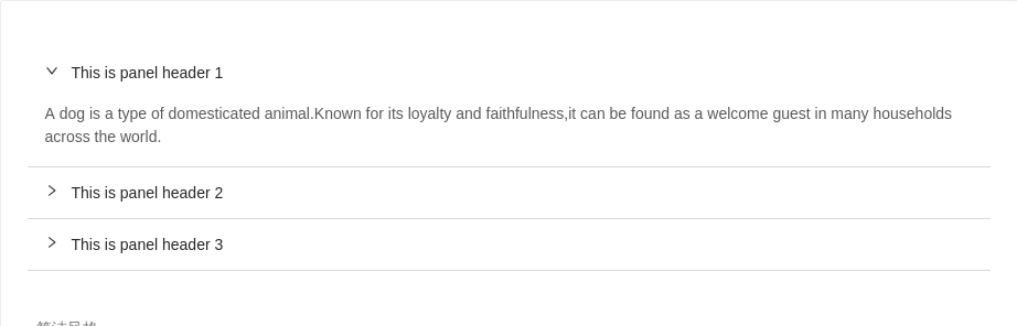
简洁风格
一套没有边框的简洁样式。
<template><div><a-collapse defaultActiveKey="1" :bordered="false"><a-collapse-panel header="This is panel header 1" key="1"><p>{{text}}</p></a-collapse-panel><a-collapse-panel header="This is panel header 2" key="2" :disabled='false'><p>{{text}}</p></a-collapse-panel><a-collapse-panel header="This is panel header 3" key="3"><p>{{text}}</p></a-collapse-panel></a-collapse></div></template><script>export default {data () {return {text: `A dog is a type of domesticated animal.Known for its loyalty and faithfulness,it can be found as a welcome guest in many households across the world.`,}},}</script>
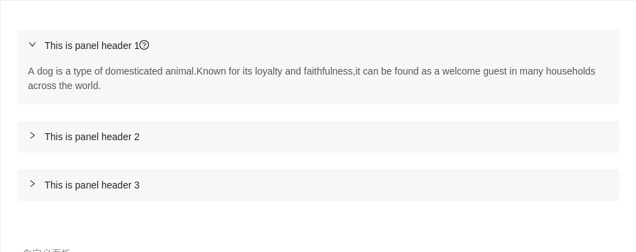
自定义面板
自定义各个面板的背景色、圆角和边距。
<template><div><a-collapse defaultActiveKey="1" :bordered="false"><a-collapse-panel key="1" :style="customStyle"><template slot="header">This is panel header 1<a-icon type="question-circle-o" /></template><p>{{text}}</p></a-collapse-panel><a-collapse-panel header="This is panel header 2" key="2" :style="customStyle"><p>{{text}}</p></a-collapse-panel><a-collapse-panel header="This is panel header 3" key="3" :style="customStyle"><p>{{text}}</p></a-collapse-panel></a-collapse></div></template><script>export default {data () {return {text: `A dog is a type of domesticated animal.Known for its loyalty and faithfulness,it can be found as a welcome guest in many households across the world.`,customStyle: 'background: #f7f7f7;border-radius: 4px;margin-bottom: 24px;border: 0;overflow: hidden'}},}</script>
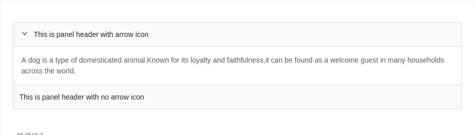
隐藏箭头
你可以通过 :showArrow="false" 隐藏 a-collapse-panel 组件的箭头图标。
<template><div><a-collapse defaultActiveKey="1" @change="changeActivekey"><a-collapse-panel header="This is panel header with arrow icon" key="1"><p>{{text}}</p></a-collapse-panel><a-collapse-panel header="This is panel header with no arrow icon" key="2" :showArrow="false"><p>{{text}}</p></a-collapse-panel></a-collapse></div></template><script>export default {data () {return {text: `A dog is a type of domesticated animal.Known for its loyalty and faithfulness,it can be found as a welcome guest in many households across the world.`,}},methods: {changeActivekey (key) {console.log(key)},},}</script>
API
Collapse
| 参数 | 说明 | 类型 | 默认值 |
|---|---|---|---|
| activeKey(v-model) | 当前激活 tab 面板的 key | string[]|string | 默认无,accordion模式下默认第一个元素 |
| defaultActiveKey | 初始化选中面板的 key | string | 无 |
事件
| 事件名称 | 说明 | 回调参数 |
|---|---|---|
| change | 切换面板的回调 | function(key) |
Collapse.Panel
| 参数 | 说明 | 类型 | 默认值 |
|---|---|---|---|
| disabled | 禁用后的面板展开与否将无法通过用户交互改变 | boolean | false |
| forceRender | 被隐藏时是否渲染 DOM 结构 | boolean | false |
| header | 面板头内容 | string|slot | 无 |
| key | 对应 activeKey | string | 无 |
