 我的书签
我的书签
 添加书签
添加书签 移除书签
移除书签- Badge徽标数
- 何时使用
- 代码演示
- 基本
- 独立使用
- 封顶数字
- 讨嫌的小红点
- 状态点
- 动态
- 自定义标题
- API
Badge徽标数
图标右上角的圆形徽标数字。
何时使用
一般出现在通知图标或头像的右上角,用于显示需要处理的消息条数,通过醒目视觉形式吸引用户处理。
代码演示
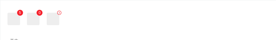
基本
简单的徽章展示,当 count 为 0 时,默认不显示,但是可以使用 showZero 修改为显示。
<template><div><a-badge count="5"><a href="#" class="head-example"></a></a-badge><a-badge count="0" showZero><a href="#" class="head-example"></a></a-badge><a-badge><a-icon slot="count" type="clock-circle" style="color: #f5222d" /><a href="#" class="head-example"></a></a-badge></div></template>
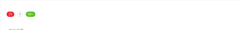
独立使用
不包裹任何元素即是独立使用,可自定样式展现。在右上角的 badge 则限定为红色。
<template><div><a-badge count="25" /><a-badge count="4" :numberStyle="{backgroundColor: '#fff', color: '#999', boxShadow: '0 0 0 1px #d9d9d9 inset'}" /><a-badge count="109" :numberStyle= "{backgroundColor: '#52c41a'} " /></div></template>
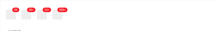
封顶数字
超过 overflowCount 的会显示为 ${overflowCount}+,默认的 overflowCount 为 99。
<template><div><a-badge :count="99"><a href="#" class="head-example"></a></a-badge><a-badge :count="100"><a href="#" class="head-example"></a></a-badge><a-badge :count="99" :overflowCount="10"><a href="#" class="head-example"></a></a-badge><a-badge :count="1000" :overflowCount="999"><a href="#" class="head-example"></a></a-badge></div></template>
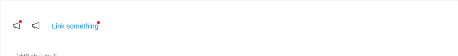
讨嫌的小红点
没有具体的数字。
<template><div id="components-badge-demo-dot"><a-badge dot><a-icon type="notification" /></a-badge><a-badge :count="0" dot><a-icon type="notification" /></a-badge><a-badge dot><a href="#">Link something</a></a-badge></div></template><style scoped>#components-badge-demo-dot .anticon-notification {width: 16px;height: 16px;line-height: 16px;font-size: 16px;}</style>
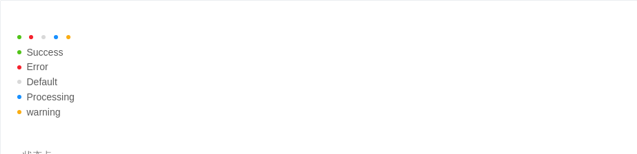
状态点
用于表示状态的小圆点。
<template><div><a-badge status="success" /><a-badge status="error" /><a-badge status="default" /><a-badge status="processing" /><a-badge status="warning" /><br /><a-badge status="success" text="Success" /><br /><a-badge status="error" text="Error" /><br /><a-badge status="default" text="Default" /><br /><a-badge status="processing" text="Processing" /><br /><a-badge status="warning" text="warning" /></div></template>
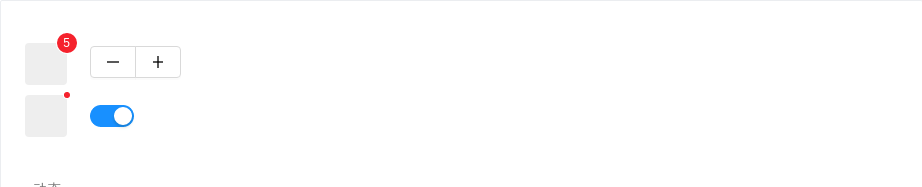
动态
展示动态变化的效果。
<template><div><div><a-badge :count="count"><a href="#" class="head-example" /></a-badge><a-button-group><a-button @click="decline"><a-icon type="minus" /></a-button><a-button @click="increase"><a-icon type="plus" /></a-button></a-button-group></div><div style="margin-top: 10px"><a-badge :dot="show"><a href="#" class="head-example" /></a-badge><a-switch v-model="show" /></div></div></template><script>export default {data(){return {count: 5,show: true,}},methods: {decline () {let count = this.count - 1if (count < 0) {count = 0}this.count = count},increase () {this.count++},}}</script>
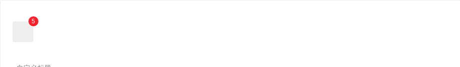
自定义标题
设置鼠标放在状态点上时显示的文字
<template><div id="components-badge-demo-title"><a-badge :count="5" title="Custom hover text"><a href="#" class="head-example" /></a-badge></div></template><style scoped>#components-badge-demo-title .ant-badge:not(.ant-badge-status) {margin-right: 20px;}.head-example {width: 42px;height: 42px;border-radius: 4px;background: #eee;display: inline-block;}</style>
API
<a-badge :count="5"><a href="#" class="head-example" /></a-badge>
| 参数 | 说明 | 类型 | 默认值 |
|---|---|---|---|
| count | 展示的数字,大于 overflowCount 时显示为 ${overflowCount}+,为 0 时隐藏 | number | string | slot | |
| dot | 不展示数字,只有一个小红点 | boolean | false |
| offset | 设置状态点的位置偏移,格式为 [x, y] | [number|string, number|string] | - |
| overflowCount | 展示封顶的数字值 | number | 99 |
| showZero | 当数值为 0 时,是否展示 Badge | boolean | false |
| status | 设置 Badge 为状态点 | Enum{ 'success', 'processing, 'default', 'error', 'warning' } | '' |
| text | 在设置了 status 的前提下有效,设置状态点的文本 | string | '' |
| numberStyle | 设置状态点的样式 | object | '' |
| title | 设置鼠标放在状态点上时显示的文字 | string | count |
