 我的书签
我的书签
 添加书签
添加书签 移除书签
移除书签- 布局
- 设计规则
- 尺寸
- 交互
- 视觉
- 组件概述
- 代码演示
- 基本结构
- 自定义触发器
- 顶部-侧边布局-通栏
- 顶部-侧边布局
- 上中下布局
- 响应式布局
- 固定侧边栏
- 固定头部
- 侧边布局
- 设计规则
- API
- Layout
- Layout.Sider
- 事件
- breakpoint width
- breakpoint width
布局
协助进行页面级整体布局。
设计规则
尺寸
一级导航项偏左靠近 logo 放置,辅助菜单偏右放置。
- 顶部导航(大部分系统):一级导航高度
64px,二级导航48px。 - 顶部导航(展示类页面):一级导航高度
80px,二级导航56px。 - 顶部导航高度的范围计算公式为:
48+8n。 - 侧边导航宽度的范围计算公式:
200+8n。
交互
- 一级导航和末级的导航需要在可视化的层面被强调出来;
- 当前项应该在呈现上优先级最高;
- 当导航收起的时候,当前项的样式自动赋予给它的上一个层级;
- 左侧导航栏的收放交互同时支持手风琴和全展开的样式,根据业务的要求进行适当的选择。
视觉
导航样式上需要根据信息层级合理的选择样式:
大色块强调
建议用于底色为深色系时,当前页面父级的导航项。高亮火柴棍
当导航栏底色为浅色系时使用,可用于当前页面对应导航项,建议尽量在导航路径的最终项使用。字体高亮变色
从可视化层面,字体高亮的视觉强化力度低于大色块,通常在当前项的上一级使用。字体放大
12px、14px是导航的标准字号,14 号字体用在一、二级导航中。字号可以考虑导航项的等级做相应选择。
组件概述
Layout:布局容器,其下可嵌套HeaderSiderContentFooter或Layout本身,可以放在任何父容器中。Header:顶部布局,自带默认样式,其下可嵌套任何元素,只能放在Layout中。Sider:侧边栏,自带默认样式及基本功能,其下可嵌套任何元素,只能放在Layout中。Content:内容部分,自带默认样式,其下可嵌套任何元素,只能放在Layout中。Footer:底部布局,自带默认样式,其下可嵌套任何元素,只能放在Layout中。
注意:采用 flex 布局实现,请注意浏览器兼容性问题。
代码演示
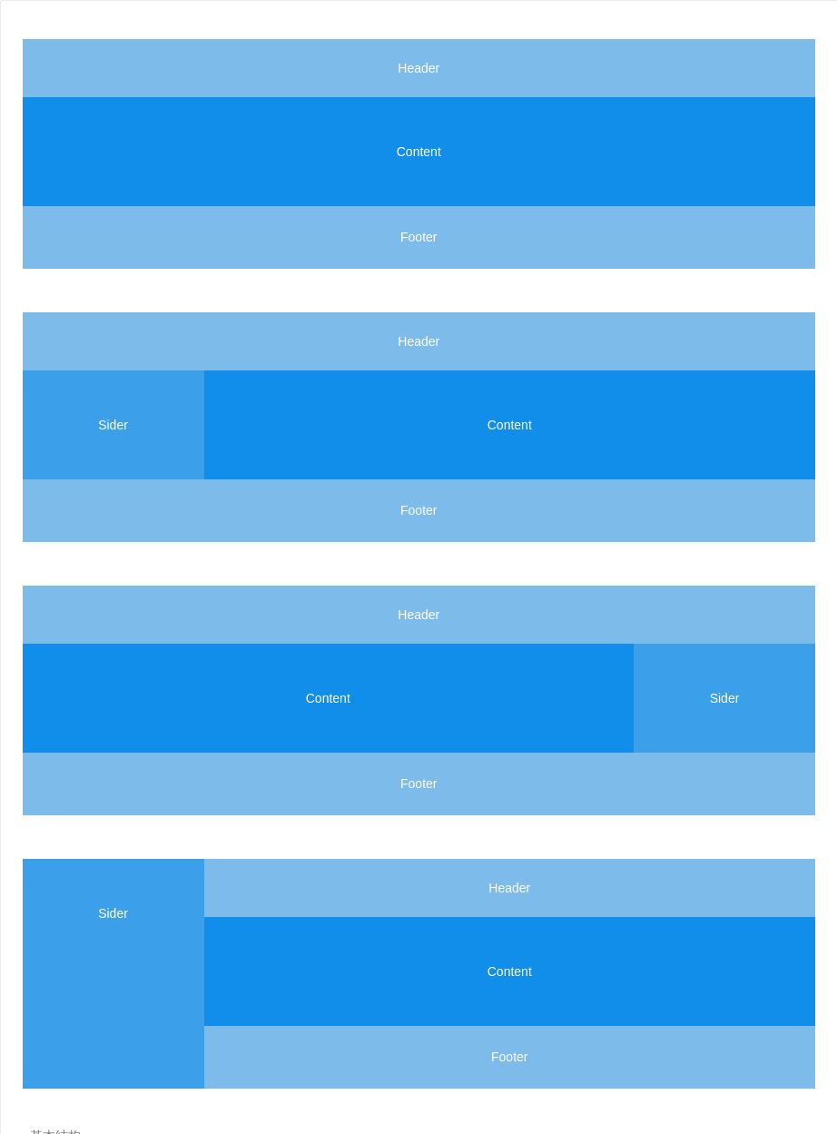
基本结构
典型的页面布局。
<template><div id="components-layout-demo-basic"><a-layout><a-layout-header>Header</a-layout-header><a-layout-content>Content</a-layout-content><a-layout-footer>Footer</a-layout-footer></a-layout><a-layout><a-layout-header>Header</a-layout-header><a-layout><a-layout-sider>Sider</a-layout-sider><a-layout-content>Content</a-layout-content></a-layout><a-layout-footer>Footer</a-layout-footer></a-layout><a-layout><a-layout-header>Header</a-layout-header><a-layout><a-layout-content>Content</a-layout-content><a-layout-sider>Sider</a-layout-sider></a-layout><a-layout-footer>Footer</a-layout-footer></a-layout><a-layout><a-layout-sider>Sider</a-layout-sider><a-layout><a-layout-header>Header</a-layout-header><a-layout-content>Content</a-layout-content><a-layout-footer>Footer</a-layout-footer></a-layout></a-layout></div></template><style>#components-layout-demo-basic {text-align: center;}#components-layout-demo-basic .ant-layout-header,#components-layout-demo-basic .ant-layout-footer {background: #7dbcea;color: #fff;}#components-layout-demo-basic .ant-layout-footer {line-height: 1.5;}#components-layout-demo-basic .ant-layout-sider {background: #3ba0e9;color: #fff;line-height: 120px;}#components-layout-demo-basic .ant-layout-content {background: rgba(16, 142, 233, 1);color: #fff;min-height: 120px;line-height: 120px;}#components-layout-demo-basic > .ant-layout {margin-bottom: 48px;}#components-layout-demo-basic > .ant-layout:last-child {margin: 0;}</style>
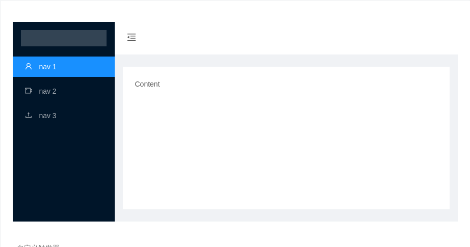
自定义触发器
要使用自定义触发器,可以设置 :trigger="null" 来隐藏默认设定。
<template><a-layout id="components-layout-demo-custom-trigger"><a-layout-sider:trigger="null"collapsiblev-model="collapsed"><div class="logo" /><a-menu theme="dark" mode="inline" :defaultSelectedKeys="['1']"><a-menu-item key="1"><a-icon type="user" /><span>nav 1</span></a-menu-item><a-menu-item key="2"><a-icon type="video-camera" /><span>nav 2</span></a-menu-item><a-menu-item key="3"><a-icon type="upload" /><span>nav 3</span></a-menu-item></a-menu></a-layout-sider><a-layout><a-layout-header style="background: #fff; padding: 0"><a-iconclass="trigger":type="collapsed ? 'menu-unfold' : 'menu-fold'"@click="()=> collapsed = !collapsed"/></a-layout-header><a-layout-content :style="{ margin: '24px 16px', padding: '24px', background: '#fff', minHeight: '280px' }">Content</a-layout-content></a-layout></a-layout></template><script>export default {data(){return {collapsed: false,}},}</script><style>#components-layout-demo-custom-trigger .trigger {font-size: 18px;line-height: 64px;padding: 0 24px;cursor: pointer;transition: color .3s;}#components-layout-demo-custom-trigger .trigger:hover {color: #1890ff;}#components-layout-demo-custom-trigger .logo {height: 32px;background: rgba(255,255,255,.2);margin: 16px;}</style>
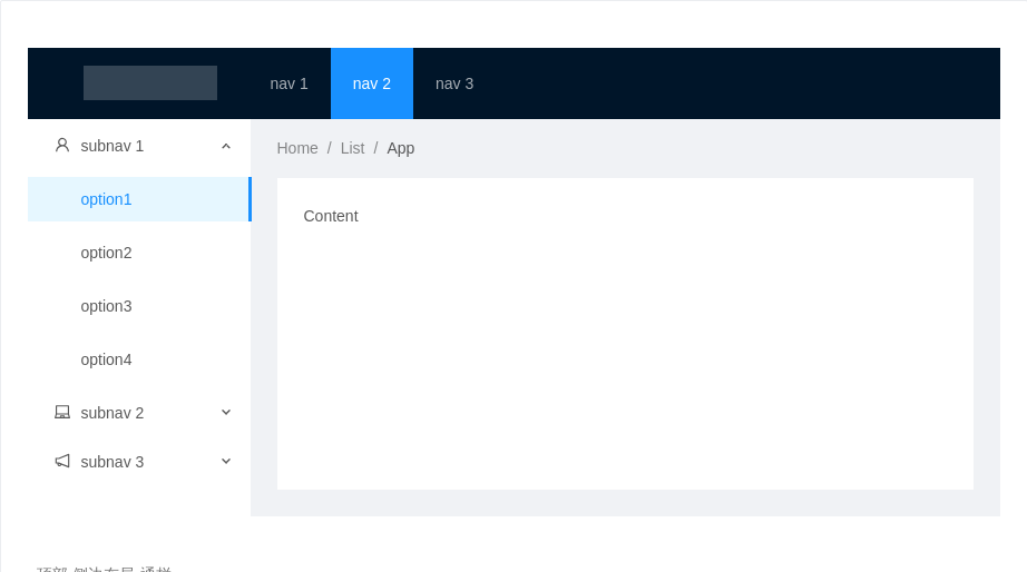
顶部-侧边布局-通栏
同样拥有顶部导航及侧边栏,区别是两边未留边距,多用于应用型的网站。
<template><a-layout id="components-layout-demo-top-side-2"><a-layout-header class="header"><div class="logo" /><a-menutheme="dark"mode="horizontal":defaultSelectedKeys="['2']":style="{ lineHeight: '64px' }"><a-menu-item key="1">nav 1</a-menu-item><a-menu-item key="2">nav 2</a-menu-item><a-menu-item key="3">nav 3</a-menu-item></a-menu></a-layout-header><a-layout><a-layout-sider width="200" style="background: #fff"><a-menumode="inline":defaultSelectedKeys="['1']":defaultOpenKeys="['sub1']":style="{ height: '100%', borderRight: 0 }"><a-sub-menu key="sub1"><span slot="title"><a-icon type="user" />subnav 1</span><a-menu-item key="1">option1</a-menu-item><a-menu-item key="2">option2</a-menu-item><a-menu-item key="3">option3</a-menu-item><a-menu-item key="4">option4</a-menu-item></a-sub-menu><a-sub-menu key="sub2"><span slot="title"><a-icon type="laptop" />subnav 2</span><a-menu-item key="5">option5</a-menu-item><a-menu-item key="6">option6</a-menu-item><a-menu-item key="7">option7</a-menu-item><a-menu-item key="8">option8</a-menu-item></a-sub-menu><a-sub-menu key="sub3"><span slot="title"><a-icon type="notification" />subnav 3</span><a-menu-item key="9">option9</a-menu-item><a-menu-item key="10">option10</a-menu-item><a-menu-item key="11">option11</a-menu-item><a-menu-item key="12">option12</a-menu-item></a-sub-menu></a-menu></a-layout-sider><a-layout style="padding: 0 24px 24px"><a-breadcrumb style="margin: 16px 0"><a-breadcrumb-item>Home</a-breadcrumb-item><a-breadcrumb-item>List</a-breadcrumb-item><a-breadcrumb-item>App</a-breadcrumb-item></a-breadcrumb><a-layout-content :style="{ background: '#fff', padding: '24px', margin: 0, minHeight: '280px' }">Content</a-layout-content></a-layout></a-layout></a-layout></template><script>export default {data () {return {collapsed: false,}},}</script><style>#components-layout-demo-top-side-2 .logo {width: 120px;height: 31px;background: rgba(255,255,255,.2);margin: 16px 28px 16px 0;float: left;}</style>
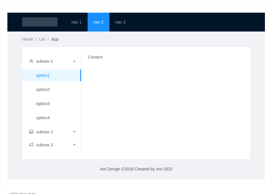
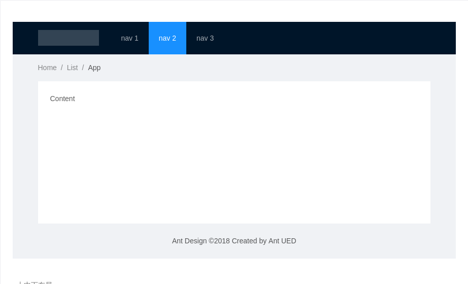
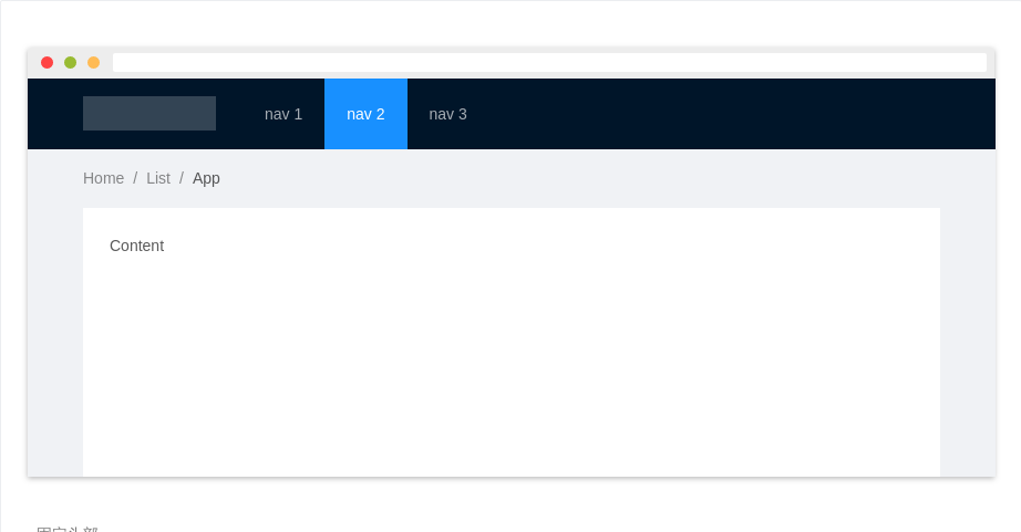
顶部-侧边布局
拥有顶部导航及侧边栏的页面,多用于展示类网站。
<template><a-layout id="components-layout-demo-top-side"><a-layout-header class="header"><div class="logo" /><a-menutheme="dark"mode="horizontal":defaultSelectedKeys="['2']":style="{ lineHeight: '64px' }"><a-menu-item key="1">nav 1</a-menu-item><a-menu-item key="2">nav 2</a-menu-item><a-menu-item key="3">nav 3</a-menu-item></a-menu></a-layout-header><a-layout-content style="padding: 0 50px"><a-breadcrumb style="margin: 16px 0"><a-breadcrumb-item>Home</a-breadcrumb-item><a-breadcrumb-item>List</a-breadcrumb-item><a-breadcrumb-item>App</a-breadcrumb-item></a-breadcrumb><a-layout style="padding: 24px 0; background: #fff"><a-layout-sider width="200" style="background: #fff"><a-menumode="inline":defaultSelectedKeys="['1']":defaultOpenKeys="['sub1']"style="height: 100%"><a-sub-menu key="sub1"><span slot="title"><a-icon type="user" />subnav 1</span><a-menu-item key="1">option1</a-menu-item><a-menu-item key="2">option2</a-menu-item><a-menu-item key="3">option3</a-menu-item><a-menu-item key="4">option4</a-menu-item></a-sub-menu><a-sub-menu key="sub2"><span slot="title"><a-icon type="laptop" />subnav 2</span><a-menu-item key="5">option5</a-menu-item><a-menu-item key="6">option6</a-menu-item><a-menu-item key="7">option7</a-menu-item><a-menu-item key="8">option8</a-menu-item></a-sub-menu><a-sub-menu key="sub3"><span slot="title"><a-icon type="notification" />subnav 3</span><a-menu-item key="9">option9</a-menu-item><a-menu-item key="10">option10</a-menu-item><a-menu-item key="11">option11</a-menu-item><a-menu-item key="12">option12</a-menu-item></a-sub-menu></a-menu></a-layout-sider><a-layout-content :style="{ padding: '0 24px', minHeight: '280px' }">Content</a-layout-content></a-layout></a-layout-content><a-layout-footer style="text-align: center">Ant Design ©2018 Created by Ant UED</a-layout-footer></a-layout></template><style>#components-layout-demo-top-side .logo {width: 120px;height: 31px;background: rgba(255,255,255,.2);margin: 16px 28px 16px 0;float: left;}</style>
上中下布局
最基本的『上-中-下』布局。一般主导航放置于页面的顶端,从左自右依次为:logo、一级导航项、辅助菜单(用户、设置、通知等)。通常将内容放在固定尺寸(例如:1200px)内,整个页面排版稳定,不受用户终端显示器影响;上下级的结构符合用户上下浏览的习惯,也是较为经典的网站导航模式。页面上下切分的方式提高了主工作区域的信息展示效率,但在纵向空间上会有一些牺牲。此外,由于导航栏水平空间的限制,不适合那些一级导航项很多的信息结构。
<template><a-layout id="components-layout-demo-top" class="layout"><a-layout-header><div class="logo" /><a-menutheme="dark"mode="horizontal":defaultSelectedKeys="['2']":style="{ lineHeight: '64px' }"><a-menu-item key="1">nav 1</a-menu-item><a-menu-item key="2">nav 2</a-menu-item><a-menu-item key="3">nav 3</a-menu-item></a-menu></a-layout-header><a-layout-content style="padding: 0 50px"><a-breadcrumb style="margin: 16px 0"><a-breadcrumb-item>Home</a-breadcrumb-item><a-breadcrumb-item>List</a-breadcrumb-item><a-breadcrumb-item>App</a-breadcrumb-item></a-breadcrumb><div :style="{ background: '#fff', padding: '24px', minHeight: '280px' }">Content</div></a-layout-content><a-layout-footer style="text-align: center">Ant Design ©2018 Created by Ant UED</a-layout-footer></a-layout></template><style>#components-layout-demo-top .logo {width: 120px;height: 31px;background: rgba(255,255,255,.2);margin: 16px 24px 16px 0;float: left;}</style>
响应式布局
Layout.Sider 支持响应式布局。
说明:配置
breakpoint属性即生效,视窗宽度小于breakpoint时 Sider 缩小为collapsedWidth宽度,若将collapsedWidth设置为零,会出现特殊 trigger。
<template><a-layout id="components-layout-demo-responsive"><a-layout-siderbreakpoint="lg"collapsedWidth="0"@collapse="onCollapse"@breakpoint="onBreakpoint"><div class="logo" /><a-menu theme="dark" mode="inline" :defaultSelectedKeys="['4']"><a-menu-item key="1"><a-icon type="user" /><span class="nav-text">nav 1</span></a-menu-item><a-menu-item key="2"><a-icon type="video-camera" /><span class="nav-text">nav 2</span></a-menu-item><a-menu-item key="3"><a-icon type="upload" /><span class="nav-text">nav 3</span></a-menu-item><a-menu-item key="4"><a-icon type="user" /><span class="nav-text">nav 4</span></a-menu-item></a-menu></a-layout-sider><a-layout><a-layout-header :style="{ background: '#fff', padding: 0 }" /><a-layout-content :style="{ margin: '24px 16px 0' }"><div :style="{ padding: '24px', background: '#fff', minHeight: '360px' }">content</div></a-layout-content><a-layout-footer style="textAlign: center">Ant Design ©2018 Created by Ant UED</a-layout-footer></a-layout></a-layout></template><script>export default {methods: {onCollapse(collapsed, type) {console.log(collapsed, type);},onBreakpoint(broken) {console.log(broken);}}}</script><style>#components-layout-demo-responsive .logo {height: 32px;background: rgba(255,255,255,.2);margin: 16px;}</style>
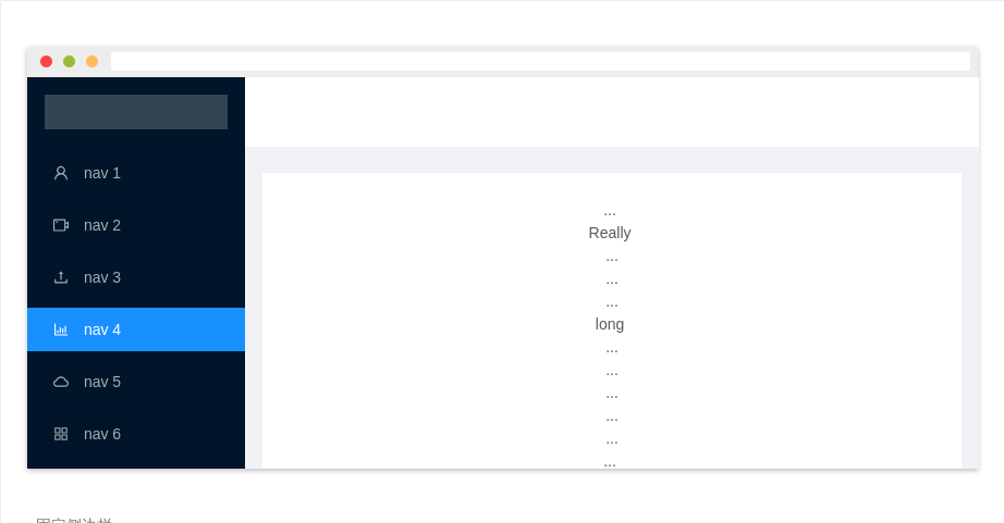
固定侧边栏
当内容较长时,使用固定侧边栏可以提供更好的体验。
<template><a-layout id="components-layout-demo-fixed-sider"><a-layout-sider :style="{ overflow: 'auto', height: '100vh', position: 'fixed', left: 0 }"><div class="logo"></div><a-menu theme="dark" mode="inline" :defaultSelectedKeys="['4']"><a-menu-item key="1"><a-icon type="user" /><span class="nav-text">nav 1</span></a-menu-item><a-menu-item key="2"><a-icon type="video-camera" /><span class="nav-text">nav 2</span></a-menu-item><a-menu-item key="3"><a-icon type="upload" /><span class="nav-text">nav 3</span></a-menu-item><a-menu-item key="4"><a-icon type="bar-chart" /><span class="nav-text">nav 4</span></a-menu-item><a-menu-item key="5"><a-icon type="cloud-o" /><span class="nav-text">nav 5</span></a-menu-item><a-menu-item key="6"><a-icon type="appstore-o" /><span class="nav-text">nav 6</span></a-menu-item><a-menu-item key="7"><a-icon type="team" /><span class="nav-text">nav 7</span></a-menu-item><a-menu-item key="8"><a-icon type="shop" /><span class="nav-text">nav 8</span></a-menu-item></a-menu></a-layout-sider><a-layout :style="{ marginLeft: '200px' }"><a-layout-header :style="{ background: '#fff', padding: 0 }" /><a-layout-content :style="{ margin: '24px 16px 0', overflow: 'initial' }"><div :style="{ padding: '24px', background: '#fff', textAlign: 'center' }">...<br />Really<br />...<br />...<br />...<br />long<br />...<br />...<br />...<br />...<br />...<br />...<br />...<br />...<br />...<br />...<br />...<br />...<br />...<br />...<br />...<br />...<br />...<br />...<br />...<br />...<br />...<br />...<br />...<br />...<br />...<br />...<br />...<br />...<br />...<br />...<br />...<br />...<br />...<br />...<br />...<br />...<br />...<br />...<br />...<br />...<br />...<br />content</div></a-layout-content><a-layout-footer :style="{ textAlign: 'center' }">Ant Design ©2018 Created by Ant UED</a-layout-footer></a-layout></a-layout></template><style>#components-layout-demo-fixed-sider .logo {height: 32px;background: rgba(255,255,255,.2);margin: 16px;}</style>
固定头部
一般用于固定顶部导航,方便页面切换。
<template><a-layout id="components-layout-demo-fixed"><a-layout-header :style="{ position: 'fixed', zIndex: 1, width: '100%' }"><div class="logo" /><a-menutheme="dark"mode="horizontal":defaultSelectedKeys="['2']":style="{ lineHeight: '64px' }"><a-menu-item key="1">nav 1</a-menu-item><a-menu-item key="2">nav 2</a-menu-item><a-menu-item key="3">nav 3</a-menu-item></a-menu></a-layout-header><a-layout-content :style="{ padding: '0 50px', marginTop: '64px' }"><a-breadcrumb :style="{ margin: '16px 0' }"><a-breadcrumb-item>Home</a-breadcrumb-item><a-breadcrumb-item>List</a-breadcrumb-item><a-breadcrumb-item>App</a-breadcrumb-item></a-breadcrumb><div :style="{ background: '#fff', padding: '24px', minHeight: '380px' }">Content</div></a-layout-content><a-layout-footer :style="{ textAlign: 'center' }">Ant Design ©2018 Created by Ant UED</a-layout-footer></a-layout></template><style>#components-layout-demo-fixed .logo {width: 120px;height: 31px;background: rgba(255,255,255,.2);margin: 16px 24px 16px 0;float: left;}</style>
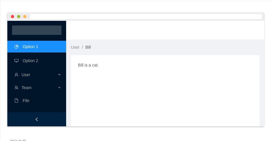
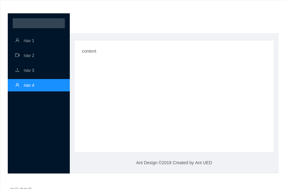
侧边布局
侧边两列式布局。页面横向空间有限时,侧边导航可收起。侧边导航在页面布局上采用的是左右的结构,一般主导航放置于页面的左侧固定位置,辅助菜单放置于工作区顶部。内容根据浏览器终端进行自适应,能提高横向空间的使用率,但是整个页面排版不稳定。侧边导航的模式层级扩展性强,一、二、三级导航项目可以更为顺畅且具关联性的被展示,同时侧边导航可以固定,使得用户在操作和浏览中可以快速的定位和切换当前位置,有很高的操作效率。但这类导航横向页面内容的空间会被牺牲一部份。
<template><a-layout id="components-layout-demo-side" style="min-height: 100vh"><a-layout-sidercollapsiblev-model="collapsed"><div class="logo" /><a-menu theme="dark" :defaultSelectedKeys="['1']" mode="inline"><a-menu-item key="1"><a-icon type="pie-chart" /><span>Option 1</span></a-menu-item><a-menu-item key="2"><a-icon type="desktop" /><span>Option 2</span></a-menu-item><a-sub-menukey="sub1"><span slot="title"><a-icon type="user" /><span>User</span></span><a-menu-item key="3">Tom</a-menu-item><a-menu-item key="4">Bill</a-menu-item><a-menu-item key="5">Alex</a-menu-item></a-sub-menu><a-sub-menukey="sub2"><span slot="title"><a-icon type="team" /><span>Team</span></span><a-menu-item key="6">Team 1</a-menu-item><a-menu-item key="8">Team 2</a-menu-item></a-sub-menu><a-menu-item key="9"><a-icon type="file" /><span>File</span></a-menu-item></a-menu></a-layout-sider><a-layout><a-layout-header style="background: #fff; padding: 0" /><a-layout-content style="margin: 0 16px"><a-breadcrumb style="margin: 16px 0"><a-breadcrumb-item>User</a-breadcrumb-item><a-breadcrumb-item>Bill</a-breadcrumb-item></a-breadcrumb><div :style="{ padding: '24px', background: '#fff', minHeight: '360px' }">Bill is a cat.</div></a-layout-content><a-layout-footer style="text-align: center">Ant Design ©2018 Created by Ant UED</a-layout-footer></a-layout></a-layout></template><script>export default {data() {return {collapsed: false,}},}</script><style>#components-layout-demo-side .logo {height: 32px;background: rgba(255,255,255,.2);margin: 16px;}</style>
API
<Layout><Header>header</Header><Layout><Sider>left sidebar</Sider><Content>main content</Content><Sider>right sidebar</Sider></Layout><Footer>footer</Footer></Layout>
Layout
布局容器。
| 参数 | 说明 | 类型 | 默认值 |
|---|---|---|---|
| class | 容器 class | string | - |
| style | 指定样式 | object | - |
| hasSider | 表示子元素里有 Sider,一般不用指定。可用于服务端渲染时避免样式闪动 | boolean | - |
Layout.HeaderLayout.FooterLayout.ContentAPI 与Layout相同
Layout.Sider
侧边栏。
| 参数 | 说明 | 类型 | 默认值 |
|---|---|---|---|
| breakpoint | 触发响应式布局的断点 | Enum { 'xs', 'sm', 'md', 'lg', 'xl', 'xxl' } | - |
| class | 容器 class | string | - |
| collapsed(v-model) | 当前收起状态 | boolean | - |
| collapsedWidth | 收缩宽度,设置为 0 会出现特殊 trigger | number | 80 |
| collapsible | 是否可收起 | boolean | false |
| defaultCollapsed | 是否默认收起 | boolean | false |
| reverseArrow | 翻转折叠提示箭头的方向,当 Sider 在右边时可以使用 | boolean | false |
| style | 指定样式 | object|string | - |
| theme | 主题颜色 | string: light dark | dark |
| trigger | 自定义 trigger,设置为 null 时隐藏 trigger | string|slot | - |
| width | 宽度 | number|string | 200 |
事件
| 事件名称 | 说明 | 回调参数 |
|---|---|---|
| collapse | 展开-收起时的回调函数,有点击 trigger 以及响应式反馈两种方式可以触发 | (collapsed, type) => {} |
| breakpoint | 触发响应式布局断点时的回调 | (broken) => {} |
breakpoint width
{xs: '480px',sm: '576px',md: '768px',lg: '992px',xl: '1200px',xxl: '1600px',}
