 我的书签
我的书签
 添加书签
添加书签 移除书签
移除书签- Select 选择器
- 何时使用
- 代码演示
- 基本使用
- 三种大小
- 标签
- 自动分词
- 获得选项的文本
- 多选
- 联动
- 分组
- 搜索框
- 带搜索框
- 搜索用户
- 后缀图标
- 隐藏已选择选项
- 扩展菜单
- API
- Select props
- 事件
- Select Methods
- Option props
- OptGroup props
Select 选择器
下拉选择器。
何时使用
- 弹出一个下拉菜单给用户选择操作,用于代替原生的选择器,或者需要一个更优雅的多选器时。
- 当选项少时(少于 5 项),建议直接将选项平铺,使用 Radio 是更好的选择。
代码演示
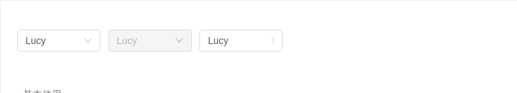
基本使用
基本使用。
<template><div><a-select defaultValue="lucy" style="width: 120px" @change="handleChange"><a-select-option value="jack">Jack</a-select-option><a-select-option value="lucy">Lucy</a-select-option><a-select-option value="disabled" disabled>Disabled</a-select-option><a-select-option value="Yiminghe">yiminghe</a-select-option></a-select><a-select defaultValue="lucy" style="width: 120px" disabled><a-select-option value="lucy">Lucy</a-select-option></a-select><a-select defaultValue="lucy" style="width: 120px" loading><a-select-option value="lucy">Lucy</a-select-option></a-select></div></template><script>export default {methods: {handleChange(value) {console.log(`selected ${value}`);},},};</script>
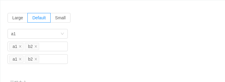
三种大小
三种大小的选择框,当 size 分别为 large 和 small 时,输入框高度为 40px 和 24px ,默认高度为 32px。
<template><div><a-radio-group v-model="size"><a-radio-button value="large">Large</a-radio-button><a-radio-button value="default">Default</a-radio-button><a-radio-button value="small">Small</a-radio-button></a-radio-group><br /><br /><a-select :size="size" defaultValue="a1" style="width: 200px" @change="handleChange"><a-select-option v-for="i in 25" :key="(i + 9).toString(36) + i">{{(i + 9).toString(36) + i}}</a-select-option></a-select><br /><a-selectmode="multiple":size="size"placeholder="Please select":defaultValue="['a1', 'b2']"style="width: 200px"@change="handleChange"@popupScroll="popupScroll"><a-select-option v-for="i in 25" :key="(i + 9).toString(36) + i">{{(i + 9).toString(36) + i}}</a-select-option></a-select><br /><a-selectmode="tags":size="size"placeholder="Please select":defaultValue="['a1', 'b2']"style="width: 200px"@change="handleChange"><a-select-option v-for="i in 25" :key="(i + 9).toString(36) + i">{{(i + 9).toString(36) + i}}</a-select-option></a-select></div></template><script>export default {data() {return {size: 'default',};},methods: {handleChange(value) {console.log(`Selected: ${value}`);},popupScroll() {console.log('popupScroll');},},};</script>
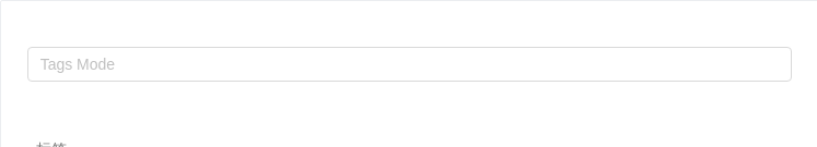
标签
tags select,随意输入的内容(scroll the menu)
<template><a-select mode="tags" style="width: 100%" @change="handleChange" placeholder="Tags Mode"><a-select-option v-for="i in 25" :key="(i + 9).toString(36) + i">{{(i + 9).toString(36) + i}}</a-select-option></a-select></template><script>export default {methods: {handleChange(value) {console.log(`selected ${value}`);},},};</script>
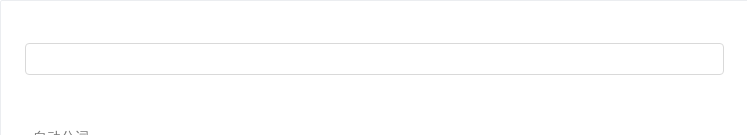
自动分词
试下复制 露西,杰克 到输入框里。只在 tags 和 multiple 模式下可用。
<template><a-select mode="tags" style="width: 100%" :tokenSeparators="[',']" @change="handleChange"><a-select-option v-for="i in 25" :key="(i + 9).toString(36) + i">{{(i + 9).toString(36) + i}}</a-select-option></a-select></template><script>export default {methods: {handleChange(value) {console.log(`selected ${value}`);},},};</script>
获得选项的文本
默认情况下 onChange 里只能拿到 value,如果需要拿到选中的节点文本 label,可以使用 labelInValue 属性。选中项的 label 会被包装到 value 中传递给 onChange 等函数,此时 value 是一个对象。
<template><a-selectlabelInValue:defaultValue="{ key: 'lucy' }"style="width: 120px"@change="handleChange"><a-select-option value="jack">Jack (100)</a-select-option><a-select-option value="lucy">Lucy (101)</a-select-option></a-select></template><script>export default {methods: {handleChange(value) {console.log(value); // { key: "lucy", label: "Lucy (101)" }},},};</script>
多选
多选,从已有条目中选择(scroll the menu)
<template><a-selectmode="multiple":defaultValue="['a1', 'b2']"style="width: 100%"@change="handleChange"placeholder="Please select"><a-select-option v-for="i in 25" :key="(i + 9).toString(36) + i">{{(i + 9).toString(36) + i}}</a-select-option></a-select></template><script>export default {methods: {handleChange(value) {console.log(`selected ${value}`);},},};</script>
联动
省市联动是典型的例子。推荐使用 Cascader 组件。
<template><div><a-select :defaultValue="provinceData[0]" style="width: 120px" @change="handleProvinceChange"><a-select-option v-for="province in provinceData" :key="province">{{province}}</a-select-option></a-select><a-select v-model="secondCity" style="width: 120px"><a-select-option v-for="city in cities" :key="city">{{city}}</a-select-option></a-select></div></template><script>const provinceData = ['Zhejiang', 'Jiangsu'];const cityData = {Zhejiang: ['Hangzhou', 'Ningbo', 'Wenzhou'],Jiangsu: ['Nanjing', 'Suzhou', 'Zhenjiang'],};export default {data() {return {provinceData,cityData,cities: cityData[provinceData[0]],secondCity: cityData[provinceData[0]][0],};},methods: {handleProvinceChange(value) {this.cities = cityData[value];this.secondCity = cityData[value][0];},},};</script>
分组
用 OptGroup 进行选项分组。
<template><a-select defaultValue="lucy" style="width: 200px" @change="handleChange"><a-select-opt-group><span slot="label"><a-icon type="user" />Manager</span><a-select-option value="jack">Jack</a-select-option><a-select-option value="lucy">Lucy</a-select-option></a-select-opt-group><a-select-opt-group label="Engineer"><a-select-option value="Yiminghe">yiminghe</a-select-option></a-select-opt-group></a-select></template><script>export default {methods: {handleChange(value) {console.log(`selected ${value}`);},},};</script>
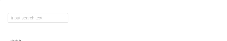
搜索框
搜索和远程数据结合。
<template><a-selectshowSearch:value="value"placeholder="input search text"style="width: 200px":defaultActiveFirstOption="false":showArrow="false":filterOption="false"@search="handleSearch"@change="handleChange":notFoundContent="null"><a-select-option v-for="d in data" :key="d.value">{{d.text}}</a-select-option></a-select></template><script>import jsonp from 'fetch-jsonp';import querystring from 'querystring';let timeout;let currentValue;function fetch(value, callback) {if (timeout) {clearTimeout(timeout);timeout = null;}currentValue = value;function fake() {const str = querystring.encode({code: 'utf-8',q: value,});jsonp(`https://suggest.taobao.com/sug?${str}`).then(response => response.json()).then(d => {if (currentValue === value) {const result = d.result;const data = [];result.forEach(r => {data.push({value: r[0],text: r[0],});});callback(data);}});}timeout = setTimeout(fake, 300);}export default {data() {return {data: [],value: undefined,};},methods: {handleSearch(value) {fetch(value, data => (this.data = data));},handleChange(value) {console.log(value);this.value = value;fetch(value, data => (this.data = data));},},};</script>
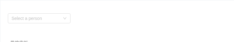
带搜索框
展开后可对选项进行搜索。
<template><a-selectshowSearchplaceholder="Select a person"optionFilterProp="children"style="width: 200px"@focus="handleFocus"@blur="handleBlur"@change="handleChange":filterOption="filterOption"><a-select-option value="jack">Jack</a-select-option><a-select-option value="lucy">Lucy</a-select-option><a-select-option value="tom">Tom</a-select-option></a-select></template><script>export default {methods: {handleChange(value) {console.log(`selected ${value}`);},handleBlur() {console.log('blur');},handleFocus() {console.log('focus');},filterOption(input, option) {return (option.componentOptions.children[0].text.toLowerCase().indexOf(input.toLowerCase()) >= 0);},},};</script>
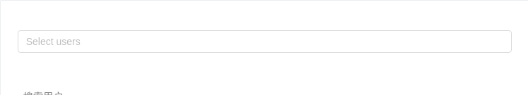
搜索用户
一个带有远程搜索,节流控制,请求时序控制,加载状态的多选示例。
<template><a-selectmode="multiple"labelInValue:value="value"placeholder="Select users"style="width: 100%":filterOption="false"@search="fetchUser"@change="handleChange":notFoundContent="fetching ? undefined : null"><a-spin v-if="fetching" slot="notFoundContent" size="small" /><a-select-option v-for="d in data" :key="d.value">{{d.text}}</a-select-option></a-select></template><script>import jsonp from 'fetch-jsonp';import querystring from 'querystring';import debounce from 'lodash/debounce';export default {data() {this.lastFetchId = 0;this.fetchUser = debounce(this.fetchUser, 800);return {data: [],value: [],fetching: false,};},methods: {fetchUser(value) {console.log('fetching user', value);this.lastFetchId += 1;const fetchId = this.lastFetchId;this.data = [];this.fetching = true;fetch('https://randomuser.me/api/?results=5').then(response => response.json()).then(body => {if (fetchId !== this.lastFetchId) {// for fetch callback orderreturn;}const data = body.results.map(user => ({text: `${user.name.first} ${user.name.last}`,value: user.login.username,}));this.data = data;this.fetching = false;});},handleChange(value) {Object.assign(this, {value,data: [],fetching: false,});},},};</script>
后缀图标
基本使用。
<template><div><a-select defaultValue="lucy" style="width: 120px" @change="handleChange"><a-icon slot="suffixIcon" type="smile" /><a-select-option value="jack">Jack</a-select-option><a-select-option value="lucy">Lucy</a-select-option><a-select-option value="disabled" disabled>Disabled</a-select-option><a-select-option value="Yiminghe">yiminghe</a-select-option></a-select><a-select defaultValue="lucy" style="width: 120px" disabled><a-icon slot="suffixIcon" type="meh" /><a-select-option value="lucy">Lucy</a-select-option></a-select></div></template><script>export default {methods: {handleChange(value) {console.log(`selected ${value}`);},},};</script>
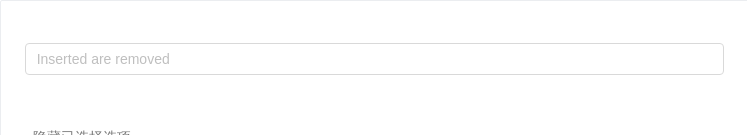
隐藏已选择选项
隐藏下拉列表中已选择的选项。
<template>
  <a-select
    mode="multiple"
    placeholder="Inserted are removed"
    :value="selectedItems"
    @change="handleChange"
    style="width: 100%"
  >
    <a-select-option v-for="item in filteredOptions" :key="item" :value="item">
      {{item}}
    </a-select-option>
  </a-select>
</template>
<script>
  const OPTIONS = ['Apples', 'Nails', 'Bananas', 'Helicopters'];
  export default {
    data() {
      return {
        selectedItems: [],
      };
    },
    computed: {
      filteredOptions() {
        return OPTIONS.filter(o => !this.selectedItems.includes(o));
      },
    },
    methods: {
      handleChange(selectedItems) {
        this.selectedItems = selectedItems;
      },
    },
  };
</script>
扩展菜单
使用 dropdownRender 对下拉菜单进行自由扩展。
<template>
  <a-select defaultValue="lucy" style="width: 120px">
    <div slot="dropdownRender" slot-scope="menu">
      <v-nodes :vnodes="menu" />
      <a-divider style="margin: 4px 0;" />
      <div style="padding: 8px; cursor: pointer;"><a-icon type="plus" /> Add item</div>
    </div>
    <a-select-option value="jack">Jack</a-select-option>
    <a-select-option value="lucy">Lucy</a-select-option>
  </a-select>
</template>
<script>
  export default {
    data: () => ({ console: console }),
    components: {
      VNodes: {
        functional: true,
        render: (h, ctx) => ctx.props.vnodes,
      },
    },
  };
</script>
API
<a-select>
  <a-select-option value="lucy">lucy</a-select-option>
</a-select>
Select props
| 参数 | 说明 | 类型 | 默认值 |
|---|---|---|---|
| allowClear | 支持清除 | boolean | false |
| autoClearSearchValue | 是否在选中项后清空搜索框,只在 mode 为 multiple 或 tags 时有效。 | boolean | true |
| autoFocus | 默认获取焦点 | boolean | false |
| defaultActiveFirstOption | 是否默认高亮第一个选项。 | boolean | true |
| defaultValue | 指定默认选中的条目 | string|string[]|number|number[] | - |
| disabled | 是否禁用 | boolean | false |
| dropdownClassName | 下拉菜单的 className 属性 | string | - |
| dropdownMatchSelectWidth | 下拉菜单和选择器同宽 | boolean | true |
| dropdownRender | 自定义下拉框内容 | (menuNode: VNode, props) => VNode | - |
| dropdownStyle | 下拉菜单的 style 属性 | object | - |
| filterOption | 是否根据输入项进行筛选。当其为一个函数时,会接收 inputValue option 两个参数,当 option 符合筛选条件时,应返回 true,反之则返回 false。 | boolean or function(inputValue, option) | true |
| firstActiveValue | 默认高亮的选项 | string|string[] | - |
| getPopupContainer | 菜单渲染父节点。默认渲染到 body 上,如果你遇到菜单滚动定位问题,试试修改为滚动的区域,并相对其定位。 | Function(triggerNode) | () => document.body |
| labelInValue | 是否把每个选项的 label 包装到 value 中,会把 Select 的 value 类型从 string 变为 {key: string, label: vNodes} 的格式 | boolean | false |
| maxTagCount | 最多显示多少个 tag | number | - |
| maxTagPlaceholder | 隐藏 tag 时显示的内容 | slot/function(omittedValues) | - |
| maxTagTextLength | 最大显示的 tag 文本长度 | number | - |
| mode | 设置 Select 的模式为多选或标签 | 'default' | 'multiple' | 'tags' | 'combobox' | - |
| notFoundContent | 当下拉列表为空时显示的内容 | string|slot | 'Not Found' |
| optionFilterProp | 搜索时过滤对应的 option 属性,如设置为 children 表示对内嵌内容进行搜索 | string | value |
| optionLabelProp | 回填到选择框的 Option 的属性值,默认是 Option 的子元素。比如在子元素需要高亮效果时,此值可以设为 value。 | string | children (combobox 模式下为 value) |
| placeholder | 选择框默认文字 | string|slot | - |
| showSearch | 使单选模式可搜索 | boolean | false |
| showArrow | 是否显示下拉小箭头 | boolean | true |
| size | 选择框大小,可选 large small | string | default |
| suffixIcon | 自定义的选择框后缀图标 | VNode | slot | - |
| removeIcon | 自定义的多选框清除图标 | VNode | slot | - |
| clearIcon | 自定义的多选框清空图标 | VNode | slot | - |
| menuItemSelectedIcon | 自定义当前选中的条目图标 | VNode | slot | - |
| tokenSeparators | 在 tags 和 multiple 模式下自动分词的分隔符 | string[] | |
| value(v-model) | 指定当前选中的条目 | string|string[]|number|number[] | - |
| options | options 数据,如果设置则不需要手动构造 selectOption 节点 | array<{value, label, [disabled, key, title]}> | [] |
| defaultOpen | 是否默认展开下拉菜单 | boolean | - |
| open | 是否展开下拉菜单 | boolean | - |
注意,如果发现下拉菜单跟随页面滚动,或者需要在其他弹层中触发 Select,请尝试使用
getPopupContainer={triggerNode => triggerNode.parentNode}将下拉弹层渲染节点固定在触发器的父元素中。
事件
| 事件名称 | 说明 | 回调参数 |
|---|---|---|
| blur | 失去焦点的时回调 | function |
| change | 选中 option,或 input 的 value 变化(combobox 模式下)时,调用此函数 | function(value, option:Option/Array<Option>) |
| deselect | 取消选中时调用,参数为选中项的 value (或 key) 值,仅在 multiple 或 tags 模式下生效 | function(value,option:Option) |
| focus | 获得焦点时回调 | function |
| inputKeydown | 键盘按下时回调 | function |
| mouseenter | 鼠标移入时回调 | function |
| mouseleave | 鼠标移出时回调 | function |
| popupScroll | 下拉列表滚动时的回调 | function |
| search | 文本框值变化时回调 | function(value: string) |
| select | 被选中时调用,参数为选中项的 value (或 key) 值 | function(value, option:Option) |
| dropdownVisibleChange | 展开下拉菜单的回调 | function(open) |
Select Methods
| 名称 | 说明 |
|---|---|
| blur() | 取消焦点 |
| focus() | 获取焦点 |
Option props
| 参数 | 说明 | 类型 | 默认值 |
|---|---|---|---|
| disabled | 是否禁用 | boolean | false |
| key | 和 value 含义一致。如果 Vue 需要你设置此项,此项值与 value 的值相同,然后可以省略 value 设置 | string | |
| title | 选中该 Option 后,Select 的 title | string | - |
| value | 默认根据此属性值进行筛选 | string|number | - |
| class | Option 器类名 | string | - |
OptGroup props
| 参数 | 说明 | 类型 | 默认值 |
|---|---|---|---|
| key | string | - | |
| label | 组名 | string||function(h)|slot | 无 |
