 我的书签
我的书签
 添加书签
添加书签 移除书签
移除书签- Drawer 抽屉
- 何时使用
- 代码演示
- 基础抽屉
- 自定义位置
- 抽屉表单
- 信息预览抽屉
- 多层抽屉
- API
- 方法
Drawer 抽屉
屏幕边缘滑出的浮层面板。
何时使用
抽屉从父窗体边缘滑入,覆盖住部分父窗体内容。用户在抽屉内操作时不必离开当前任务,操作完成后,可以平滑地回到到原任务。
- 当需要一个附加的面板来控制父窗体内容,这个面板在需要时呼出。比如,控制界面展示样式,往界面中添加内容。
- 当需要在当前任务流中插入临时任务,创建或预览附加内容。比如展示协议条款,创建子对象。
代码演示

基础抽屉
基础抽屉,点击触发按钮抽屉从右滑出,点击遮罩区关闭
<template><div><a-button type="primary" @click="showDrawer">Open</a-button><a-drawertitle="Basic Drawer"placement="right":closable="false"@close="onClose":visible="visible"><p>Some contents...</p><p>Some contents...</p><p>Some contents...</p></a-drawer></div></template><script>export default {data() {return {visible: false,};},methods: {showDrawer() {this.visible = true;},onClose() {this.visible = false;},},};</script>
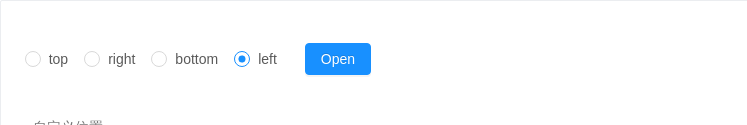
自定义位置
自定义位置,点击触发按钮抽屉从相应的位置滑出,点击遮罩区关闭
<template><div><a-radio-group style="margin-right: 8px" :defaultValue="placement" @change="onChange"><a-radio value="top">top</a-radio><a-radio value="right">right</a-radio><a-radio value="bottom">bottom</a-radio><a-radio value="left">left</a-radio></a-radio-group><a-button type="primary" @click="showDrawer">Open</a-button><a-drawertitle="Basic Drawer":placement="placement":closable="false"@close="onClose":visible="visible"><p>Some contents...</p><p>Some contents...</p><p>Some contents...</p></a-drawer></div></template><script>export default {data() {return {visible: false,placement: 'left',};},methods: {showDrawer() {this.visible = true;},onClose() {this.visible = false;},onChange(e) {this.placement = e.target.value;},},};</script>
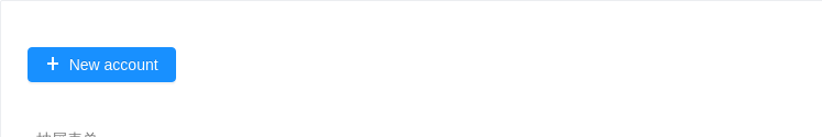
抽屉表单
在抽屉中使用表单。
<template><div><a-button type="primary" @click="showDrawer"> <a-icon type="plus" /> New account </a-button><a-drawertitle="Create a new account":width="720"@close="onClose":visible="visible":wrapStyle="{height: 'calc(100% - 108px)',overflow: 'auto',paddingBottom: '108px'}"><a-form :form="form" layout="vertical" hideRequiredMark><a-row :gutter="16"><a-col :span="12"><a-form-item label="Name"><a-inputv-decorator="['name', {rules: [{ required: true, message: 'Please enter user name' }]}]"placeholder="Please enter user name"/></a-form-item></a-col><a-col :span="12"><a-form-item label="Url"><a-inputv-decorator="['url', {rules: [{ required: true, message: 'please enter url' }]}]"style="width: 100%"addonBefore="http://"addonAfter=".com"placeholder="please enter url"/></a-form-item></a-col></a-row><a-row :gutter="16"><a-col :span="12"><a-form-item label="Owner"><a-selectv-decorator="['owner', {rules: [{ required: true, message: 'Please select an owner' }]}]"placeholder="Please a-s an owner"><a-select-option value="xiao">Xiaoxiao Fu</a-select-option><a-select-option value="mao">Maomao Zhou</a-select-option></a-select></a-form-item></a-col><a-col :span="12"><a-form-item label="Type"><a-selectv-decorator="['type', {rules: [{ required: true, message: 'Please choose the type' }]}]"placeholder="Please choose the type"><a-select-option value="private">Private</a-select-option><a-select-option value="public">Public</a-select-option></a-select></a-form-item></a-col></a-row><a-row :gutter="16"><a-col :span="12"><a-form-item label="Approver"><a-selectv-decorator="['approver', {rules: [{ required: true, message: 'Please choose the approver' }]}]"placeholder="Please choose the approver"><a-select-option value="jack">Jack Ma</a-select-option><a-select-option value="tom">Tom Liu</a-select-option></a-select></a-form-item></a-col><a-col :span="12"><a-form-item label="DateTime"><a-date-pickerv-decorator="['dateTime', {rules: [{ required: true, message: 'Please choose the dateTime' }]}]"style="width: 100%":getPopupContainer="trigger => trigger.parentNode"/></a-form-item></a-col></a-row><a-row :gutter="16"><a-col :span="24"><a-form-item label="Description"><a-textareav-decorator="['description', {rules: [{ required: true, message: 'Please enter url description' }]}]":rows="4"placeholder="please enter url description"/></a-form-item></a-col></a-row></a-form><div:style="{position: 'absolute',left: 0,bottom: 0,width: '100%',borderTop: '1px solid #e9e9e9',padding: '10px 16px',background: '#fff',textAlign: 'right',}"><a-button :style="{marginRight: '8px'}" @click="onClose">Cancel</a-button><a-button @click="onClose" type="primary">Submit</a-button></div></a-drawer></div></template><script>export default {data() {return {form: this.$form.createForm(this),visible: false,};},methods: {showDrawer() {this.visible = true;},onClose() {this.visible = false;},},};</script>
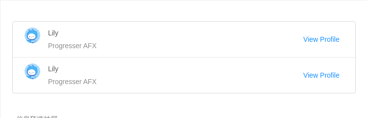
信息预览抽屉
需要快速预览对象概要时使用,点击遮罩区关闭。
<template><div><a-list:dataSource="[{name: 'Lily',},{name: 'Lily',},]"bordered><a-list-item slot="renderItem" slot-scope="item, index"><a slot="actions" @click="showDrawer">View Profile</a><a-list-item-meta description="Progresser AFX"><a slot="title" href="https://www.antdv.com/">{{item.name}}</a><a-avatarslot="avatar"src="https://gw.alipayobjects.com/zos/rmsportal/BiazfanxmamNRoxxVxka.png"/></a-list-item-meta></a-list-item></a-list><a-drawer width="640" placement="right" :closable="false" @close="onClose" :visible="visible"><p :style="[pStyle, pStyle2]">User Profile</p><p :style="pStyle">Personal</p><a-row><a-col :span="12"><description-item title="Full Name" content="Lily" /></a-col><a-col :span="12"><description-item title="Account" content="AntDesign@example.com" /></a-col></a-row><a-row><a-col :span="12"><description-item title="City" content="HangZhou" /></a-col><a-col :span="12"><description-item title="Country" content="China??" /></a-col></a-row><a-row><a-col :span="12"><description-item title="Birthday" content="February 2,1900" /></a-col><a-col :span="12"><description-item title="Website" content="-" /></a-col></a-row><a-row><a-col :span="12"><description-itemtitle="Message"content="Make things as simple as possible but no simpler."/></a-col></a-row><a-divider /><p :style="pStyle">Company</p><a-row><a-col :span="12"><description-item title="Position" content="Programmer" /></a-col><a-col :span="12"><description-item title="Responsibilities" content="Coding" /></a-col></a-row><a-row><a-col :span="12"><description-item title="Department" content="AFX" /></a-col><a-col :span="12"><description-item title="Supervisor"><a slot="content">Lin</a></description-item></a-col></a-row><a-row><a-col :span="24"><description-itemtitle="Skills"content="C / C + +, data structures, software engineering, operating systems, computer networks, databases, compiler theory, computer architecture, Microcomputer Principle and Interface Technology, Computer English, Java, ASP, etc."/></a-col></a-row><a-divider /><p :style="pStyle">Contacts</p><a-row><a-col :span="12"><description-item title="Email" content="ant-design-vue@example.com" /></a-col><a-col :span="12"><description-item title="Phone Number" content="+86 181 0000 0000" /></a-col></a-row><a-row><a-col :span="24"><description-item title="Github"><a slot="content" href="https://github.com/vueComponent/ant-design-vue">github.com/vueComponent/ant-design-vue</a></description-item></a-col></a-row></a-drawer></div></template><script>import descriptionItem from './descriptionItem';export default {data() {return {visible: false,pStyle: {fontSize: '16px',color: 'rgba(0,0,0,0.85)',lineHeight: '24px',display: 'block',marginBottom: '16px',},pStyle2: {marginBottom: '24px',},};},components: {descriptionItem,},methods: {showDrawer() {this.visible = true;},onClose() {this.visible = false;},},};</script>
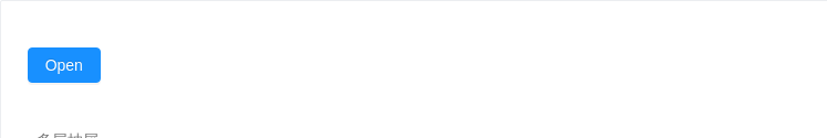
多层抽屉
在抽屉内打开新的抽屉,用以解决多分支任务的复杂状况。
<template>
  <div>
    <a-button type="primary" @click="showDrawer">
      Open
    </a-button>
    <a-drawer
      title="Multi-level drawer"
      width="520"
      :closable="false"
      @close="onClose"
      :visible="visible"
    >
      <a-button type="primary" @click="showChildrenDrawer">
        Two-level drawer
      </a-button>
      <a-drawer
        title="Two-level Drawer"
        width="320"
        :closable="false"
        @close="onChildrenDrawerClose"
        :visible="childrenDrawer"
      >
        <a-button type="primary" @click="showChildrenDrawer">
          This is two-level drawer
        </a-button>
      </a-drawer>
      <div
        :style="{
          position: 'absolute',
          bottom: 0,
          width: '100%',
          borderTop: '1px solid #e8e8e8',
          padding: '10px 16px',
          textAlign: 'right',
          left: 0,
          background: '#fff',
          borderRadius: '0 0 4px 4px',
        }"
      >
        <a-button style="marginRight: 8px" @click="onClose">
          Cancel
        </a-button>
        <a-button @click="onClose" type="primary">
          Submit
        </a-button>
      </div>
    </a-drawer>
  </div>
</template>
<script>
  export default {
    data() {
      return {
        visible: false,
        childrenDrawer: false,
      };
    },
    methods: {
      showDrawer() {
        this.visible = true;
      },
      onClose() {
        this.visible = false;
      },
      showChildrenDrawer() {
        this.childrenDrawer = true;
      },
      onChildrenDrawerClose() {
        this.childrenDrawer = false;
      },
    },
  };
</script>
API
| 参数 | 说明 | 类型 | 默认值 |
|---|---|---|---|
| closable | 是否显示右上角的关闭按钮 | boolean | true |
| destroyOnClose | 关闭时销毁 Drawer 里的子元素 | boolean | false |
| getContainer | 指定 Drawer 挂载的 HTML 节点 | HTMLElement | () => HTMLElement | Selectors | 'body' |
| maskClosable | 点击蒙层是否允许关闭 | boolean | true |
| mask | 是否展示遮罩 | Boolean | true |
| maskStyle | 遮罩样式 | object | {} |
| title | 标题 | string | slot | - |
| visible | Drawer 是否可见 | boolean | - |
| wrapClassName | 对话框外层容器的类名 | string | - |
| wrapStyle | 对话框外层容器的style | object | - |
| bodyStyle | 可用于设置 Drawer 的样式,调整浮层位置等 | object | - |
| width | 宽度 | string | number | 256 |
| height | 高度, 在 placement 为 top 或 bottom 时使用 | string | number | 256 |
| zIndex | 设置 Drawer 的 z-index | Number | 1000 |
| placement | 抽屉的方向 | 'top' | 'right' | 'bottom' | 'left' | 'right' |
| handle | 设置后抽屉直接挂载到 DOM 上,你可以通过该 handle 控制抽屉打开关闭 | VNode | slot | - |
方法
| 名称 | 描述 | 类型 | 默认值 |
|---|---|---|---|
| close | 点击遮罩层或右上角叉或取消按钮的回调 | function(e) | 无 |
