 我的书签
我的书签
 添加书签
添加书签 移除书签
移除书签- Progress 进度条
- 何时使用
- 代码演示
- 进度条
- 进度圈
- 小型进度条
- 小型进度圈
- 进度圈动态展示
- 自定义文字格式
- 动态展示
- 仪表盘
- 分段进度条
- 圆角/方角边缘
- API
- type="line"
- type="circle"
- type="dashboard"
Progress 进度条
展示操作的当前进度。
何时使用
在操作需要较长时间才能完成时,为用户显示该操作的当前进度和状态。
- 当一个操作会打断当前界面,或者需要在后台运行,且耗时可能超过2秒时;
- 当需要显示一个操作完成的百分比时。
代码演示
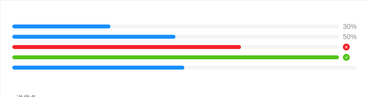
进度条
标准的进度条。
<template><div><a-progress :percent="30" /><a-progress :percent="50" status="active" /><a-progress :percent="70" status="exception" /><a-progress :percent="100" /><a-progress :percent="50" :showInfo="false" /></div></template>

进度圈
圈形的进度。
<template><div><a-progress type="circle" :percent="75" /><a-progress type="circle" :percent="70" status="exception" /><a-progress type="circle" :percent="100" /></div></template><style scoped>.ant-progress-circle-wrap,.ant-progress-line-wrap {margin-right: 8px;margin-bottom: 5px;}</style>

小型进度条
适合放在较狭窄的区域内。
<template><div style="width: 170px"><a-progress :percent="30" size="small" /><a-progress :percent="50" size="small" status="active" /><a-progress :percent="70" size="small" status="exception" /><a-progress :percent="100" size="small" /></div></template>

小型进度圈
小一号的圈形进度。
<template><div><a-progress type="circle" :percent="30" :width="80" /><a-progress type="circle" :percent="70" :width="80" status="exception" /><a-progress type="circle" :percent="100" :width="80" /></div></template><style scoped>.ant-progress-circle-wrap,.ant-progress-line-wrap {margin-right: 8px;margin-bottom: 5px;}</style>

进度圈动态展示
会动的进度条才是好进度条。
<template><div><a-progress type="circle" :percent="percent" /><a-button-group><a-button @click="decline" icon="minus" /><a-button @click="increase" icon="plus" /></a-button-group></div></template><script>export default {data() {return {percent: 0,};},methods: {increase() {let percent = this.percent + 10;if (percent > 100) {percent = 100;}this.percent = percent;},decline() {let percent = this.percent - 10;if (percent < 0) {percent = 0;}this.percent = percent;},},};</script>

自定义文字格式
format 属性指定格式。
<template><div><a-progress type="circle" :percent="75" :format="percent => `${percent} Days`" /><a-progress type="circle" :percent="100" :format="() => 'Done'" /><a-progress type="circle" :percent="75"><template v-slot:format="percent"><span style="color: red">{{percent}}</span></template></a-progress></div></template><style scoped>div.ant-progress-circle,div.ant-progress-line {margin-right: 8px;margin-bottom: 8px;}</style>

动态展示
会动的进度条才是好进度条。
<template><div><a-progress :percent="percent" /><a-button-group><a-button @click="decline" icon="minus" /><a-button @click="increase" icon="plus" /></a-button-group></div></template><script>export default {data() {return {percent: 0,};},methods: {increase() {let percent = this.percent + 10;if (percent > 100) {percent = 100;}this.percent = percent;},decline() {let percent = this.percent - 10;if (percent < 0) {percent = 0;}this.percent = percent;},},};</script>

仪表盘
By setting type=dashboard, you can get a dashboard style of progress easily.
<template><div><a-progress type="dashboard" :percent="75" /></div></template>
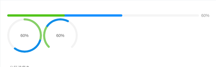
分段进度条
标准的进度条。
<template><div><a-tooltip title="3 done / 3 in progress / 4 to do"><a-progress :percent="60" :successPercent="30" /></a-tooltip><a-tooltip title="3 done / 3 in progress / 4 to do"><a-progress :percent="60" :successPercent="30" type="circle" /></a-tooltip><a-tooltip title="3 done / 3 in progress / 4 to do"><a-progress :percent="60" :successPercent="30" type="dashboard" /></a-tooltip></div></template>
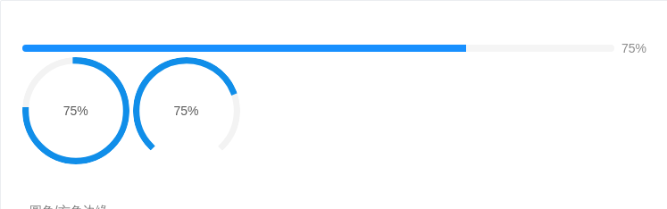
圆角/方角边缘
strokeLinecap="square|round" 可以调整进度条边缘的形状。
<template><div><a-progress strokeLinecap="square" :percent="75" /><a-progress strokeLinecap="square" :percent="75" type="circle" /><a-progress strokeLinecap="square" :percent="75" type="dashboard" /></div></template>
API
各类型共用的属性。
| 属性 | 说明 | 类型 | 默认值 |
|---|---|---|---|
| type | 类型,可选 line circle dashboard | string | line |
| format | 内容的模板函数 | function(percent, successPercent) | v-slot:format="percent, successPercent" | percent => percent + '%' |
| percent | 百分比 | number | 0 |
| showInfo | 是否显示进度数值或状态图标 | boolean | true |
| status | 状态,可选:success exception active normal | string | - |
| strokeLinecap | Enum{ 'round', 'square' } | round | |
| strokeColor | 进度条的色彩 | string | - |
| successPercent | 已完成的分段百分比 | number | 0 |
type="line"
| 属性 | 说明 | 类型 | 默认值 |
|---|---|---|---|
| strokeWidth | 进度条线的宽度,单位 px | number | 10 |
type="circle"
| 属性 | 说明 | 类型 | 默认值 |
|---|---|---|---|
| width | 圆形进度条画布宽度,单位 px | number | 132 |
| strokeWidth | 圆形进度条线的宽度,单位是进度条画布宽度的百分比 | number | 6 |
type="dashboard"
| 属性 | 说明 | 类型 | 默认值 |
|---|---|---|---|
| width | 仪表盘进度条画布宽度,单位 px | number | 132 |
| strokeWidth | 仪表盘进度条线的宽度,单位是进度条画布宽度的百分比 | number | 6 |
| gapDegree | 仪表盘进度条缺口角度,可取值 0 ~ 360 | number | 0 |
| gapPosition | 仪表盘进度条缺口位置 | Enum{ 'top', 'bottom', 'left', 'right' } | top |
