 我的书签
我的书签
 添加书签
添加书签 移除书签
移除书签- Popconfirm
- 何时使用
- 代码演示
- 基本
- 国际化
- 位置
- 条件触发
- 自定义 Icon 图标
- API
- 事件
- 注意
Popconfirm
点击元素,弹出气泡式的确认框。
何时使用
目标元素的操作需要用户进一步的确认时,在目标元素附近弹出浮层提示,询问用户。
和 ‘confirm’ 弹出的全屏居中模态对话框相比,交互形式更轻量。
代码演示

基本
最简单的用法。
<template><a-popconfirmtitle="Are you sure delete this task?"@confirm="confirm"@cancel="cancel"okText="Yes"cancelText="No"><a href="#">Delete</a></a-popconfirm></template><script>export default {methods: {confirm(e) {console.log(e);this.$message.success('Click on Yes');},cancel(e) {console.log(e);this.$message.error('Click on No');},},};</script>

国际化
使用 okText 和 cancelText 自定义按钮文字。
<template><a-popconfirm title="Are you sure?" okText="Yes" cancelText="No"><a href="#">Delete</a></a-popconfirm></template>
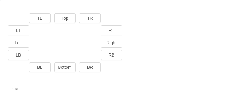
位置
位置有十二个方向。如需箭头指向目标元素中心,可以设置 arrowPointAtCenter。
<template>
  <div id="components-a-popconfirm-demo-placement">
    <div :style="{ marginLeft: `${buttonWidth}px`, whiteSpace: 'nowrap' }">
      <a-popconfirm placement="topLeft" okText="Yes" cancelText="No" @confirm="confirm">
        <template slot="title">
          <p>{{text}}</p>
          <p>{{text}}</p>
        </template>
        <a-button>TL</a-button>
      </a-popconfirm>
      <a-popconfirm placement="top" okText="Yes" cancelText="No" @confirm="confirm">
        <template slot="title">
          <p>{{text}}</p>
          <p>{{text}}</p>
        </template>
        <a-button>Top</a-button>
      </a-popconfirm>
      <a-popconfirm placement="topRight" okText="Yes" cancelText="No" @confirm="confirm">
        <template slot="title">
          <p>{{text}}</p>
          <p>{{text}}</p>
        </template>
        <a-button>TR</a-button>
      </a-popconfirm>
    </div>
    <div :style="{ width: `${buttonWidth}px`, float: 'left' }">
      <a-popconfirm placement="leftTop" okText="Yes" cancelText="No" @confirm="confirm">
        <template slot="title">
          <p>{{text}}</p>
          <p>{{text}}</p>
        </template>
        <a-button>LT</a-button>
      </a-popconfirm>
      <a-popconfirm placement="left" okText="Yes" cancelText="No" @confirm="confirm">
        <template slot="title">
          <p>{{text}}</p>
          <p>{{text}}</p>
        </template>
        <a-button>Left</a-button>
      </a-popconfirm>
      <a-popconfirm placement="leftBottom" okText="Yes" cancelText="No" @confirm="confirm">
        <template slot="title">
          <p>{{text}}</p>
          <p>{{text}}</p>
        </template>
        <a-button>LB</a-button>
      </a-popconfirm>
    </div>
    <div :style="{ width: `${buttonWidth}px`, marginLeft: `${buttonWidth * 4 + 24 }px`}">
      <a-popconfirm placement="rightTop" okText="Yes" cancelText="No" @confirm="confirm">
        <template slot="title">
          <p>{{text}}</p>