 我的书签
我的书签
 添加书签
添加书签 移除书签
移除书签- 二十二、自定义填充、修剪和清除
二十二、自定义填充、修剪和清除
欢迎阅读另一个 Matplotlib 教程! 在本教程中,我们将清除图表,然后再做一些自定义。
我们当前的代码是:
import matplotlib.pyplot as pltimport matplotlib.dates as mdatesimport matplotlib.ticker as mtickerfrom matplotlib.finance import candlestick_ohlcfrom matplotlib import styleimport numpy as npimport urllibimport datetime as dtstyle.use('fivethirtyeight')print(plt.style.available)print(plt.__file__)MA1 = 10MA2 = 30def moving_average(values, window):weights = np.repeat(1.0, window)/windowsmas = np.convolve(values, weights, 'valid')return smasdef high_minus_low(highs, lows):return highs-lowsdef bytespdate2num(fmt, encoding='utf-8'):strconverter = mdates.strpdate2num(fmt)def bytesconverter(b):s = b.decode(encoding)return strconverter(s)return bytesconverterdef graph_data(stock):fig = plt.figure()ax1 = plt.subplot2grid((6,1), (0,0), rowspan=1, colspan=1)plt.title(stock)ax2 = plt.subplot2grid((6,1), (1,0), rowspan=4, colspan=1)plt.xlabel('Date')plt.ylabel('Price')ax3 = plt.subplot2grid((6,1), (5,0), rowspan=1, colspan=1)stock_price_url = 'http://chartapi.finance.yahoo.com/instrument/1.0/'+stock+'/chartdata;type=quote;range=1y/csv'source_code = urllib.request.urlopen(stock_price_url).read().decode()stock_data = []split_source = source_code.split('\n')for line in split_source:split_line = line.split(',')if len(split_line) == 6:if 'values' not in line and 'labels' not in line:stock_data.append(line)date, closep, highp, lowp, openp, volume = np.loadtxt(stock_data,delimiter=',',unpack=True,converters={0: bytespdate2num('%Y%m%d')})x = 0y = len(date)ohlc = []while x < y:append_me = date[x], openp[x], highp[x], lowp[x], closep[x], volume[x]ohlc.append(append_me)x+=1ma1 = moving_average(closep,MA1)ma2 = moving_average(closep,MA2)start = len(date[MA2-1:])h_l = list(map(high_minus_low, highp, lowp))ax1.plot_date(date,h_l,'-')candlestick_ohlc(ax2, ohlc, width=0.4, colorup='#77d879', colordown='#db3f3f')for label in ax2.xaxis.get_ticklabels():label.set_rotation(45)ax2.xaxis.set_major_formatter(mdates.DateFormatter('%Y-%m-%d'))ax2.xaxis.set_major_locator(mticker.MaxNLocator(10))ax2.grid(True)bbox_props = dict(boxstyle='round',fc='w', ec='k',lw=1)ax2.annotate(str(closep[-1]), (date[-1], closep[-1]),xytext = (date[-1]+4, closep[-1]), bbox=bbox_props)## # Annotation example with arrow## ax2.annotate('Bad News!',(date[11],highp[11]),## xytext=(0.8, 0.9), textcoords='axes fraction',## arrowprops = dict(facecolor='grey',color='grey'))###### # Font dict example## font_dict = {'family':'serif',## 'color':'darkred',## 'size':15}## # Hard coded text## ax2.text(date[10], closep[1],'Text Example', fontdict=font_dict)ax3.plot(date[-start:], ma1[-start:])ax3.plot(date[-start:], ma2[-start:])plt.subplots_adjust(left=0.11, bottom=0.24, right=0.90, top=0.90, wspace=0.2, hspace=0)plt.show()graph_data('EBAY')
现在我认为向我们的移动均值添加自定义填充是一个很好的主意。 移动均值通常用于说明价格趋势。 这个想法是,你可以计算一个快速和一个慢速的移动均值。 一般来说,移动均值用于使价格变得『平滑』。 他们总是『滞后』于价格,但是我们的想法是计算不同的速度。 移动均值越大就越『慢』。 所以这个想法是,如果『较快』的移动均值超过『较慢』的均值,那么价格就会上升,这是一件好事。 如果较快的 MA 从较慢的 MA 下方穿过,则这是下降趋势并且通常被视为坏事。 我的想法是在快速和慢速 MA 之间填充,『上升』趋势为绿色,然后下降趋势为红色。 方法如下:
ax3.fill_between(date[-start:], ma2[-start:], ma1[-start:],where=(ma1[-start:] < ma2[-start:]),facecolor='r', edgecolor='r', alpha=0.5)ax3.fill_between(date[-start:], ma2[-start:], ma1[-start:],where=(ma1[-start:] > ma2[-start:]),facecolor='g', edgecolor='g', alpha=0.5)
下面,我们会碰到一些我们可解决的问题:
ax3.xaxis.set_major_formatter(mdates.DateFormatter('%Y-%m-%d'))ax3.xaxis.set_major_locator(mticker.MaxNLocator(10))for label in ax3.xaxis.get_ticklabels():label.set_rotation(45)plt.setp(ax1.get_xticklabels(), visible=False)plt.setp(ax2.get_xticklabels(), visible=False)
这里,我们剪切和粘贴ax2日期格式,然后我们将x刻度标签设置为false,去掉它们!
我们还可以通过在轴域定义中执行以下操作,为每个轴域提供自定义标签:
fig = plt.figure()ax1 = plt.subplot2grid((6,1), (0,0), rowspan=1, colspan=1)plt.title(stock)ax2 = plt.subplot2grid((6,1), (1,0), rowspan=4, colspan=1)plt.xlabel('Date')plt.ylabel('Price')ax3 = plt.subplot2grid((6,1), (5,0), rowspan=1, colspan=1)
接下来,我们可以看到,我们y刻度有许多数字,经常互相覆盖。 我们也看到轴之间互相重叠。 我们可以这样:
ax1.yaxis.set_major_locator(mticker.MaxNLocator(nbins=5, prune='lower'))
所以,这里发生的是,我们通过首先将nbins设置为 5 来修改我们的y轴对象。这意味着我们显示的标签最多为 5 个。然后我们还可以『修剪』标签,因此,在我们这里, 我们修剪底部标签,这会使它消失,所以现在不会有任何文本重叠。 我们仍然可能打算修剪ax2的顶部标签,但这里是我们目前为止的源代码:
当前的源码:
import matplotlib.pyplot as pltimport matplotlib.dates as mdatesimport matplotlib.ticker as mtickerfrom matplotlib.finance import candlestick_ohlcfrom matplotlib import styleimport numpy as npimport urllibimport datetime as dtstyle.use('fivethirtyeight')print(plt.style.available)print(plt.__file__)MA1 = 10MA2 = 30def moving_average(values, window):weights = np.repeat(1.0, window)/windowsmas = np.convolve(values, weights, 'valid')return smasdef high_minus_low(highs, lows):return highs-lowsdef bytespdate2num(fmt, encoding='utf-8'):strconverter = mdates.strpdate2num(fmt)def bytesconverter(b):s = b.decode(encoding)return strconverter(s)return bytesconverterdef graph_data(stock):fig = plt.figure()ax1 = plt.subplot2grid((6,1), (0,0), rowspan=1, colspan=1)plt.title(stock)plt.ylabel('H-L')ax2 = plt.subplot2grid((6,1), (1,0), rowspan=4, colspan=1)plt.ylabel('Price')ax3 = plt.subplot2grid((6,1), (5,0), rowspan=1, colspan=1)plt.ylabel('MAvgs')stock_price_url = 'http://chartapi.finance.yahoo.com/instrument/1.0/'+stock+'/chartdata;type=quote;range=1y/csv'source_code = urllib.request.urlopen(stock_price_url).read().decode()stock_data = []split_source = source_code.split('\n')for line in split_source:split_line = line.split(',')if len(split_line) == 6:if 'values' not in line and 'labels' not in line:stock_data.append(line)date, closep, highp, lowp, openp, volume = np.loadtxt(stock_data,delimiter=',',unpack=True,converters={0: bytespdate2num('%Y%m%d')})x = 0y = len(date)ohlc = []while x < y:append_me = date[x], openp[x], highp[x], lowp[x], closep[x], volume[x]ohlc.append(append_me)x+=1ma1 = moving_average(closep,MA1)ma2 = moving_average(closep,MA2)start = len(date[MA2-1:])h_l = list(map(high_minus_low, highp, lowp))ax1.plot_date(date,h_l,'-')ax1.yaxis.set_major_locator(mticker.MaxNLocator(nbins=5, prune='lower'))candlestick_ohlc(ax2, ohlc, width=0.4, colorup='#77d879', colordown='#db3f3f')ax2.grid(True)bbox_props = dict(boxstyle='round',fc='w', ec='k',lw=1)ax2.annotate(str(closep[-1]), (date[-1], closep[-1]),xytext = (date[-1]+4, closep[-1]), bbox=bbox_props)## # Annotation example with arrow## ax2.annotate('Bad News!',(date[11],highp[11]),## xytext=(0.8, 0.9), textcoords='axes fraction',## arrowprops = dict(facecolor='grey',color='grey'))###### # Font dict example## font_dict = {'family':'serif',## 'color':'darkred',## 'size':15}## # Hard coded text## ax2.text(date[10], closep[1],'Text Example', fontdict=font_dict)ax3.plot(date[-start:], ma1[-start:], linewidth=1)ax3.plot(date[-start:], ma2[-start:], linewidth=1)ax3.fill_between(date[-start:], ma2[-start:], ma1[-start:],where=(ma1[-start:] < ma2[-start:]),facecolor='r', edgecolor='r', alpha=0.5)ax3.fill_between(date[-start:], ma2[-start:], ma1[-start:],where=(ma1[-start:] > ma2[-start:]),facecolor='g', edgecolor='g', alpha=0.5)ax3.xaxis.set_major_formatter(mdates.DateFormatter('%Y-%m-%d'))ax3.xaxis.set_major_locator(mticker.MaxNLocator(10))for label in ax3.xaxis.get_ticklabels():label.set_rotation(45)plt.setp(ax1.get_xticklabels(), visible=False)plt.setp(ax2.get_xticklabels(), visible=False)plt.subplots_adjust(left=0.11, bottom=0.24, right=0.90, top=0.90, wspace=0.2, hspace=0)plt.show()graph_data('EBAY')
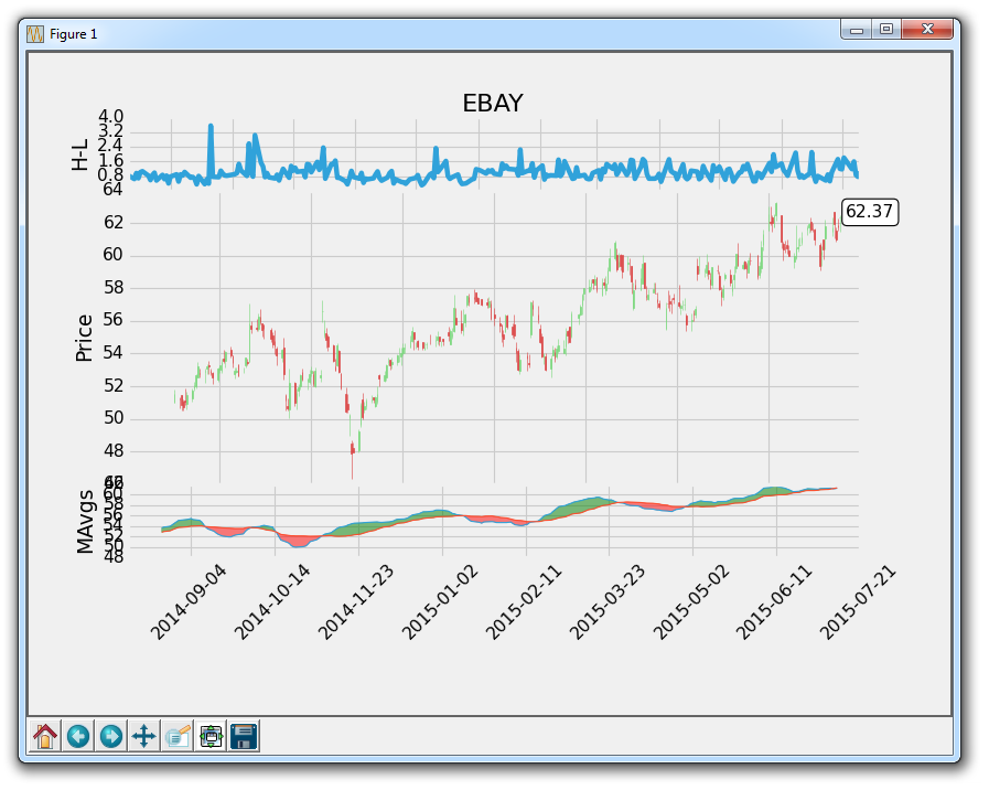
看起来好了一些,但是仍然有一些东西需要清除。
