- InheritedWidget: Custom Theme Class
- Set Up a Custom Theme
- Use the Custom Theme
- 1. Wrap your app
- 2. Use the props:
- 3. A design system suggestion:
InheritedWidget: Custom Theme Class
There are a few global style options that are glaringly missing fromFlutter's built in theme. For example, consistent spacing might be _the most_important part of good layout design.
If you're working with a team, maybe you want to ensure that everyone workingon your app uses the exactsame spacing guidelines. You can achieve this by creating your ownInheritedWidget that passes props across the whole app. Theme is aninherited Widget, so it would work exactly like that.
Set Up a Custom Theme
The InheritedWidget takes a bit of boiler plate to set up, so if it's yourfirst time, you may benefit from a 'zero-to-one' explanation:
Here's a detailed explanation of how to use an InhertiedWidget.
What you'll actually need to set this up is 3 classes:
class LayoutThemeContainer extends StatefulWidgetclass LayoutThemeState extends State<LayoutThemeContainer>class _InheritedStateContainer extends InheritedWidget
LayoutThemeContainer is just a standard StatefulWidget, with on bonus method: of.
static LayoutThemeState of(BuildContext context) {return (context.inheritFromWidgetOfExactType(_InheritedStateContainer)as _InheritedStateContainer).data;}
Your state class is pretty simple also:
class LayoutThemeState extends State<LayoutThemeContainer> {// Add all your theme properties and logic here:double get spacingUnit => 10.0;@overrideWidget build(BuildContext context) {return new _InheritedStateContainer(data: this,child: widget.child,);}}
And finally, a standard InheritedWidget class:
class _InheritedStateContainer extends InheritedWidget {final LayoutThemeState data;_InheritedStateContainer({Key key,@required this.data,@required Widget child,}) : super(key: key, child: child);@overridebool updateShouldNotify(_InheritedStateContainer old) => true;}
Use the Custom Theme
1. Wrap your app
First, you need to wrap your app in the theme, so you can access it everywhere:
class MyApp extends StatelessWidget {// This widget is the root of your application.@overrideWidget build(BuildContext context) {return LayoutThemeContainer(child: new MaterialApp(title: 'Flutter Demo',theme: Theme.of(context).copyWith(primaryColor: Colors.amber,textTheme: Typography(platform: TargetPlatform.iOS).black),home: new MyHomePage(title: 'Flutter Demo Home Page'),),);}}
2. Use the props:
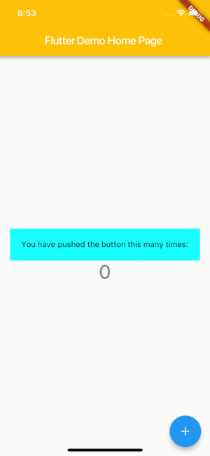
new Container(padding: new EdgeInsets.all(// Just like you'd use Theme.of or MediaQuery.ofLayoutThemeContainer.of(context).spacingUnit,),decoration: new BoxDecoration(color: Colors.cyanAccent,),child: new Text('You have pushed the button this many times:'),),

3. A design system suggestion:
At the company I work for, we mostly follow material guidelines, but wehave some of our own design conventions in place. In order to ensure thateveryone is on the same page, we use a custom theme that forces us to workwithin our own rules.
For example, if you wanted everyone to use an 8pt grid (a la Material design):
class LayoutThemeState extends State<LayoutThemeContainer> {// Generic Material Spacing Sizesstatic const double _matGridUnit = 8.0;static double matGridUnit({scale = 1}) {// Material design grid uses multiples of 8// Multiples of 4 are acceptable if needed// Only accept numbers that are full or half units of _matGridUnitassert(scale % .5 == 0);return _matGridUnit * scale;}...
Then to use it:
new Container(padding: new EdgeInsets.all(LayoutThemeContainer.of(context).matGridUnit(scale: 2.5),),
It's that easy, and super useful as your team and app grows.
