- Reusable Custom Card Widget
- 1. Create Dog Card Widget
- 2. Dog Card UI
Reusable Custom Card Widget
1. Create Dog Card Widget
We need a nice widget to display our doggos.
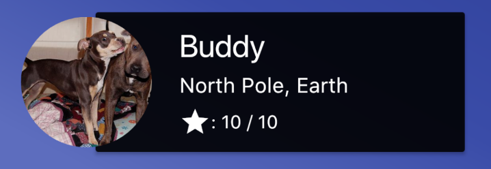
First you'll make a card that looks like this:

Create a new file called 'dog_card.dart`.
In that file, make a new, blank StatefulWidget. It should take a Dog in its constructor.
For the time being, all this will do is display the name of a dog.
// dog_card.dartimport 'package:flutter/material.dart';import 'dog_model.dart';class DogCard extends StatefulWidget {final Dog dog;DogCard(this.dog);@override_DogCardState createState() => _DogCardState(dog);}class _DogCardState extends State<DogCard> {Dog dog;_DogCardState(this.dog);@overrideWidget build(BuildContext context) {return Text(widget.dog.name);}}
In order to make the DogCard appear, let's modify the _MyHomePageState build method in main.dart:
// main.dart@overrideWidget build(BuildContext context) {return Scaffold(appBar: AppBar(title: Text(widget.title),backgroundColor: Colors.black87,),body: Container(child: DogCard(initialDoggos[1]), // New code),);}
And import dog_card.dart:
// main.dartimport 'package:flutter/material.dart';import 'dog_card.dart';import 'dog_model.dart';
Refresh your app and you can see that it's wired up now. Time to build the card.
2. Dog Card UI
There are two main parts to this card. The image, and the actual Card that sits under it.
First, make that image.
Add this getter to you _DogCardState class:
// dog_card.dart// A class property that represents the URL flutter will render// from the Dog class.String renderUrl;Widget get dogImage {return Container(// You can explicitly set heights and widths on Containers.// Otherwise they take up as much space as their children.width: 100.0,height: 100.0,// Decoration is a property that lets you style the container.// It expects a BoxDecoration.decoration: BoxDecoration(// BoxDecorations have many possible properties.// Using BoxShape with a background image is the// easiest way to make a circle cropped avatar style image.shape: BoxShape.circle,image: DecorationImage(// Just like CSS's `imagesize` property.fit: BoxFit.cover,// A NetworkImage widget is a widget that// takes a URL to an image.// ImageProviders (such as NetworkImage) are ideal// when your image needs to be loaded or can change.// Use the null check to avoid an error.image: NetworkImage(renderUrl ?? ''),),),);}
In order to see this image, you'll first need to tell the Dog class to get that image from the internets.
In your dog card, add this to your _DogCardState class:
// dog_card.dart// State classes run this method when the state is created.// You shouldn't do async work in initState, so we'll defer it// to another method.void initState() {super.initState();renderDogPic();}// IRL, we'd want the Dog class itself to get the image// but this is a simpler way to explain Flutter basicsvoid renderDogPic() async {// this makes the service callawait dog.getImageUrl();// setState tells Flutter to rerender anything that's been changed.// setState cannot be async, so we use a variable that can be overwrittenif (mounted) { // Avoid calling `setState` if the widget is no longer in the widget tree.setState(() {renderUrl = dog.imageUrl;});}}
Now you have a doggos avatar that's properly getting the URL to render.
In order to get the overlap look of the card, use the built-in widget Stack.
The Stack widget lays out its children relative to its edges.
In other words, it's CSS's position, top, bottom, left and right properties.
Within a stack, you can wrap children in 'Position' widgets, but you don't have to.
- Position wrapped widgets are outside of document flow, to use web development terms. They'll be at position [0,0] by default — the top corner of the Stack widget.
- Non-wrapped widgets aren't positioned. They stay in normal 'document flow', laid out as a column of widgets by default.
This is how the stack is going to start:
// dog_card.dart@overrideWidget build(BuildContext context) {// Start with a container so we can add layout and style props:return Container(// Arbitrary number that I decided looked good:height: 115.0,// A stack takes children, with a list of widgets.child: Stack(children: <Widget>[// position our dog image, so we can explicitly place it.// We'll place it after we've made the card.Positioned(child: dogImage,),],),);}
Reload your app to see a picture of a dog in the top corner.
Let's create the card and layout in _DogCardState:
// dog_card.dartWidget get dogCard {// A new container// The height and width are arbitrary numbers for styling.return Container(width: 290.0,height: 115.0,child: Card(color: Colors.black87,// Wrap children in a Padding widget in order to give padding.child: Padding(// The class that controls padding is called 'EdgeInsets'// The EdgeInsets.only constructor is used to set// padding explicitly to each side of the child.padding: const EdgeInsets.only(top: 8.0,bottom: 8.0,left: 64.0,),// Column is another layout widget -- like stack -- that// takes a list of widgets as children, and lays the// widgets out from top to bottom.child: Column(// These alignment properties function exactly like// CSS flexbox properties.// The main axis of a column is the vertical axis,// `MainAxisAlignment.spaceAround` is equivalent of// CSS's 'justify-content: space-around' in a vertically// laid out flexbox.crossAxisAlignment: CrossAxisAlignment.start,mainAxisAlignment: MainAxisAlignment.spaceAround,children: <Widget>[Text(widget.dog.name,// Themes are set in the MaterialApp widget at the root of your app.// They have default values -- which we're using because we didn't set our own.// They're great for having consistent, app-wide styling that's easily changed.style: Theme.of(context).textTheme.headline),Text(widget.dog.location,style: Theme.of(context).textTheme.subhead),Row(children: <Widget>[Icon(Icons.star,),Text(': ${widget.dog.rating} / 10')],)],),),),);}
Almost there. One more thing you need to do to complete the DogCard UI. Add a bit more styling to the main widget in the build method:
// dog_card.dart@overrideWidget build(BuildContext context) {return Padding(padding: const EdgeInsets.symmetric(horizontal: 16.0, vertical: 8.0),child: Container(height: 115.0,child: Stack(children: <Widget>[Positioned(left: 50.0,child: dogCard,),Positioned(top: 7.5, child: dogImage),],),),);}
