 我的书签
我的书签
 添加书签
添加书签 移除书签
移除书签- .card卡片组件(样式)
- 关于
- 示例
- 内容类型
- 主体
- 标题、文字和链接
- 图片
- 列表组
- 混合样式
- 页眉页脚
- 缩放
- 使用栅格系统
- 使用通用全局属性
- 自定义CSS
- 文本对齐
- 导航
- 图片
- 图片覆盖
- 图像叠加覆盖
- 水平排列
- 卡片样式
- 背景和颜色
- 网页中传达辅助技术及其背后的意义
- 边框
- Mixins 实用程序
- 背景和颜色
- 卡片排版
- 卡片组
- Card decks卡片阵列
- 多列卡片浮动排版
.card卡片组件(样式)
卡片是一个灵活的、可扩展的内容窗口,同时可以做出多种展示效果变体。
关于
.card卡片组件是BootStrap 4新增的一组重要样式,它是一一个灵活的、可扩展的内容器,包含了可选的卡片头和卡片脚、一个大范围的内容、上下文背景色以及强大的显示选项。
使用按钮组合,可以把一系列按钮编组在一行里,并通过可选的JavaScript插件(方法)赋予按钮单选、复选等强化行为。
如果你对Bootstrap 3很熟悉,卡片代替了我们旧的panel、well和thumbnail样式—那些组件类似的功能可以通过卡片的修饰类来实现。
示例
卡片作为一个新式引入到BootStrap 4中,可能样式、标记和扩展属性不会很多(未来会不断扩充发展),但它仍然可以提供许多控制项和定义方法,由于我们使用了flex弹性布局,使得它们可以轻松对齐、并方便的与其它Bootstrap组件混合搭配使用。
下面是一个具有混合内容并固定了宽度的基本.card卡片使用范例,如果.card卡片如果没有定义宽度,将自然地填满父元素的全宽-利用这个属性,我们可以轻松的订制各种尺寸的卡片。
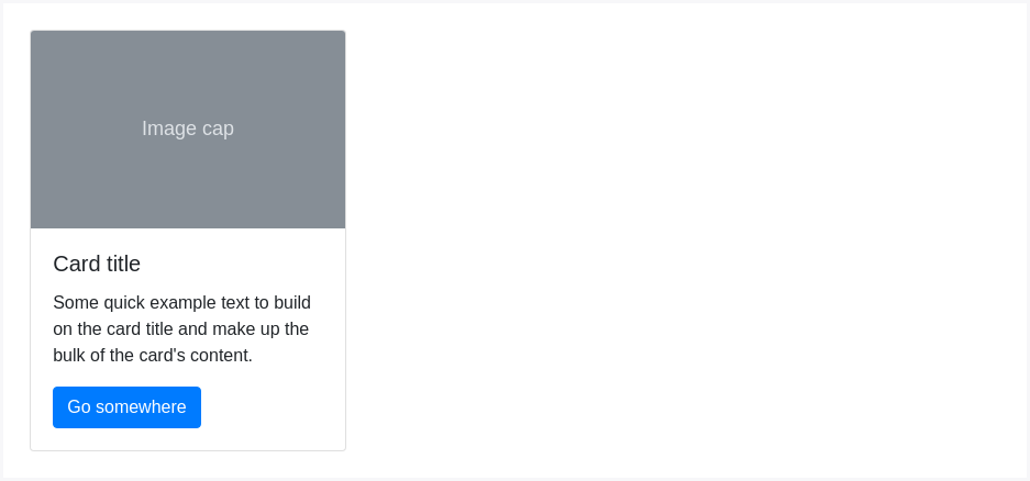
<div class="card" style="width: 18rem;"><img class="card-img-top" src="..." alt="Card image cap"><div class="card-body"><h5 class="card-title">Card title</h5><p class="card-text">Some quick example text to build on the card title and make up the bulk of the card's content.</p><a href="#" class="btn btn-primary">Go somewhere</a></div></div>
内容类型
卡片支持多种多样的内容,包括图片、文本、列组、链接等,混合并匹配多种内容类型以创建你想要的卡片。
主体
引用.card-body样式,可以建立起卡片的内容主体,如果你需要在一个.card中装置带边框的内容时,可以使用它。
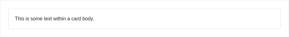
<div class="card"><div class="card-body">This is some text within a card body.</div></div>
标题、文字和链接
通过.card-title和 <h*>组合,可以添加卡片标题。同亲将.card-link 与 <a>结合使用,可以方便添加平行的链接。
通过 .card-subtitle 和 <h*> 结合,可以添加副标题,如果 .card-title 和 .card-subtitle 组合放在 .card-body 中, 则可对齐主、副标题。
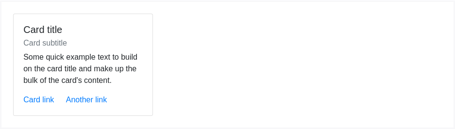
<div class="card" style="width: 18rem;"><div class="card-body"><h5 class="card-title">Card title</h5><h6 class="card-subtitle mb-2 text-muted">Card subtitle</h6><p class="card-text">Some quick example text to build on the card title and make up the bulk of the card's content.</p><a href="#" class="card-link">Card link</a><a href="#" class="card-link">Another link</a></div></div>
图片
.card-img-top 定义一张图片在卡片的顶部, .card-text定义文字在卡片中,当然你也可以在.card-text 中设计自己的个性化HTML标签样式。
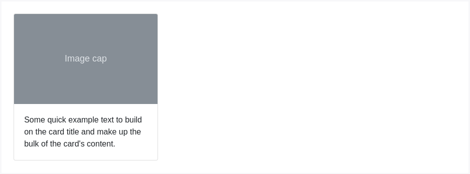
<div class="card" style="width: 18rem;"><img class="card-img-top" src="..." alt="Card image cap"><div class="card-body"><p class="card-text">Some quick example text to build on the card title and make up the bulk of the card's content.</p></div></div>
列表组
建立一个包含内容的列表组卡片。
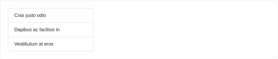
<div class="card" style="width: 18rem;"><ul class="list-group list-group-flush"><li class="list-group-item">Cras justo odio</li><li class="list-group-item">Dapibus ac facilisis in</li><li class="list-group-item">Vestibulum at eros</li></ul></div>
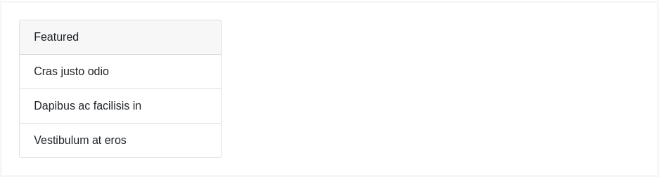
<div class="card" style="width: 18rem;"><div class="card-header">Featured</div><ul class="list-group list-group-flush"><li class="list-group-item">Cras justo odio</li><li class="list-group-item">Dapibus ac facilisis in</li><li class="list-group-item">Vestibulum at eros</li></ul></div>
混合样式
混合并结合多种内容形式来创建个性化卡片,下例即是将图像、块、文字以及列表整合在一个固定宽度的卡片中。
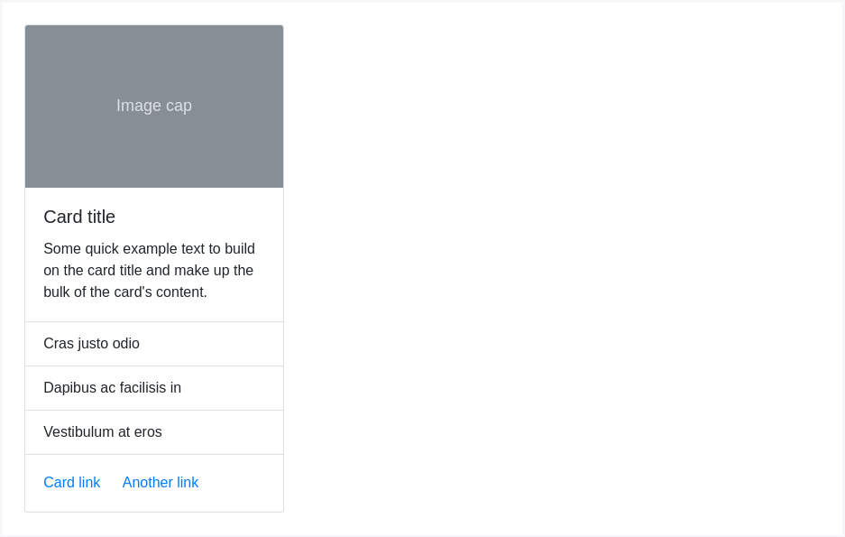
<div class="card" style="width: 18rem;"><img class="card-img-top" src="..." alt="Card image cap"><div class="card-body"><h5 class="card-title">Card title</h5><p class="card-text">Some quick example text to build on the card title and make up the bulk of the card's content.</p></div><ul class="list-group list-group-flush"><li class="list-group-item">Cras justo odio</li><li class="list-group-item">Dapibus ac facilisis in</li><li class="list-group-item">Vestibulum at eros</li></ul><div class="card-body"><a href="#" class="card-link">Card link</a><a href="#" class="card-link">Another link</a></div></div>
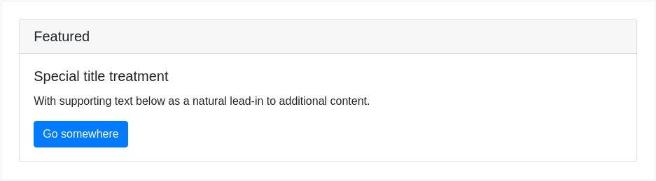
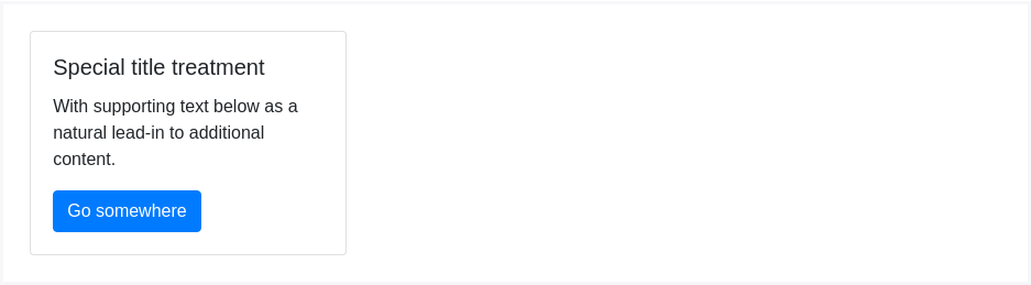
页眉页脚
在卡内添加可选的页眉和/或页脚。

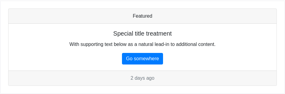
<div class="card"><div class="card-header">Featured</div><div class="card-body"><h5 class="card-title">Special title treatment</h5><p class="card-text">With supporting text below as a natural lead-in to additional content.</p><a href="#" class="btn btn-primary">Go somewhere</a></div></div>
可以将 <h*> 元素添加到 .card-header页头中。
<div class="card"><h5 class="card-header">Featured</h4><div class="card-body"><h4 class="card-title">Special title treatment</h4><p class="card-text">With supporting text below as a natural lead-in to additional content.</p><a href="#" class="btn btn-primary">Go somewhere</a></div></div>
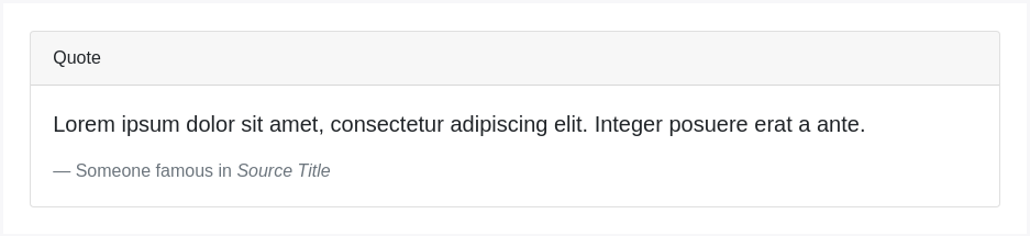
<div class="card"><div class="card-header">Quote</div><div class="card-body"><blockquote class="blockquote mb-0"><p>Lorem ipsum dolor sit amet, consectetur adipiscing elit. Integer posuere erat a ante.</p><footer class="blockquote-footer">Someone famous in <cite title="Source Title">Source Title</cite></footer></blockquote></div></div>
<div class="card text-center"><div class="card-header">Featured</div><div class="card-body"><h5 class="card-title">Special title treatment</h5><p class="card-text">With supporting text below as a natural lead-in to additional content.</p><a href="#" class="btn btn-primary">Go somewhere</a></div><div class="card-footer text-muted">2 days ago</div></div>
缩放
卡片没有特定的宽度width定义,除非另有定义声明,否则它们的真实宽度将是100%,您可以根据需要使用自定义CSS,引入栅格系统、定义栅格系统Sass mixins或其它程式进行更改。
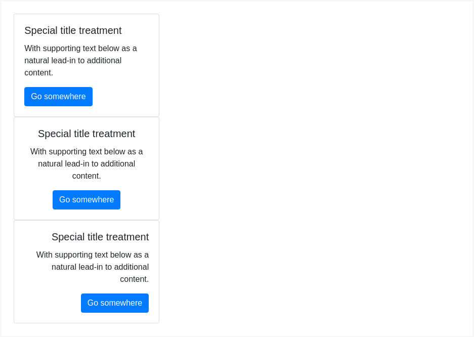
使用栅格系统
使用栅格系统,根据需求按行与列来装载卡片。
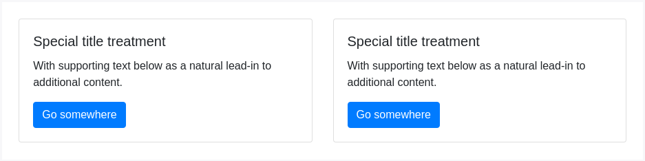
<div class="row"><div class="col-sm-6"><div class="card"><div class="card-body"><h5 class="card-title">Special title treatment</h5><p class="card-text">With supporting text below as a natural lead-in to additional content.</p><a href="#" class="btn btn-primary">Go somewhere</a></div></div></div><div class="col-sm-6"><div class="card"><div class="card-body"><h5 class="card-title">Special title treatment</h5><p class="card-text">With supporting text below as a natural lead-in to additional content.</p><a href="#" class="btn btn-primary">Go somewhere</a></div></div></div></div>
使用通用全局属性
使用我们提供的通用全局属性来定义卡片的宽度。
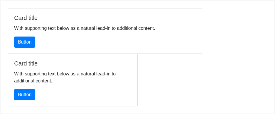
<div class="card w-75"><div class="card-body"><h5 class="card-title">Card title</h5><p class="card-text">With supporting text below as a natural lead-in to additional content.</p><a href="#" class="btn btn-primary">Button</a></div></div><div class="card w-50"><div class="card-body"><h5 class="card-title">Card title</h5><p class="card-text">With supporting text below as a natural lead-in to additional content.</p><a href="#" class="btn btn-primary">Button</a></div></div>
自定义CSS
在样式表中使用自定义CSS或使用内联样式设置宽度。
<div class="card" style="width: 18rem;"><div class="card-body"><h5 class="card-title">Special title treatment</h5><p class="card-text">With supporting text below as a natural lead-in to additional content.</p><a href="#" class="btn btn-primary">Go somewhere</a></div></div>
文本对齐
使用我们的文本对齐类来更改或特定部份的文本对齐。
<div class="card" style="width: 18rem;"><div class="card-body"><h5 class="card-title">Special title treatment</h5><p class="card-text">With supporting text below as a natural lead-in to additional content.</p><a href="#" class="btn btn-primary">Go somewhere</a></div></div><div class="card text-center" style="width: 18rem;"><div class="card-body"><h5 class="card-title">Special title treatment</h5><p class="card-text">With supporting text below as a natural lead-in to additional content.</p><a href="#" class="btn btn-primary">Go somewhere</a></div></div><div class="card text-right" style="width: 18rem;"><div class="card-body"><h5 class="card-title">Special title treatment</h5><p class="card-text">With supporting text below as a natural lead-in to additional content.</p><a href="#" class="btn btn-primary">Go somewhere</a></div></div>
导航
使用 Bootstrap导航组件将导航元件添加到卡片的标题或块中
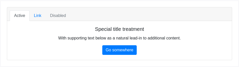
<div class="card text-center"><div class="card-header"><ul class="nav nav-tabs card-header-tabs"><li class="nav-item"><a class="nav-link active" href="#">Active</a></li><li class="nav-item"><a class="nav-link" href="#">Link</a></li><li class="nav-item"><a class="nav-link disabled" href="#">Disabled</a></li></ul></div><div class="card-body"><h5 class="card-title">Special title treatment</h5><p class="card-text">With supporting text below as a natural lead-in to additional content.</p><a href="#" class="btn btn-primary">Go somewhere</a></div></div>
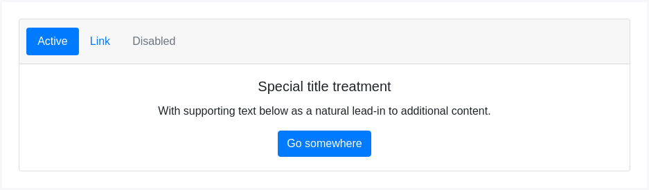
<div class="card text-center"><div class="card-header"><ul class="nav nav-pills card-header-pills"><li class="nav-item"><a class="nav-link active" href="#">Active</a></li><li class="nav-item"><a class="nav-link" href="#">Link</a></li><li class="nav-item"><a class="nav-link disabled" href="#">Disabled</a></li></ul></div><div class="card-body"><h5 class="card-title">Special title treatment</h5><p class="card-text">With supporting text below as a natural lead-in to additional content.</p><a href="#" class="btn btn-primary">Go somewhere</a></div></div>
图片
卡片中包含一些选项来搭配图像,选择在卡片的任何一端附加.cad-img-*,用卡片内容覆盖图像(如同背景),或者只是将图像置入到卡片当中。
图片覆盖
可以使用用 Image caps在卡片顶部或是底部,定义图片,如同页眉页脚效果。
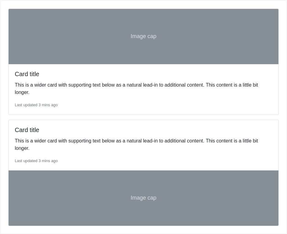
<div class="card mb-3"><img class="card-img-top" src="..." alt="Card image cap"><div class="card-body"><h5 class="card-title">Card title</h5><p class="card-text">This is a wider card with supporting text below as a natural lead-in to additional content. This content is a little bit longer.</p><p class="card-text"><small class="text-muted">Last updated 3 mins ago</small></p></div></div><div class="card"><div class="card-body"><h5 class="card-title">Card title</h5><p class="card-text">This is a wider card with supporting text below as a natural lead-in to additional content. This content is a little bit longer.</p><p class="card-text"><small class="text-muted">Last updated 3 mins ago</small></p></div><img class="card-img-bottom" src="..." alt="Card image cap"></div>
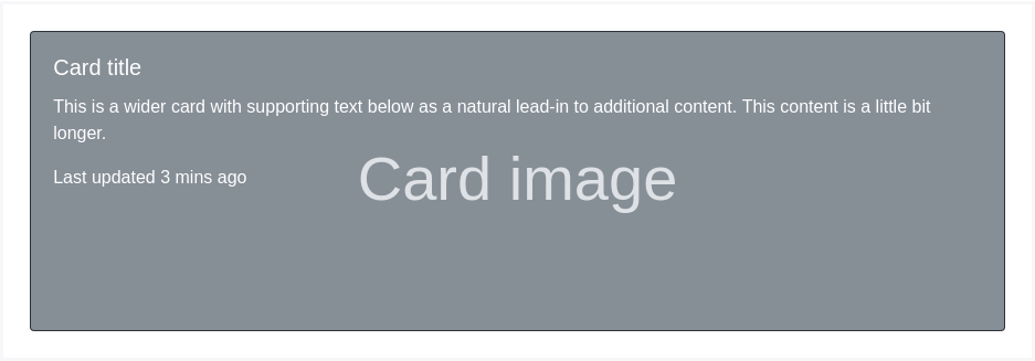
图像叠加覆盖
将图像转换为卡片背景,并覆盖卡片的文字。根据图像,你可以选择是否需要额外的样式或其它属性定义。
<div class="card bg-dark text-white"><img class="card-img" src="..." alt="Card image"><div class="card-img-overlay"><h5 class="card-title">Card title</h5><p class="card-text">This is a wider card with supporting text below as a natural lead-in to additional content. This content is a little bit longer.</p><p class="card-text">Last updated 3 mins ago</p></div></div>
请注意,内容不应大于图像的高度。 如果内容大于图像,则内容将显示在图像外部.
水平排列
使用网格和实用程序类的组合,可以以移动友好和响应方式使卡水平。 在下面的示例中,我们使用.no-gutters删除网格排水沟,并使用.col-md-* 类使卡在md 断点处水平。 根据您的卡内容,可能需要进一步调整。
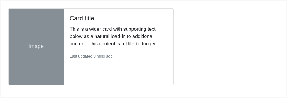
<div class="card mb-3" style="max-width: 540px;"><div class="row no-gutters"><div class="col-md-4"><img src="..." class="card-img" alt="..."></div><div class="col-md-8"><div class="card-body"><h5 class="card-title">Card title</h5><p class="card-text">This is a wider card with supporting text below as a natural lead-in to additional content. This content is a little bit longer.</p><p class="card-text"><small class="text-muted">Last updated 3 mins ago</small></p></div></div></div></div>
卡片样式
订制卡片、边框 、颜色等方法。
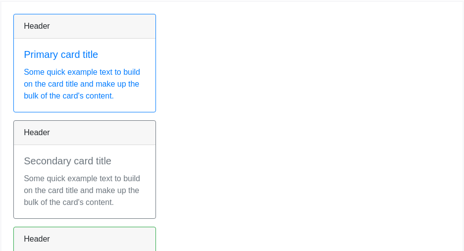
背景和颜色
使用 文字和通用背景定义 定义卡片的显示颜色。
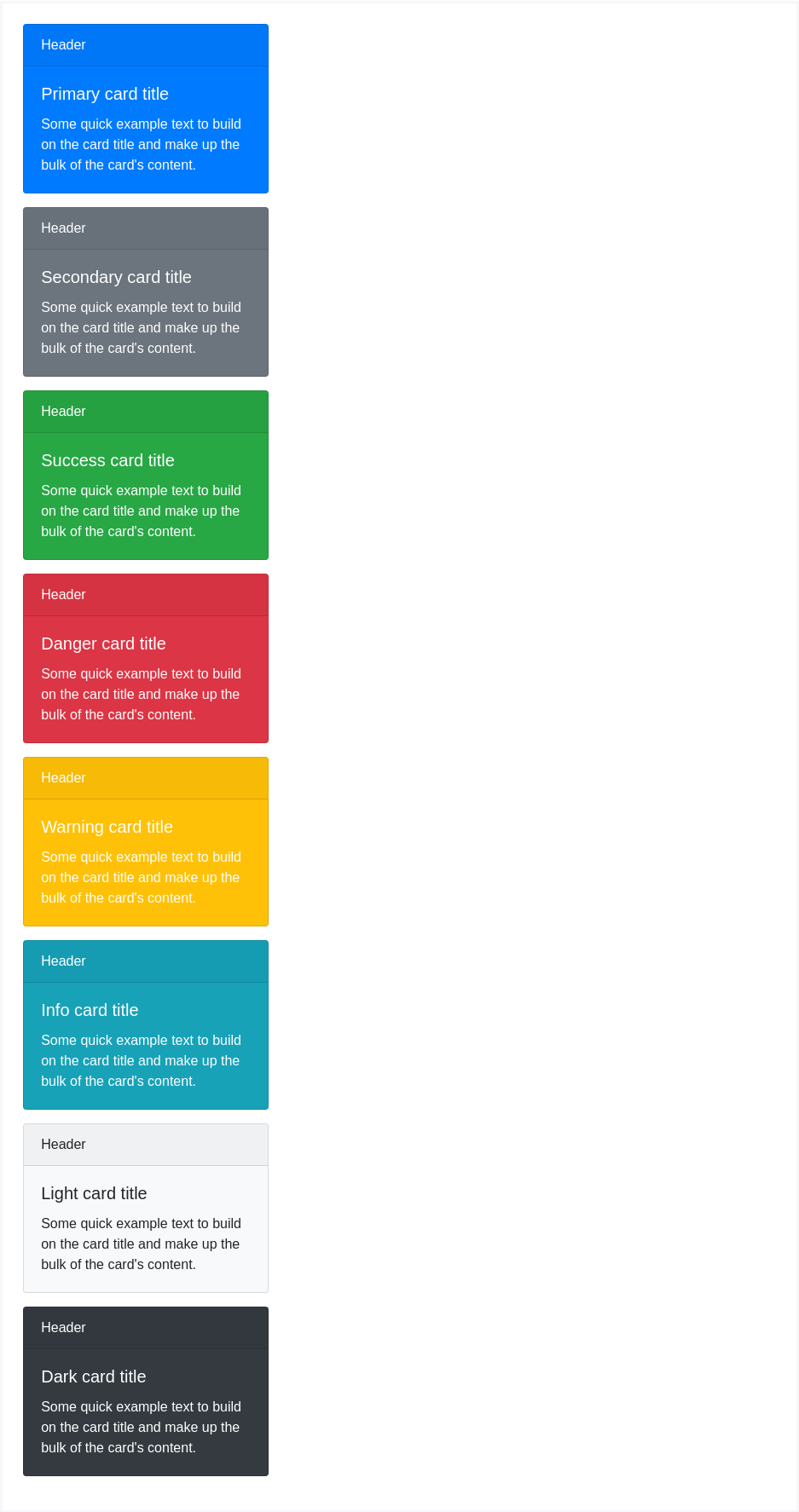
<div class="card text-white bg-primary mb-3" style="max-width: 20rem;"><div class="card-header">Header</div><div class="card-body"><h5 class="card-title">Primary card title</h5><p class="card-text">Some quick example text to build on the card title and make up the bulk of the card's content.</p></div></div><div class="card text-white bg-secondary mb-3" style="max-width: 20rem;"><div class="card-header">Header</div><div class="card-body"><h5 class="card-title">Secondary card title</h5><p class="card-text">Some quick example text to build on the card title and make up the bulk of the card's content.</p></div></div><div class="card text-white bg-success mb-3" style="max-width: 20rem;"><div class="card-header">Header</div><div class="card-body"><h5 class="card-title">Success card title</h5><p class="card-text">Some quick example text to build on the card title and make up the bulk of the card's content.</p></div></div><div class="card text-white bg-danger mb-3" style="max-width: 20rem;"><div class="card-header">Header</div><div class="card-body"><h5 class="card-title">Danger card title</h5><p class="card-text">Some quick example text to build on the card title and make up the bulk of the card's content.</p></div></div><div class="card text-white bg-warning mb-3" style="max-width: 20rem;"><div class="card-header">Header</div><div class="card-body"><h5 class="card-title">Warning card title</h5><p class="card-text">Some quick example text to build on the card title and make up the bulk of the card's content.</p></div></div><div class="card text-white bg-info mb-3" style="max-width: 20rem;"><div class="card-header">Header</div><div class="card-body"><h5 class="card-title">Info card title</h5><p class="card-text">Some quick example text to build on the card title and make up the bulk of the card's content.</p></div></div><div class="card bg-light mb-3" style="max-width: 20rem;"><div class="card-header">Header</div><div class="card-body"><h5 class="card-title">Light card title</h5><p class="card-text">Some quick example text to build on the card title and make up the bulk of the card's content.</p></div></div><div class="card text-white bg-dark mb-3" style="max-width: 20rem;"><div class="card-header">Header</div><div class="card-body"><h5 class="card-title">Dark card title</h5><p class="card-text">Some quick example text to build on the card title and make up the bulk of the card's content.</p></div></div>
网页中传达辅助技术及其背后的意义
使用颜色添加意义只提供一个视觉指示,这不会传达给需要辅助技术(如盲人、听力障碍者)的用户,也就决定了诸如屏幕阅读器并不能读出颜色本身的意义。一般推荐确保由颜色表示的信息从内容本身(例如可见文本)中显而易见,或者通过替代方法,例如隐藏在.sr-only该类中的附加文本来创造更多的辅助传达技术。
.sr-only,全称 screen reader only,意为:(仅供)屏幕阅读器,这个 class 主要用于增强 accessbility(可访问性),有时候 UI 上会出现一些仅供视觉识别的元素,比如说“菜单按钮”,只有视力正常的人才能清楚辨识这些元素的作用。而残障人士,比如弱势或盲人是不可能知道这些视觉识别元素是什么的。他们上网使用的是屏幕阅读器,也就是 screen reader(sr),屏幕阅读器需要找到能辨识的文本说明然后“读”出来给用户听。问题是图形元素怎么可能“读出来”呢?因此我们还要写上这些元素的文本说明,但是又不需要展示给普通用户看到,于是加上 sr-only 的意义就在于能保证屏幕阅读器正确读取且不会影响 UI 的视觉呈现(译者补充)。
边框
使用 边框通用样式 来改变卡片的border-color 、 .text-{color} ,或者在父层的 .card 上显示内容。
<div class="card border-primary mb-3" style="max-width: 20rem;"><div class="card-header">Header</div><div class="card-body text-primary"><h5 class="card-title">Primary card title</h5><p class="card-text">Some quick example text to build on the card title and make up the bulk of the card's content.</p></div></div><div class="card border-secondary mb-3" style="max-width: 20rem;"><div class="card-header">Header</div><div class="card-body text-secondary"><h5 class="card-title">Secondary card title</h5><p class="card-text">Some quick example text to build on the card title and make up the bulk of the card's content.</p></div></div><div class="card border-success mb-3" style="max-width: 20rem;"><div class="card-header">Header</div><div class="card-body text-success"><h5 class="card-title">Success card title</h5><p class="card-text">Some quick example text to build on the card title and make up the bulk of the card's content.</p></div></div><div class="card border-danger mb-3" style="max-width: 20rem;"><div class="card-header">Header</div><div class="card-body text-danger"><h5 class="card-title">Danger card title</h5><p class="card-text">Some quick example text to build on the card title and make up the bulk of the card's content.</p></div></div><div class="card border-warning mb-3" style="max-width: 20rem;"><div class="card-header">Header</div><div class="card-body text-warning"><h5 class="card-title">Warning card title</h5><p class="card-text">Some quick example text to build on the card title and make up the bulk of the card's content.</p></div></div><div class="card border-info mb-3" style="max-width: 20rem;"><div class="card-header">Header</div><div class="card-body text-info"><h5 class="card-title">Info card title</h5><p class="card-text">Some quick example text to build on the card title and make up the bulk of the card's content.</p></div></div><div class="card border-light mb-3" style="max-width: 20rem;"><div class="card-header">Header</div><div class="card-body"><h5 class="card-title">Light card title</h5><p class="card-text">Some quick example text to build on the card title and make up the bulk of the card's content.</p></div></div><div class="card border-dark mb-3" style="max-width: 20rem;"><div class="card-header">Header</div><div class="card-body text-dark"><h5 class="card-title">Dark card title</h5><p class="card-text">Some quick example text to build on the card title and make up the bulk of the card's content.</p></div></div>
Mixins 实用程序
您还可以更改卡上的页眉和页脚所需的边框,也能使用.bg-transparent删除其background-color背景颜色。

<div class="card border-success mb-3" style="max-width: 20rem;"><div class="card-header bg-transparent border-success">Header</div><div class="card-body text-success"><h5 class="card-title">Success card title</h5><p class="card-text">Some quick example text to build on the card title and make up the bulk of the card's content.</p></div><div class="card-footer bg-transparent border-success">Footer</div></div>
卡片排版
Bootstrap除了对卡片內的內容可以进行设计排版外,还包括一系列布置选项,目前这些布置选项还不支持响应式。
卡片组
将多个卡片结为一个群组,使用他们具有相同的宽度和高度列。卡片组使用display: flex;来实现统一的布局。

<div class="card-group"><div class="card"><img class="card-img-top" src="..." alt="Card image cap"><div class="card-body"><h5 class="card-title">Card title</h5><p class="card-text">This is a wider card with supporting text below as a natural lead-in to additional content. This content is a little bit longer.</p><p class="card-text"><small class="text-muted">Last updated 3 mins ago</small></p></div></div><div class="card"><img class="card-img-top" src="..." alt="Card image cap"><div class="card-body"><h5 class="card-title">Card title</h5><p class="card-text">This card has supporting text below as a natural lead-in to additional content.</p><p class="card-text"><small class="text-muted">Last updated 3 mins ago</small></p></div></div><div class="card"><img class="card-img-top" src="..." alt="Card image cap"><div class="card-body"><h5 class="card-title">Card title</h5><p class="card-text">This is a wider card with supporting text below as a natural lead-in to additional content. This card has even longer content than the first to show that equal height action.</p><p class="card-text"><small class="text-muted">Last updated 3 mins ago</small></p></div></div></div>
当使用带页脚的卡片图时,他们的内容会自动水平对齐和栅格式布局。

<div class="card-group"><div class="card"><img class="card-img-top" src="..." alt="Card image cap"><div class="card-body"><h5 class="card-title">Card title</h5><p class="card-text">This is a wider card with supporting text below as a natural lead-in to additional content. This content is a little bit longer.</p></div><div class="card-footer"><small class="text-muted">Last updated 3 mins ago</small></div></div><div class="card"><img class="card-img-top" src="..." alt="Card image cap"><div class="card-body"><h5 class="card-title">Card title</h5><p class="card-text">This card has supporting text below as a natural lead-in to additional content.</p></div><div class="card-footer"><small class="text-muted">Last updated 3 mins ago</small></div></div><div class="card"><img class="card-img-top" src="..." alt="Card image cap"><div class="card-body"><h5 class="card-title">Card title</h5><p class="card-text">This is a wider card with supporting text below as a natural lead-in to additional content. This card has even longer content than the first to show that equal height action.</p></div><div class="card-footer"><small class="text-muted">Last updated 3 mins ago</small></div></div></div>
Card decks卡片阵列
需要一套相互不相连,但宽度和高度相同的卡片?使用卡片阵列(Card decks)吧。

<div class="card-deck"><div class="card"><img class="card-img-top" src="..." alt="Card image cap"><div class="card-body"><h5 class="card-title">Card title</h5><p class="card-text">This is a longer card with supporting text below as a natural lead-in to additional content. This content is a little bit longer.</p><p class="card-text"><small class="text-muted">Last updated 3 mins ago</small></p></div></div><div class="card"><img class="card-img-top" src="..." alt="Card image cap"><div class="card-body"><h5 class="card-title">Card title</h5><p class="card-text">This card has supporting text below as a natural lead-in to additional content.</p><p class="card-text"><small class="text-muted">Last updated 3 mins ago</small></p></div></div><div class="card"><img class="card-img-top" src="..." alt="Card image cap"><div class="card-body"><h5 class="card-title">Card title</h5><p class="card-text">This is a wider card with supporting text below as a natural lead-in to additional content. This card has even longer content than the first to show that equal height action.</p><p class="card-text"><small class="text-muted">Last updated 3 mins ago</small></p></div></div></div>
与卡片组一样,卡片阵列中的的的卡片页脚会自动排列。

<div class="card-deck"><div class="card"><img class="card-img-top" src="..." alt="Card image cap"><div class="card-body"><h5 class="card-title">Card title</h5><p class="card-text">This is a wider card with supporting text below as a natural lead-in to additional content. This content is a little bit longer.</p></div><div class="card-footer"><small class="text-muted">Last updated 3 mins ago</small></div></div><div class="card"><img class="card-img-top" src="..." alt="Card image cap"><div class="card-body"><h5 class="card-title">Card title</h5><p class="card-text">This card has supporting text below as a natural lead-in to additional content.</p></div><div class="card-footer"><small class="text-muted">Last updated 3 mins ago</small></div></div><div class="card"><img class="card-img-top" src="..." alt="Card image cap"><div class="card-body"><h5 class="card-title">Card title</h5><p class="card-text">This is a wider card with supporting text below as a natural lead-in to additional content. This card has even longer content than the first to show that equal height action.</p></div><div class="card-footer"><small class="text-muted">Last updated 3 mins ago</small></div></div></div>
多列卡片浮动排版
將卡片包在.card-columns 中,可以將做出象 Masonry网站的瀑布式排列卡片效果,卡片是使用column属性,而不是基于 flexbox弹性布局,从而实现更方便实用的浮动对齐,顺序是从上到下、从左到右。
注意: 为了防止卡片排列突出栏目,我们必须为它们设置为 display: inline-block (当 column-break-inside: avoid 这个解决方案还没有生效时。

<div class="card-columns"><div class="card"><img class="card-img-top" src="..." alt="Card image cap"><div class="card-body"><h5 class="card-title">Card title that wraps to a new line</h5><p class="card-text">This is a longer card with supporting text below as a natural lead-in to additional content. This content is a little bit longer.</p></div></div><div class="card p-3"><blockquote class="blockquote mb-0 card-body"><p>Lorem ipsum dolor sit amet, consectetur adipiscing elit. Integer posuere erat a ante.</p><footer class="blockquote-footer"><small class="text-muted">Someone famous in <cite title="Source Title">Source Title</cite></small></footer></blockquote></div><div class="card"><img class="card-img-top" src="..." alt="Card image cap"><div class="card-body"><h5 class="card-title">Card title</h5><p class="card-text">This card has supporting text below as a natural lead-in to additional content.</p><p class="card-text"><small class="text-muted">Last updated 3 mins ago</small></p></div></div><div class="card bg-primary text-white text-center p-3"><blockquote class="blockquote mb-0"><p>Lorem ipsum dolor sit amet, consectetur adipiscing elit. Integer posuere erat.</p><footer class="blockquote-footer"><small>Someone famous in <cite title="Source Title">Source Title</cite></small></footer></blockquote></div><div class="card text-center"><div class="card-body"><h5 class="card-title">Card title</h5><p class="card-text">This card has supporting text below as a natural lead-in to additional content.</p><p class="card-text"><small class="text-muted">Last updated 3 mins ago</small></p></div></div><div class="card"><img class="card-img" src="..." alt="Card image"></div><div class="card p-3 text-right"><blockquote class="blockquote mb-0"><p>Lorem ipsum dolor sit amet, consectetur adipiscing elit. Integer posuere erat a ante.</p><footer class="blockquote-footer"><small class="text-muted">Someone famous in <cite title="Source Title">Source Title</cite></small></footer></blockquote></div><div class="card"><div class="card-body"><h5 class="card-title">Card title</h5><p class="card-text">This is a wider card with supporting text below as a natural lead-in to additional content. This card has even longer content than the first to show that equal height action.</p><p class="card-text"><small class="text-muted">Last updated 3 mins ago</small></p></div></div></div>
Card columns can also be extended and customized with some additional code. Shown below is an extension of the .card-columns class using the same CSS we use—CSS columns— to generate a set of responsive tiers for changing the number of columns.
.card-columns {@include media-breakpoint-only(lg) {column-count: 4;}@include media-breakpoint-only(xl) {column-count: 5;}}
