 我的书签
我的书签
 添加书签
添加书签 移除书签
移除书签- 警告提示框(Alert)
- 示例
- 网页中传达辅助技术及其背后的意义
- 链接颜色
- 额外附加内容
- 关闭警告(小贴士效果)
- 示例
- JavaScript行为
- 触发
- 方法
- 事件
警告提示框(Alert)
警告框组件通过提供一些灵活的预定义消息,为常见的用户动作提供常见的上下反馈消息和提示。
示例
警报是一组颜色控件(共八个颜色样式),可用于任何长度的文本,以及可选的关闭按钮,系统提供8个可用的正确的样式(如,.alert-success),如你还可以使用jQuery插件方法来解除内联元素。
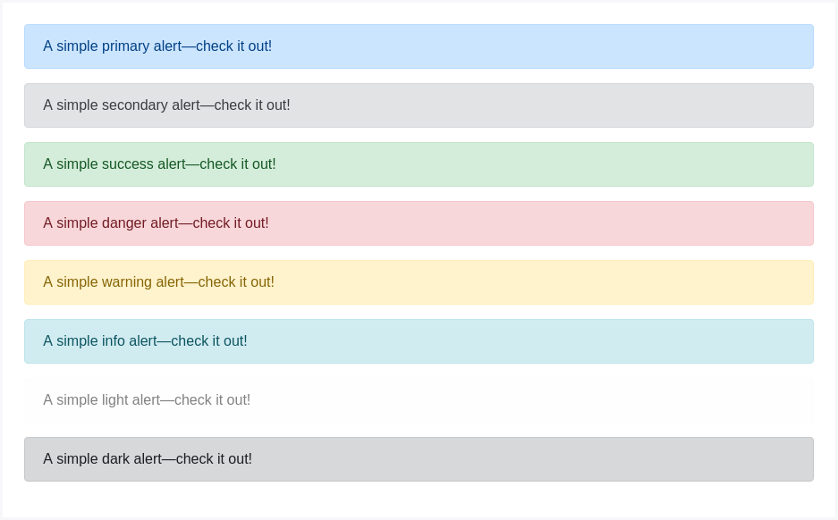
<div class="alert alert-primary" role="alert">A simple primary alert—check it out!</div><div class="alert alert-secondary" role="alert">A simple secondary alert—check it out!</div><div class="alert alert-success" role="alert">A simple success alert—check it out!</div><div class="alert alert-danger" role="alert">A simple danger alert—check it out!</div><div class="alert alert-warning" role="alert">A simple warning alert—check it out!</div><div class="alert alert-info" role="alert">A simple info alert—check it out!</div><div class="alert alert-light" role="alert">A simple light alert—check it out!</div><div class="alert alert-dark" role="alert">A simple dark alert—check it out!</div>
网页中传达辅助技术及其背后的意义
使用颜色添加意义只提供一个视觉指示,这不会传达给需要辅助技术(如盲人、听力障碍者)的用户,也就决定了诸如屏幕阅读器并不能读出颜色本身的意义。一般推荐确保由颜色表示的信息从内容本身(例如可见文本)中显而易见,或者通过替代方法,例如隐藏在.sr-only该类中的附加文本来创造更多的辅助传达技术。
.sr-only,全称 screen reader only,意为:(仅供)屏幕阅读器,这个 class 主要用于增强 accessbility(可访问性),有时候 UI 上会出现一些仅供视觉识别的元素,比如说“菜单按钮”,只有视力正常的人才能清楚辨识这些元素的作用。而残障人士,比如弱势或盲人是不可能知道这些视觉识别元素是什么的。他们上网使用的是屏幕阅读器,也就是 screen reader(sr),屏幕阅读器需要找到能辨识的文本说明然后“读”出来给用户听。问题是图形元素怎么可能“读出来”呢?因此我们还要写上这些元素的文本说明,但是又不需要展示给普通用户看到,于是加上 sr-only 的意义就在于能保证屏幕阅读器正确读取且不会影响 UI 的视觉呈现(译者补充)。
链接颜色
使用 .alert-link 类可以为带颜色的警告文本框中的链接加上合适的颜色(BootStrap已经内置了相应的颜色解决方案,会自动对应有一个优化后的链接颜色方案-译者注)。
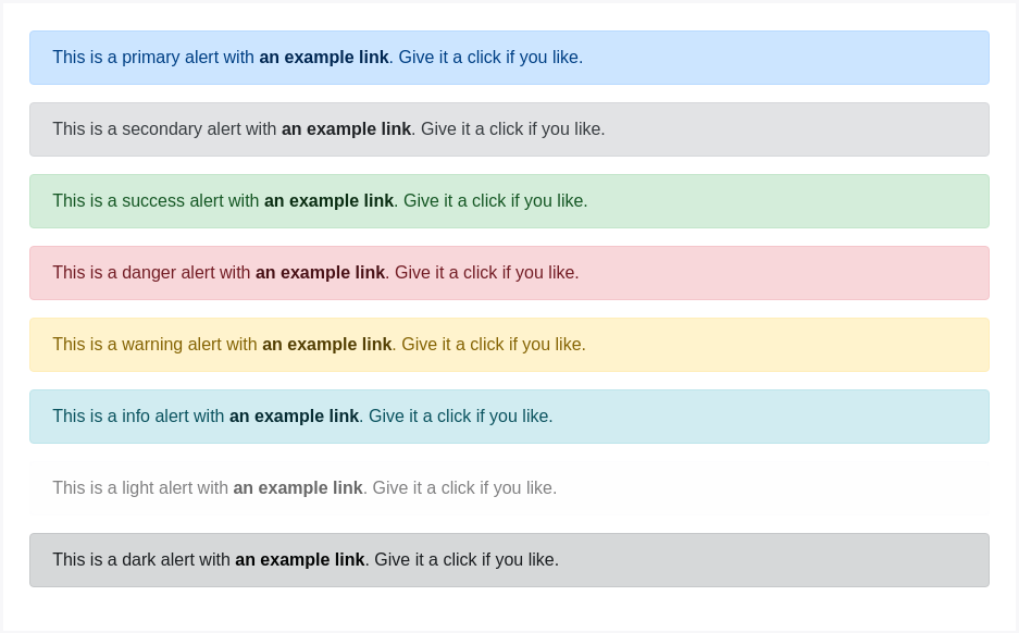
<div class="alert alert-primary" role="alert">This is a primary alert with <a href="#" class="alert-link">an example link</a>. Give it a click if you like.</div><div class="alert alert-secondary" role="alert">This is a secondary alert with <a href="#" class="alert-link">an example link</a>. Give it a click if you like.</div><div class="alert alert-success" role="alert">This is a success alert with <a href="#" class="alert-link">an example link</a>. Give it a click if you like.</div><div class="alert alert-danger" role="alert">This is a danger alert with <a href="#" class="alert-link">an example link</a>. Give it a click if you like.</div><div class="alert alert-warning" role="alert">This is a warning alert with <a href="#" class="alert-link">an example link</a>. Give it a click if you like.</div><div class="alert alert-info" role="alert">This is a info alert with <a href="#" class="alert-link">an example link</a>. Give it a click if you like.</div><div class="alert alert-light" role="alert">This is a light alert with <a href="#" class="alert-link">an example link</a>. Give it a click if you like.</div><div class="alert alert-dark" role="alert">This is a dark alert with <a href="#" class="alert-link">an example link</a>. Give it a click if you like.</div>
额外附加内容
警报还可以包含其他HTML元素,如标、段落和分隔符。
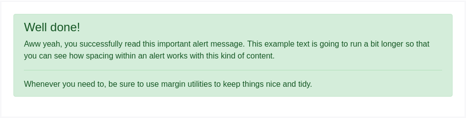
<div class="alert alert-success" role="alert"><h4 class="alert-heading">Well done!</h4><p>Aww yeah, you successfully read this important alert message. This example text is going to run a bit longer so that you can see how spacing within an alert works with this kind of content.</p><hr><p class="mb-0">Whenever you need to, be sure to use margin utilities to keep things nice and tidy.</p></div>
关闭警告(小贴士效果)
使用.alert结合JavaScript,可以实现警报效果,贴在页面上,并可以自由关闭,其要点如下:
- 确保你正确加载了
.alert警报组件,或者是编译后的 Bootstrap JavaScript代码组。 - 如果你要自行编译JavaScript组件,请将必须的
util.js包括进去。 - 可以在右上角定义一个
.close关闭按钮效果,则需要在容器中引用.alert-dismissible类。 - 警告按钮上要增加
data-dismiss="alert"触发 JavaScript 动作,同时使用<button>元素,以确保在所有设备上都能获得正确的行为响应。 - 要在关闭警报时生成警报提示,请确保添加
.fade和.show样式。
实际效果展示:
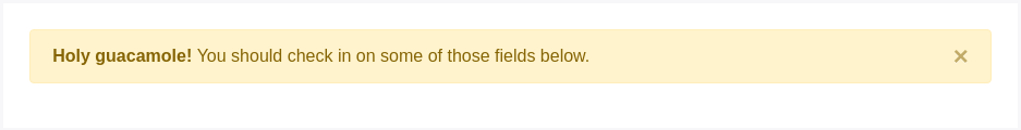
<div class="alert alert-warning alert-dismissible fade show" role="alert"><strong>Holy guacamole!</strong> You should check in on some of those fields below.<button type="button" class="close" data-dismiss="alert" aria-label="Close"><span aria-hidden="true">×</span></button></div>
JavaScript行为
触发
使用JavaScript插件解除警报:
$(".alert").alert()
或者使用 警报控件中的data 属性,如下所示:
<button type="button" class="close" data-dismiss="alert" aria-label="Close"><span aria-hidden="true">×</span></button>
请注意,关闭警报会将其从DOM中移除。
方法
| 方法 | 描述 |
|---|---|
$().alert() | Makes an alert listen for click events on descendant elements which have the data-dismiss="alert" attribute. (Not necessary when using the data-api’s auto-initialization.) |
$().alert('close') | Closes an alert by removing it from the DOM. If the .fade and .show classes are present on the element, the alert will fade out before it is removed. |
$().alert('dispose') | Destroys an element’s alert. |
$(".alert").alert('close')
事件
Bootstrap警报插件提供额外的事件,可以直接取得调用方法和函式。
| 事件 | 描述 |
|---|---|
close.bs.alert | This event fires immediately when the close instance method is called. |
closed.bs.alert | This event is fired when the alert has been closed (will wait for CSS transitions to complete). |
$('#myAlert').on('closed.bs.alert', function () {// do something…})
