 我的书签
我的书签
 添加书签
添加书签 移除书签
移除书签- Progress进度条
- 规则
- 代码演示
- API
Progress进度条
表明某个任务的当前进度。
规则
- 需要准确告知当前进度,否则应该使用组件 ActivityIndicator。
- 和 NavBar 一起搭配使用时,可以隐藏 Progress 未填充部分的轨道,提升整体感。
代码演示
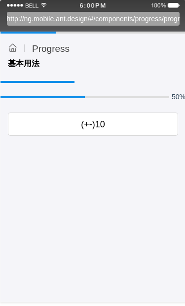
基本用法
进度条示例。
import { Component } from '@angular/core';@Component({selector: 'demo-progress-basic',template: `<div class="progress-container"><nzm-progress [percent]="30" [position]="'fixed'" [barStyle]="barStyleDemo"></nzm-progress><div style="height: 18px"></div><Progress [percent]="40" [position]="'normal'" [unfilled]="false" appearTransition></Progress><div class="show-info"><div class="progress"><Progress [percent]="percent" [position]="'normal'"></Progress></div><div aria-hidden="true">{{percent}}%</div></div><WhiteSpace [size]="'xl'"></WhiteSpace><WingBlank><a Button (click)="add()">(+-)10</a></WingBlank></div>`,styles: [`.show-info {margin-top: 18px;display: flex;align-items: center;}.show-info .progress {margin-right: 5px;width: 100%;}`]})export class DemoProgressBasicComponent {percent = 50;barStyleDemo = {border: '2px solid #108ee9'};constructor() {}add() {this.percent += 10;if (this.percent >= 100) {this.percent = 0;}}}
API
| 属性 | 说明 | 类型 | 默认值 |
|---|---|---|---|
| percent | 进度百分比 | number | 0 |
| position | 进度条的位置,fixed 将浮出固定在最顶层,可选: fixednormal | string | fixed |
| unfilled | 是否显示未填充的轨道 | boolean | true |
| barStyle | 进度样式(仅在selector为nzm-progress时生效) | object | {} |
