 我的书签
我的书签
 添加书签
添加书签 移除书签
移除书签- ActivityIndicator活动指示器
- 规则
- 代码演示
- API
- ActivityIndicator
- ActivityIndicator
ActivityIndicator活动指示器
活动指示器。表明某个任务正在进行中。
规则
- 不要让活动指示器静止,用户会以为该任务停滞了。
- 在某些特定场景下,提供有意义的文案,帮助用户明白哪个任务正在进行中,eg:正在上传照片。
- 如果能知道用户的等待时间,可以使用组件 Progress 来替代。
代码演示
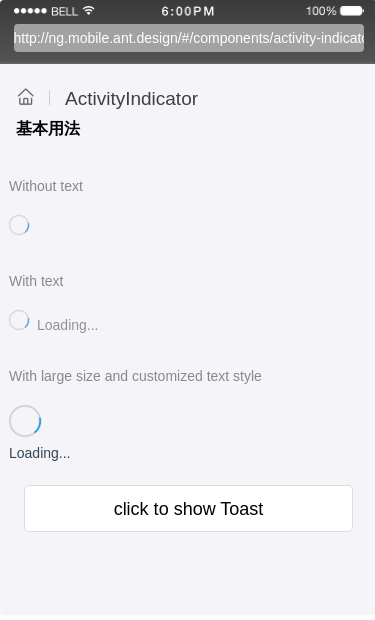
基本用法
最简单的用法。
import { Component, OnDestroy } from '@angular/core';@Component({selector: 'demo-activity-indicator-basic',template: `<div class="am-wingblank am-wingblank-lg"><div class="loading-container"><p class="sub-title">Without text</p><div class="loading-example"><ActivityIndicator [animating]="true"></ActivityIndicator></div><p class="sub-title">With text</p><div class="loading-example"><ActivityIndicator [text]="'Loading...'"></ActivityIndicator></div><p class="sub-title">With large size and customized text style</p><div class="loading-example"><div class="align"><ActivityIndicator [size]="'large'"></ActivityIndicator><span style="margin-top:8;">Loading...</span></div></div></div><div class="toast-container"><div class="am-whitespace am-whitespace-xl"></div><a role="button" class="am-button" (click)="showToast()"><span>click to show Toast</span></a><div class="toast-example"><ActivityIndicator [toast]="true" [text]="'Loading...'" [animating]="animating"></ActivityIndicator></div></div></div>`,styles: [`.sub-title {color: #888;font-size: 14px;padding: 30px 0 18px 0;}.am-wingblank .am-wingblank-lg {margin-left: 15px;margin-right: 15px;}.am-whitespace.am-whitespace-xl {height: 21px;}.am-wingblank {margin-left: 8px;margin-right: 8px;}.am-button {display: block;outline: 0 none;-webkit-appearance: none;-webkit-box-sizing: border-box;box-sizing: border-box;padding: 0;text-align: center;font-size: 18px;height: 47px;line-height: 47px;overflow: hidden;text-overflow: ellipsis;word-break: break-word;white-space: nowrap;color: #000;background-color: #fff;border: 1px solid #ddd;border-radius: 5px;margin: 0 15px 15px 15px;}`]})export class DemoActivityIndicatorBasicComponent implements OnDestroy {animating = false;private _closeTimer;constructor() {}showToast() {this.animating = !this.animating;this._closeTimer = setTimeout(() => {this.animating = !this.animating;}, 1000);}ngOnDestroy() {clearTimeout(this._closeTimer);}}
API
ActivityIndicator
| 属性 | 说明 | 类型 | 默认值 |
|---|---|---|---|
| animating | 显隐状态 | boolean | true |
| size | spinner大小,可选small/large | string | small |
| toast | loading样式类型 | boolean | false |
| text | loading文本 | string | - |
