 我的书签
我的书签
 添加书签
添加书签 移除书签
移除书签- Tooltip 文字提示
- 基础用法
- 主题
- 更多 Content
- 高级扩展
- Attributes
Tooltip 文字提示
常用于展示鼠标 hover 时的提示信息。
基础用法
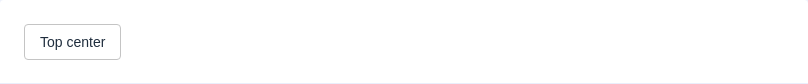
在这里我们提供 9 种不同方向的展示方式,可以通过以下完整示例来理解,选择你要的效果。

主题
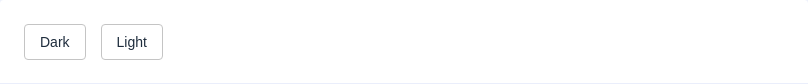
Tooltip 组件提供了两个不同的主题:dark和light。
更多 Content
展示多行文本或者是设置文本内容的格式
高级扩展
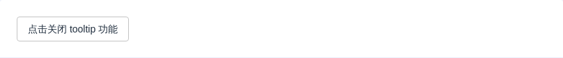
除了这些基本设置外,还有一些属性可以让使用者更好的定制自己的效果:transition属性可以定制显隐的动画效果,默认为fade-in-linear。如果需要关闭tooltip功能,disabled属性可以满足这个需求,它接受一个Boolean,设置为true即可。
Attributes
| 参数 | 说明 | 类型 | 可选值 | 默认值 |
|---|---|---|---|---|
| effect | 默认提供的主题 | String | dark, light | dark |
| content | 显示的内容 | String/Node | — | — |
| placement | Tooltip 的出现位置 | String | top, top-start, top-end, bottom, bottom-start, bottom-end, left, left-start, left-end, right, right-start, right-end | bottom |
| visible | 状态是否可见 | Boolean | — | false |
| disabled | Tooltip 是否可用 | Boolean | — | false |
| transition | 定义渐变动画 | String | — | fade-in-linear |
| visibleArrow | 是否显示 Tooltip 箭头 | Boolean | — | true |
| openDelay | 延迟出现,单位毫秒 | Number | — | 0 |
| manual | 手动控制模式,设置为 true 后,mouseenter 和 mouseleave 事件将不会生效 | Boolean | true,false | false |
