 我的书签
我的书签
 添加书签
添加书签 移除书签
移除书签- Alert 警告
- 基本用法
- 主题
- 自定义关闭按钮
- 带有 icon
- 文字居中
- 带有辅助性文字介绍
- 带有 icon 和辅助性文字介绍
- Attributes
- Slot
- Events
Alert 警告
用于页面中展示重要的提示信息。
基本用法
页面中的非浮层元素,不会自动消失。
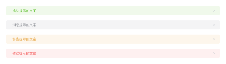
Alert 组件提供四种主题,由type属性指定,默认值为info。
<template><el-alerttitle="成功提示的文案"type="success"></el-alert><el-alerttitle="消息提示的文案"type="info"></el-alert><el-alerttitle="警告提示的文案"type="warning"></el-alert><el-alerttitle="错误提示的文案"type="error"></el-alert></template>
主题
Alert 组件提供了两个不同的主题:light和dark。
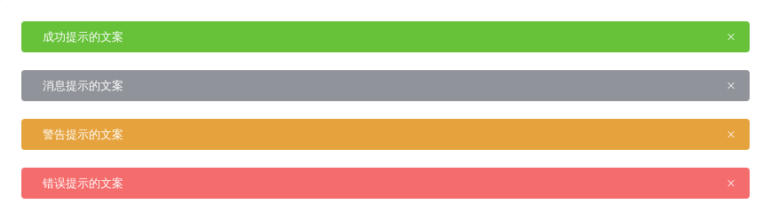
通过设置effect属性来改变主题,默认为light。
<template><el-alerttitle="成功提示的文案"type="success"effect="dark"></el-alert><el-alerttitle="消息提示的文案"type="info"effect="dark"></el-alert><el-alerttitle="警告提示的文案"type="warning"effect="dark"></el-alert><el-alerttitle="错误提示的文案"type="error"effect="dark"></el-alert></template>
自定义关闭按钮
自定义关闭按钮为文字或其他符号。
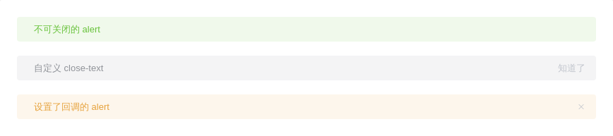
在 Alert 组件中,你可以设置是否可关闭,关闭按钮的文本以及关闭时的回调函数。closable属性决定是否可关闭,接受boolean,默认为true。你可以设置close-text属性来代替右侧的关闭图标,注意:close-text必须为文本。设置close事件来设置关闭时的回调。
<template><el-alerttitle="不可关闭的 alert"type="success":closable="false"></el-alert><el-alerttitle="自定义 close-text"type="info"close-text="知道了"></el-alert><el-alerttitle="设置了回调的 alert"type="warning"@close="hello"></el-alert></template><script>export default {methods: {hello() {alert('Hello World!');}}}</script>
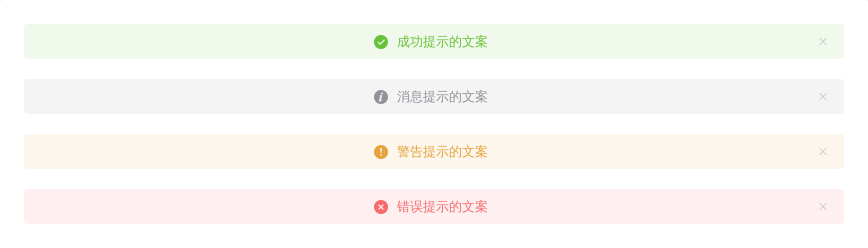
带有 icon
表示某种状态时提升可读性。
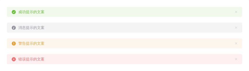
通过设置show-icon属性来显示 Alert 的 icon,这能更有效地向用户展示你的显示意图。
<template><el-alerttitle="成功提示的文案"type="success"show-icon></el-alert><el-alerttitle="消息提示的文案"type="info"show-icon></el-alert><el-alerttitle="警告提示的文案"type="warning"show-icon></el-alert><el-alerttitle="错误提示的文案"type="error"show-icon></el-alert></template>
文字居中
使用 center 属性让文字水平居中。
<template><el-alerttitle="成功提示的文案"type="success"centershow-icon></el-alert><el-alerttitle="消息提示的文案"type="info"centershow-icon></el-alert><el-alerttitle="警告提示的文案"type="warning"centershow-icon></el-alert><el-alerttitle="错误提示的文案"type="error"centershow-icon></el-alert></template>
带有辅助性文字介绍
包含标题和内容,解释更详细的警告。

除了必填的title属性外,你可以设置description属性来帮助你更好地介绍,我们称之为辅助性文字。辅助性文字只能存放单行文本,会自动换行显示。
<template><el-alerttitle="带辅助性文字介绍"type="success"description="这是一句绕口令:黑灰化肥会挥发发灰黑化肥挥发;灰黑化肥会挥发发黑灰化肥发挥。 黑灰化肥会挥发发灰黑化肥黑灰挥发化为灰……"></el-alert></template>
带有 icon 和辅助性文字介绍
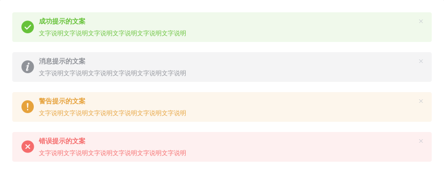
最后,这是一个同时具有 icon 和辅助性文字的样例。
<template><el-alerttitle="成功提示的文案"type="success"description="文字说明文字说明文字说明文字说明文字说明文字说明"show-icon></el-alert><el-alerttitle="消息提示的文案"type="info"description="文字说明文字说明文字说明文字说明文字说明文字说明"show-icon></el-alert><el-alerttitle="警告提示的文案"type="warning"description="文字说明文字说明文字说明文字说明文字说明文字说明"show-icon></el-alert><el-alerttitle="错误提示的文案"type="error"description="文字说明文字说明文字说明文字说明文字说明文字说明"show-icon></el-alert></template>
Attributes
| 参数 | 说明 | 类型 | 可选值 | 默认值 |
|---|---|---|---|---|
| title | 标题 | string | — | — |
| type | 主题 | string | success/warning/info/error | info |
| description | 辅助性文字。也可通过默认 slot 传入 | string | — | — |
| closable | 是否可关闭 | boolean | — | true |
| center | 文字是否居中 | boolean | — | true |
| close-text | 关闭按钮自定义文本 | string | — | — |
| show-icon | 是否显示图标 | boolean | — | false |
| effect | 选择提供的主题 | string | light/dark | light |
Slot
| Name | Description |
|---|---|
| — | 描述 |
| title | 标题的内容 |
Events
| 事件名称 | 说明 | 回调参数 |
|---|---|---|
| close | 关闭alert时触发的事件 | — |
