 我的书签
我的书签
 添加书签
添加书签 移除书签
移除书签- Checkbox 多选框
- 基础用法
- 禁用状态
- 多选框组
- indeterminate 状态
- 可选项目数量的限制
- 按钮样式
- 带有边框
- Checkbox Attributes
- Checkbox Events
- Checkbox-group Attributes
- Checkbox-group Events
- Checkbox-button Attributes
Checkbox 多选框
一组备选项中进行多选
基础用法
单独使用可以表示两种状态之间的切换,写在标签中的内容为 checkbox 按钮后的介绍。

在el-checkbox元素中定义v-model绑定变量,单一的checkbox中,默认绑定变量的值会是Boolean,选中为true。
<template><!-- `checked` 为 true 或 false --><el-checkbox v-model="checked">备选项</el-checkbox></template><script>export default {data() {return {checked: true};}};</script>
禁用状态
多选框不可用状态。

设置disabled属性即可。
<template><el-checkbox v-model="checked1" disabled>备选项1</el-checkbox><el-checkbox v-model="checked2" disabled>备选项</el-checkbox></template><script>export default {data() {return {checked1: false,checked2: true};}};</script>
多选框组
适用于多个勾选框绑定到同一个数组的情景,通过是否勾选来表示这一组选项中选中的项。

checkbox-group元素能把多个 checkbox 管理为一组,只需要在 Group 中使用v-model绑定Array类型的变量即可。 el-checkbox 的 label属性是该 checkbox 对应的值,若该标签中无内容,则该属性也充当 checkbox 按钮后的介绍。label与数组中的元素值相对应,如果存在指定的值则为选中状态,否则为不选中。
<template><el-checkbox-group v-model="checkList"><el-checkbox label="复选框 A"></el-checkbox><el-checkbox label="复选框 B"></el-checkbox><el-checkbox label="复选框 C"></el-checkbox><el-checkbox label="禁用" disabled></el-checkbox><el-checkbox label="选中且禁用" disabled></el-checkbox></el-checkbox-group></template><script>export default {data () {return {checkList: ['选中且禁用','复选框 A']};}};</script>
indeterminate 状态
indeterminate 属性用以表示 checkbox 的不确定状态,一般用于实现全选的效果
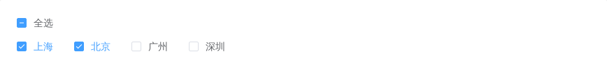
<template><el-checkbox :indeterminate="isIndeterminate" v-model="checkAll" @change="handleCheckAllChange">全选</el-checkbox><div style="margin: 15px 0;"></div><el-checkbox-group v-model="checkedCities" @change="handleCheckedCitiesChange"><el-checkbox v-for="city in cities" :label="city" :key="city">{{city}}</el-checkbox></el-checkbox-group></template><script>const cityOptions = ['上海', '北京', '广州', '深圳'];export default {data() {return {checkAll: false,checkedCities: ['上海', '北京'],cities: cityOptions,isIndeterminate: true};},methods: {handleCheckAllChange(val) {this.checkedCities = val ? cityOptions : [];this.isIndeterminate = false;},handleCheckedCitiesChange(value) {let checkedCount = value.length;this.checkAll = checkedCount === this.cities.length;this.isIndeterminate = checkedCount > 0 && checkedCount < this.cities.length;}}};</script>
可选项目数量的限制
使用 min 和 max 属性能够限制可以被勾选的项目的数量。

<template>
  <el-checkbox-group
    v-model="checkedCities"
    :min="1"
    :max="2">
    <el-checkbox v-for="city in cities" :label="city" :key="city">{{city}}</el-checkbox>
  </el-checkbox-group>
</template>
<script>
  const cityOptions = ['上海', '北京', '广州', '深圳'];
  export default {
    data() {
      return {
        checkedCities: ['上海', '北京'],
        cities: cityOptions
      };
    }
  };
</script>
按钮样式
按钮样式的多选组合。
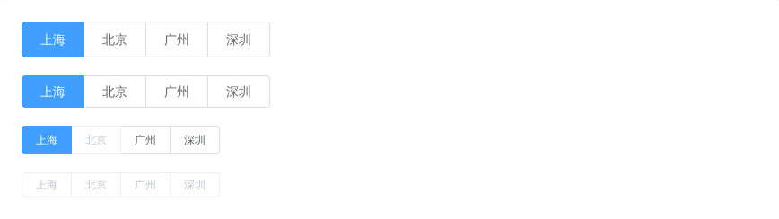
只需要把el-checkbox元素替换为el-checkbox-button元素即可。此外,Element 还提供了size属性。
<template>
  <div>
    <el-checkbox-group v-model="checkboxGroup1">
      <el-checkbox-button v-for="city in cities" :label="city" :key="city">{{city}}</el-checkbox-button>
    </el-checkbox-group>
  </div>
  <div style="margin-top: 20px">
    <el-checkbox-group v-model="checkboxGroup2" size="medium">
      <el-checkbox-button v-for="city in cities" :label="city" :key="city">{{city}}</el-checkbox-button>
    </el-checkbox-group>
  </div>
  <div style="margin-top: 20px">
    <el-checkbox-group v-model="checkboxGroup3" size="small">
      <el-checkbox-button v-for="city in cities" :label="city" :disabled="city === '北京'" :key="city">{{city}}</el-checkbox-button>
    </el-checkbox-group>
  </div>
  <div style="margin-top: 20px">
    <el-checkbox-group v-model="checkboxGroup4" size="mini" disabled>
      <el-checkbox-button v-for="city in cities" :label="city" :key="city">{{city}}</el-checkbox-button>
    </el-checkbox-group>
  </div>
</template>
<script>
  const cityOptions = ['上海', '北京', '广州', '深圳'];
  export default {
    data () {
      return {
        checkboxGroup1: ['上海'],
        checkboxGroup2: ['上海'],
        checkboxGroup3: ['上海'],
        checkboxGroup4: ['上海'],
        cities: cityOptions
      };
    }
  }
</script>
带有边框
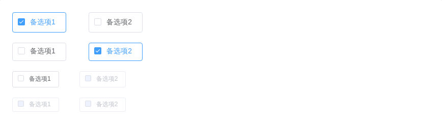
设置border属性可以渲染为带有边框的多选框。
<template>
  <div>
    <el-checkbox v-model="checked1" label="备选项1" border></el-checkbox>
    <el-checkbox v-model="checked2" label="备选项2" border></el-checkbox>
  </div>
  <div style="margin-top: 20px">
    <el-checkbox v-model="checked3" label="备选项1" border size="medium"></el-checkbox>
    <el-checkbox v-model="checked4" label="备选项2" border size="medium"></el-checkbox>
  </div>
  <div style="margin-top: 20px">
    <el-checkbox-group v-model="checkboxGroup1" size="small">
      <el-checkbox label="备选项1" border></el-checkbox>
      <el-checkbox label="备选项2" border disabled></el-checkbox>
    </el-checkbox-group>
  </div>
  <div style="margin-top: 20px">
    <el-checkbox-group v-model="checkboxGroup2" size="mini" disabled>
      <el-checkbox label="备选项1" border></el-checkbox>
      <el-checkbox label="备选项2" border></el-checkbox>
    </el-checkbox-group>
  </div>
</template>

<script>
  export default {
    data () {
      return {
        checked1: true,
        checked2: false,
        checked3: false,
        checked4: true,
        checkboxGroup1: [],
        checkboxGroup2: []
      };
    }
  }
</script>
Checkbox Attributes
| 参数 | 说明 | 类型 | 可选值 | 默认值 |
|---|---|---|---|---|
| value / v-model | 绑定值 | string / number / boolean | — | — |
| label | 选中状态的值(只有在checkbox-group或者绑定对象类型为array时有效) | string / number / boolean | — | — |
| true-label | 选中时的值 | string / number | — | — |
| false-label | 没有选中时的值 | string / number | — | — |
| disabled | 是否禁用 | boolean | — | false |
| border | 是否显示边框 | boolean | — | false |
| size | Checkbox 的尺寸,仅在 border 为真时有效 | string | medium / small / mini | — |
| name | 原生 name 属性 | string | — | — |
| checked | 当前是否勾选 | boolean | — | false |
| indeterminate | 设置 indeterminate 状态,只负责样式控制 | boolean | — | false |
Checkbox Events
| 事件名称 | 说明 | 回调参数 |
|---|---|---|
| change | 当绑定值变化时触发的事件 | 更新后的值 |
Checkbox-group Attributes
| 参数 | 说明 | 类型 | 可选值 | 默认值 |
|---|---|---|---|---|
| value / v-model | 绑定值 | array | — | — |
| size | 多选框组尺寸,仅对按钮形式的 Checkbox 或带有边框的 Checkbox 有效 | string | medium / small / mini | — |
| disabled | 是否禁用 | boolean | — | false |
| min | 可被勾选的 checkbox 的最小数量 | number | — | — |
| max | 可被勾选的 checkbox 的最大数量 | number | — | — |
| text-color | 按钮形式的 Checkbox 激活时的文本颜色 | string | — | #ffffff |
| fill | 按钮形式的 Checkbox 激活时的填充色和边框色 | string | — | #409EFF |
Checkbox-group Events
| 事件名称 | 说明 | 回调参数 |
|---|---|---|
| change | 当绑定值变化时触发的事件 | 更新后的值 |
Checkbox-button Attributes
| 参数 | 说明 | 类型 | 可选值 | 默认值 |
|---|---|---|---|---|
| label | 选中状态的值(只有在checkbox-group或者绑定对象类型为array时有效) | string / number / boolean | — | — |
| true-label | 选中时的值 | string / number | — | — |
| false-label | 没有选中时的值 | string / number | — | — |
| disabled | 是否禁用 | boolean | — | false |
| name | 原生 name 属性 | string | — | — |
| checked | 当前是否勾选 | boolean | — | false |
